Category: CBR

  • Where you put a railway

    Coalition for Better Rail · ALTO HSR Citizen Research Initiative · The HPR Research Report

    Where you put a railway decides almost everything else

    Build beside a highway that already exists, or cut a new line through open country. That single choice sets the carbon, the habitat damage, the disruption during construction and the opposition — and it sets the cost too.

    −15 Mt

    Carbon removed over fifty years by the brownfield route, on our model

    +15 Mt

    Carbon added over the same period by the greenfield route

    29 v 65

    Community friction scores, brownfield against greenfield

    The environmental case for a railway is usually made with one number: the carbon saved by taking people out of cars and planes. That number matters, and we deal with it first. But the bigger environmental fact about a railway is decided before a single train runs — by where the line is put.

    A route that follows an existing transport corridor inherits ground that has already been cleared, drained, fenced and cut through. A route driven across open country creates a new line of disturbance where there was none. The same choice governs the human side: whether a project takes its land from beside a highway people already live next to, or from farms and communities that never expected a railway.

    This page covers the four consequences that follow from that one decision. On each of them the two routes differ not by a margin but in kind.

    1. Carbon: the two routes have opposite signs

    Over fifty years the brownfield route is a net removal of carbon. The greenfield route, measured the same way, is a net emitter. Not smaller — opposite.

    Three things drive that. Construction carbon is the one-off emission of building the line. Building at grade beside an existing highway needs no tunnelling through the Canadian Shield, no deep cuts, and no treatment of the unstable marine clay south of Ottawa. Our estimate is 4.9 Mt for the brownfield line against 14.9 Mt for the greenfield one — roughly three times more.

    Running the trains turns out to be almost a rounding error either way. On Ontario’s grid, electric traction at 200 km/h emits about 6 grams of carbon per passenger-kilometre.

    Freight is what decides it. A passenger line built beside the existing freight railway frees capacity on that railway. Every long-haul truck that moves off Highway 401 onto rail saves about a quarter of a tonne of carbon on a typical haul. At 3,000 trucks a day — about eight freight trains — that is roughly 13.5 Mt over fifty years. The greenfield route has no freight function, so it cannot claim any of it.

    Fifty-year carbon balance — our estimate, central case
    What countsBrownfield (electric)Greenfield
    Building it+4.9 Mt+14.9 Mt
    Running the trains+1.3 Mt+5.4 Mt
    Roads closed by fencing+1.7 Mt
    Trucks moved to rail−13.5 Mtnone
    Passengers out of cars−7.9 Mt−7 Mt
    Net over 50 years−15.2 Mt+15 Mt

    Both columns are Initiative estimates, not published figures. A dash means the project structurally has no such term. The two routes differ in length — roughly 485 km against roughly 1,000 km — which is itself part of the comparison, because the longer line is the heavier one to build.

    Why the freight credit matters so much

    The carbon saved by taking a passenger out of a car shrinks every year as more cars become electric. By the 2050s it is close to nothing. The carbon saved by taking a truck off the road and putting the load on a train does not shrink the same way, because trucks stay diesel far longer — and it grows as the electricity grid gets cleaner.

    So the brownfield route’s carbon case rests on something that strengthens with time. The greenfield route’s rests on something that weakens.

    That shows up most clearly in how long each takes to pay back its construction carbon. The brownfield line breaks even in 12 to 18 years and stays in credit after that, and the timing barely changes with passenger numbers because freight carries it. The greenfield line depends entirely on passengers: about 22 years at the ridership its reference class suggests, 39 years at a more central figure, and at low ridership it does not break even within fifty years at all.

    2. Habitat: a new barrier in the wrong place

    A railway is a barrier to animals. Where you put the barrier decides whether it cuts through habitat that is still whole, or adds one more strand to ground that is already crossed by a highway and a freight line.

    The greenfield alignment runs through or beside three of eastern Ontario’s most sensitive landscapes.

    The Frontenac Arch

    A billion-year-old granite ridge linking the Canadian Shield to the Adirondacks, a UNESCO Biosphere Reserve since 2002, and the narrowest point on the wildlife corridor running from Algonquin to the Adirondacks. It holds Blanding’s turtle, the grey ratsnake, the eastern whip-poor-will and somewhere between half and two thirds of Canada’s cerulean warblers, along with fisher, black bear, moose and eastern wolf.

    Because it is already the tightest pinch-point in a continental corridor, a new barrier laid across it does disproportionate harm. It does not just disturb habitat; it narrows the last gap animals still move through.

    The Napanee Limestone Plain

    Alvar — flat limestone pavement with almost no soil, flooded in spring and parched in summer. It exists in only two places on Earth, the Great Lakes basin and the Baltic, and about 85 per cent of North America’s alvar is in Ontario. It supports part of Ontario’s remaining eastern loggerhead shrike population, a bird now down to a handful of nesting pairs province-wide.

    A brownfield route is not ecologically free. Its right-of-way still crosses natural land. The point is comparative: it adds a strand where a barrier already exists, rather than opening a fresh one through the ground that the biosphere designation exists to protect.

    We say that plainly because it matters. The corridor audit in Chapter 4 finds the brownfield spine still crosses about 41 per cent natural cover. It is not a route through nothing. It is a route through ground that a four-lane highway and a Class I freight main already run down.

    3. Construction: where the trucks go

    A 479-kilometre construction site has to be fed. The brownfield spine needs roughly 9.8 million tonnes of fill, ballast, track and concrete — about 20,400 tonnes for every kilometre built. Delivered entirely by road, that is around 390,000 loaded truck trips, running on the same Highway 401 the railway is being built beside, during the decade that highway is itself being widened.

    Britain has already run this experiment. HS2 moved more than 10 million tonnes of material by rail, and the reason it did is the instructive part: it was not a carbon measure. Local councils refused the lorry routes the project had planned. Moving material by train was how the works stayed consented.

    The honest size of the carbon saving

    Moving 60 to 80 per cent of the material by rail instead of road would avoid somewhere between 0.05 and 0.08 Mt of carbon. That is one to two per cent of the line’s construction emissions. It is a real saving and a small one, and the carbon case on this page does not rest on it.

    What it changes is something else: whether people along the route can live with the construction. That is the variable that decides whether a corridor gets built at all.

    And this is not a strategy a project can simply decide to adopt. It is a property of where the line is. A route beside an existing freight railway has yards at Belleville, Kingston, Brockville, Cornwall and Coteau available as railheads, and on the Ottawa legs runs on publicly owned track. A greenfield route through the Frontenac Arch has no railway to deliver to. Materials arrive by road on haul roads built for the purpose, and excavated rock leaves the same way, through the same rural communities.

    4. Communities: friction is priced into the cost

    We score this two ways. The Latent Friction Index measures the structural friction a route will generate, before any opposition has appeared. The Community Friction Index measures opposition that has actually materialised. On the forward measure the brownfield spine scores about 29 and the greenfield corridor about 65. On the realised measure the greenfield project has already reached 54, and is rising.

    This is not only a political point. In our reference-class cost model, community friction is a statistically significant predictor of cost escalation — it carries most of the explanatory power in what a kilometre actually costs to build, across the international sample. The friction a new corridor generates gets priced into the bill.

    A low-friction route is not just quieter. It is cheaper, and those are the same fact seen from two sides.

    The difference comes down to where the land is taken from. Both routes need new land; a railway cannot be laid inside a live highway. But land taken beside an existing highway and freight line is already fragmented, already severed, and already next to infrastructure. Land taken across open country is none of those things, and the people it is taken from had no prior relationship with the project.

    One thing that cuts the other way

    The margin beside Highway 401 that makes the brownfield route cheap is being consumed — by interchange development, logistics parks moving east, subdivisions at growth centres and utility lock-in. Chapter 4 puts the cost of waiting until the corridor fills in at around $20 billion, which would roughly halve the route’s benefit-cost ratio and erase the advantage that is the reason to prefer it.

    The brownfield option is the low-friction one, but only while the window is open.

    5. What the corridor could give back

    Everything above treats the corridor as something done to the land it crosses. There is a reciprocal question worth asking.

    Against the intuition that Ontario’s sun improves as you go south and west, the province’s strongest solar yields are in the east. Kingston records about 1,194 kilowatt-hours per installed kilowatt per year and Ottawa about 1,140, against roughly 1,096 for Toronto and 1,084 for London. The railway is proposed through the sunniest ground in southern Ontario — and developers noticed first. Four ten-megawatt solar farms stand within a few kilometres of the 401 around Ingleside alone — Rutley, Cornwall, David Brown and South Stormont, built between 2012 and 2015 — and at Edwardsburgh Cardinal a partnership including the Algonquins of Pikwàkanagàn First Nation is building the largest battery storage system in Canada.

    This matters for a reason that has nothing to do with electricity. A right-of-way takes a strip of land and pays for it once. A generation lease pays on the land that remains, every year, for decades. The awkward leftover parcels created by a railway are poor ground for crops and perfectly good ground for solar panels. The Rutley farm gives a sense of the scale: ten megawatts across about ninety acres.

    Being clear about the numbers

    The contracts that built the existing solar farms paid up to 44.3 cents a kilowatt-hour and are closed to new entrants. At today’s rates a ten-megawatt facility earns closer to a million dollars a year than the five to seven million those contracts paid. The existing arrays are a poor guide to what a new one is worth.

    A million a year through a lease and a tax roll is still a different thing from a single expropriation cheque.

    The limits deserve stating as plainly as the opportunity. Solar output peaks in summer and stops at night, while a railway’s demand is flat and year-round — so this is a commercial and community proposition, not a way to power trains. Provincial policy restricts ground-mount solar on prime farmland. Connection capacity governs what can actually be built. None of that is a reason to leave it unexamined; it is a reason to examine it while the route is still being decided, rather than after the land has been taken and the relationships have set.

    How to read the numbers on this page

    Figures attributed to a named source — Alto, HS2, the C.D. Howe Institute, Metrolinx, Environment and Climate Change Canada, the Treasury Board, Natural Resources Canada, UNESCO, or a named developer — are quoted from the full chapter’s source lists and can be checked there.

    Everything else is output from our own models: both columns of the carbon table, the freight credit, the breakeven years, the friction scores, the land-cover audit, the materials tonnage and the delay-escalation estimate. These are estimates built on stated assumptions, not measurements. The assumptions are set out in the full report so that any of them can be replaced and the arithmetic re-run.

    Where Alto has not published a figure, we say so rather than inferring one, and we make no claim about why any figure has not been published.

    Read the full chapter

    Chapter 5 — Environmental and Community Impact (PDF)

    Nineteen pages. The full lifecycle carbon account with its discount-rate sensitivity, the traction comparison including bi-mode trainsets, the species and habitat assessments, the materials-by-rail analysis against HS2 outturn, the friction indices, the corridor solar assessment, and the complete source lists for each section.

    Sources and notes

    1Discount rates: Metrolinx Business Case Manual Volume 2 (3.5 per cent); Environment and Climate Change Canada, social cost of greenhouse gas emissions (2 per cent near-term Ramsey rate); Treasury Board of Canada Secretariat, Canadian Cost-Benefit Analysis Guide: Regulatory Proposals (8 per cent); US Office of Management and Budget Circular A-4, revised November 2023, in which the 7 per cent capital rate was withdrawn.
    2C.D. Howe Institute, All Aboard: The Benefits of Faster, More Frequent Passenger Trains between Ontario and Québec (D. Jones and T. Fariha), February 2025 — 3.5 per cent social discount rate over a 60-year appraisal, and the only published benefit analysis of this corridor.
    3Habitat: UNESCO Man and the Biosphere Programme, Frontenac Arch Biosphere Reserve; Birds Canada, cerulean warbler profile; COSEWIC and Environment and Climate Change Canada recovery strategies; Important Bird and Biodiversity Areas Canada, Napanee Limestone Plain (ON152); Wildlife Preservation Canada, eastern loggerhead shrike. Initiative assessments of the Frontenac Arch (A. Hyett) and the Napanee Limestone Plain (S. Moore and K. Hennige), March 2026.
    4Materials by rail: HS2 Ltd, Materials by Rail, HS2 Learning Legacy, and HS2 media releases 2020–2023; Crossrail Excavated Materials Story; Railway Association of Canada on rail fuel efficiency.
    5Solar: Natural Resources Canada photovoltaic potential data; Canada Energy Regulator market snapshot; Firelight Infrastructure Partners, Saturn Power and Clearlight Energy project data; The Energy Mix on the Skyview 2 storage project at Edwardsburgh Cardinal.
    Coalition for Better Rail  ·  ALTO HSR Citizen Research Initiative  ·  beyondalto.ca  ·  citizenresearch.ca  ·  The HPR Research Report · Chapter 5 Independent, non-partisan research on Canada’s proposed Toronto–Québec City high-speed rail corridor. This page is a plain-language summary of Chapter 5; the full chapter sets out the models, the tables and the complete source lists. Nothing on this page is a statement about the motives or conduct of any person or organisation. It is a comparison of two route choices and of what follows from each.
  • Where the line goes

    Coalition for Better Rail · ALTO HSR Citizen Research Initiative · The HPR Research Report

    Where the line goes, and what it costs

    Pick the route first and the speed follows. Pick the speed first and the route picks itself — expensively.

    Every rail project has one decision that cannot be undone. Not the trains, not the timetable, not whether the line runs on diesel or electricity — all of those can be changed later. The route is the one that is fixed for a century. This chapter is about that decision: where an HPR line would run, why, and what it would cost.

    It also explains the single choice that separates the two proposals. ALTO decided on 300 km/h and then had to find ground straight enough to carry it. HPR starts from what the corridor already offers and lets the speed come out of that. The result is a railway that costs roughly a third as much per kilometre — and arrives about twenty-five minutes later.

    Download
    Chapter 4: Route Alignment and Capital Cost (PDF)
    The full chapter, with the cost model, maps and sourcing
    Download PDF
    4.1 · The Window

    Is the corridor still available?

    Speed decides how straight a railway has to be, and the relationship is steep. A curve for 200 km/h needs a radius of about 1,900 metres. At 240 km/h it is about 2,700. At 300 km/h it is about 4,250 — nearer 7,000 for a comfortable ride. Anywhere in the 177–240 km/h band, those curves are gentle enough to follow a route that has already been cut through the landscape, easing the bends here and there. At 300 km/h the curves run for kilometres, and no amount of easing fits them alongside Highway 401 or the existing rail corridor. The line has to strike out across open country. That is physics, not preference.

    This is why the project’s own history matters. What became ALTO went into the procurement as VIA High Frequency Rail — a plan the government itself described as running at up to 200 km/h on dedicated track along mostly existing rights-of-way. The 300 km/h target that emerged is what closed the existing corridor off.

    The window is closing, but not mainly because of the highway

    The Highway 401 widening is the visible threat, but it is only the leading edge. What really closes the corridor is ordinary growth: commercial development at the interchanges, then logistics parks moving east from the GTA, then housing, then the utility corridors — hydro, gas, fibre, water — that lock in behind them.

    None of it reverses. A logistics park is not removed; a subdivision is not un-built; a utility corridor is not moved cheaply. Each step is fast and cheap to build and slow and expensive to undo. By late in the century the corridor that is open today is set solid, and a surface railway through it is no longer possible — only an elevated or tunnelled one, at a cost approaching ALTO’s.

    We put a number on what that closure would cost: roughly $42.6 billion, in a range of about $28 to $55 billion. It has three parts — farmland on the margin re-valued as developed land when it finally has to be bought ($2.6B); the jump from an at-grade build on open ground to elevated and tunnelled construction through built-up areas ($19.3B); and the value of the benefits lost during the decades of delay ($20.7B). The headline is that the cost of missing the window is about the same order as the cost of building the railway — and it is incurred by waiting, not by building.

    4.2 · The Route

    Take the speed the ground gives you

    Inside the Toronto–Ottawa–Montréal triangle the route has two parts. A spine of roughly 479 kilometres from Pickering Junction to Dorval, built and upgraded as a dedicated passenger route. And the Ottawa legs, about 200 kilometres of upgrades on track the public passenger operator already owns.

    In each stretch the line follows whichever existing corridor runs straighter — Highway 401 or the existing rail corridor — sitting beside it rather than on it, separated from road traffic throughout. The two run roughly parallel for most of the way, so the ground the railway follows is already a transport corridor rather than open farmland. No major tunnels, and only a limited number of viaducts.

    The reversal at the heart of the chapter

    ALTO fixes the speed and lets it dictate the route — which is exactly how the corridor came to be closed off. HPR does it the other way round: it takes the highest speed each stretch of corridor already offers, up to a 240 km/h ceiling, and never buys speed the ground does not give away free.

    Where the ground is generous, the trains go fast

    The dead-straight run along the St. Lawrence from Brockville to Cornwall, the riverside stretch to Coteau, the inland 401 across the Napanee plain — all support 240 km/h with routine curve easing alone.

    Where it isn’t, they go slower

    Through the Frontenac Arch, where the line follows the least-bad path the 1850s builders found through the Shield, and on the tight approaches through Durham and into Montréal, trains simply run slower. Buying speed there would mean buying tunnels, viaducts and a new right-of-way.

    One consequence matters for the costing: the whole spine is priced at the 200 km/h standard — conventional structures, curves near 1,900 metres. The stretches that can run faster are a bonus in service, not an extra cost to build. The cost model never pays for speed the corridor gives away.

    4.3–4.6 · The Cost

    What it would cost, and what we commit against

    The spine is priced two ways, and the difference between them is the discipline this whole report is built on.

    FigureWhat it means
    $19.0 billion
    as specified — about $40M per km
    What the 479 km diesel spine costs if everything goes to plan, grade separations included.
    $26.1 billion
    de-biased — about $54M per km
    What comparable projects have actually cost when things didn’t go to plan. This is the figure to commit against — not because this project is expected to overrun, but because comparable ones reliably have.
    +$3.1 billion
    electrification
    A separately priced option that can be deferred, rather than a fixed requirement. The line opens on diesel and electrifies when demand warrants.

    Adjusting for the record is not pessimism. The as-specified figure is what the corridor costs if everything goes right; the adjusted figure is what similar projects have actually cost when it didn’t. Committing against the second is the discipline ALTO never applied to itself.

    Why deferring electrification matters more than it sounds

    Eastern Ontario’s electricity system is already under active capacity assessment — the system operator is testing whether the existing grid can meet ordinary demand growth over the next two decades before any railway load is added. A 300 km/h electric line is a heavy new customer on exactly that system, and its electric design makes that load mandatory and up front.

    A diesel-first railway opens on the traction it carries with it. Electrification — lighter in any case at 200 km/h — follows once the grid has headroom and the ridership justifies it. The railway’s opening is not tied to the grid’s expansion timetable.

    Cold climate cuts the same way. Leda clay, karst and freeze–thaw are real hazards, and the international record shows what they can do: China’s Harbin–Dalian line ran about 25% over budget and carried a multi-year frost-heave speed restriction. But that is a 300 km/h record. At 200 km/h the tolerances are far more forgiving, and frost heave that would force a speed restriction on a high-speed line is a maintenance item on a slower one. The lower design speed buys a smaller penalty.

    4.7 · The Comparison

    Three and a half times the price per kilometre

    The chapter’s figures resolve into a single comparison. Measured the same way, the HPR spine costs about $40 million per kilometre. ALTO costs about $142 million per kilometre. Two railways, the same corridor, the same cities — one priced at roughly three and a half times the other for every kilometre of route.

    The gap splits roughly one-third engineering, two-thirds friction. About 35% is engineering complexity: a 300 km/h line across open country with its tunnels, viaducts and fresh cut through difficult ground, against a 200 km/h build that needs no major spine tunnels. The other 65% is corridor friction: the consultation, land-tenure and political burden of a new corridor, against a route that asks far less of the land and the people it crosses. The gap is not the product of one assumption. It is about a third from how the line is engineered and two-thirds from where it is put.

    RailwayCost per kilometre
    TGV Paris–Lyon~$26M — flat, low-friction early French high-speed line
    Tokaido Shinkansen~$35M — dense, high-utilisation Japanese line
    HPR spine~$40M — among the most efficiently delivered railways in the international record
    ALTO~$142M — above the international range
    4.8 · Journey Time

    What the speed difference actually buys

    Speeds are only interesting for what they add up to. Toronto Union to Montréal’s Gare Centrale, on an express stopping once at Kingston, works out at a little over three and a half hours.

    ServiceToronto–Montréal journey time
    VIA Rail today~5h00 — scheduled service on shared freight track
    VIA HFR base case, 177 km/h3h59–4h19 — the only journey time ever actually simulated for this corridor
    HPR express, Kingston stop~3h32 — estimated from segment speeds and corridor geometry
    ALTO, 300 km/h3h07 — ALTO’s published figure, a spreadsheet estimate rather than a simulation

    One caution and one conclusion. The caution is that our figure is an estimate of the same kind as ALTO’s — distance divided by speed, with allowances. Neither has been simulated, and we say so.

    The conclusion is that the honest gap between the two railways is about twenty-five minutes, and about nineteen against a non-stop run. ALTO buys that quarter of an hour at roughly three and a half times the capital cost per kilometre.

    Toronto–Ottawa works out at about 2h55 — the spine as far as Brockville, then the upgraded Ottawa leg — against roughly four and a quarter hours today. And the towns along the route gain proportionally more than the endpoints do, because they start from a slower and less frequent service: Cobourg in under an hour, Belleville in about 1h20, on a regional train calling at every station.

    4.9 · The Long View

    What the corridor is in 2125

    A rail corridor is not a project. It is an asset that lasts a century, and the decision taken now is the corridor the region lives with long after today’s arguments about cost and timetable are forgotten. The right test of a route is not only what it costs to build this decade, but what kind of corridor it leaves to the people who inherit it.

    That is why the questions in this chapter matter most. They are the irreversible ones. The trains, the traction and the timetable can all be changed later. The route cannot.

    Chapters 5 through 8 take these figures forward — into the environmental and community comparison, the ridership modelling, the operating economics, and the full cost-benefit and financial analysis.

  • Incompatible traffic types

    Coalition for Better Rail · ALTO HSR Citizen Research Initiative · The HPR Research Report

    Two incompatible traffic types share one corridor

    Why North America’s freight railways work the opposite way from Europe’s—and what that means for the passenger problem.

    The Toronto–Montréal corridor’s passenger problem has a single physical cause: intercity passenger trains and heavy freight trains are competing for the same tracks. This chapter explains why that conflict is the real problem—and why the solution isn’t to build a new line somewhere else, but to separate the traffic on the corridor that already exists.

    3.1 · The Opposing Models

    North America and Europe run railways in opposite ways

    Europe’s model: Railways are run by the state or with heavy state support. The network is built around passenger service first—high-speed trains get priority over freight. Freight competes for capacity on a passenger-focused network and often loses money or relies on subsidies.

    North America’s model: Railways are private companies that own their own tracks. Freight is the core business, and it comes first. Intercity passenger trains are tenants that run in between freight movements. The freight railways have spent 30 years optimizing for moving more tonnage at lower cost.

    What the freight model bought. The clearest physical expression of the North American model is the size of the trains it runs. Because crew and locomotive costs are largely fixed per departure, length is leverage. North American freight trains routinely run beyond three kilometres and the longest exceed four, against a European standard of roughly 740 metres. The second and larger efficiency is double-stack, introduced in North America in 1984 and now carrying the majority of US intermodal traffic: two containers stacked vertically in a single well car, roughly doubling the container payload of a train of a given length. Europe cannot do either, because siding lengths, signalling design and overhead electrification on a passenger-first network cap both train length and loading gauge.

    The numbers tell the story. In the United States, freight carries roughly 40 percent of long-distance goods movement by weight—among the world’s highest. In Europe, it’s fallen to about 17 percent and still dropping. Why? Because Europe invested in passenger railways, and freight became the secondary user. North America invested in freight railways, and passenger service became secondary.

    This matters because

    Canada’s proposed Toronto–Montréal corridor would run on North American freight railway tracks owned by Canadian National Railway. That means it’s joining a corridor governed by North American logic: the freight railway owns the track, and its tonnage comes first. A passenger plan modelled on Europe won’t work here.

    3.2 · The Incumbent Railway

    CN is constrained, and its problem is capacity—not speed

    Canadian National Railway (CN) owns and operates the Kingston Subdivision, the main freight line through the Toronto–Montréal corridor. CN’s story over the past three decades is a master class in what makes private railways valuable: squeezing more output from existing track without building new infrastructure.

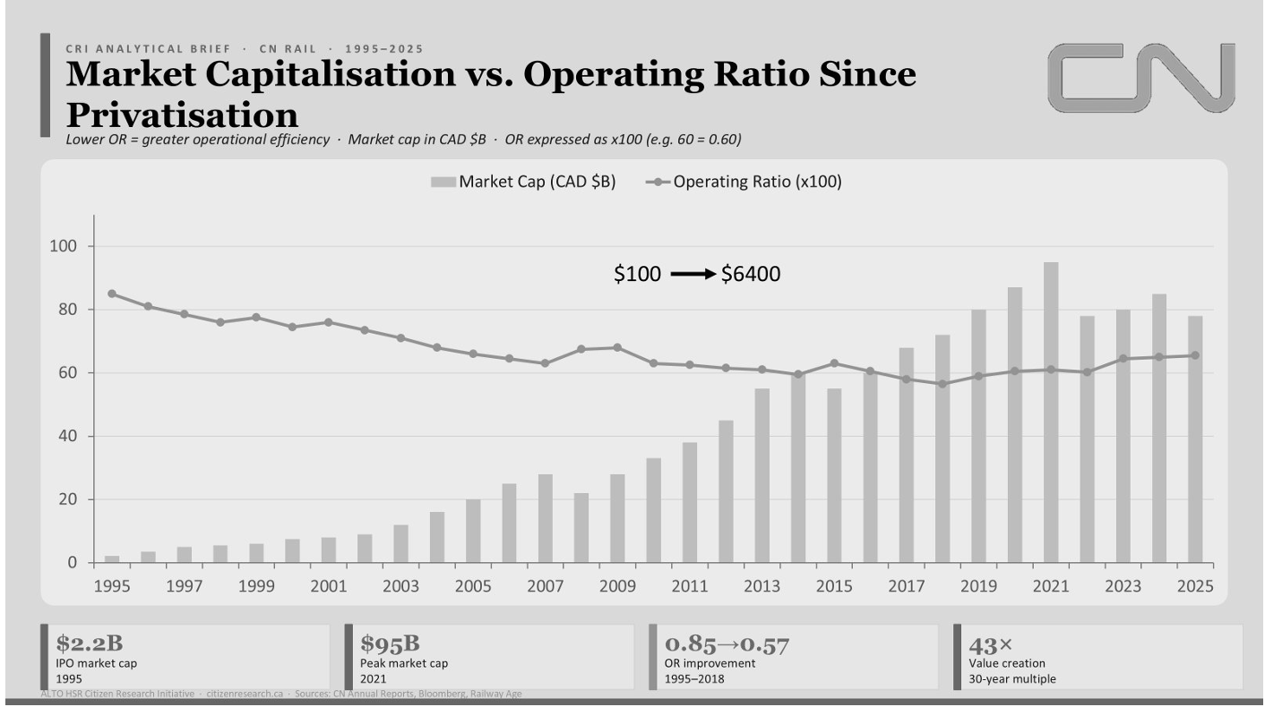
    When CN was privatized in 1995, it was a struggling Crown corporation. By the 2000s, under new leadership, CN adopted “Precision Scheduled Railroading”—moving individual cars on fixed schedules, cutting dwell time in rail yards, and lengthening trains. The operating ratio—the industry’s efficiency measure, where lower is better—fell from 76 percent to 56 percent. CN’s share price went up roughly 60 times.

    Chart of CN market capitalisation against operating ratio from 1995 to 2025, showing market capitalisation rising as the operating ratio falls
    Figure 3.1. CN market capitalisation versus operating ratio since privatisation, 1995–2025. Market capitalisation in CAD billions; operating ratio expressed ×100. The inverse relationship is this chapter’s central premise: as the operating ratio fell, market capitalisation compounded — value created by operating discipline on existing track, not by network construction. Sources: CN annual reports; Bloomberg; Railway Age.

    The lesson: The market rewarded CN not for building new railways but for extracting more value from the railway it already owned. This is the capital-light path to rail value: efficiency on assets in the ground, not greenfield construction.

    Why this matters to the corridor

    CN’s problem today is not speed—it’s capacity. Its three main intermodal terminals in the Greater Toronto Area are running at full capacity. It proposed a new terminal at Milton in 2015 and met a decade of local opposition, environmental assessment and litigation before construction could start; the approval was ultimately upheld on appeal and the terminal is now being built. This tells us something crucial: the cost of building new capacity in a populated landscape is measured in years, not just dollars — Milton took roughly a decade from proposal to construction on a facility of about $250 million — and community resistance is as big a factor as engineering difficulty.

    3.3 · The Other Railway

    What about CP? It runs on its own track

    CN isn’t the only major freight railway on the Toronto–Montréal axis. Canadian Pacific—since its 2023 merger with Kansas City Southern, now Canadian Pacific Kansas City (CPKC)—also runs a line through the corridor. It’s reasonable to ask whether CPKC changes the picture. It doesn’t, and the reason is geographic.

    CPKC runs west out of Toronto on its Galt Subdivision. Its main Toronto–Montréal line is the Belleville Subdivision, which runs roughly parallel to CN’s Kingston Subdivision through the central part of the corridor, then turns north toward Smiths Falls and continues to Montréal on CPKC’s own tracks. CPKC’s eastern freight travels on its own metals, not on CN’s. Since the KCS merger, CPKC’s strategic focus has shifted decisively north–south—to the continental Canada–US–Mexico network that is now its primary growth story.

    Why this matters

    The passenger–freight conflict is specific to CN’s Kingston Subdivision, where VIA’s trains share track with CN’s freight. CPKC, on its separate Belleville Subdivision, is not a party to it—so the freight capacity that separation liberates accrues to CN, the line’s owner. The Belleville Subdivision matters in one further respect: it’s a second existing rail right-of-way running parallel to the CN line and Highway 401 through the corridor’s central section—further evidence that the ground HPR would follow is already a multi-track transport spine rather than open country.

    3.4 · The Root Problem

    Entanglement: two traffic types, one track

    VIA’s intercity passenger trains and CN’s freight trains share the Kingston Subdivision. They have opposite operating needs.

    Freight trains

    Long, heavy, slow to accelerate. Can tolerate delays. Run to commercial schedules. Need to be as long as possible to spread fixed locomotive costs across more cargo.

    Passenger trains

    Short, light, quick to accelerate. Cannot tolerate delays. Need frequent, reliable service. Need short platforms and quick turnarounds.

    Under the “host railway priority” rules that govern shared track across North America, when a freight train and a passenger train want the same track at the same time, the freight train proceeds and the passenger train waits in a siding. VIA cannot unilaterally add frequency because every additional passenger train needs to be negotiated around CN’s freight schedule. CN controls the dispatcher, and under this ownership structure nothing requires the track owner to give up freight capacity to improve passenger reliability.

    This creates a two-sided failure: every passenger path is capacity CN cannot use for freight; every siding meet is friction on a network built and operated to move tonnage without interruption. They are entangled—neither can be optimized without degrading the other. And the owner of the track whose traffic comes first has no incentive to give ground.

    The corridor’s real problem

    It’s not a shortage of speed. It’s not an engineering problem. It’s a structural conflict over who owns the capacity and whose traffic comes first. No schedule adjustment solves this while the two traffic types remain on one set of rails.

    3.5 · The Solution

    Separation: give each traffic type its own path

    If entanglement is the disease, separation is the cure—and it’s the single design principle behind HPR.

    The idea is simple: build a dedicated passenger path engineered for passenger requirements, and hand the shared corridor back to freight. Each traffic type then runs on infrastructure suited to it. The capacity conflict that produces the corridor’s present failure simply ceases to exist. This doesn’t ask a private freight railway to subordinate its tonnage to passenger priority—it removes the passenger trains from the freight railway’s tracks altogether.

    Separation can be achieved cheaply or expensively. The difference between the two approaches is the difference between HPR and ALTO.

    HPR pursues separation through a brownfield-led philosophy: Build the dedicated passenger path along the geometry of corridors that are already disturbed—Highway 401 and the existing rail right-of-way. Upgrade and reuse infrastructure wherever engineering permits; build new only where geometry or capacity genuinely demands it. This keeps the new passenger alignment adjacent to the freight corridor it is relieving.

    What that means in practice: a roughly 479 km new-build passenger spine from Pickering Junction to Dorval, plus about 200 km of upgrade on the VIA-owned Smiths Falls and Alexandria Subdivisions. The spine is the capital project; the upgrades extend it using track already in public hands.

    ALTO pursues separation through greenfield construction: Build a new high-speed line through Eastern Ontario, engineered for 300 km/h, away from the existing freight corridor. This imports the European passenger-first model—a dedicated high-speed line as an end in itself—into a North American freight corridor whose economics it doesn’t engage.

    3.6 · The Insight

    Build one, make one free: the dual-asset structure

    This is where HPR differs fundamentally from ALTO, and where the economics become positive-sum rather than single-purpose.

    When HPR moves passenger trains onto their own dedicated path, they vacate the Kingston Subdivision. The capacity they were consuming—the paths, the priority negotiations, the siding meets—reverts to CN as liberated freight capacity on the line it owns. That capacity bears on the operating ratio and the terminal congestion CN’s own public reporting identifies as central. CN has taken no public position on HPR, and none should be inferred here — the point is that the incentives run in the same direction.

    Think of it this way:

    • “Build one” is High Performance Passenger Rail (HPPR)—the dedicated passenger path. That’s the capital project.
    • “Make one free” is High Performance Freight Rail (HPFR)—the freight capacity liberated on the shared corridor the moment passenger trains vacate it. No additional construction required to create it. It falls out of the geometry of the build.

    One capital project produces two separable outputs. The passenger business case needs only to justify itself on passenger benefits. The freight-capacity dividend is surplus—untouched by any reference-class reduction of passenger ridership forecasts. This is a deliberate bias countermeasure against the benefit-shortfall failure mode that sinks megaprojects.

    Why this structure matters

    On the reference-class basis used throughout this report, ALTO builds one thing — a passenger-only line — at the corridor’s maximum per-kilometre cost of about $142M/km, and captures one benefit stream. HPR builds one thing at about $54M/km de-biased and captures two. The difference isn’t in execution quality; it’s in whether the design is aligned with the corridor’s actual economics and incentives.

    3.7 · Who Gains

    The freight dividend: how the freed capacity translates to real benefits

    The liberated freight capacity is not abstract. It lands on named, motivated beneficiaries:

    The host railway (CN)

    Recovers paths previously consumed by passenger service. Uncongested freight paths translate to higher network fluidity, more predictable transit times, and the ability to grow tonnage without hitting a capacity ceiling. Where clearance is addressed, it enables double-stack container operation—which roughly halves the per-container cost of moving goods by rail. A freight railway that no longer dispatches around passenger priority is materially more valuable on the same physical asset.

    Shippers and supply chain

    Reliable, uncongested rail capacity on the busiest goods corridor in the country is a resilience asset. It raises the ceiling on how much freight moves by rail and reduces variability that pushes shippers toward more expensive or higher-emission alternatives. Combined with on-dock terminal design of the kind the Montréal Port Authority is building at Contrecœur, it extends competitive intermodal service to a larger share of corridor flows.

    The public

    Freight capacity that would otherwise be unavailable on rail is capacity that can absorb goods movement currently carried by road. Each tonne shifted from truck to rail reduces highway congestion, road wear, and—most consequentially—carbon emissions, given the substantial per-tonne-kilometre advantage of rail over road haulage.

    3.8 · The Contrast

    Why ALTO cannot capture the freight dividend

    ALTO is also a separation scheme—it too gives passenger trains a dedicated line. But the freight dividend is not equally available to it, and the reasons are fundamental.

    First, routing: ALTO’s dedicated line runs away from the existing freight corridor, through new terrain in Eastern Ontario. It doesn’t reorganize the freight corridor; it builds a parallel facility through different ground and leaves the freight network’s configuration, congestion, and clearance constraints essentially as it found them.

    Second, design: ALTO is a single-purpose asset—a passenger-only line engineered for 300 km/h. It cannot carry freight and is not designed to. The only benefit it can capture is the passenger benefit.

    Third, accounting: ALTO’s own business case books no freight benefit at all. The freight dividend does not appear in ALTO’s appraisal because ALTO’s design does not produce it.

    Fourth, cost: ALTO solves the single problem it addresses — passenger throughput — at the maximum per-kilometre cost the corridor admits: a new greenfield high-speed alignment through sensitive terrain. The capital cost analysis in Chapter 4 places HPPR at roughly $39 million per kilometre as specified and about $54 million per kilometre on the de-biased central estimate, some $18.6B to $26.1B for the 479 km spine, against ALTO at approximately $142 million per kilometre on the same reference-class basis.

    On a like-for-like de-biased comparison, ALTO therefore costs roughly two and a half times as much per kilometre to produce one benefit stream — and considerably more in total, once its far longer corridor is counted. HPR’s lower-cost, corridor-aligned build produces two benefits, and leaves CN’s capacity and clearance problems measurably better than it found them.

    The core difference

    ALTO builds one and makes nothing free. HPR builds one and makes one free, at roughly two-fifths of the per-kilometre cost. The difference is not in how well each is executed; it is in whether the concept is aligned with the corridor’s actual economics and the incentives of the parties who own and operate it.

    Key Findings · Chapter 3

    The concept in eight parts

    3.1 — North America runs the opposite railway

    North American freight railways are private, profitable, vertically integrated, and freight-priority. Rail’s freight share is far higher in North America (~40% of US long-distance ton-miles vs ~17% of EU inland tonne-km). A passenger plan modelled on Europe imports passenger-first assumptions into a freight-first corridor.

    3.2 — CN is the incumbent, and it is constrained

    CN’s extraordinary returns came from efficiency on existing track, not construction. Its valuation has stalled; it struggles to add capacity (Milton took a decade from proposal to construction); and its corridor economics improve on uncongested paths and double-stack clearance.

    3.3 — CP is not a party to the conflict

    CPKC runs its own Belleville Subdivision on the Toronto–Montréal axis, parallel to the CN Kingston Sub, and shares no track with VIA. The entanglement, and the freight dividend, are CN’s. CPKC’s parallel line is also a second disturbed right-of-way in the corridor.

    3.4 — Entanglement is the root cause

    Passenger and freight share the Kingston Subdivision with opposite operating characteristics. The corridor’s failure—sub-64% on-time performance, four-hour schedules, low frequency—is one capacity conflict seen from two sides, on track owned by the party whose tonnage comes first.

    3.5 — Separation is the design principle

    Give passenger service its own dedicated path and hand the shared corridor back to freight—resolving the conflict with the North American model, not against it. HPR does this brownfield-led, along Highway 401 and existing rail geometry: a ~479 km Pickering Junction–Dorval spine plus ~200 km of upgrade on the VIA-owned Smiths Falls and Alexandria Subdivisions.

    3.6 — Build one, make one free

    One capital project—HPR—produces two separable assets: HPPR (the dedicated passenger path) and HPFR (the freight capacity liberated on the shared corridor), created at no incremental cost by the geometry of the build.

    3.7 — HPFR lands on a motivated beneficiary

    The liberated freight corridor benefits the host railway (fluidity, operating-ratio gains, double-stack where cleared), shippers (resilience, Contrecœur-style reach), and the public (road freight diverted to rail, with emissions and safety gains). It is carried as a measured quantity: a Chapter 8 benefit-cost stream and Chapter 5 emissions.

    3.8 — ALTO cannot capture it

    ALTO builds a greenfield passenger-only line at ~$142M/km against HPPR’s ~$54M/km de-biased (~$39M/km as specified) — roughly two and a half times the unit cost — and captures one benefit. HPR captures two. ALTO builds one at maximum cost and makes nothing free.

    Download Chapter 3
    The HPR Concept: Untangling the Corridor
    PDF · 3.2 MB · Full technical chapter with figures and tables
    Download PDF
  • The wrong answer to the right question

    Coalition for Better Rail · ALTO HSR Citizen Research Initiative · The HPR Research Report

    The Wrong Answer to the Right Question

    The corridor genuinely needs better trains. What it got instead was a project that grew far beyond its original plan during procurement — and that can’t be fixed with tweaks, because its problems come from how it was chosen, not how it’s being built.

    This chapter doesn’t dispute that the Windsor–Toronto–Ottawa–Montréal corridor needs better intercity rail. It does. What it disputes is ALTO — on grounds that are about method and evidence, not politics. We trace how a modest upgrade of a largely existing, disused rail corridor turned into a 300 km/h greenfield megaproject during a competitive bidding process, lay out four structural problems with the project as designed, and explain why none of it can be patched from the inside.

    Source Note

    Much of this chapter draws on documents obtained through Access to Information requests — internal board and executive records, procurement files, and the independent fairness monitor’s final report — along with the Initiative’s own independent cost, ridership, and route-friction models. Specific releases are cited by their file numbers throughout. Some key documents, including the internal slide where the project’s scope was reframed, remain withheld.

    Download
    Chapter 2: The Wrong Answer to the Right Question (PDF)
    The full chapter, with footnotes and sourcing
    Download PDF
    2.1 · The Real Problem

    The corridor genuinely needs better trains

    The Windsor–Toronto–Ottawa–Montréal corridor connects Canada’s two largest metro areas and the national capital, and generates roughly half the country’s GDP. Despite that, intercity rail service on it is among the worst in any comparable wealthy country. VIA Rail shares track with CN freight, and freight trains get priority — when both need the same stretch of track, the passenger train waits in a siding. The result is slow, unreliable, and infrequent service.

    <64%
    VIA Rail’s on-time performance in 2023 — worse than Air Canada’s 63%, which itself ranked last among North America’s ten largest airlines
    4h+
    Scheduled Toronto–Montréal journey time — more than double a competitive flight, including check-in
    ~50%
    Share of Canada’s GDP generated in this corridor — the economic weight today’s rail service fails to serve

    Schedules are padded with hours of slack to absorb the delays that freight priority makes routine. The result isn’t competitive with driving or flying, and VIA can’t simply add more trains without bumping freight that has the contractual and legal right of way. So the question this report asks isn’t whether the corridor needs investment. It’s what kind of investment actually delivers it — at what cost, on what timeline, with what risk.

    2.2 · How This Happened

    A modest upgrade grew into a much bigger, much pricier project — during the bidding process

    ALTO’s cost and ambition problems didn’t come from ordinary planning drift. Records obtained through Access to Information show the project’s scope escalating in the middle of the bidding process itself — not through any public announcement or debate. Understanding how that happened explains why ALTO costs what it costs today.

    One thing to be clear about up front: this is not a claim that the procurement was run improperly. BDO Canada, the independent fairness monitor appointed in 2022, concluded in its final report of May 2025 that the process it observed was carried out in a fair, open and transparent manner, and recorded no fairness concerns at any stage. The problem is not that rules were broken. It is that a process run properly within its own terms produced a project no one had put to Parliament.

    What was on the table originally

    The project ALTO replaced was VIA Rail’s High Frequency Rail (HFR) plan: a dedicated-track plan running at up to 177 km/h, largely reviving a long-disused rail right-of-way through Peterborough, Havelock, and Smiths Falls — a separate, more direct route away from the CN Kingston Subdivision VIA still shares with freight today — delivered incrementally, segment by segment. Its own 2021 business case projected about 13.5 million riders a year, at a capital cost roughly a quarter to a third of what ALTO now proposes. That’s the baseline the public was never shown as a discrete choice against what came next.

    An open-ended bidding process

    The request for proposals went out in October 2023 without a settled route — internal records show the route was still being debated at the executive and board level as late as March 2024, five months after bidding opened. It also asked every bidder for two designs: one topping out at 200 km/h, and a second, more ambitious one with high-speed sections. The process then included 36 structured private meetings between the government and each bidder over eight and a half months.

    All three bidders proposed something bigger

    A Privy Council Office briefing note of 20 February 2025, released under access to information, records that as the bidding progressed all three shortlisted consortia put forward designs more ambitious than the high-frequency plan — new routes on largely new land, above 250 km/h. The jump in scope did not come from any one bidder. The winning consortium, Cadence — CDPQ Infra, AtkinsRéalis, Keolis, SYSTRA Canada, SNCF Voyageurs, and Air Canada — brings substantial experience in dedicated, higher-speed rail: its members built Montréal’s REM and operate France’s TGV network. What has never been published is the comparison the bidding process was set up to produce. The same briefing note credits an unnamed third party with concluding those bigger proposals would deliver greater benefits, and that analysis has not appeared in any release to date.

    Billions committed before the plan was finished

    The government committed $3.9 billion in the 2024 Fall Economic Statement before the business case was finalized and before a route was chosen. The internal slide that appears to document the scope escalation — titled “Level of Ambition Supported by Business Case” — remains withheld from public release. Once the funding commitment was public, there was effectively no way back to the smaller project.

    Selling the bigger, pricier version

    With the scope already locked in, the government faced a communications problem: a project that started as “VIA HFR” was now something much closer to European-style high-speed rail. Internal records show “high frequency” tested poorly with Ontario audiences, while the name “Alto” tested well with 18–34-year-olds and worked bilingually. A national ad campaign promoting the project’s benefits ran while the business case and route documents were still being withheld from information requesters.

    The pattern, stated plainly

    A project that entered the bidding process as a $9–12 billion, 177 km/h upgrade of a largely disused rail corridor came out the other side as a $60–90 billion (on the government’s own published figures — our independent estimate is materially higher), 300 km/h greenfield railway. That change in scope was never put to Parliament or the public as a choice. It emerged from the mechanics of the procurement itself.

    2.3 · Four Problems Built Into the Design

    Route, math, price tag, ridership — each one falls short

    Having won a mandate for a much bigger project than the one that went to bid, ALTO’s proponents faced four separate problems: a route through sensitive land, a business case that has to clear a federal investment bar, a cost estimate that has to hold up, and a ridership forecast that has to be believable. None of the four holds up well under independent scrutiny.

    2.3.1 · The route runs through some of the most sensitive land in the corridor

    ALTO’s proposed new corridor crosses the Frontenac Arch Biosphere Reserve — a UNESCO-designated ecological corridor — the Napanee Limestone Plain, habitat for several species at risk, and Leda clay deposits south of Ottawa with known engineering hazards at high speed. This wasn’t a routing choice made for technical reasons; it reflects a decision to build an entirely new, 300 km/h-optimized corridor rather than follow existing, already-disturbed infrastructure. In our Participant Experience Survey, only 2% of respondents received direct notification about ALTO, and 88% found the information they did get inadequate. Our Community Friction Index — which scores corridors on land conflict, municipal pushback, expropriation exposure, ecological sensitivity, and public mobilisation — puts ALTO’s corridor at 54 out of 100, in the high-friction range. That matters financially, not just politically: in our statistical model, community friction is a significant predictor of cost overruns.

    2.3.2 · The math doesn’t clear the government’s own bar

    The only published economic appraisal of this corridor is the December 2021 business case for the predecessor project. It puts the benefit-cost ratio at about 0.13 over a 30-year period — about thirteen cents of measured value for every dollar spent — rising to about 0.4 once two newer and less established benefit categories are added in. A separate calculation in the same document shows a net loss of $21.1 billion in present-value terms. These are the government’s own figures. A ratio of 1.0 is simply break-even, the point where benefits equal costs. Our independent analysis, which grounds every input in how comparable projects have actually performed rather than project-specific projections, finds the ratio is likely far worse still.

    ScenarioWhat it shows
    Published (Dec 2021 appraisal)
    30-year evaluation period
    Benefit-cost ratio ~0.13, or ~0.40 on the expanded basis
    Initiative reference-class estimate
    Cost assumed: ~$143B
    Benefit-cost ratio ~0.03–0.11
    Break-evenBenefit-cost ratio of 1.0 — benefits equal costs
    In plain terms

    ALTO fails its own government’s investment test on the government’s own numbers. Checking those numbers against how similar projects have actually performed makes the gap worse, not better.

    2.3.3 · The price tag is very likely too low

    ALTO’s published cost range of $60–90 billion comes from an early-stage estimate — the type quantity surveyors flag as accurate only to within roughly ±50%, which makes it a planning figure, not a firm commitment. Our own cost model, built from 16 comparable rail megaprojects worldwide and calibrated to those projects’ actual outcomes, puts ALTO’s realistic central cost at around $143 billion, with a worst-case scenario approaching $200 billion or more once cold-climate engineering risk (frost-susceptible clay, karst terrain, freeze-thaw cycles at high-speed tolerances) is factored in.

    2.3.4 · No independent study backs the ridership numbers

    ALTO projects 24 million riders a year by 2055. No car-dependent North American corridor without existing high-speed rail has ever come close to that. Research on transportation megaprojects generally finds ridership forecasts overstate actual results by about 51% on average. Our own bottom-up model — built from corridor population, trip-making patterns, and VIA’s own ridership data, tested under three different fare and subsidy scenarios — puts 2055 ridership at 3.7 to 17.2 million, with 9.2 million as the central estimate. ALTO’s 24-million target sits 40% above even our upper bound.

    Source2055 ridership estimate
    ALTO’s public target24 million
    ALTO’s internal Corporate Plan figure (by 2059)17 million — about 30% below the public figure
    McGill TRAM stated-preference study~19.7 million (year 50)
    Munk School (U of T) model18–19 million (year 30)
    Standard bias correction applied to ALTO’s own figure8.4 million
    Initiative bottom-up model, central case9.2 million (range: 3.7–17.2 million)
    The pattern here too

    Every independent forecast built from a published methodology lands within or close to our range. ALTO’s own public target is the outlier — and it’s the one figure whose methodology has never been disclosed.

    2.4 · Why Patching It Won’t Work

    These aren’t execution problems — they’re the project’s founding choices

    A different route doesn’t fix the business case. A revised ridership forecast doesn’t fix the cost problem. Tighter project management doesn’t undo the fact that funding was committed before the business case was finished, on a specification set by the bidding process rather than by public need. Four reasons why this can’t be corrected from within:

    It’s been treated as one-of-a-kind, so nothing gets checked against it

    ALTO’s documentation consistently describes the corridor as having no real comparator, which is exactly the reasoning pattern researchers have found opens the door to over-optimistic numbers. Every genuinely comparable project elsewhere in the world gets waved away as not relevant — leaving the project’s own estimate as the only “evidence” available.

    The most optimistic version of the numbers is the one that won

    In competitive funding processes, the most optimistic projection tends to win, because optimism produces a better-looking business case than realism does. A version built on our reference-class numbers — a benefit-cost ratio of 0.03–0.11 — could never have survived the funding decision. The optimistic version did, but only because the more realistic numbers weren’t available yet when the commitment was made.

    The first segment is too weak to stand alone — which is exactly the point

    The planned first segment, Ottawa–Montréal, is the corridor’s weakest market: roughly 98% of that travel is currently by road, and there’s barely any competing flight traffic for a speed premium to beat. It can’t pay for itself. Its economics only work if the network keeps extending toward Toronto — which locks in a public commitment to the rest of the corridor before its full price has ever been disclosed. Britain’s HS2 project shows how badly this can go if it doesn’t: two legs cancelled, leaving a line more than double its original budget serving less than half the original network. HS2 at least stranded into its strongest market. If ALTO’s later phases stall, it strands into its weakest.

    The alternative is quietly being closed off while this proceeds

    The report’s proposed alternative, HPR, would run alongside the existing Highway 401 corridor. Ontario’s ongoing 401 widening is already consuming the road margin that alternative would need, section by section. Every year ALTO’s planning phase continues is a year in which that door narrows further — a real cost that doesn’t show up in any of ALTO’s published figures.

    What’s Next

    What’s in the rest of this report

    This chapter has traced one argument in four parts: the corridor’s need is real (2.1); a modest upgrade became a much bigger project during procurement (2.2); the resulting project has four structural problems (2.3); and none of it can be fixed by refinement (2.4). The chapters that follow set out the alternative.

    Ch. 3
    The HPR alternative. How a passenger line built along the existing Highway 401 and rail corridor can free up freight capacity at the same time, instead of building an entirely new line elsewhere and leaving the freight problem untouched.
    Ch. 4
    Route and cost. Where the line would go and what it would cost, using the same cost model applied consistently to both ALTO and HPR.
    Ch. 5
    Environment and communities. How the two options compare on carbon emissions and disruption to the communities along the route.
    Ch. 6
    How many people would ride it. Ridership estimates built on the real-world pattern, checked four different ways.
    Ch. 7
    Running costs. The ongoing yearly balance between what it costs to operate and maintain the railway, and what fares plus any subsidy bring in.
    Ch. 8
    Is it worth it. A full cost-benefit and financial analysis across a range of scenarios, including the value of the freed-up freight capacity.
    Ch. 9
    Getting it built. How to phase construction, manage the risk of cost overruns, and keep the project accountable to the numbers in this report.
  • Deconstructing the Megaproject Playbook

    Coalition for Better Rail · ALTO HSR Citizen Research Initiative · The HPR Research Report

    Deconstructing the Megaproject Playbook

    Why big rail projects almost always cost more and carry fewer riders than promised — and how to check a project’s numbers against the real-world record, not just its own promises.

    This chapter explains the method behind every number in this report. It’s based on the work of Bent Flyvbjerg, an Oxford researcher who has spent decades studying how big infrastructure projects around the world actually turn out, compared to what they promised. His findings have been confirmed again and again, across many countries and many kinds of projects. We use his method for every forecast in this report — and we’re explaining it here first, before any of our own results, so you can see the rules before you see the numbers.

    Download
    Chapter 1: Deconstructing the Megaproject Playbook (PDF)
    The full chapter, with footnotes and sourcing
    Download PDF
    1.1 · The Track Record

    The iron law of megaprojects

    Here’s an uncomfortable fact: big public infrastructure projects almost always cost more, take longer, and carry fewer passengers than promised. This isn’t bad luck on any one project — it’s been true again and again, everywhere records have been kept, for decades. Researcher Bent Flyvbjerg calls this the iron law of megaprojects: over budget, over time, under benefits — over and over again, regardless of country, project type, or how sophisticated the planning was.

    1.40×
    What rail projects actually cost, on average, vs. what was first promised
    0.66×
    The benefits rail projects actually deliver, on average, vs. what was promised
    52%
    Average budget overrun for high-speed rail specifically
    106%
    How much rail projects overestimate rider numbers, on average
    9/10
    Rail projects that predicted more riders than they actually got
    +45%
    How much longer construction takes than planned, on average

    Our own analysis of ALTO finds the same pattern. The published benefit-cost ratio — a standard measure of whether a project’s benefits are worth its costs — is already far short of break-even. The December 2021 business case for the predecessor project put it at about 0.13 over 30 years, or about 0.4 once some newer and less established benefit categories are counted. A ratio of 1.0 is the point where benefits merely equal costs. Correct the cost and ridership numbers using the real-world track record, and that ratio falls further still. This doesn’t mean going over budget is inevitable. It means any assessment that ignores this well-documented pattern is starting from an unrealistic place — not by accident, but by leaving out the most relevant evidence available. ALTO’s risk profile isn’t an unlucky exception. It’s exactly what you’d expect from a project of this size, this type, and this level of political backing.

    1.2 · Two Reasons Forecasts Go Wrong

    Honest mistakes and strategic misrepresentation

    There are two different reasons a project forecast can turn out to be wrong — and it matters which one is at play, because they call for very different fixes.

    Optimism bias — the honest mistake

    Planners genuinely believe their numbers. They aren’t lying — they’re not even aware they’re being too optimistic. This is a well-documented pattern in psychology: people naturally focus on the details of their own project and forget to check how similar projects have actually gone in the past. It’s a fixable process problem — the fix is forcing real-world comparisons into every estimate.

    Strategic misrepresentation — telling people what they want to hear

    Costs get underestimated and benefits get overestimated on purpose, to get a project approved and funded. Writing about the research record as a whole, Flyvbjerg borrows a word from ethics and calls this what it is: lying. It’s an incentive problem — and it’s only fixed by changing what forecasters are rewarded and held accountable for.

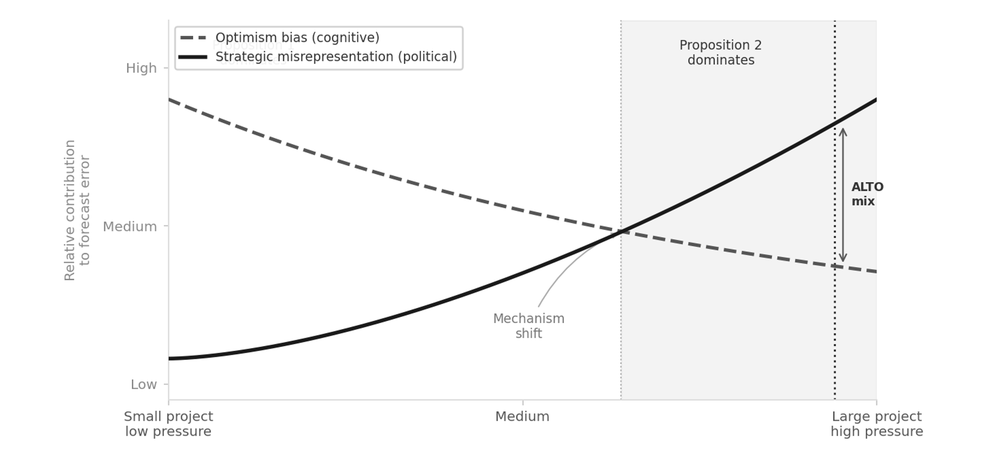
    In real projects, both are usually present together, and the mix shifts with the stakes. For small, low-attention projects, honest mistakes tend to be the bigger factor. For large projects with strong political backing — the kind a minister or a Crown corporation needs approved — strategic misrepresentation tends to dominate, with honest optimism layered on top rather than absent.

    The pattern, stated plainly

    Underestimate the cost, overestimate the benefit, and you get funded. This isn’t random. It points in exactly the direction that wins the competition for a limited pool of money.

    1.3 · Structural Profile

    Where ALTO sits on the scale

    Flyvbjerg’s research lets us predict, in general terms, which kind of error is more likely for a given project — without needing to know what’s in anyone’s head. For small projects that don’t attract much political attention, honest mistakes are usually the bigger factor. For large projects with major political weight behind them, strategic misrepresentation usually is — with honest mistakes still layered on top.

    Diagram showing how the mix of honest mistakes and strategic misrepresentation shifts with project size and political pressure
    Figure 1.1. How the mix of honest mistakes and strategic misrepresentation changes as a project gets bigger and more politically important. Honest mistakes (dashed line) matter more for small, low-pressure projects and fade — but never fully disappear — as projects grow. Strategic misrepresentation (solid line) is close to zero for small projects but rises sharply and takes over for large, high-pressure ones. Large, politically backed projects competing for scarce funding sit at the right-hand end of this scale.

    ALTO checks every box that predicts heavy political pressure. It’s run by a federal Crown corporation with a multi-billion-dollar budget. It has had public backing from successive governments. And it’s competing against every other federal priority for a limited pot of money. By this framework’s own logic, projects in that position sit at the end of the scale where the research expects political pressure, rather than honest error, to account for most of the pattern across the class. The pressure to look good is strongest exactly where the numbers matter most for getting funded.

    Flyvbjerg calls this the survival of the unfittest: it isn’t necessarily the best projects that get built — it’s the ones that look best on paper. The approval process quietly rewards optimistic numbers over honest ones: a proposal with realistic costs and realistic ridership loses the funding contest to one that doesn’t. Seen this way, the fact that ALTO has survived several rounds of budget approval isn’t proof its numbers are wrong — but it is a reason to look at them carefully rather than take them at face value.

    To be clear

    None of this requires anyone at ALTO to be lying. An honest mistake would produce errors that go in both directions about equally — some projects under budget, some over. What actually happens, again and again, is that the errors all point the same way: costs come in higher, benefits come in lower. That one-directional pattern is the tell. It is why this report checks ALTO’s published figures against the real-world record instead of accepting them on their own terms. Nothing here identifies the cause of any particular number, and this report makes no claim about the honesty of any person or organisation.

    1.4 · The Uniqueness Trap

    Why “it’s different this time” doesn’t hold up

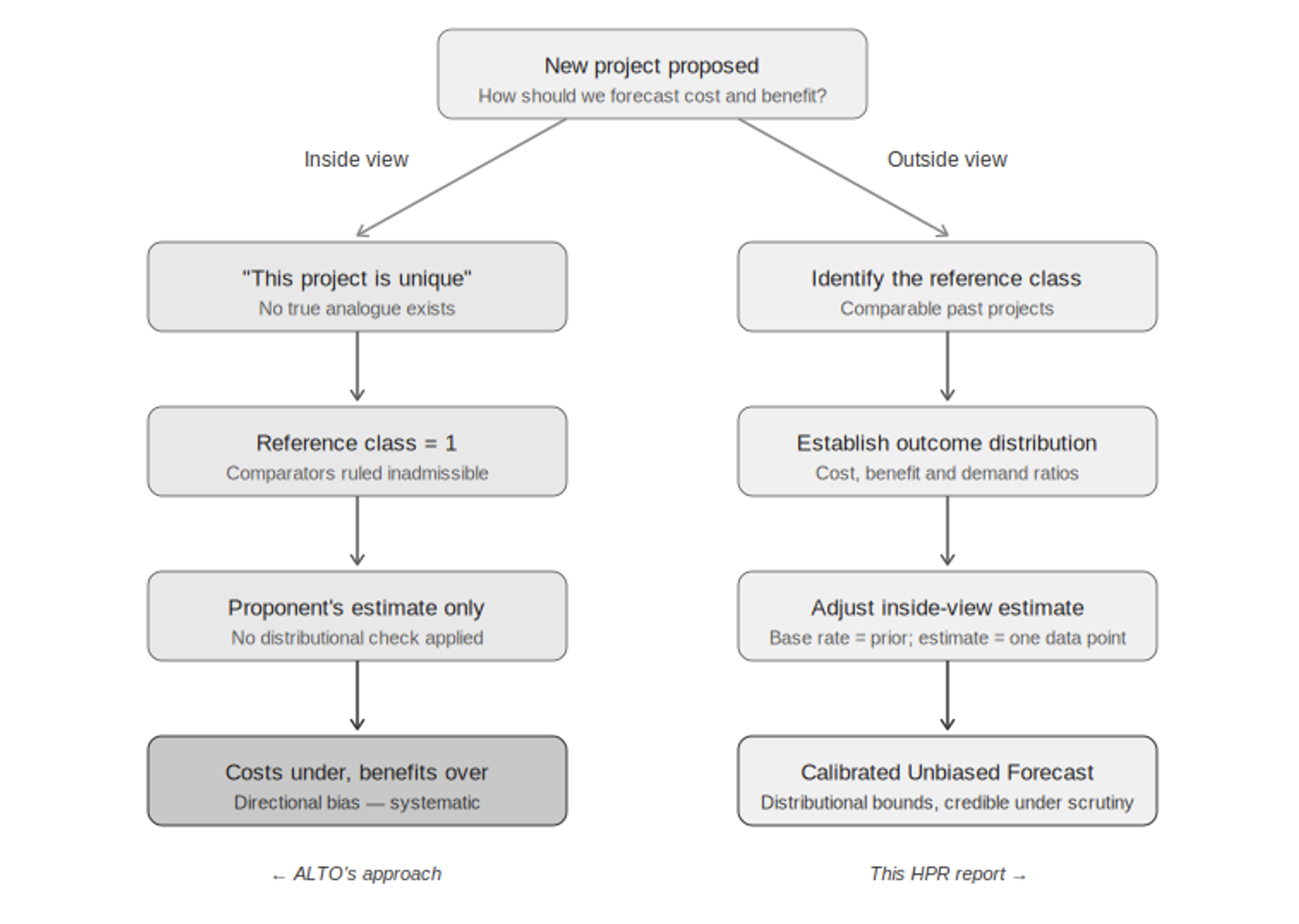
    One of the most common — and most costly — mistakes in big project planning is treating a project as one-of-a-kind, and therefore exempt from comparison with anything else. ALTO has been promoted as Canada’s first true high-speed railway, on uniquely Canadian geology, on an unprecedented corridor. That’s exactly the kind of claim researchers have found, again and again, opens the door to over-optimistic forecasting.

    Diagram contrasting a uniqueness claim, which leaves nothing to compare a project against, with the outside view, which checks the estimate against similar projects elsewhere
    Figure 1.2. The uniqueness trap. Claiming a project is unique (left) leaves nothing to compare it to, so all you can do is trust the project’s own estimate. Looking at similar projects elsewhere (right) means checking that estimate against real-world evidence instead. This report takes the second approach throughout.

    Here’s why the “unique” claim matters so much. If a project is truly one of a kind, there’s nothing to compare it to — which means the only evidence left is the very estimate you’re trying to check. Every comparable project, every real-world outcome from similar lines, gets waved away as not relevant. This report takes the opposite view: ALTO is one example of a well-studied category — high-speed and intercity rail megaprojects — and there’s plenty of real-world data on how that category actually performs. That data is the most relevant evidence available.

    What the disagreement is really about

    The disagreement between this report and ALTO’s own numbers isn’t really about any single figure. It’s about whether ALTO should be judged purely on its own terms, as a one-off case — or against how similar projects have actually turned out.

    1.5 · Risk of Bad Surprises

    Why standard contingency budgets fall short

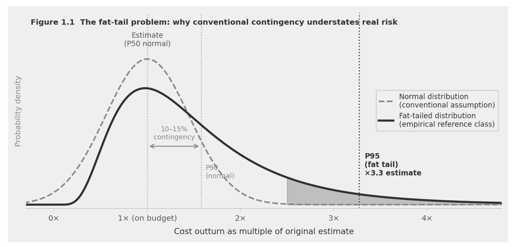
    Standard project planning assumes cost risk is spread fairly evenly around a central estimate — like a bell curve — so a reasonable contingency budget can be calculated with simple statistics. The real-world data don’t support that assumption. Big infrastructure projects almost never come in significantly under budget, but they regularly come in massively over — by two or three times the original estimate in the worst cases. Statisticians call this a fat-tailed distribution: the chance of a very bad outcome is much higher than a normal bell curve would suggest.

    Chart comparing the real-world pattern of rail megaproject cost overruns to a normal bell-curve distribution, showing a much higher chance of large overruns
    Figure 1.3. The real pattern of cost overruns on rail megaprojects (solid line) has a much bigger chance of large overruns than a normal bell curve (dashed line) would predict. A typical 10–15% contingency budget looks safe against a bell curve — but against the real-world pattern, it may only cover half of projects, or fewer. The shaded area shows the range of bad outcomes a standard contingency budget doesn’t account for.

    This matters directly for how much money a project should set aside for the unexpected. A standard 10–15% buffer looks adequate if you assume a bell curve — but against the real-world pattern, it may only protect against half of possible outcomes, or fewer. That’s why this report carries three cost figures all the way through its financial model — the number as originally specified, a corrected central estimate based on similar projects, and a worst-case scenario — instead of relying on one confident number that history suggests is likely to be wrong.

    1.6 · The Fix

    Checking the numbers against the real-world record

    The standard fix for both problems above is simple in principle: find a group of similar past projects; look at how their costs, benefits, and ridership actually turned out compared to what was promised; then use that real-world pattern to sanity-check the new project’s own estimate, rather than taking that estimate at face value. This flips the usual burden of proof — the real-world pattern becomes the starting assumption, and anyone predicting something better has to explain why.

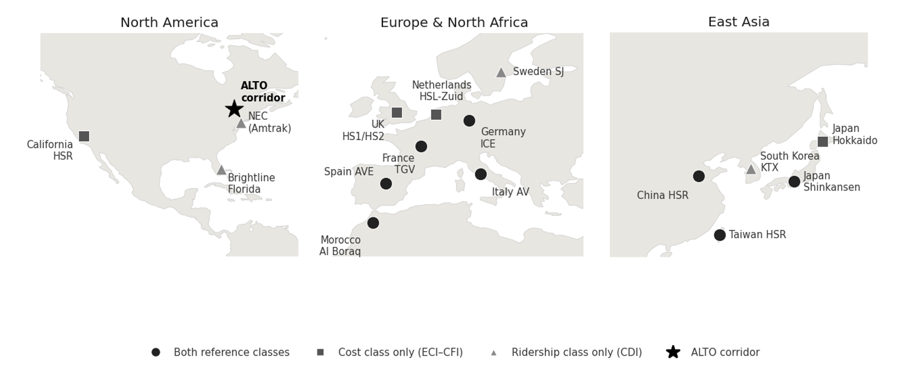
    World map showing the countries whose rail systems were used for comparison in this report's cost and ridership models, spanning Europe, East Asia, North Africa, and North America, with the ALTO corridor marked for reference
    Figure 1.4. Where the comparison projects are. They span Europe, East Asia, North Africa, and North America — different countries, different governments, different planning systems. That range matters: it shows the patterns we rely on aren’t specific to any one country’s way of doing things. ALTO’s corridor is shown for reference.

    What it costs

    We compared 16 real high-speed rail projects worldwideWe looked at what actually drove the final cost per kilometre on 16 comparable projects, and found two things matter most: how difficult the engineering is, and how much local resistance and land-use friction a project runs into.
    Local resistance is the stronger driver in our modelOf the two, local and political resistance is the stronger predictor of final cost per kilometre — carrying roughly twice the weight of engineering difficulty in the fitted model.
    What this means for ALTOBased on ALTO’s engineering difficulty and level of local resistance, this points to a realistic cost of around $142 million per kilometre, with a likely range of $76–264 million per kilometre.

    How many people would ride it

    We compared 12 real high-speed rail systems worldwideWe looked at how car-dependent a region is against how many people actually use rail there.
    No car-dependent region has high ridershipNot one of the 12 systems combines heavy car dependence with high rail ridership. ALTO’s corridor scores as heavily car-dependent.
    ALTO’s target vs. the realistic estimateALTO’s own target of 24 million riders a year by 2055 is far above what any comparable region has achieved. Three independent forecasts for this corridor instead cluster around 10 million riders a year.
    The standard this report holds itself to

    A forecast that looks better than the real-world pattern isn’t more accurate — it’s less accurate. This report’s numbers are, on purpose, less flattering than what a typical project pitch would produce for the same corridor. That’s the point: this report is built to hold up under tough scrutiny, which means accepting an honest, sometimes unwelcome, comparison to how these projects actually turn out.

    1.7 · Why Now

    Canada’s changed circumstances

    The case against ALTO isn’t only about method — it’s also about timing. ALTO was approved during a period of relative calm with the US, a stable trade agreement, extra federal money after the pandemic, low interest rates, and confident population-growth predictions that made ambitious ridership numbers easier to defend. Nearly all of those conditions have since changed. Today, Canada faces US tariff pressure, pressure to diversify trade away from the US, a tighter federal budget, and a public more focused on economic resilience than on amenity projects. A passenger project of this scale — on the Initiative’s reference-class estimates, $100–200 billion — has to clear a much higher bar today than it did when it was first approved.

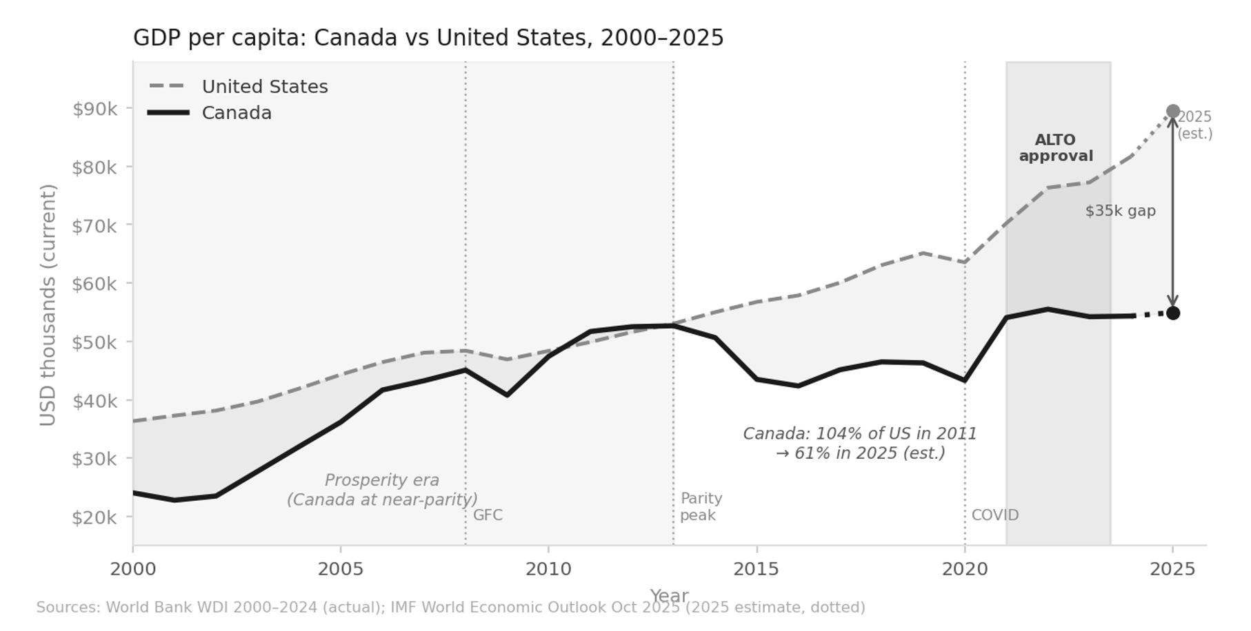
    Line chart of Canada and United States income per person from 2000 to 2025, showing Canada nearly matching the US during the 2011-2012 resource boom then falling to roughly 61 percent of US income per person by 2025
    Figure 1.5. Canada’s income per person compared to the US, 2000–2025. Canada came close to matching US income per person during the 2011–2012 resource boom, then fell steadily as oil prices dropped. By 2025, Canada’s income per person is roughly 61% of the US level — a gap of about $35,000. ALTO was approved near the peak of Canada’s post-pandemic economic rebound, in conditions that have since tightened considerably. Sources: World Bank World Development Indicators 2000–2024; IMF World Economic Outlook, October 2025.
    The question this raises

    ALTO is a project built for good economic times. The question for Canada in 2026 isn’t whether high-speed rail would be nice to have. It’s whether this corridor is worth the cost — and whether this design is the right answer to the problem.

    The high-speed rail systems that have actually succeeded — in Japan, France, Spain, Taiwan, South Korea — share things the Toronto–Ottawa–Montréal corridor doesn’t have: low car use, dense cities at both ends, strong local transit, and a rail culture that already existed before high-speed rail arrived. What’s left, globally, are second-tier projects on car-dependent corridors where the ridership case relies on optimistic in-house projections rather than real-world evidence. California’s high-speed rail project is the best-known example: years behind schedule, billions over budget, and in political trouble, for exactly these reasons. On the real-world evidence, the Toronto–Ottawa–Montréal corridor shares that second-tier profile.

    What’s Next

    What’s in the rest of this report

    This chapter sets out the method. The chapters that follow apply it — to ALTO, and to the alternative this report proposes, HPR (High-Performance Rail).

    Ch. 2
    Why the current plan doesn’t add up. Checks the case for doing something about intercity travel on this corridor — which we don’t dispute — against whether ALTO’s specific design actually makes financial sense.
    Ch. 3
    The HPR alternative. How a passenger line built along the existing Highway 401 and rail corridor can free up freight capacity at the same time, instead of building an entirely new line elsewhere and leaving the freight problem untouched.
    Ch. 4
    Route and cost. Where the line would go and what it would cost, using the same cost model applied consistently to both ALTO and HPR.
    Ch. 5
    Environment and communities. How the two options compare on carbon emissions and disruption to the communities along the route.
    Ch. 6
    How many people would ride it. Ridership estimates built on the real-world pattern from this chapter, checked four different ways.
    Ch. 7
    Running costs. The ongoing yearly balance between what it costs to operate and maintain the railway, and what fares plus any subsidy bring in.
    Ch. 8
    Is it worth it. A full cost-benefit and financial analysis across a range of scenarios, including the value of the freed-up freight capacity.
    Ch. 9
    Getting it built. How to phase construction, manage the risk of cost overruns, and keep the project accountable to the numbers in this report.
  • Introduction: What is HPR

    Coalition for Better Rail · ALTO HSR Citizen Research Initiative · The HPR Research Report

    What is HPR?

    An alternative built around the journey people actually take — not the top speed on the brochure.

    High Performance Rail (HPR) is a plan to modernise passenger and freight rail along a corridor that already has track. Instead of one brand-new high-speed line built from scratch, HPR treats the whole corridor as a single system and asks what the smartest fix is for each part. That means new track where new track earns its place, upgrades to existing lines where they deliver more per dollar, and added freight capacity so passenger and freight trains can each run to their own schedule. The goal is a trip that beats driving door to door, reaches city centres and the towns in between, and gets built in affordable stages.

    Download
    What is HPR? — Introduction (PDF)
    The HPR framework in full: the three-part structure, the 10 Guiding Principles, and the case for a made-in-Canada alternative to greenfield high-speed rail
    Download PDF
    The Framework

    Three parts, one corridor strategy

    HPR is not one thing but a whole-system approach with two working halves. It combines a passenger spine and a freight dimension into one corridor strategy, assessed together and built step by step, so each mode can grow on its own terms instead of being forced onto the other’s infrastructure.

    Three names for three things, used consistently across this report. The corridor is the Toronto–Québec City route Alto proposes. The triangle is the Toronto–Ottawa–Montréal network HPR proposes in its place. The spine is the 479-kilometre Pickering Junction to Dorval element of that triangle, on the Toronto–Montréal axis, which is where the new-build cost concentrates. Where a chapter names one of the three, it means that one.

    HPR — High Performance Rail · the framework

    The whole-system approach. HPR combines the passenger spine and the freight side into one corridor strategy, assessed together and delivered in stages.

    HPPR — High Performance Passenger Rail · the spine

    The physical passenger railway. New-build and grade-separated where the corridor requires it, engineered to run reliably across a 177–240 km/h band, with 240 km/h (150 mph) the alignment’s design maximum, serving downtowns and the communities along the route.

    HPFR — High Performance Freight Rail · the freight dimension

    The capacity that separates freight from passenger obligations. Freed from passenger schedules, freight can run to a more flexible timetable and operate longer trains. Those are the levers that lower a railway’s operating ratio, so each mode can grow without crowding out the other on shared track.

    The 10 Guiding Principles of HPR

    What HPR is built on

    01
    Look at the whole system. Treat the rail network as one system rather than a set of separate projects, and respect the different business models freight and passenger operations run on. Avoid a single project that monopolises the funding and starves the many smaller improvements that would together deliver more.
    02
    Build for communities. Make sure the towns along the route benefit from the railway, not just the big cities at each end. A railway that brings those places in rather than bypassing them meets less local opposition, carries less political risk and, in the end, costs less.
    03
    Separate freight from passengers. Build the capacity to give each its own space, so neither has to run to the other’s schedule.
    04
    Go fast enough, not the fastest possible. Target speeds of 177–240 km/h. That is fast enough to compete with driving or flying door to door, without the cost of fully new, arrow-straight high-speed lines. A 240 km/h maximum is also the more practical option in extreme Canadian heat and cold (±30 °C).
    05
    Make the ride safe, comfortable and useful. Grade separation and modern rolling stock make rail among the safest ways to travel, and generous space lets passengers work, rest or talk on the way. Time on the train is usable time, which driving can never offer.
    06
    Be frequent and on time. Compete on turn-up-and-go frequency and dependable punctuality, with on-time performance above 90% sustained through Canadian winters. Reliability, not peak speed, is what earns a traveller’s trust.
    07
    Reach downtowns and smaller towns. Put stations in city centres and serve the communities along the route, not only the two endpoints.
    08
    Mix new construction with upgrades. Use whichever delivers more value for the money: new track, or improvements to what is already there.
    09
    Share the tracks. Let regional, commuter and intercity trains use the same tracks, with freed freight capacity as a deliberate co-benefit.
    10
    Build it in stages. Invest where the benefits can be demonstrated, phasing improvements so each stage earns its place, instead of concentrating all the cost and risk in one megaproject.
    How HPR Differs

    A North American solution

    The defining difference is what the railway is optimised for. A design that chases 300-plus km/h commits, almost by necessity, to a new greenfield alignment: long straight sections, wide curves, and bypasses that route around the very communities and city centres a passenger service exists to reach. The speed gained on open track is paid back in access time, capital and carbon.

    HPR takes the opposite approach. By accepting typical speeds of 177–240 km/h, it can follow the existing corridor, upgrade what already works, and go straight into downtowns, all while freeing up capacity for freight. The result is competitive door to door at a fraction of the capital exposure, in stages that can be re-scoped as the evidence matures.

    It is also a difference of origin. A greenfield high-speed line is essentially an imported design. The French passenger-rail model was built for a temperate, densely settled country on a network that carries no freight. North American railroading is the opposite: freight-dominated, shared-track, and tested by hard winters and long distances.

    HPR is engineered for those conditions — made in Canada, for Canadian ones. It builds domestic expertise that transfers to later Canadian projects rather than importing it. HPR is best understood not as a slower high-speed railway but as a different answer for a different continent. The question it sets out to answer is this: how do you move the most people and freight, to the most useful places, at prices that compete with driving, for the most defensible investment at the lowest risk?

    Travel Time, Not Speed

    The clock, not the speedometer

    A journey is not a single dash between two stations. It is a chain: getting to the station, waiting for the departure, the run itself, and then getting to the final destination at the far end. Top speed touches only one link in that chain. Once the time at both ends is counted, the run itself is a fraction of the door-to-door total, and shaving it returns less and less. The gap between 240 and 300 km/h saves minutes on the segment that is already the smallest part of the trip.

    Worse, the alignments that allow the highest speeds tend to push stations out of city centres. That adds time at both ends, which can outweigh whatever the faster run saved — so a train that is quicker on paper can be slower in practice. Frequency compounds the point: a train leaving soon beats a faster one you have to wait an hour to board.

    The measure that matters

    Over a corridor drive of some 540 kilometres, the car is the real competitor. Measured the way travellers actually experience the journey, what counts is the reliable door-to-door clock — not the number on the fastest stretch of track.

    The Price Lever

    Pricing for a car-centric market

    In a car-centric country, the railway’s real competitor is not the airplane or the existing train. It is the private car. Against a car someone already owns, a trip is judged on the fairly small extra cost of just driving it. That makes price the most direct lever on whether people switch.

    A line built at megaproject cost has to recover that capital somewhere. Fares set to service debt push budget-conscious travellers straight back into their cars, hollowing out the very ridership the business case assumed. HPR’s lower capital cost is therefore not only a fiscal virtue but a demand strategy: a railway that costs less to build can price to fill trains rather than to service debt.

    Frequency, downtown access and reliable door-to-door times create the conditions for people to switch. Price is what converts them into boardings — and where most trips default to the car, the fare is often the difference between a full train and an empty one.

    What HPR Is Not

    Neither political, nor all at once

    HPR is not a political project. Its route, its staging and its scope follow the evidence — engineering, economics and demographics — not political convenience or partisan preference. Where a claim cannot be grounded in that evidence, it is not made.

    Nor is it everything at once. Stage 1, the scope of the current report, is deliberately limited. It does not detour via Peterborough, it reaches Ottawa over upgraded existing lines rather than costly new-build, and it leaves Québec City to a later stage. Each further stage is added only when the evidence and the need justify it.

    The Pitch

    A case built to be checked

    HPR does not ask to be believed. It asks to be checked. Every figure in its case is meant to be traced to a source, tested against what comparable projects actually cost and carried, and stated with its uncertainty rather than at its best case. Where a promotional business case leads with a single confident number, HPR leads with a range and the reference class behind it. The honest way to forecast a railway is from the record of railways already built, rather than from a proponent’s own projections for the one not yet built.

    The result is a stronger case, not a softer one. Compared with a conventional greenfield high-speed line, HPR offers four things:

    Passengers
    A service that beats driving on door-to-door time, for a fraction of the cost of a from-scratch high-speed line.
    Freight
    Upgrades that help freight operators instead of competing with passenger trains for track space.
    Delivery
    Benefits that arrive in proven stages, each one demonstrated before the next is committed.
    Whole life
    A cost and environmental picture that improves, rather than worsens, once the entire lifespan of the asset is counted.

    None of that needs an optimistic ridership forecast or heroic cost control to stand up. That is the pitch: not the fastest railway that can be drawn on paper, but the one that will actually get built, get used, and pay its way.