Deconstructing the Megaproject Playbook
Why big rail projects almost always cost more and carry fewer riders than promised — and how to check a project’s numbers against the real-world record, not just its own promises.
This chapter explains the method behind every number in this report. It’s based on the work of Bent Flyvbjerg, an Oxford researcher who has spent decades studying how big infrastructure projects around the world actually turn out, compared to what they promised. His findings have been confirmed again and again, across many countries and many kinds of projects. We use his method for every forecast in this report — and we’re explaining it here first, before any of our own results, so you can see the rules before you see the numbers.
The iron law of megaprojects
Here’s an uncomfortable fact: big public infrastructure projects almost always cost more, take longer, and carry fewer passengers than promised. This isn’t bad luck on any one project — it’s been true again and again, everywhere records have been kept, for decades. Researcher Bent Flyvbjerg calls this the iron law of megaprojects: over budget, over time, under benefits — over and over again, regardless of country, project type, or how sophisticated the planning was.
Our own analysis of ALTO finds the same pattern. The published benefit-cost ratio — a standard measure of whether a project’s benefits are worth its costs — is already far short of break-even. The December 2021 business case for the predecessor project put it at about 0.13 over 30 years, or about 0.4 once some newer and less established benefit categories are counted. A ratio of 1.0 is the point where benefits merely equal costs. Correct the cost and ridership numbers using the real-world track record, and that ratio falls further still. This doesn’t mean going over budget is inevitable. It means any assessment that ignores this well-documented pattern is starting from an unrealistic place — not by accident, but by leaving out the most relevant evidence available. ALTO’s risk profile isn’t an unlucky exception. It’s exactly what you’d expect from a project of this size, this type, and this level of political backing.
Honest mistakes and strategic misrepresentation
There are two different reasons a project forecast can turn out to be wrong — and it matters which one is at play, because they call for very different fixes.
Optimism bias — the honest mistake
Planners genuinely believe their numbers. They aren’t lying — they’re not even aware they’re being too optimistic. This is a well-documented pattern in psychology: people naturally focus on the details of their own project and forget to check how similar projects have actually gone in the past. It’s a fixable process problem — the fix is forcing real-world comparisons into every estimate.
Strategic misrepresentation — telling people what they want to hear
Costs get underestimated and benefits get overestimated on purpose, to get a project approved and funded. Writing about the research record as a whole, Flyvbjerg borrows a word from ethics and calls this what it is: lying. It’s an incentive problem — and it’s only fixed by changing what forecasters are rewarded and held accountable for.
In real projects, both are usually present together, and the mix shifts with the stakes. For small, low-attention projects, honest mistakes tend to be the bigger factor. For large projects with strong political backing — the kind a minister or a Crown corporation needs approved — strategic misrepresentation tends to dominate, with honest optimism layered on top rather than absent.
Underestimate the cost, overestimate the benefit, and you get funded. This isn’t random. It points in exactly the direction that wins the competition for a limited pool of money.
Where ALTO sits on the scale
Flyvbjerg’s research lets us predict, in general terms, which kind of error is more likely for a given project — without needing to know what’s in anyone’s head. For small projects that don’t attract much political attention, honest mistakes are usually the bigger factor. For large projects with major political weight behind them, strategic misrepresentation usually is — with honest mistakes still layered on top.
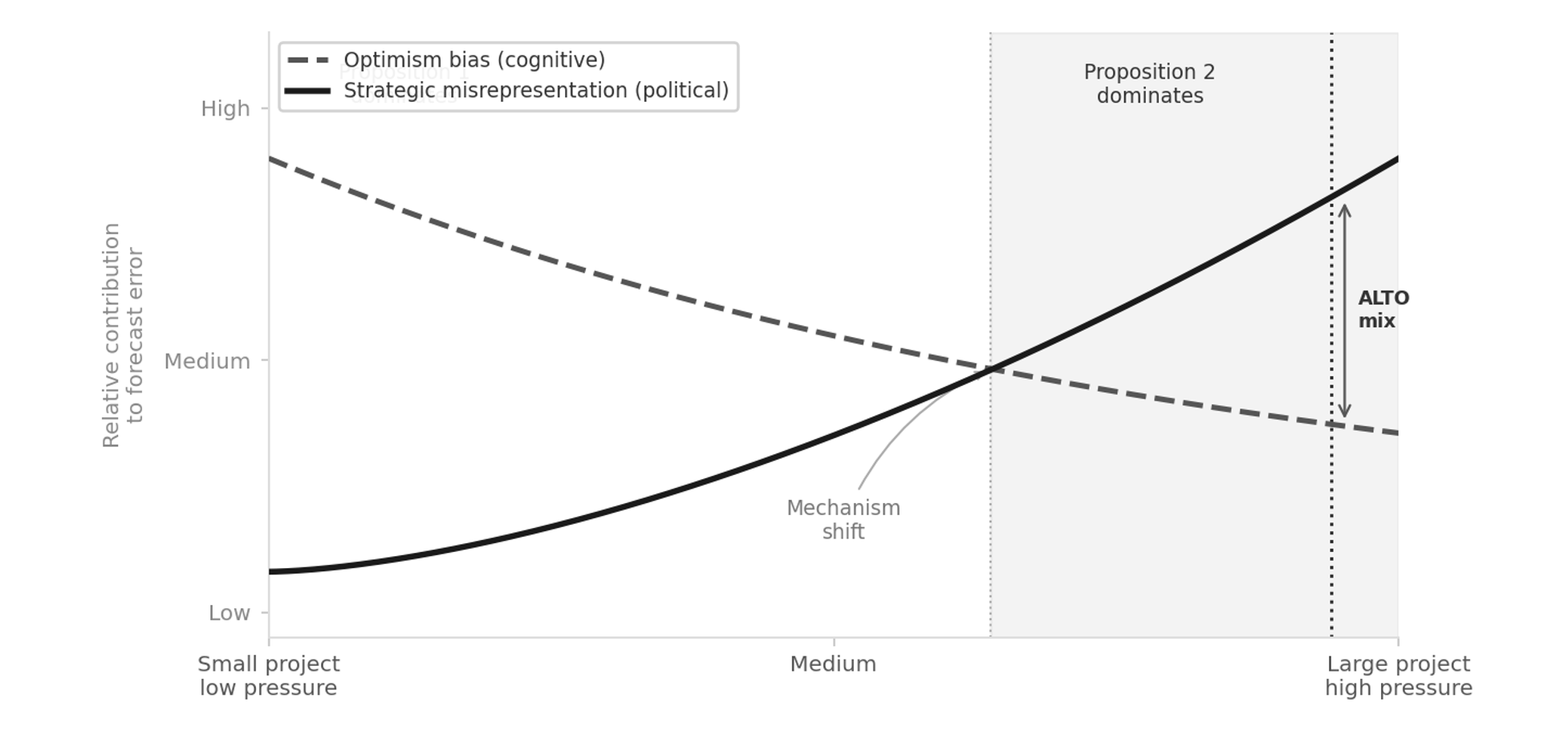
ALTO checks every box that predicts heavy political pressure. It’s run by a federal Crown corporation with a multi-billion-dollar budget. It has had public backing from successive governments. And it’s competing against every other federal priority for a limited pot of money. By this framework’s own logic, projects in that position sit at the end of the scale where the research expects political pressure, rather than honest error, to account for most of the pattern across the class. The pressure to look good is strongest exactly where the numbers matter most for getting funded.
Flyvbjerg calls this the survival of the unfittest: it isn’t necessarily the best projects that get built — it’s the ones that look best on paper. The approval process quietly rewards optimistic numbers over honest ones: a proposal with realistic costs and realistic ridership loses the funding contest to one that doesn’t. Seen this way, the fact that ALTO has survived several rounds of budget approval isn’t proof its numbers are wrong — but it is a reason to look at them carefully rather than take them at face value.
None of this requires anyone at ALTO to be lying. An honest mistake would produce errors that go in both directions about equally — some projects under budget, some over. What actually happens, again and again, is that the errors all point the same way: costs come in higher, benefits come in lower. That one-directional pattern is the tell. It is why this report checks ALTO’s published figures against the real-world record instead of accepting them on their own terms. Nothing here identifies the cause of any particular number, and this report makes no claim about the honesty of any person or organisation.
Why “it’s different this time” doesn’t hold up
One of the most common — and most costly — mistakes in big project planning is treating a project as one-of-a-kind, and therefore exempt from comparison with anything else. ALTO has been promoted as Canada’s first true high-speed railway, on uniquely Canadian geology, on an unprecedented corridor. That’s exactly the kind of claim researchers have found, again and again, opens the door to over-optimistic forecasting.
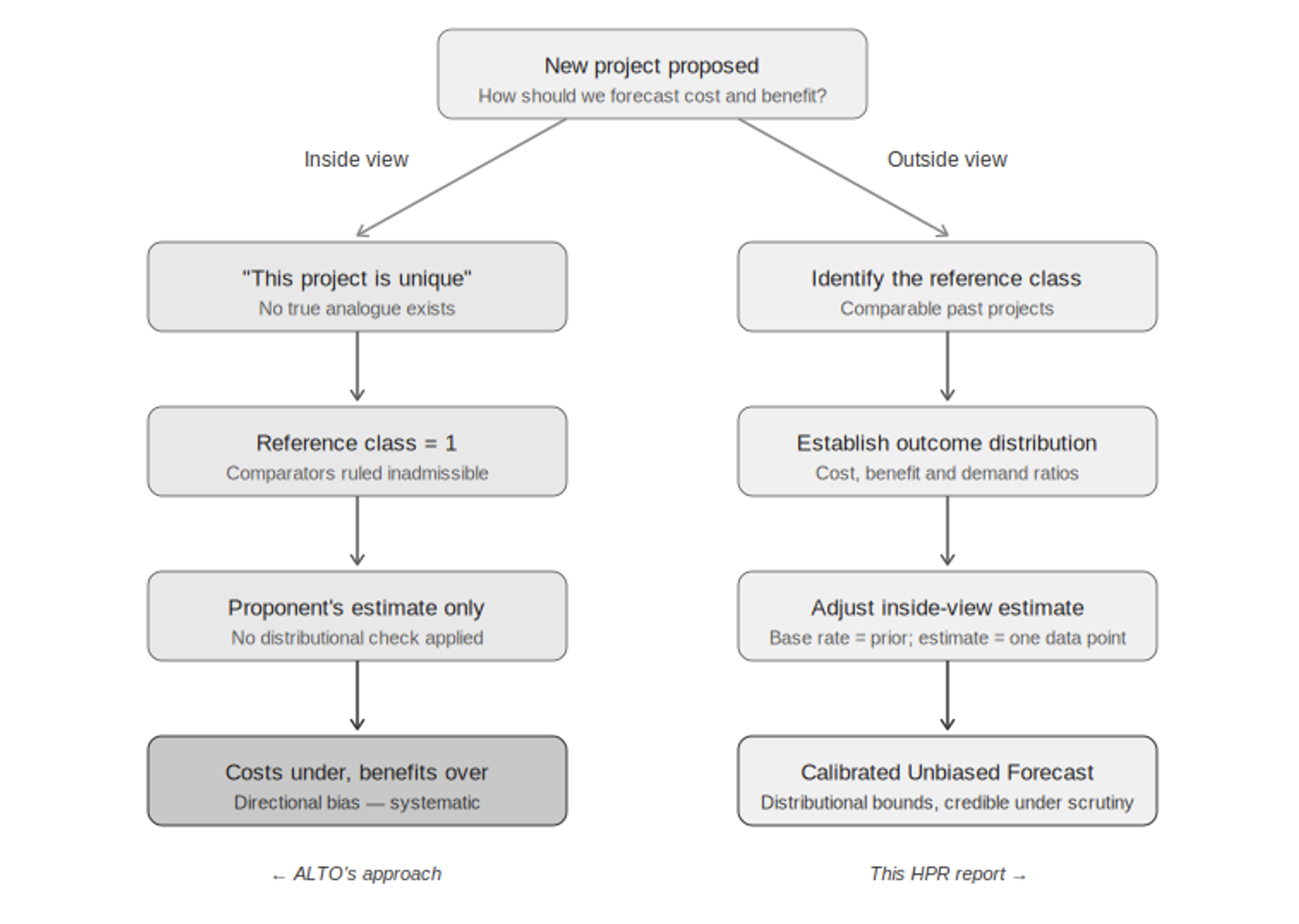
Here’s why the “unique” claim matters so much. If a project is truly one of a kind, there’s nothing to compare it to — which means the only evidence left is the very estimate you’re trying to check. Every comparable project, every real-world outcome from similar lines, gets waved away as not relevant. This report takes the opposite view: ALTO is one example of a well-studied category — high-speed and intercity rail megaprojects — and there’s plenty of real-world data on how that category actually performs. That data is the most relevant evidence available.
The disagreement between this report and ALTO’s own numbers isn’t really about any single figure. It’s about whether ALTO should be judged purely on its own terms, as a one-off case — or against how similar projects have actually turned out.
Why standard contingency budgets fall short
Standard project planning assumes cost risk is spread fairly evenly around a central estimate — like a bell curve — so a reasonable contingency budget can be calculated with simple statistics. The real-world data don’t support that assumption. Big infrastructure projects almost never come in significantly under budget, but they regularly come in massively over — by two or three times the original estimate in the worst cases. Statisticians call this a fat-tailed distribution: the chance of a very bad outcome is much higher than a normal bell curve would suggest.
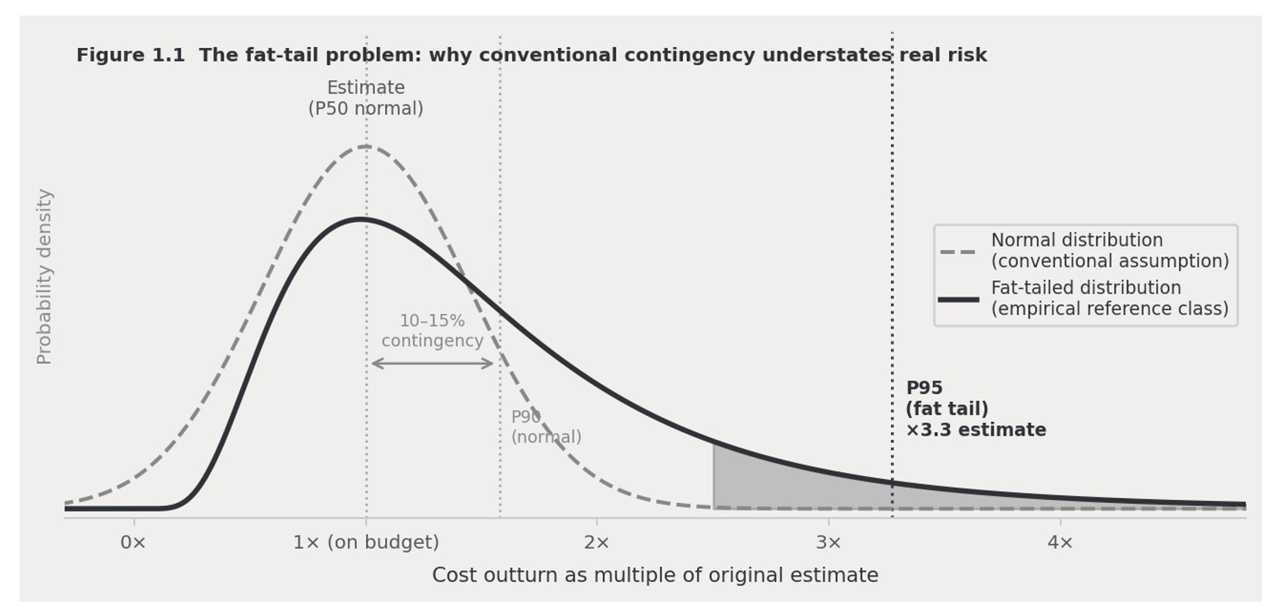
This matters directly for how much money a project should set aside for the unexpected. A standard 10–15% buffer looks adequate if you assume a bell curve — but against the real-world pattern, it may only protect against half of possible outcomes, or fewer. That’s why this report carries three cost figures all the way through its financial model — the number as originally specified, a corrected central estimate based on similar projects, and a worst-case scenario — instead of relying on one confident number that history suggests is likely to be wrong.
Checking the numbers against the real-world record
The standard fix for both problems above is simple in principle: find a group of similar past projects; look at how their costs, benefits, and ridership actually turned out compared to what was promised; then use that real-world pattern to sanity-check the new project’s own estimate, rather than taking that estimate at face value. This flips the usual burden of proof — the real-world pattern becomes the starting assumption, and anyone predicting something better has to explain why.
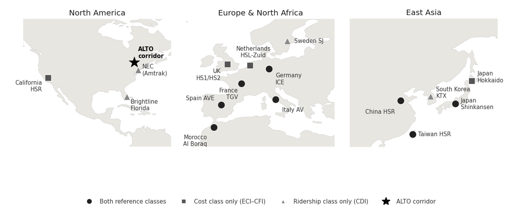
What it costs
How many people would ride it
A forecast that looks better than the real-world pattern isn’t more accurate — it’s less accurate. This report’s numbers are, on purpose, less flattering than what a typical project pitch would produce for the same corridor. That’s the point: this report is built to hold up under tough scrutiny, which means accepting an honest, sometimes unwelcome, comparison to how these projects actually turn out.
Canada’s changed circumstances
The case against ALTO isn’t only about method — it’s also about timing. ALTO was approved during a period of relative calm with the US, a stable trade agreement, extra federal money after the pandemic, low interest rates, and confident population-growth predictions that made ambitious ridership numbers easier to defend. Nearly all of those conditions have since changed. Today, Canada faces US tariff pressure, pressure to diversify trade away from the US, a tighter federal budget, and a public more focused on economic resilience than on amenity projects. A passenger project of this scale — on the Initiative’s reference-class estimates, $100–200 billion — has to clear a much higher bar today than it did when it was first approved.
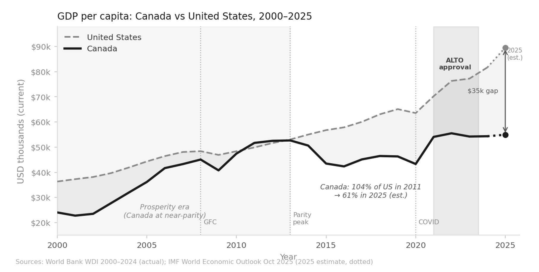
ALTO is a project built for good economic times. The question for Canada in 2026 isn’t whether high-speed rail would be nice to have. It’s whether this corridor is worth the cost — and whether this design is the right answer to the problem.
The high-speed rail systems that have actually succeeded — in Japan, France, Spain, Taiwan, South Korea — share things the Toronto–Ottawa–Montréal corridor doesn’t have: low car use, dense cities at both ends, strong local transit, and a rail culture that already existed before high-speed rail arrived. What’s left, globally, are second-tier projects on car-dependent corridors where the ridership case relies on optimistic in-house projections rather than real-world evidence. California’s high-speed rail project is the best-known example: years behind schedule, billions over budget, and in political trouble, for exactly these reasons. On the real-world evidence, the Toronto–Ottawa–Montréal corridor shares that second-tier profile.
What’s in the rest of this report
This chapter sets out the method. The chapters that follow apply it — to ALTO, and to the alternative this report proposes, HPR (High-Performance Rail).