Tag: megaprojects

  • Deconstructing the Megaproject Playbook

    Coalition for Better Rail · ALTO HSR Citizen Research Initiative · The HPR Research Report

    Deconstructing the Megaproject Playbook

    Why big rail projects almost always cost more and carry fewer riders than promised — and how to check a project’s numbers against the real-world record, not just its own promises.

    This chapter explains the method behind every number in this report. It’s based on the work of Bent Flyvbjerg, an Oxford researcher who has spent decades studying how big infrastructure projects around the world actually turn out, compared to what they promised. His findings have been confirmed again and again, across many countries and many kinds of projects. We use his method for every forecast in this report — and we’re explaining it here first, before any of our own results, so you can see the rules before you see the numbers.

    Download
    Chapter 1: Deconstructing the Megaproject Playbook (PDF)
    The full chapter, with footnotes and sourcing
    Download PDF
    1.1 · The Track Record

    The iron law of megaprojects

    Here’s an uncomfortable fact: big public infrastructure projects almost always cost more, take longer, and carry fewer passengers than promised. This isn’t bad luck on any one project — it’s been true again and again, everywhere records have been kept, for decades. Researcher Bent Flyvbjerg calls this the iron law of megaprojects: over budget, over time, under benefits — over and over again, regardless of country, project type, or how sophisticated the planning was.

    1.40×
    What rail projects actually cost, on average, vs. what was first promised
    0.66×
    The benefits rail projects actually deliver, on average, vs. what was promised
    52%
    Average budget overrun for high-speed rail specifically
    106%
    How much rail projects overestimate rider numbers, on average
    9/10
    Rail projects that predicted more riders than they actually got
    +45%
    How much longer construction takes than planned, on average

    Our own analysis of ALTO finds the same pattern. The published benefit-cost ratio — a standard measure of whether a project’s benefits are worth its costs — is already far short of break-even. The December 2021 business case for the predecessor project put it at about 0.13 over 30 years, or about 0.4 once some newer and less established benefit categories are counted. A ratio of 1.0 is the point where benefits merely equal costs. Correct the cost and ridership numbers using the real-world track record, and that ratio falls further still. This doesn’t mean going over budget is inevitable. It means any assessment that ignores this well-documented pattern is starting from an unrealistic place — not by accident, but by leaving out the most relevant evidence available. ALTO’s risk profile isn’t an unlucky exception. It’s exactly what you’d expect from a project of this size, this type, and this level of political backing.

    1.2 · Two Reasons Forecasts Go Wrong

    Honest mistakes and strategic misrepresentation

    There are two different reasons a project forecast can turn out to be wrong — and it matters which one is at play, because they call for very different fixes.

    Optimism bias — the honest mistake

    Planners genuinely believe their numbers. They aren’t lying — they’re not even aware they’re being too optimistic. This is a well-documented pattern in psychology: people naturally focus on the details of their own project and forget to check how similar projects have actually gone in the past. It’s a fixable process problem — the fix is forcing real-world comparisons into every estimate.

    Strategic misrepresentation — telling people what they want to hear

    Costs get underestimated and benefits get overestimated on purpose, to get a project approved and funded. Writing about the research record as a whole, Flyvbjerg borrows a word from ethics and calls this what it is: lying. It’s an incentive problem — and it’s only fixed by changing what forecasters are rewarded and held accountable for.

    In real projects, both are usually present together, and the mix shifts with the stakes. For small, low-attention projects, honest mistakes tend to be the bigger factor. For large projects with strong political backing — the kind a minister or a Crown corporation needs approved — strategic misrepresentation tends to dominate, with honest optimism layered on top rather than absent.

    The pattern, stated plainly

    Underestimate the cost, overestimate the benefit, and you get funded. This isn’t random. It points in exactly the direction that wins the competition for a limited pool of money.

    1.3 · Structural Profile

    Where ALTO sits on the scale

    Flyvbjerg’s research lets us predict, in general terms, which kind of error is more likely for a given project — without needing to know what’s in anyone’s head. For small projects that don’t attract much political attention, honest mistakes are usually the bigger factor. For large projects with major political weight behind them, strategic misrepresentation usually is — with honest mistakes still layered on top.
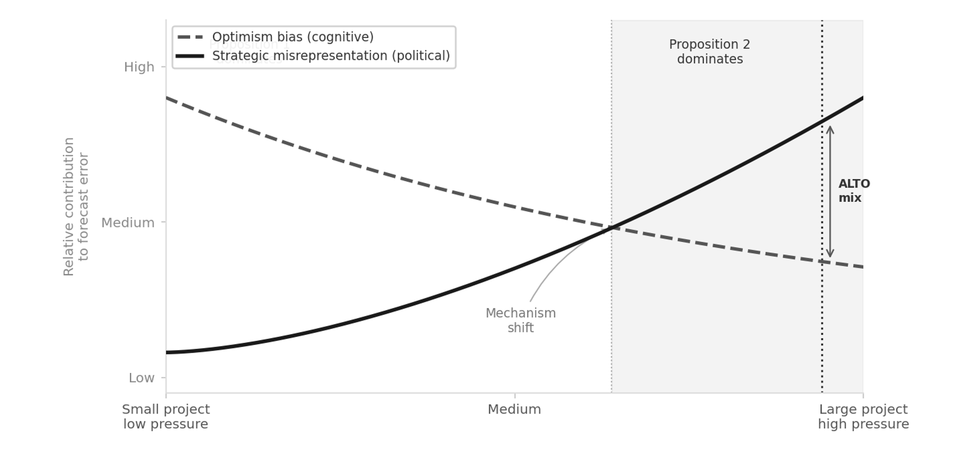
    Diagram showing how the mix of honest mistakes and strategic misrepresentation shifts with project size and political pressure
    Figure 1.1. How the mix of honest mistakes and strategic misrepresentation changes as a project gets bigger and more politically important. Honest mistakes (dashed line) matter more for small, low-pressure projects and fade — but never fully disappear — as projects grow. Strategic misrepresentation (solid line) is close to zero for small projects but rises sharply and takes over for large, high-pressure ones. Large, politically backed projects competing for scarce funding sit at the right-hand end of this scale.

    ALTO checks every box that predicts heavy political pressure. It’s run by a federal Crown corporation with a multi-billion-dollar budget. It has had public backing from successive governments. And it’s competing against every other federal priority for a limited pot of money. By this framework’s own logic, projects in that position sit at the end of the scale where the research expects political pressure, rather than honest error, to account for most of the pattern across the class. The pressure to look good is strongest exactly where the numbers matter most for getting funded.

    Flyvbjerg calls this the survival of the unfittest: it isn’t necessarily the best projects that get built — it’s the ones that look best on paper. The approval process quietly rewards optimistic numbers over honest ones: a proposal with realistic costs and realistic ridership loses the funding contest to one that doesn’t. Seen this way, the fact that ALTO has survived several rounds of budget approval isn’t proof its numbers are wrong — but it is a reason to look at them carefully rather than take them at face value.

    To be clear

    None of this requires anyone at ALTO to be lying. An honest mistake would produce errors that go in both directions about equally — some projects under budget, some over. What actually happens, again and again, is that the errors all point the same way: costs come in higher, benefits come in lower. That one-directional pattern is the tell. It is why this report checks ALTO’s published figures against the real-world record instead of accepting them on their own terms. Nothing here identifies the cause of any particular number, and this report makes no claim about the honesty of any person or organisation.

    1.4 · The Uniqueness Trap

    Why “it’s different this time” doesn’t hold up

    One of the most common — and most costly — mistakes in big project planning is treating a project as one-of-a-kind, and therefore exempt from comparison with anything else. ALTO has been promoted as Canada’s first true high-speed railway, on uniquely Canadian geology, on an unprecedented corridor. That’s exactly the kind of claim researchers have found, again and again, opens the door to over-optimistic forecasting.
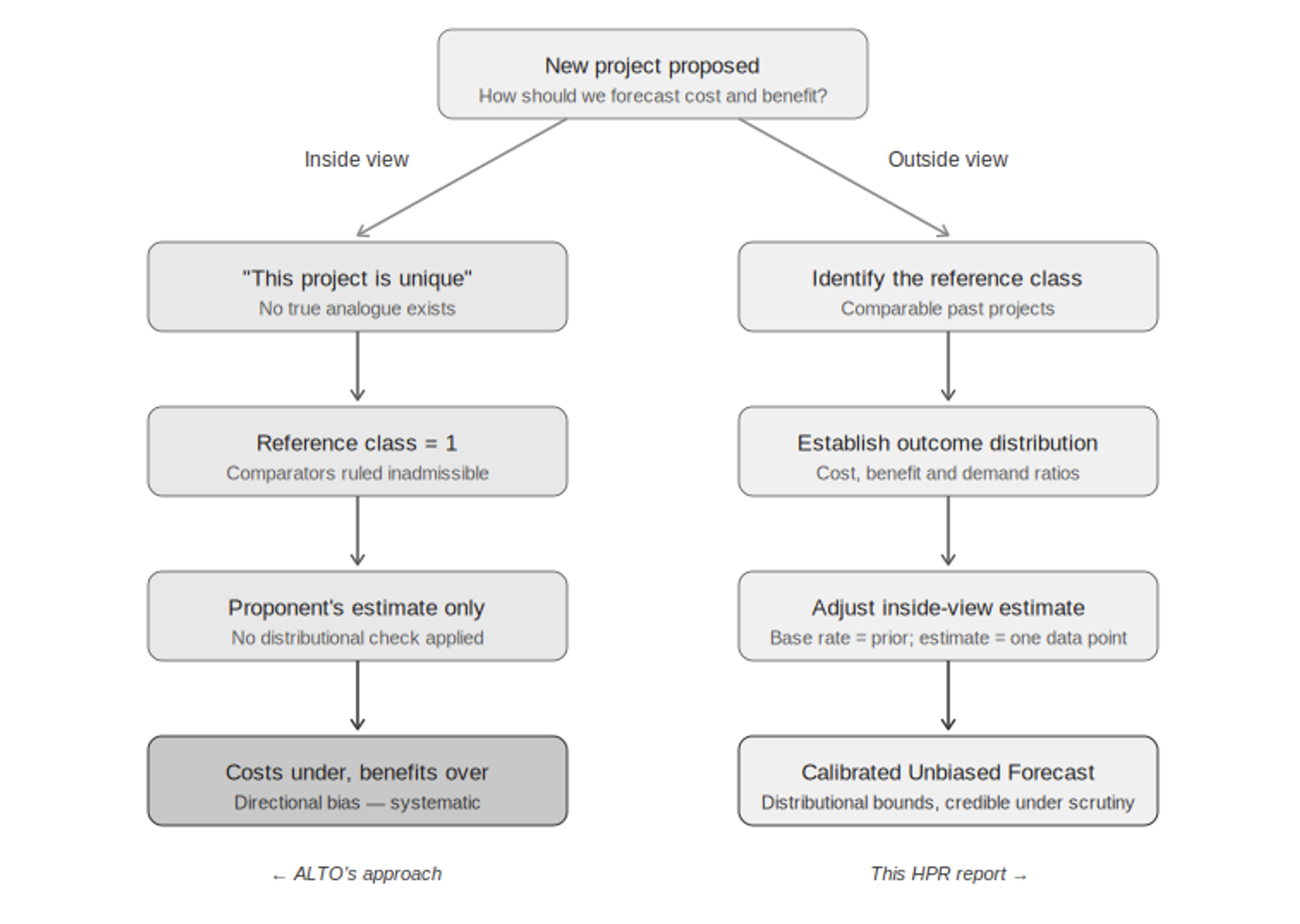
    Diagram contrasting a uniqueness claim, which leaves nothing to compare a project against, with the outside view, which checks the estimate against similar projects elsewhere
    Figure 1.2. The uniqueness trap. Claiming a project is unique (left) leaves nothing to compare it to, so all you can do is trust the project’s own estimate. Looking at similar projects elsewhere (right) means checking that estimate against real-world evidence instead. This report takes the second approach throughout.

    Here’s why the “unique” claim matters so much. If a project is truly one of a kind, there’s nothing to compare it to — which means the only evidence left is the very estimate you’re trying to check. Every comparable project, every real-world outcome from similar lines, gets waved away as not relevant. This report takes the opposite view: ALTO is one example of a well-studied category — high-speed and intercity rail megaprojects — and there’s plenty of real-world data on how that category actually performs. That data is the most relevant evidence available.

    What the disagreement is really about

    The disagreement between this report and ALTO’s own numbers isn’t really about any single figure. It’s about whether ALTO should be judged purely on its own terms, as a one-off case — or against how similar projects have actually turned out.

    1.5 · Risk of Bad Surprises

    Why standard contingency budgets fall short

    Standard project planning assumes cost risk is spread fairly evenly around a central estimate — like a bell curve — so a reasonable contingency budget can be calculated with simple statistics. The real-world data don’t support that assumption. Big infrastructure projects almost never come in significantly under budget, but they regularly come in massively over — by two or three times the original estimate in the worst cases. Statisticians call this a fat-tailed distribution: the chance of a very bad outcome is much higher than a normal bell curve would suggest.
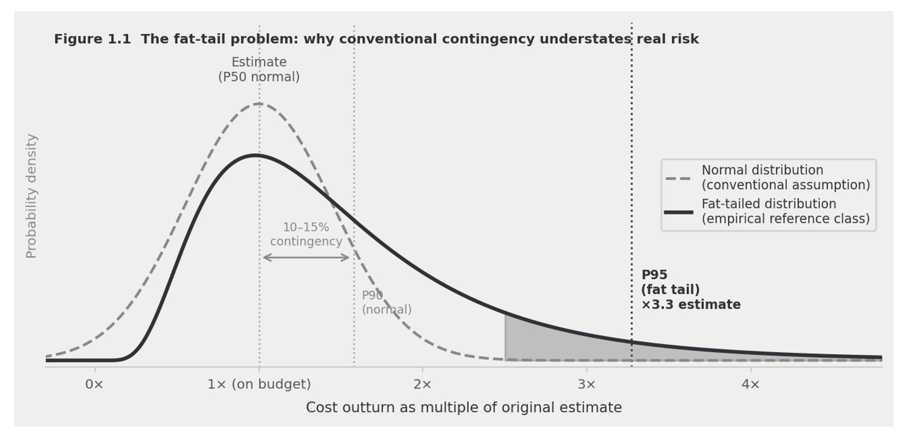
    Chart comparing the real-world pattern of rail megaproject cost overruns to a normal bell-curve distribution, showing a much higher chance of large overruns
    Figure 1.3. The real pattern of cost overruns on rail megaprojects (solid line) has a much bigger chance of large overruns than a normal bell curve (dashed line) would predict. A typical 10–15% contingency budget looks safe against a bell curve — but against the real-world pattern, it may only cover half of projects, or fewer. The shaded area shows the range of bad outcomes a standard contingency budget doesn’t account for.

    This matters directly for how much money a project should set aside for the unexpected. A standard 10–15% buffer looks adequate if you assume a bell curve — but against the real-world pattern, it may only protect against half of possible outcomes, or fewer. That’s why this report carries three cost figures all the way through its financial model — the number as originally specified, a corrected central estimate based on similar projects, and a worst-case scenario — instead of relying on one confident number that history suggests is likely to be wrong.

    1.6 · The Fix

    Checking the numbers against the real-world record

    The standard fix for both problems above is simple in principle: find a group of similar past projects; look at how their costs, benefits, and ridership actually turned out compared to what was promised; then use that real-world pattern to sanity-check the new project’s own estimate, rather than taking that estimate at face value. This flips the usual burden of proof — the real-world pattern becomes the starting assumption, and anyone predicting something better has to explain why.
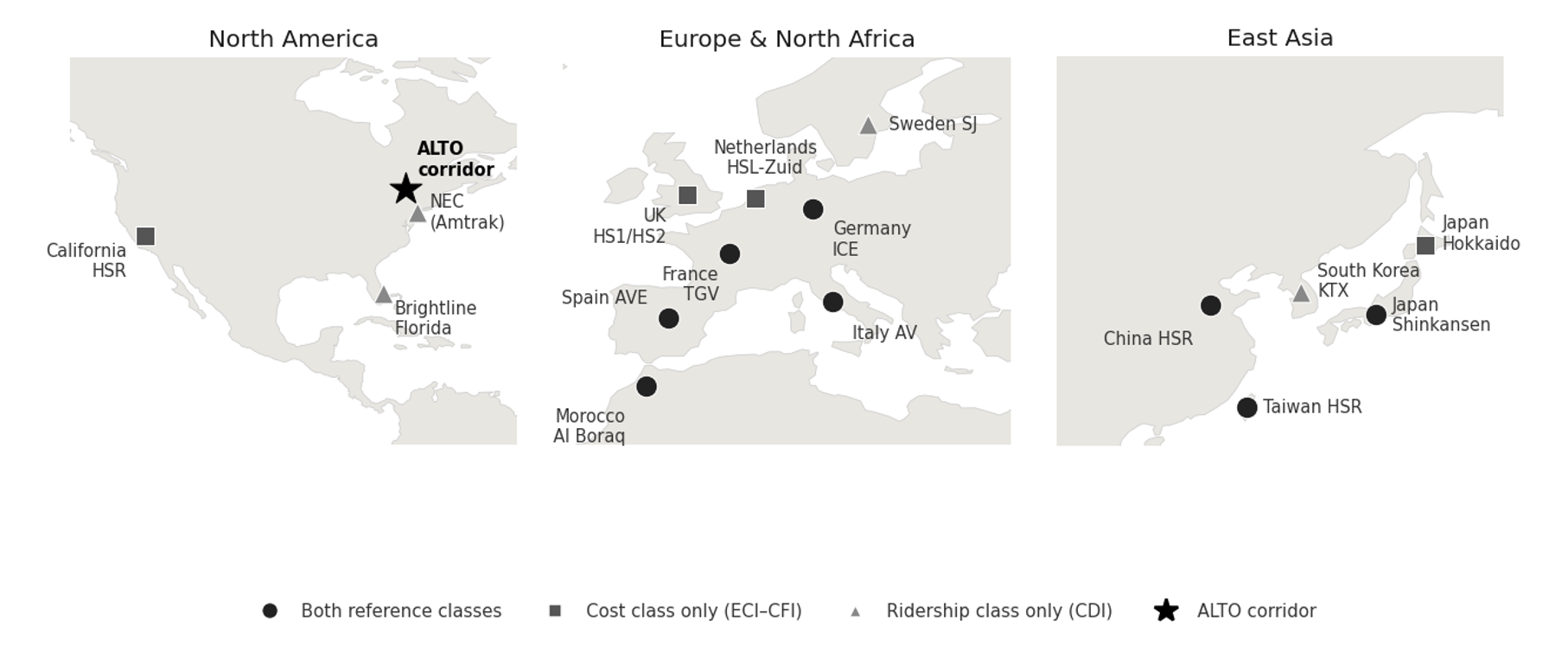
    World map showing the countries whose rail systems were used for comparison in this report's cost and ridership models, spanning Europe, East Asia, North Africa, and North America, with the ALTO corridor marked for reference
    Figure 1.4. Where the comparison projects are. They span Europe, East Asia, North Africa, and North America — different countries, different governments, different planning systems. That range matters: it shows the patterns we rely on aren’t specific to any one country’s way of doing things. ALTO’s corridor is shown for reference.

    What it costs

    We compared 16 real high-speed rail projects worldwideWe looked at what actually drove the final cost per kilometre on 16 comparable projects, and found two things matter most: how difficult the engineering is, and how much local resistance and land-use friction a project runs into.
    Local resistance is the stronger driver in our modelOf the two, local and political resistance is the stronger predictor of final cost per kilometre — carrying roughly twice the weight of engineering difficulty in the fitted model.
    What this means for ALTOBased on ALTO’s engineering difficulty and level of local resistance, this points to a realistic cost of around $142 million per kilometre, with a likely range of $76–264 million per kilometre.

    How many people would ride it

    We compared 12 real high-speed rail systems worldwideWe looked at how car-dependent a region is against how many people actually use rail there.
    No car-dependent region has high ridershipNot one of the 12 systems combines heavy car dependence with high rail ridership. ALTO’s corridor scores as heavily car-dependent.
    ALTO’s target vs. the realistic estimateALTO’s own target of 24 million riders a year by 2055 is far above what any comparable region has achieved. Three independent forecasts for this corridor instead cluster around 10 million riders a year.
    The standard this report holds itself to

    A forecast that looks better than the real-world pattern isn’t more accurate — it’s less accurate. This report’s numbers are, on purpose, less flattering than what a typical project pitch would produce for the same corridor. That’s the point: this report is built to hold up under tough scrutiny, which means accepting an honest, sometimes unwelcome, comparison to how these projects actually turn out.

    1.7 · Why Now

    Canada’s changed circumstances

    The case against ALTO isn’t only about method — it’s also about timing. ALTO was approved during a period of relative calm with the US, a stable trade agreement, extra federal money after the pandemic, low interest rates, and confident population-growth predictions that made ambitious ridership numbers easier to defend. Nearly all of those conditions have since changed. Today, Canada faces US tariff pressure, pressure to diversify trade away from the US, a tighter federal budget, and a public more focused on economic resilience than on amenity projects. A passenger project of this scale — on the Initiative’s reference-class estimates, $100–200 billion — has to clear a much higher bar today than it did when it was first approved.
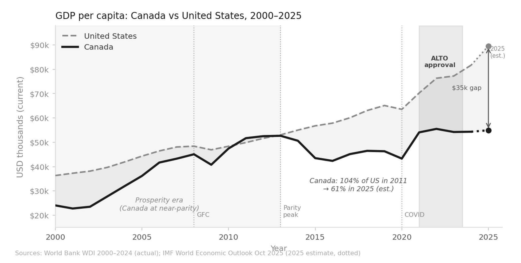
    Line chart of Canada and United States income per person from 2000 to 2025, showing Canada nearly matching the US during the 2011-2012 resource boom then falling to roughly 61 percent of US income per person by 2025
    Figure 1.5. Canada’s income per person compared to the US, 2000–2025. Canada came close to matching US income per person during the 2011–2012 resource boom, then fell steadily as oil prices dropped. By 2025, Canada’s income per person is roughly 61% of the US level — a gap of about $35,000. ALTO was approved near the peak of Canada’s post-pandemic economic rebound, in conditions that have since tightened considerably. Sources: World Bank World Development Indicators 2000–2024; IMF World Economic Outlook, October 2025.
    The question this raises

    ALTO is a project built for good economic times. The question for Canada in 2026 isn’t whether high-speed rail would be nice to have. It’s whether this corridor is worth the cost — and whether this design is the right answer to the problem.

    The high-speed rail systems that have actually succeeded — in Japan, France, Spain, Taiwan, South Korea — share things the Toronto–Ottawa–Montréal corridor doesn’t have: low car use, dense cities at both ends, strong local transit, and a rail culture that already existed before high-speed rail arrived. What’s left, globally, are second-tier projects on car-dependent corridors where the ridership case relies on optimistic in-house projections rather than real-world evidence. California’s high-speed rail project is the best-known example: years behind schedule, billions over budget, and in political trouble, for exactly these reasons. On the real-world evidence, the Toronto–Ottawa–Montréal corridor shares that second-tier profile.

    What’s Next

    What’s in the rest of this report

    This chapter sets out the method. The chapters that follow apply it — to ALTO, and to the alternative this report proposes, HPR (High-Performance Rail).
    Ch. 2
    Why the current plan doesn’t add up. Checks the case for doing something about intercity travel on this corridor — which we don’t dispute — against whether ALTO’s specific design actually makes financial sense.
    Ch. 3
    The HPR alternative. How a passenger line built along the existing Highway 401 and rail corridor can free up freight capacity at the same time, instead of building an entirely new line elsewhere and leaving the freight problem untouched.
    Ch. 4
    Route and cost. Where the line would go and what it would cost, using the same cost model applied consistently to both ALTO and HPR.
    Ch. 5
    Environment and communities. How the two options compare on carbon emissions and disruption to the communities along the route.
    Ch. 6
    How many people would ride it. Ridership estimates built on the real-world pattern from this chapter, checked four different ways.
    Ch. 7
    Running costs. The ongoing yearly balance between what it costs to operate and maintain the railway, and what fares plus any subsidy bring in.
    Ch. 8
    Is it worth it. A full cost-benefit and financial analysis across a range of scenarios, including the value of the freed-up freight capacity.
    Ch. 9
    Getting it built. How to phase construction, manage the risk of cost overruns, and keep the project accountable to the numbers in this report.
  • Sixth in NA

    Sixth in North America

    What the ranking actually measures — and the route it does not describe.

    ⚠ Source: Disclosed under the Access to Information Act

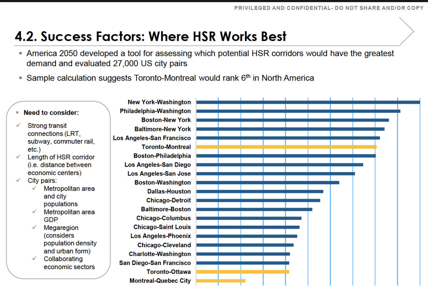
    The slide below is page 206 of a 294-page record released by the Canada Infrastructure Bank under access request A-2022-005 — a request for all studies, analyses, and reports related to the federal government’s high-frequency and high-speed rail file, disclosed in part. The briefing deck it belongs to is stamped “Privileged and Confidential — Do Not Share and/or Copy,” and its own footer marks it “DRAFT.” Adjacent pages were withheld under the Act’s economic-interest and advice exemptions (s. 18 and s. 21). The deck, as disclosed, is posted in full here: Ministerial Briefing — HFR and HSR (PDF).

    The marking is part of the point: this is a draft analysis the department preferred not be seen, and it is the evidence being used to vouch for the corridor.

    Briefing slide: Success Factors, Where HSR Works Best, ranking North American city pairs by high-speed rail demand
    Section 4.2, “Success Factors: Where HSR Works Best.” Page 206 of the Canada Infrastructure Bank release, A-2022-005 (disclosed in part; marked DRAFT). The three highlighted bars are Toronto–Montreal, Toronto–Ottawa, and Montreal–Quebec City.
    The finding in brief

    The slide ranks Toronto–Montreal sixth among North American city pairs for high-speed rail demand. The ranking is real. What it measures is the market between two endpoint metros — not the route now being built.

    The number describes the direct Toronto–Montreal corridor. The alignment taking shape runs Toronto–Peterborough–Kingston–Ottawa–Montreal — a longer, meandering route. On the very methodology the slide cites, every one of those detours lowers the score rather than raising it. And the segment actually proceeding first, Ottawa–Montreal, does not appear on the chart at all.

    The Methodology

    What the ranking measures

    The “sixth in North America” figure comes from America 2050’s screen of tens of thousands of city pairs, a methodology published in full by the Regional Plan Association. It scores the market between two endpoint metros: downtown employment, population density, transit reach, and the existing air and road travel between them. On those inputs Toronto–Montreal scores well. The endpoints are large, dense, and already heavily travelled.

    Two features of that method decide everything that follows, and both are explicit in the source.

    It is calculated per mile. Adding distance without adding a major generator pulls a corridor’s score down, not up. The screen normalizes precisely so that longer routes cannot coast on length.

    Intermediate stations only help when they are themselves large. The report is clear that longer corridors out-rank shorter ones only when the cities in between are medium or large generators. Otherwise the additional miles are a penalty. The top-ranked corridor on the chart, New York–Washington, scores as it does because the dense intermediate cities of Philadelphia and Baltimore sit directly on the shortest path between the endpoints.

    The Route

    The corridor on the chart is not the corridor being built

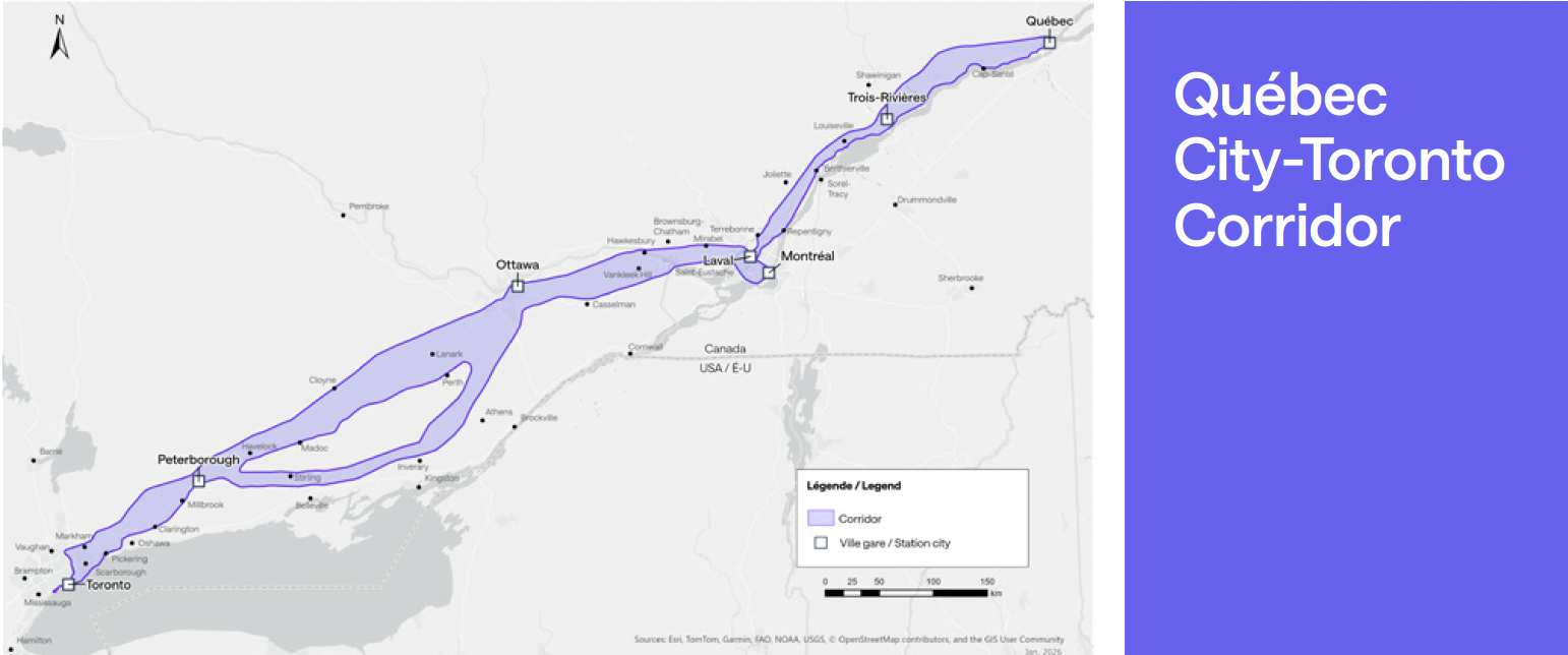
    The favourable score belongs to the direct Toronto–Montreal market — the existing lakeshore line, the shortest path, with a dense string of intermediate communities along it. The alignment now taking shape is the opposite of that. From Toronto it runs north to Peterborough; then — assuming the Kingston stop and southern routing the federal government added to its consideration in June 2026 come to pass — it doubles back south to Kingston, climbs north again to Ottawa, and drops south once more to Montreal. The result is a corridor that zigzags between its cities rather than running directly between its endpoints.

    Map of the projected Toronto to Quebec City corridor showing the route meandering north and south between cities rather than following a direct line
    The projected Toronto–Quebec City corridor. Rather than following the direct lakeshore line, the alignment meanders — north to Peterborough, south to Kingston, north to Ottawa, south to Montreal, and on toward Quebec City.
    The direct corridor (what the bar scores)The alignment being built
    Toronto–Montreal, direct. The existing Lake Ontario lakeshore line, on the order of 540 km — the shortest path between the two endpoints. Toronto–Peterborough–Kingston–Ottawa–Montreal. Roughly 610 km via Ottawa — about 13 per cent longer for the identical endpoints, and longer still with a Kingston dogleg. (This path assumes the Kingston stop and southern routing added to federal consideration in June 2026 proceed.)
    Dense intermediate string. Oshawa, Cobourg, Belleville, Kingston — population and employment added steadily along the path. Sparse flanks, weak axis. Peterborough is small and the stretches on either side of it are thinly populated; reaching Ottawa means importing the Toronto–Ottawa axis the same chart ranks near the bottom.
    Highest possible per-mile score for these two endpoints. A lower per-mile score: more kilometres, less density per kilometre, and a low-scoring leg folded in.

    There is a particular irony in Kingston. It is the natural intermediate city on the direct corridor — precisely the stop that would have helped the Toronto–Montreal score. The chosen alignment runs north to bypass it. Now it is being considered for re-inclusion, bolted back onto a route designed to avoid it.

    On the Method’s Own Terms

    What each detour does to the score

    Re-run the published methodology on the alignment actually on the table, and the per-mile score falls below the sixth-place bar. Each of the route’s defining choices works against it:

    Length is a straight penalty

    Per-mile normalization spreads the same Toronto and Montreal endpoint demand over more kilometres. A longer, more circuitous route scores lower for the identical endpoints — that is what the normalization is designed to do.

    Peterborough adds miles faster than density

    Intermediate stops only lift the score if they add population and employment per kilometre faster than the corridor’s average. Peterborough is too small, and the stretches on either side are sparse, so it adds length faster than it adds riders — a net penalty.

    A Kingston dogleg is more of the same

    Re-adding the one city the alignment was routed to avoid means a southern detour off the northern line: a modest generator bought with extra kilometres — again, length outpacing density.

    Reaching Ottawa imports a weak leg

    Ottawa is the one genuine generator among the added stops. But reaching it is the Toronto–Ottawa axis the same chart already ranks near the bottom of its field. The detour swaps the strong direct Toronto–Montreal axis for a leg the deck itself scores as weak.

    Sequencing

    What is actually being built first

    There is a further mismatch between the headline number and the build. The first segment to proceed is not Toronto–Montreal at all — it is Ottawa–Montreal, confirmed in December 2025 as the opening phase, with construction targeted for 2029. Ottawa–Montreal does not appear anywhere on the chart.

    And by the government’s own account, it was chosen first not for demand but for buildability: a relatively short and straight portion of the overall route, since high-speed trains do not handle curves well — the same logic that led California to build its first section across the flat Central Valley, avoiding tunnelling and urban construction. A constructability rationale, not a ridership one.

    The corridor that scores sixth, Toronto–Montreal, is only realized once the full line is complete — including the Toronto–Ottawa leg that sits near the bottom of this very chart — work not expected to finish until the 2040s. So the headline ranking and the actual build diverge twice over: the number describes a market the first segment does not deliver, assembled from legs the chart scores unevenly, with the strongest part of the case deferred to last.

    In plain language

    Strip away the methodology and the point is simple. The federal government’s own briefing says high-speed rail makes the most sense between Toronto and Montreal — two large cities with heavy travel between them. It says nothing in favour of the winding route now being built.

    That route keeps collecting stops the demand evidence does not support: north to Peterborough, a proposed southern dogleg to Kingston, and Trois-Rivières on the Quebec leg. Each one adds distance and cost while the case for the line still rests on the direct Toronto–Montreal market. When stations are added that do not earn their place on the numbers, the usual explanation is political — spreading the visible benefits of a marquee project across as many communities as possible to assemble support for it.

    This is one of the central problems with the project, and it is a familiar one. Bent Flyvbjerg’s research on megaprojects — the body of work behind this Initiative’s reference-class approach — finds that large infrastructure projects routinely run over budget and under-deliver because their scope and routing are shaped by political bargaining and the need to sell the project, rather than by the demand evidence. A corridor designed around who gets a station rather than where the riders are is precisely the pattern that research warns about.

    In Summary

    What the slide does and does not say

    The “sixth in North America” finding endorses a Toronto–Montreal market. It says nothing in favour of the Peterborough-routed, Kingston-doglegged, Ottawa-and-Montreal-served alignment. On the methodology’s own terms, those inclusions are exactly the choices it would mark down.

    A strong endpoint market is a real asset. It is not the same thing as a strong route — and a briefing that uses the first to vouch for the second is measuring the wrong thing. That the slide is marked “DRAFT,” and that adjacent pages were withheld under the Act’s economic-interest and advice exemptions, only sharpens the question: this is the analysis on the record, and on its own terms it does not say what it is being used to say.

    A note on method. The deck describes its result as a “sample calculation.” The disclosed page does not show how the path was drawn or scored. The standard America 2050 methodology and the headline result both point to the direct corridor as the basis for the sixth-place figure; if the underlying calculation is obtained, the path it used is the detail to confirm.

    Anticipated Objection

    “Doesn’t the line serve all those city pairs — Toronto–Ottawa, Ottawa–Montreal, Montreal–Quebec — not just Toronto–Montreal? Combine them and the project makes sense.”

    It is true that a corridor serves a whole matrix of city pairs, not only its endpoints. But that observation concedes the point rather than answering it. The “sixth in North America” figure is the score for the direct Toronto–Montreal pair. The moment the case leans on Toronto–Ottawa, Ottawa–Quebec, and Toronto–Quebec, it is no longer resting on that figure — and those are precisely the legs the same chart rates weakest: Toronto–Ottawa sits second from the bottom, Montreal–Quebec City is last, and Ottawa–Quebec, Toronto–Quebec, and Ottawa–Montreal do not appear on it at all.

    Two things make “combine the figures” fail on the slide’s own terms. The bars are demand-strength rankings — built from population, GDP, density, and corridor length — not passenger counts that can be summed; a sixth-place pair plus a near-last pair does not add up to a stronger corridor. And because the screen normalizes per mile, stringing the one strong pair onto a longer, detouring alignment spreads the same demand across more track-kilometres, which lowers the score rather than raising it.

    The logic in fact argues for the line this brief describes. If the goal is to capture Toronto–Montreal and the markets in between, the alignment that does it best is the direct lakeshore corridor — it serves the sixth-place pair at full strength and threads a dense string of real intermediate cities (Oshawa, Cobourg, Belleville, Kingston) on the way. Adding up the pairs does not rescue the meandering route; it makes the case for the direct one.

    Sources

    Primary documents and statements

    1.
    Canada Infrastructure Bank, completed access-to-information release A-2022-005 (disclosed in part), “Success Factors: Where HSR Works Best,” draft briefing slide, page 206. Released under the Access to Information Act; deck marked “Privileged and Confidential — Do Not Share and/or Copy” and “DRAFT.” View the disclosed deck (PDF)
    2.
    America 2050 / Regional Plan Association, High-Speed Rail in America, January 2011 — the published methodology scoring rail corridors by ridership demand on a per-mile basis.
    3.
    America 2050, Where High-Speed Rail Works Best — the precursor study of city pairs that the briefing slide reproduces.
    4.
    Transport Canada / Alto, “Full speed ahead: Ottawa–Montreal chosen as starting point for Alto High-Speed Rail,” December 12, 2025. canada.ca · altotrain.ca
    5.
    “First segment of Canadian high-speed rail to be built between Montreal, Ottawa,” Trains, December 12, 2025 — carries the Minister of Transport’s rationale for selecting the segment as a short, straight portion of the route. trains.com
    6.
    “Ottawa-Montreal chosen as 1st segment of promised high-speed rail line,” CBC News, December 12, 2025 — remaining segments (Quebec City–Montreal and Ottawa–Toronto) to begin at a later, unspecified date. CBC News
    7.
    Federal government statement, June 22, 2026, indicating an additional stop at Kingston would be considered for the corridor.
    8.
    Bent Flyvbjerg, Nils Bruzelius & Werner Rothengatter, Megaprojects and Risk: An Anatomy of Ambition (Cambridge University Press, 2003); Flyvbjerg, “Survival of the Unfittest: Why the Worst Infrastructure Gets Built — and What We Can Do About It,” Oxford Review of Economic Policy 25, no. 3 (2009): 344–367; and Flyvbjerg, “Design by Deception: The Politics of Megaproject Approval,” Harvard Design Magazine no. 22 (2005) — on strategic misrepresentation, perverse incentives, and the political shaping of megaproject scope and routing.