Sixth in North America
What the ranking actually measures — and the route it does not describe.
The slide below is page 206 of a 294-page record released by the Canada Infrastructure Bank under access request A-2022-005 — a request for all studies, analyses, and reports related to the federal government’s high-frequency and high-speed rail file, disclosed in part. The briefing deck it belongs to is stamped “Privileged and Confidential — Do Not Share and/or Copy,” and its own footer marks it “DRAFT.” Adjacent pages were withheld under the Act’s economic-interest and advice exemptions (s. 18 and s. 21). The deck, as disclosed, is posted in full here: Ministerial Briefing — HFR and HSR (PDF).
The marking is part of the point: this is a draft analysis the department preferred not be seen, and it is the evidence being used to vouch for the corridor.
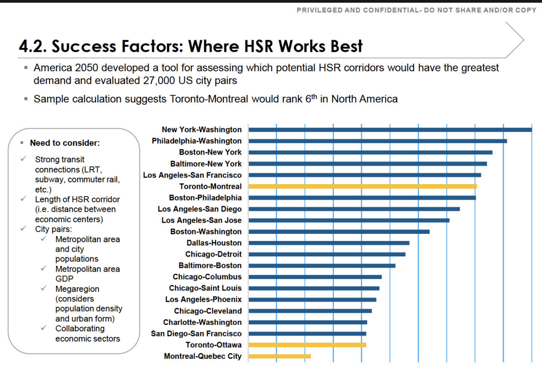
The slide ranks Toronto–Montreal sixth among North American city pairs for high-speed rail demand. The ranking is real. What it measures is the market between two endpoint metros — not the route now being built.
The number describes the direct Toronto–Montreal corridor. The alignment taking shape runs Toronto–Peterborough–Kingston–Ottawa–Montreal — a longer, meandering route. On the very methodology the slide cites, every one of those detours lowers the score rather than raising it. And the segment actually proceeding first, Ottawa–Montreal, does not appear on the chart at all.
What the ranking measures
The “sixth in North America” figure comes from America 2050’s screen of tens of thousands of city pairs, a methodology published in full by the Regional Plan Association. It scores the market between two endpoint metros: downtown employment, population density, transit reach, and the existing air and road travel between them. On those inputs Toronto–Montreal scores well. The endpoints are large, dense, and already heavily travelled.
Two features of that method decide everything that follows, and both are explicit in the source.
It is calculated per mile. Adding distance without adding a major generator pulls a corridor’s score down, not up. The screen normalizes precisely so that longer routes cannot coast on length.
Intermediate stations only help when they are themselves large. The report is clear that longer corridors out-rank shorter ones only when the cities in between are medium or large generators. Otherwise the additional miles are a penalty. The top-ranked corridor on the chart, New York–Washington, scores as it does because the dense intermediate cities of Philadelphia and Baltimore sit directly on the shortest path between the endpoints.
The corridor on the chart is not the corridor being built
The favourable score belongs to the direct Toronto–Montreal market — the existing lakeshore line, the shortest path, with a dense string of intermediate communities along it. The alignment now taking shape is the opposite of that. From Toronto it runs north to Peterborough; then — assuming the Kingston stop and southern routing the federal government added to its consideration in June 2026 come to pass — it doubles back south to Kingston, climbs north again to Ottawa, and drops south once more to Montreal. The result is a corridor that zigzags between its cities rather than running directly between its endpoints.
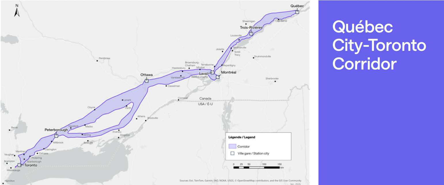
| The direct corridor (what the bar scores) | The alignment being built |
|---|---|
| Toronto–Montreal, direct. The existing Lake Ontario lakeshore line, on the order of 540 km — the shortest path between the two endpoints. | Toronto–Peterborough–Kingston–Ottawa–Montreal. Roughly 610 km via Ottawa — about 13 per cent longer for the identical endpoints, and longer still with a Kingston dogleg. (This path assumes the Kingston stop and southern routing added to federal consideration in June 2026 proceed.) |
| Dense intermediate string. Oshawa, Cobourg, Belleville, Kingston — population and employment added steadily along the path. | Sparse flanks, weak axis. Peterborough is small and the stretches on either side of it are thinly populated; reaching Ottawa means importing the Toronto–Ottawa axis the same chart ranks near the bottom. |
| Highest possible per-mile score for these two endpoints. | A lower per-mile score: more kilometres, less density per kilometre, and a low-scoring leg folded in. |
There is a particular irony in Kingston. It is the natural intermediate city on the direct corridor — precisely the stop that would have helped the Toronto–Montreal score. The chosen alignment runs north to bypass it. Now it is being considered for re-inclusion, bolted back onto a route designed to avoid it.
What each detour does to the score
Re-run the published methodology on the alignment actually on the table, and the per-mile score falls below the sixth-place bar. Each of the route’s defining choices works against it:
Length is a straight penalty
Per-mile normalization spreads the same Toronto and Montreal endpoint demand over more kilometres. A longer, more circuitous route scores lower for the identical endpoints — that is what the normalization is designed to do.
Peterborough adds miles faster than density
Intermediate stops only lift the score if they add population and employment per kilometre faster than the corridor’s average. Peterborough is too small, and the stretches on either side are sparse, so it adds length faster than it adds riders — a net penalty.
A Kingston dogleg is more of the same
Re-adding the one city the alignment was routed to avoid means a southern detour off the northern line: a modest generator bought with extra kilometres — again, length outpacing density.
Reaching Ottawa imports a weak leg
Ottawa is the one genuine generator among the added stops. But reaching it is the Toronto–Ottawa axis the same chart already ranks near the bottom of its field. The detour swaps the strong direct Toronto–Montreal axis for a leg the deck itself scores as weak.
What is actually being built first
There is a further mismatch between the headline number and the build. The first segment to proceed is not Toronto–Montreal at all — it is Ottawa–Montreal, confirmed in December 2025 as the opening phase, with construction targeted for 2029. Ottawa–Montreal does not appear anywhere on the chart.
And by the government’s own account, it was chosen first not for demand but for buildability: a relatively short and straight portion of the overall route, since high-speed trains do not handle curves well — the same logic that led California to build its first section across the flat Central Valley, avoiding tunnelling and urban construction. A constructability rationale, not a ridership one.
The corridor that scores sixth, Toronto–Montreal, is only realized once the full line is complete — including the Toronto–Ottawa leg that sits near the bottom of this very chart — work not expected to finish until the 2040s. So the headline ranking and the actual build diverge twice over: the number describes a market the first segment does not deliver, assembled from legs the chart scores unevenly, with the strongest part of the case deferred to last.
Strip away the methodology and the point is simple. The federal government’s own briefing says high-speed rail makes the most sense between Toronto and Montreal — two large cities with heavy travel between them. It says nothing in favour of the winding route now being built.
That route keeps collecting stops the demand evidence does not support: north to Peterborough, a proposed southern dogleg to Kingston, and Trois-Rivières on the Quebec leg. Each one adds distance and cost while the case for the line still rests on the direct Toronto–Montreal market. When stations are added that do not earn their place on the numbers, the usual explanation is political — spreading the visible benefits of a marquee project across as many communities as possible to assemble support for it.
This is one of the central problems with the project, and it is a familiar one. Bent Flyvbjerg’s research on megaprojects — the body of work behind this Initiative’s reference-class approach — finds that large infrastructure projects routinely run over budget and under-deliver because their scope and routing are shaped by political bargaining and the need to sell the project, rather than by the demand evidence. A corridor designed around who gets a station rather than where the riders are is precisely the pattern that research warns about.
What the slide does and does not say
The “sixth in North America” finding endorses a Toronto–Montreal market. It says nothing in favour of the Peterborough-routed, Kingston-doglegged, Ottawa-and-Montreal-served alignment. On the methodology’s own terms, those inclusions are exactly the choices it would mark down.
A strong endpoint market is a real asset. It is not the same thing as a strong route — and a briefing that uses the first to vouch for the second is measuring the wrong thing. That the slide is marked “DRAFT,” and that adjacent pages were withheld under the Act’s economic-interest and advice exemptions, only sharpens the question: this is the analysis on the record, and on its own terms it does not say what it is being used to say.
A note on method. The deck describes its result as a “sample calculation.” The disclosed page does not show how the path was drawn or scored. The standard America 2050 methodology and the headline result both point to the direct corridor as the basis for the sixth-place figure; if the underlying calculation is obtained, the path it used is the detail to confirm.
“Doesn’t the line serve all those city pairs — Toronto–Ottawa, Ottawa–Montreal, Montreal–Quebec — not just Toronto–Montreal? Combine them and the project makes sense.”
It is true that a corridor serves a whole matrix of city pairs, not only its endpoints. But that observation concedes the point rather than answering it. The “sixth in North America” figure is the score for the direct Toronto–Montreal pair. The moment the case leans on Toronto–Ottawa, Ottawa–Quebec, and Toronto–Quebec, it is no longer resting on that figure — and those are precisely the legs the same chart rates weakest: Toronto–Ottawa sits second from the bottom, Montreal–Quebec City is last, and Ottawa–Quebec, Toronto–Quebec, and Ottawa–Montreal do not appear on it at all.
Two things make “combine the figures” fail on the slide’s own terms. The bars are demand-strength rankings — built from population, GDP, density, and corridor length — not passenger counts that can be summed; a sixth-place pair plus a near-last pair does not add up to a stronger corridor. And because the screen normalizes per mile, stringing the one strong pair onto a longer, detouring alignment spreads the same demand across more track-kilometres, which lowers the score rather than raising it.
The logic in fact argues for the line this brief describes. If the goal is to capture Toronto–Montreal and the markets in between, the alignment that does it best is the direct lakeshore corridor — it serves the sixth-place pair at full strength and threads a dense string of real intermediate cities (Oshawa, Cobourg, Belleville, Kingston) on the way. Adding up the pairs does not rescue the meandering route; it makes the case for the direct one.