ALTO’s economic report introduces a semi-retired nurse from Peterborough to show what high-speed rail changes. The corridor’s own ridership and fare data says otherwise.
ALTO HSR Citizen Research Initiative · Corridor Communities Brief · Published August 2026
⚠ The scenario under examination
On page 17 of Canada’s Moment, under the heading “What changes for Canadians,” ALTO introduces Nina — a semi-retired nurse living in Peterborough, invited to help train nursing students in Toronto. The report describes it as “an opportunity she would have declined in the past” because of the burden and unpredictability of commuting. With ALTO, it says, “that constraint is reduced” — letting her travel into the city twice a week without significant disruption to her routine, supplement her income, and pass on her expertise.
It is a well-drawn illustration and the kind of person it describes certainly exists. This brief tests whether the journey it describes actually works, using the only published numbers available for that journey.
Critical Finding
On the only published assumption about ALTO’s service span — departures from 6 am — the first train of the day leaves Peterborough roughly 35 minutes too late to get Nina to a clinical placement. Nursing students take handover on the ward at 06:45. To be there, she needs to leave Peterborough around 05:25. She drives, exactly as she does today, which is the constraint the vignette says ALTO removes.
On cost, the corridor’s own survey data puts willingness to pay for a Peterborough–Toronto trip at C$31 — the lowest value of any city pair on the entire route. Applying the published fare rule, two return trips a week comes to roughly $149–$178 weekly, or somewhere between a quarter and a half of what a part-time clinical teaching post pays after tax. ALTO itself discloses no fare anywhere in its 83 pages.
And Nina is already inside the forecast she is meant to justify. The same research programme projects 269 daily boardings from Peterborough in every direction combined — about one fifth of a single 1,300-seat departure.
The document under examination
Canada’s Moment: The Economic Opportunity of High-Speed Rail
ALTO, August 2026 — 83 pages. The Nina vignette appears at page 17.
The most-cited independent study of corridor demand — High-Speed Rail in Canada, from Transportation Research at McGill — publishes a station-by-station table of projected daily boardings. It is the only public breakdown of its kind.
The Peterborough row reads: 181 people a day to Toronto, 36 to Ottawa, 27 to Montréal, 9 to Trois-Rivières, 16 to Québec City. Total: 269 daily boardings — every direction, every trip purpose, everyone.
269
projected daily boardings at Peterborough, all destinations combined
McGill, Prospective Daily Boarding table
C$31
willingness to pay, Peterborough to Toronto — the lowest of any pair on the corridor
McGill, Willingness to Pay table
35 min
how much too late the first train is for a 7 am clinical start
Initiative calculation, see below
For scale: an ALTO departure of two coupled eight-car trainsets seats 1,300 people. Peterborough’s entire daily outbound demand is about one fifth of a single departure.
Peterborough council was told the corridor would carry up to 72 trains a day. That is a corridor figure, not a Peterborough figure — and McGill’s own service design runs an express Toronto–Montréal train that does not stop at Peterborough at all. But even if a third of those 72 trains stopped, 269 boardings spread across 24 stopping trains works out to about eleven people per train.
Three things should be said about this number before it is used. It is survey-derived stated preference, not observed demand — people saying what they think they would do. It is McGill’s projection, not ALTO’s: ALTO forecasts roughly 2.7 times McGill’s corridor total, and scaling Peterborough proportionally would give around 480 a day to Toronto rather than 181. And the source table contains a visible oddity — 886 people arriving in Peterborough from Toronto against 181 leaving for it, a fivefold asymmetry that is almost certainly a survey artefact rather than a real pattern. None of that changes the order of magnitude, and none of it is what breaks the scenario.
The Timetable
Clinical teaching starts at seven in the morning
This is the part of the scenario that cannot be rescued, and it has nothing to do with money.
Nursing students on a day-shift clinical placement take handover on the ward at 07:00. They are expected there at about 06:45. An instructor supervising them arrives before that. This is not a detail of one hospital’s policy — it is how bedside clinical education works, because it follows the shift.
ALTO has published no timetable at all. The only public assumption about its service span is in the McGill financial analysis, which models departures between 6 am and 9 pm. Work backwards from a 06:45 ward start on that assumption:
What the job requires
What the service offers
06:45 — on the ward for handover 06:15 — leave Union Station by transit 06:10 — train arrives Toronto 05:25 — train must leave Peterborough
06:00 — earliest assumed departure
On a 6 am train she reaches Union around 06:50 and a downtown hospital around 07:15 — a quarter of an hour after her students have taken handover without her.
The first train of the day Leaves 35 minutes too late
To teach a morning clinical placement, Nina drives — leaving Peterborough around five, exactly as she would today. The constraint the vignette says ALTO removes is the one thing ALTO doesn’t touch.
One honest qualification. If Nina were teaching classroom or simulation-lab sessions rather than bedside clinical supervision, later start times are possible and this objection weakens considerably. The report describes a nurse with decades of experience in clinical practice, invited to help train the next generation — which in nursing education means supervision on a unit, at shift change.
The Fare
What the trip costs, and what the job pays
ALTO discloses no fare, no average ticket price, and no revenue per passenger anywhere in Canada’s Moment. The only published basis for estimating one is McGill’s: a willingness-to-pay survey, with the financial analysis setting the standard fare at 1.2 times willingness to pay.
For Peterborough–Toronto, willingness to pay is C$31 — the lowest single value in the entire matrix, lower than every other city pair on the corridor. Applying the published rule:
Nina’s fares
Nina’s pay
Round trip: $74–$89
Two return trips a week: $149–$178
A 26-week teaching year: $3,870–$4,620
Before parking at the station, driving to it, or two TTC fares a day.
An eight-hour clinical day at Ontario rates: $280–$440 gross
Two days a week: $560–$880 gross
Pay figures are from salary aggregators and are indicative only.
Fare as a share of take-home pay Roughly one quarter to one half
The vignette describes someone taking a part-time post to supplement her income. On the corridor’s own published fare basis, getting to the job would consume between a quarter and a half of what the job pays. For the person described, that is the difference between an offer worth accepting and one that isn’t.
And it isn’t cheaper than driving
Driving
Fuel alone, 280 km round trip: about $36. Fuel plus wear at roughly 25¢/km: about $70. Hospital-district parking: $15–$25. All in: $50–$95.
ALTO
Fare $74–$89, plus station parking and two TTC fares. All in: $85–$110.
The train costs more than the car for this journey, arrives too late for the shift, and still requires the car to reach the station.
The Journey
Door to door, the saving is ten to thirty minutes
The corridor headline — journey times cut in half — is calculated on long city pairs, where the train’s cruising speed dominates the trip. Peterborough to Toronto is about 140 kilometres. On a leg that short, getting to and from the stations dominates instead.
Driving today
With ALTO
Peterborough to a downtown Toronto hospital, door to door:
1 hour 45 minutes to 2 hours 30, depending on the 401.
Drive to station 15–25 min · park, walk, wait 15–20 min · train 40–50 min · Union to hospital 20–30 min
1 hour 30 minutes to 2 hours 05
Door-to-door saving About 10 to 30 minutes each way
Real, but not a transformation — and it disappears entirely if she has to drive anyway to make a seven o’clock start.
Station siting makes it worse rather than better. ALTO’s own materials point to a site outside Peterborough’s built-up area, and the McGill survey found that Peterborough respondents themselves prefer a car-accessible station away from downtown, near a highway or park-and-ride. Wherever it lands, Nina keeps the car. (Siting is unresolved; a downtown station would improve these timings.)
The Pricing
Revenue management points straight at her
ALTO’s published FAQ states that the project plans to use revenue management — as most airlines and high-speed operators do — to match fares with demand and available seats, with the objective of maximising seat occupancy.
Yield management prices Nina highest
Airline-style pricing charges the most for peak, predictable, inflexible travel. Nina travels at peak, on fixed days, to a timetable set by a teaching term she cannot move. She is not the traveller who gets the cheap seat — she is the traveller the cheap seat is withheld from.
Her city pair is the least valuable on the corridor
An operator facing a $31 willingness to pay on a short leg and $110 on Toronto–Québec City has an obvious commercial answer, and it is not more Peterborough stops. The scenario depends on a pricing decision that runs against the operator’s stated pricing strategy.
The Circle
Nina is already inside the forecast she is meant to justify
The vignette is offered as an illustration of what high-speed rail makes possible — a benefit the project would create. But the 181 figure comes from asking Peterborough residents how often they would use high-speed rail if it existed.
The model has already counted the Ninas. There are 181 of them a day, in every trip purpose combined: commuters, visitors, shoppers, students, patients, people going to appointments, people going to the airport, tourists. The illustration does not add to the forecast. It is a description of one person inside it.
That matters for how the vignette should be read. It is not evidence of demand. It is a portrait of a member of a demand estimate that the same body of research puts at a fifth of one trainload.
In Fairness
What this brief is not saying
The vignette isn’t dishonest
People like Nina existA faster, more reliable connection would genuinely help some of them. The objection is to the weight a single illustration is asked to carry in an economic case.
A Peterborough station may be justified on other groundsRegional equity, development around the station, network structure. This brief addresses only whether this scenario demonstrates what it is offered to demonstrate.
The report is candid elsewhereIts ridership figures are labelled “up to,” and its own tables are headed “upper estimate.” The vignette is where those qualifiers stop applying.
And the limits of what we can show
The fares are McGill’s, not ALTO’sALTO has published no fare. If its eventual fare is lower, the affordability arithmetic changes — and nobody can check, because the number does not exist.
The 6 am service span is an assumptionIt is McGill’s modelling assumption, not an ALTO commitment. ALTO has published no timetable, so the clock test uses the only published assumption available.
The pay range is indicativeOntario clinical instructor rates here come from salary aggregators and should be replaced with a collective-agreement figure.
What Would Settle It
Four questions
1. What time does the first train leave Peterborough?
Any service beginning at 6 am cannot deliver anyone to a seven o’clock shift change anywhere in Toronto. Hospitals, factories and construction sites all start before the corridor does.
2. How many of the 72 daily trains stop at Peterborough?
The figure given to Peterborough council was a corridor total. The station’s actual frequency has never been published.
3. What is the fare?
The scenario’s plausibility rests entirely on a number that appears nowhere in the 83 pages that contain the scenario.
4. Was this scenario tested against the ridership model, or written independently of it?
The corridor’s own survey data puts Nina’s entire market — Peterborough to Toronto, all purposes — at 181 people a day.
Sources
Primary documents
1.
ALTO, Canada’s Moment: The Economic Opportunity of High-Speed Rail, August 2026, 83 pp. The Nina vignette appears at p. 17 under “What changes for Canadians.” Ridership and route described in the executive summary; benefit tables at pp. 60 and 72. altotrain.ca (PDF)
2.
Zhang, B., Negm, H., & El-Geneidy, A. (2026). High-Speed Rail in Canada: Insights from a corridorwide survey and a financial analysis. Transportation Research at McGill, McGill University. Daily boardings at section I.3; willingness to pay at section I.4; fare rule, service span and fleet assumptions at section II. tram.mcgill.ca (PDF)
3.
ALTO, “Frequently Asked Questions,” altotrain.ca — statement of intent to use revenue management to match fares with demand and available seats. altotrain.ca
4.
Deny Sullivan, “High Speed Rail: Ridership forecasting,” 30 April 2026 — secondary commentary that first drew attention to the Peterborough rows and the directional asymmetry in the McGill boarding table. Substack
5.
Peterborough City Council resolution coverage, kawarthaNOW, 24 March 2026 — source of the “up to 72 trains per day” figure presented to council. kawarthanow.com
Kingston has one of the busiest stations on the network. The question that matters is not whether it gets a stop, but whether a stop would leave more people riding the train, or fewer.
ALTO HSR Citizen Research Initiative · Policy Brief · July 2026
⚠ What has been said, and what has not been published
ALTO’s chief executive has said Kingston will probably get a station, and that most trains would pass through without stopping. Neither the timetable nor the location of the station has been published.
Those two missing facts are exactly the ones that decide the outcome. This brief therefore tests the range: today’s railway, a faster conventional railway using the existing station, and ALTO with a station either inside the city or a twenty‑seven‑minute drive north of it, at normal fares and at fares 25 per cent higher. Every number that goes into the model is listed, so any of them can be argued with.
The short answer
Of the options tested, only one leaves Kingston with more rail trips than it has today: a faster conventional railway serving the existing station, at about 12 per cent more. The best ALTO case — a station inside the city, at normal fares — roughly matches today. Every other ALTO case comes out below today’s service, by 8 to 17 per cent.
The reason is simple. Speed is only one part of what makes a train trip worth taking. ALTO’s faster run to Toronto is worth about 10 per cent more trips on its own. But cutting the number of daily stops from eighteen to eight gives that back. Charging 25 per cent more gives it back again. Moving the station twenty‑seven minutes north of the city costs another 6 to 8 points on top.
Running more trains cannot rescue it by itself. Even at eighteen stops a day, matching what Kingston has now, an out‑of‑town station at a premium fare still comes out around 9 per cent below today. And about 8 per cent of Kingston’s trips — Belleville, Brockville, Cobourg, Napanee, Oshawa — have no ALTO equivalent at any frequency, because high‑speed trains do not stop at those places.
Download
Kingston’s ALTO Ridership Analysis — Full Brief (PDF)
Full method, all parameters, sensitivity ranges and break‑even tables
The table below is the whole brief in one place. The first row is what Kingston has today. The second is a faster conventional railway from the same station. The last four are ALTO, differing only in where the station sits and what the ticket costs.
+12%
faster conventional railway, existing station, same number of trains, normal fares
the only option that grows ridership
0%
best ALTO case: station in town, normal fares, eight stops a day
matches today, does not beat it
−17%
ALTO station 27 minutes north, eight stops a day, fares 25% higher
central case for an out‑of‑town station
Table 1 · Headline comparison
Option
To Toronto
Stops a day
Fare premium
Annual trips
Change
Today’s service
135 min
18
none
450,000
—
Faster conventional railway, existing station
95 min
18
none
502,000
+12%
ALTO, station in town
80 min
8
none
449,000
0%
ALTO, station in town
80 min
8
+25%
403,000
−10%
ALTO, 27 min north
80 min
8
none
416,000
−8%
ALTO, 27 min north
80 min
8
+25%
376,000
−17%
All four ALTO rows assume eight stops a day and that today’s conventional service is withdrawn. They differ only in where the station is and what the ticket costs. No fare structure for intermediate stations has been published, so both possibilities are shown rather than assumed. The faster conventional railway is the 240 km/h new‑build line proposed under the High Performance Rail framework, serving the existing station.
Starting Point
Why Kingston already rides the train
Kingston’s place among the busiest stations on the network gets cited as the reason it should have a high‑speed stop. But what produces that ridership decides whether a different kind of station would reproduce it. Four things do most of the work, and a high‑speed alignment north of the city removes two of them.
It gets two sets of trains, not one
Kingston sits halfway along the Toronto–Montréal mainline, and the Toronto–Ottawa trains use the same track as far as Brockville. So Kingston collects two timetables instead of one, and ends up with a level of service beaten only by the three biggest cities on the corridor. Frequency matters to ridership on its own, quite apart from speed: in intercity rail, a 10 per cent increase in service typically brings 4 to 7 per cent more trips.
The station serves a region, not a city
Napanee, Gananoque, Amherstview and the western Thousand Islands have no intercity rail of their own, so people drive to Kingston to catch the train. Ridership credited to a city of 132,000 is actually generated by an area several times larger.
The population is unusually inclined to take the train
Roughly forty thousand post‑secondary students live in a city of about 132,000, one of the highest ratios in the country. Many come from the Toronto and Ottawa regions and travel without a car. Kingston also has a large retired population, for whom avoiding the highway is the point of the trip, and an unusually high share of hospital, university, military and public‑sector jobs where travel is expensed and defaults to rail.
But that ridership is hard to charge a premium for
This travel is not spread evenly. It piles up at term boundaries, Thursday and Sunday afternoons, reading weeks and holidays, and it creates a matching flow of families travelling to Kingston. These are the travellers most sensitive to how often trains run and how far the station is from where they are going, and the least able to just drive instead. They are also the least profitable: peaked, price‑sensitive, and largely outside the weekday business hours a high‑speed operation’s revenue depends on.
Two things worth being clear about
The ridership figure itself is not published. Kingston’s standing as one of the busiest stations rests on statements by the operator and the Minister, not on released station‑level data. That is the first item on the list of things that should be published, at the end of this brief.
Existing demand is not the same as new demand. Busy today proves Kingston already travels by train. It does not prove that a different station would generate additional trips. Only new trips add ridership to the corridor.
There is also no flight from Kingston to Toronto. Elsewhere, high‑speed rail wins its premium passengers off aircraft. In Kingston those passengers are already on the train, so there is nobody to convert. Extra trips can only come out of cars, or be created from nothing.
Both of the things that built Kingston’s ridership — frequent trains, and a station within the city, roughly ten minutes from the core and the university — are the two things a high‑speed alignment north of the city takes away. That is what the model is built to test.
Method
How the numbers were worked out
Every trip is priced in minutes. Add up the time on the train, the time getting to and from the station at each end, the waiting created by having fewer trains, and the fare converted into minutes using what an hour is worth to that kind of traveller. Time spent driving to a station or standing on a platform counts for more than time sitting on a moving train, because people dislike it more. Journeys that involve changing trains carry an allowance for the change. That matters for one market in particular: ALTO reaches Montréal from Kingston by way of Ottawa, so some of those journeys involve a change, where a direct lakeshore railway does not.
That total is the real cost of the trip. If it goes up, fewer people travel. If it goes down, more do. The response used here is roughly one for one: make the total 10 per cent better and you get about 10 per cent more trips.
Travellers are split into four destinations and four types, each divided by whether they have a car available: thirty‑two groups, each worked out separately and then added up. That matters because a student without a car and an expensed public‑sector traveller react to a distant station in completely different ways.
Table 2 · Everything the model assumes
Input
Value used
Trips today
450,000 a year through the station (tested from 400,000 to 550,000)
Where people go
Toronto 58%, Ottawa 22%, Montréal 12%, other corridor stations 8%
Who travels
Students 30%, seniors and leisure 25%, public sector 20%, other 25%
Share without a car
Students 85%, seniors and leisure 50%, public sector 15%, other 20%
Worth of an hour
$14, $20, $48 and $24 respectively, in the same order
Existing station 10 min by car, 20 by transit; ALTO 27 by car, 35 by shuttle
How that time is weighted
1.5 times if a car is available, 2.0 times if not
Waiting
Half the gap between trains, weighted at 0.5, across a fifteen‑hour day
ALTO fare premium
25% in the central case; 0% and 40% also tested
Sensitivity of demand
One for one in the central case (tested from 0.8 to 1.2)
Far‑end access time is held identical in every scenario, which is a conservative choice: it gives ALTO the benefit of the doubt at the Toronto and Ottawa ends.
Two possible futures for today’s trains
Every service level is tested twice, because the answer depends less on ALTO than on what happens to the service Kingston already has.
Replacement
ALTO becomes Kingston’s rail service to Toronto, Ottawa and Montréal, and conventional service is withdrawn or cut below a useful level. Trips to Belleville, Brockville, Cobourg, Napanee and Oshawa lose their train altogether.
Both together
Today’s service keeps running at present frequency and ALTO is added on top. Travellers pick whichever is cheaper in total, and only the improvement over the better of the two creates new trips.
What is assumed rather than known
Four inputs are estimates, not published data: the number of trips today, where those trips go, ALTO’s journey times (the alignment for this stretch has not been published), and where the station would be. All four appear on the list at the end of this brief. The model also applies a constant response to a very large change in trip cost, which is at the outer edge of where this method behaves well. The direction of the results is solid. The exact sizes are indicative.
Result One
Where the speed gain goes
Start with today’s service and change one thing at a time. This is the clearest way to see why a faster train can still end up with fewer passengers.
Table 3 · One change at a time
Step
Annual trips
Change
Effect of this step
Today’s service, as it runs
450,000
—
—
Cut the Toronto run to 80 minutes, change nothing else
496,000
+10%
+10 pts
Cut stops from 18 a day to 8
449,000
0%
−10 pts
Add a 25 per cent fare premium
403,000
−10%
−10 pts
Move the station 27 minutes north
376,000
−17%
−6 pts
The second row is the entire value of high‑speed running time at Kingston: about 10 per cent. Each of the three things that come with it takes back as much or more. This calculation already leaves out trips to other corridor stations, which a high‑speed line cannot serve at any frequency.
Result Two
More trains cannot fix it on its own
Suppose the number of stops is the thing that gets negotiated. Hold the station twenty‑seven minutes north and the fare 25 per cent higher, and vary how often ALTO calls.
Table 4 · ALTO at a station 27 minutes north
Stops a day
Annual trips
Change
Range
If today’s trains stay
6
359,000
−20%
−17% to −24%
0%
8
376,000
−17%
−13% to −21%
0%
10
387,000
−14%
−10% to −18%
+0.2%
18
408,000
−9%
−4% to −14%
+1.6%
12 (six each way)
394,000
−12%
−9% to −17%
+0.5%
16 (eight each way)
404,000
−10%
−6% to −15%
+1.3%
20 (ten each way)
411,000
−9%
−3% to −14%
+1.9%
The range covers the whole plausible span of the model’s assumptions, at a 25 per cent fare premium. The bottom three rows read six, eight and ten as stops each way, which is the most generous reading available. It improves the result without changing the sign. The last column is the “both together” case, where today’s service survives: ALTO then adds almost nothing, because travellers only switch when it is genuinely better for them.
The fare premium matters more than the timetable
Table 5 · What moves the answer
Stops a day
Normal fares
Fares +25%
Fares +40%
Station 25 min out
Station 45 min out
6
−12%
−20%
−24%
−17%
−23%
8
−8%
−17%
−21%
−13%
−20%
10
−5%
−14%
−19%
−10%
−17%
The last two columns hold the fare premium at 25 per cent and vary the drive from the station to downtown; the central case is 27 minutes. Notice that going from normal fares to a 25 per cent premium costs more than doubling the distance to the station.
How many trains would it actually take?
The more useful question is what it would take for an out‑of‑town ALTO station to be no worse for Kingston than the service it already has. At normal fares the answer is nine stops a day for everyone. At a 25 per cent premium, the answer falls apart.
Table 6 · Daily stops needed just to match today, Toronto trips
Who is travelling
At normal fares
At a 25% premium
Public sector and institutional (expensed)
9
13
Other business and leisure
9
27
Seniors, leisure, visiting family
9
48
Students and young adults
9
no number works
Forty‑eight stops a day is a train every twenty minutes all day. For students, no frequency at all makes up for a distant station plus a premium ticket, because their time is worth less than the fare increase costs them.
One case runs the other way and should be said plainly: expensed public‑sector travel between Kingston and Ottawa is better off under ALTO in every scenario tested, because today’s service on that pair is slow and indirect. It is a real gain, and it is a small share of the total.
Under the friendliest assumptions available — normal fares, a station twenty‑five minutes out, today’s trains kept running alongside, ten stops a day — the best figure the model will produce for an out‑of‑town Kingston station is about +8 per cent. Getting there means giving up the premium pricing the revenue case depends on everywhere else.
Result Three
What if you just made today’s trains faster?
Now reverse the test. Keep the existing station, keep eighteen stops a day, keep normal fares, and change nothing but speed on the existing route.
Table 7 · Speed alone, from the existing station
Toronto journey time
Time saved
Annual trips
Change
135 min, as it runs today
—
450,000
—
118 min, reliable 160 to 177 km/h
13%
471,000
+4.6%
95 min, a 240 km/h conventional railway
30%
502,000
+11.6%
80 min, upper bound for this station
41%
525,000
+16.6%
The last row applies high‑speed running time to the existing station. It is there to separate speed from station location, frequency and fare, not as a proposal.
The comparison that matters
Eighty minutes to Toronto from the existing station, eighteen stops a day, normal fares: about +17 per cent. The same eighty minutes from a station twenty‑seven minutes out of town, eight stops a day, fares 25 per cent higher: about −17 per cent.
The time on the train is identical. The two outcomes are thirty‑four points apart, and every one of those points is station location, frequency and fare.
Speed gives diminishing returns
Roughly speaking, every 1 per cent cut in journey time buys about 0.4 per cent more trips. A 30 per cent time saving buys about 12 per cent more passengers. For most of Kingston’s travellers, time on the train is a minority of what the trip really costs them — fare, getting to the station and waiting make up the rest, and speed does nothing about any of those. The gain concentrates where an hour is worth most: on a 95‑minute conventional railway, public‑sector travel grows about 17 per cent, business and leisure 13, seniors and leisure 12, students 10.
A conservative figure, and a warning
These figures are cautious. The response to journey time implied here is weaker than the rail literature usually finds, because the fare term in the calculation dampens it. Using a more standard figure, the same 30 per cent time saving would give about +22 per cent rather than +12. Table 7 should be read as a floor, with the 95‑minute case plausibly worth anywhere from +10 to +25 per cent. The comparisons earlier in the brief are unaffected, because they compare like with like.
The warning is that fares erode the gain fast in either direction. Raising tickets 10 per cent to help pay for an upgrade cuts the benefit from about +12 per cent to about +7 — two‑fifths of the speed gain eaten by a 10 per cent fare rise. That is the same mechanism that sinks the high‑speed cases, working here on the alternative. It is an argument for funding an upgrade from capital rather than from the farebox.
What It Means
A stop is not the same as service
Three things set whether Kingston gains or loses, and speed is not one of them: how far the station is from where people are actually going, what the ticket costs, and whether today’s trains survive. Frequency cannot rescue the result on its own. At eighteen stops a day, matching today, an out‑of‑town station at a premium fare still comes out around 9 per cent down.
A public debate about whether Kingston gets a station, and how many trains stop there, is a debate about the wrong variables.
The two things ALTO has said do not fit together
A station justified by strong ridership, but served by a minority of trains, has its timetable set by the express service rather than by the demand used to justify it. Table 6 shows why that is not a workable compromise: the frequency needed to make the station work at a premium fare is far above what an express pattern tolerates. The usual international answer is two tiers, express and semi‑fast, which needs somewhere for fast trains to overtake at the intermediate station. Whether the cost estimate includes that overtaking capacity is a question with two possible answers, and both are informative.
A conventional railway does better here
A new conventional railway built for 240 km/h, running typically at 200, serves Kingston without moving the station, without the fare premium high‑speed operation needs, and without cutting the number of trains that stop. It captures a smaller share of the theoretical time saving and a larger share of the ridership. That is the trade the tables above quantify.
What Would Change the Answer
Three commitments, and four documents
None of this is a prediction that a Kingston station must fail. The results turn on assumptions, and those assumptions are all things the project could settle.
Would help
A station much closer to the core, or a frequent connection to it that is committed and timed to the trains rather than hoped for.
Would help most
Normal fares on Kingston journeys. Table 6 shows this is the single decisive variable. A premium fare is what makes the arithmetic unrecoverable for students, seniors and leisure travellers.
Would help
A binding commitment that service on the existing line is maintained, which turns the replacement case into the both‑together case, plus a published timetable, so frequency becomes a fact instead of an assumption.
Four things that should be published
Before any of these figures are treated as more than an order of magnitude, four inputs should be replaced with real data:
Not published
Station‑level boardings and destinations. This alone would settle both the number of trips today and where they go. A matter for the operator.
Not published
The calling pattern assumed for the Toronto–Ottawa segment — how many trains actually stop, and where.
Not published
The fare structure for intermediate stations. On the evidence above, this matters more than anything else on the list.
Not published
The station location, with the assumed travel time from it to downtown Kingston.
The first sits with the operator. The other three sit with the project and its joint project office, whose report and business case remain unpublished.
The finding that matters
It is not that a Kingston station would fail. It is that the service Kingston already has is the benchmark the project has never been asked to beat — and on the assumptions set out here, it does not beat it.
Download Full Brief
Kingston’s ALTO Ridership Analysis (PDF)
Full method, all thirty‑two market segments, sensitivity bands and break‑even calculations
ALTO HSR Citizen Research Initiative · Research Brief
A Friendly Witness
How a supportive submission to ALTO lists the things the project cannot deliver.
ALTO HSR Citizen Research Initiative · Research Brief · Published July 2026 · On Trajectoire Québec’s memoir to ALTO, 24 April 2026
Critical Finding
Trajectoire Québec’s memoir endorses high-speed rail. But its nine recommendations describe downtown stations, affordable fares, more intermediate stops, preserved conventional service, and seamless local integration — the specification of a high-frequency conventional railway, not of a 300 km/h greenfield line. Measured against ALTO’s actual design, the memoir substantively meets none of its own recommendations, leaves one open (passenger experience), and runs into structural conflict, adverse economics, or the project’s own premise on the rest. The friendliest submission on the consultation file reads as a list of the project’s gaps.
Two of the adverse assessments depend on ALTO’s unpublished plans — whether airport stations appear, and how central the endpoint stations finally sit — and could improve. The others follow from physics and economics: the severance and peripheral siting a grade-separated 250+ km/h alignment entails, and the cost and ridership figures in the Initiative’s reference-class work.
Download
A Friendly Witness — Full Brief (PDF)
Recommendation-by-recommendation assessment of Trajectoire Québec’s memoir against ALTO’s actual design
Trajectoire was an early backer of VIA Rail’s high-frequency proposal (the TGF). Its memoir now supports high-speed rail — but conditionally, “dans la mesure où” the project delivers accessibility, integration, and equity. The memoir’s own narrative traces the shift from high-frequency to high-speed not to a technical or economic case but to a 2024 opinion poll it cites — 92 per cent preferring high-speed over high-frequency — and to the stated preferences of local mayors. What the organization asks for did not change when its endorsement did. It wanted a frequent, reliable, affordable, well-connected interurban railway before the pivot, and it wants one still. The recommendations describe that railway; the endorsement sits on top of it.
9
recommendations in Trajectoire’s memoir
memoir summary of recommendations
~0.07
ALTO benefit–cost ratio, central estimate
Initiative reference-class analysis
43 → 54
community friction, before → after the consultation
Initiative friction index
Recommendation by Recommendation
Nine recommendations, measured against the design
The memoir’s own summary lists nine recommendations. Set against the design ALTO is advancing and the Initiative’s research record, each resolves into a verdict.
Trajectoire’s Recommendation
What ALTO’s Design Delivers
1. Downtown stations, universally accessible, integrated with local and interurban networks. Central stations sit inside existing transit networks, enabling efficient connections and reducing car dependence to reach the train.
A grade-separated alignment engineered for 250+ km/h — the speed all three RFP bidders independently proposed — cannot be threaded into dense downtowns at a cost the project will bear, which pushes stations toward the periphery. Trajectoire’s own examples — the pull of the downtown Palais station over Sainte-Foy, the car-inducing effect of Ottawa’s out-of-centre station — are the pattern ALTO’s design tends toward, not away from.
Assessment:Structural conflict
2. Urban integration with no impassable barriers for pedestrians and cyclists. The network should knit into the urban fabric without severing pedestrian and cycle routes or forcing long detours.
High-speed track must be fully grade-separated and fenced along its length. That severance is the impassable barrier the recommendation asks the project to avoid — a condition of running trains at that speed, not an incidental feature. The Initiative’s forward friction measure captures the gap: a high-performance spine scores roughly 29 against ALTO’s ~65.
Assessment:Structural conflict
3. Affordable and accessible to all. A publicly funded project should serve the whole population, with fares that keep the train competitive with the car for youth, families, and seniors.
Central cost near $143 million per kilometre, a benefit–cost ratio around 0.07, and low ridership (~0.29 trips per capita) in the Initiative’s reference-class work create structural pressure toward premium, cost-recovery fares — the opposite of the equity pricing the recommendation requires.
Assessment:Contrary to the economics
4. Tight cost control; private participation if needed; no crowding-out of urban transit. The project must not consume the federal funding that urban transit networks depend on.
The same economics point to fiscal displacement — the exact crowding-out the recommendation fears. Nothing in the record indicates the tight cost control it asks for.
Assessment:Contrary to the economics
5. Stations at Montréal-Trudeau (YUL) and Québec / Jean-Lesage (YQB) airports. Direct airport connections would capture regional and international travellers and spare them a transfer.
As far as ALTO’s public plan shows, airport stations are not included. This verdict depends on plans ALTO has not fully published and could change.
Assessment:Not in the plan
6. Amend ALTO’s mandate to provide more intermediate stations. More stops would broaden ridership and build social acceptance along the corridor.
Every intermediate stop erodes the journey-time advantage that is the sole justification for a 300 km/h greenfield line over higher-frequency upgrades. The recommendation therefore asks the government to partially unwind the project’s premise. Trajectoire half-concedes this, proposing passing loops so express trains can overtake local ones.
Assessment:Against the premise
7. Preserve and improve conventional interurban service on the existing network. The corridor service Trajectoire once championed under the high-frequency banner must not be degraded.
A separate greenfield line does nothing, on its own, to preserve or improve VIA’s conventional service. The Initiative has documented a benchmark substitution in ALTO’s costing material, where the high-frequency baseline is replaced by an undifferentiated “Conventional Rail.” The dual-asset move that would satisfy this — a new spine that also frees the legacy network — is the HPR framework’s, and ALTO does not offer it.
Assessment:Unaddressed
8. European / Asian-standard passenger experience, distinct from air travel. Simple ticketing, clear information, easy baggage, no airport-style check-in.
An operational choice made late in delivery. The record gives no signal either way; it is fair to call this undetermined.
Assessment:Open
9. Secure social acceptability through rigorous, proactive consultation. Acceptability must be built through genuine, early, influential consultation.
Community friction, on the Initiative’s index, rose from 43 to 54 after the consultation round — the process increased opposition rather than building acceptability. Measured against that movement, a supportive organization’s polite call for better consultation is a finding that the consultation so far has failed its own test.
Assessment:Failing
The Pattern
A supportive submission describes a different train
Set the recommendations beside one another and a single shape emerges.
The recommendations describe high-frequency rail
Downtown access, more stops, affordable fares, network integration, preserved conventional service — item by item, this is the value proposition of high-frequency conventional rail, the case the Initiative advances under the HPR framework, restated by an organization convinced it is endorsing something else.
Even the friendly witness describes the gaps
The friendliest submission on the consultation record describes the project by what it lacks. That matters precisely because the witness is favourable: the gap between what ALTO is and what its supporters want is not a partisan artifact. It is visible even to those cheering the train on.
Structural, not merely contingent
Two adverse verdicts — airport stations and endpoint centrality — depend on ALTO’s unpublished plans and could improve. The rest follow from the design itself: the severance and peripheral siting a grade-separated 250+ km/h alignment entails, and the cost and ridership economics in the Initiative’s reference-class work. Those move only with the choice of technology.
Where Things Stand · July 2026
Summary ledger
In summary, against the recommendations in the memoir:
Open
Passenger experience (Rec 8): undetermined — an operational choice made late in delivery.
Not met
Downtown, accessible, integrated stations (Rec 1): structural conflict with a grade-separated high-speed alignment.
Not met
Urban integration without severance (Rec 2): the fenced, grade-separated corridor is itself the barrier.
Not met
Affordable fares for all (Rec 3): the economics push toward premium, cost-recovery pricing.
Not met
Cost control; no crowding-out of urban transit (Rec 4): the economics point to fiscal displacement.
Not met
Airport stations at YUL and YQB (Rec 5): not in the public plan — contingent on ALTO’s plans.
Not met
More intermediate stations (Rec 6): against the express premise of a 300 km/h line.
Not met
Preserve / improve conventional service (Rec 7): a separate greenfield line does not deliver it; the dual-asset HPR move is absent.
Not met
Social acceptability via consultation (Rec 9): friction rose 43 → 54 after the consultation round.
Trajectoire Québec supports the train. Its recommendations, read against ALTO’s actual design, are not — in the main — met by the project as scoped. The organization is not asking for tweaks to a design it accepts; it is describing, recommendation by recommendation, a high-frequency railway that the high-speed greenfield line was never built to be.
Download Full Brief
A Friendly Witness (PDF)
Recommendation-by-recommendation analysis for decision-makers, MPs, and constituents tracking the consultation record
Trajectoire Québec, Train à grande vitesse entre Québec et Toronto : une occasion à saisir pour améliorer les transports interurbains au Québec. Memoir presented to ALTO, 24 April 2026. trajectoire.quebec
2.
Assessment draws on the Initiative’s research record — the reference-class cost and ridership models, the community friction index, and Privy Council Office briefing note A-2025-00015, which confirms that all three RFP bidders independently proposed 250+ km/h greenfield alignments.
ALTO HSR Citizen Research Initiative · Note de recherche
Un témoin bienveillant
Comment un mémoire favorable à ALTO énumère ce que le projet ne peut offrir.
ALTO HSR Citizen Research Initiative · Note de recherche · Publié en juillet 2026 · À propos du mémoire de Trajectoire Québec à ALTO, le 24 avril 2026
Constat essentiel
Le mémoire de Trajectoire Québec appuie le train à grande vitesse. Mais ses neuf recommandations décrivent des gares en centre-ville, des tarifs abordables, davantage de gares intermédiaires, le maintien du service conventionnel et une intégration locale fluide — le cahier des charges d’un train à grande fréquence conventionnel, non d’une ligne neuve à 300 km/h. Mesuré à la conception réelle d’ALTO, le mémoire ne satisfait substantiellement aucune de ses propres recommandations, en laisse une ouverte (l’expérience client) et se heurte, pour le reste, à un conflit structurel, à une économie défavorable ou à la prémisse même du projet. Le mémoire le plus bienveillant du dossier se lit comme une liste des lacunes du projet.
Deux des constats défavorables dépendent des plans non publiés d’ALTO — la présence de gares aéroportuaires et le degré de centralité des gares terminales — et pourraient s’améliorer. Les autres découlent de la physique et de l’économie : la coupure et l’implantation périphérique qu’entraîne un tracé dénivelé à 250 km/h et plus, ainsi que les chiffres de coûts et d’achalandage établis par les travaux de l’Initiative sur classe de référence.
Télécharger
Un témoin bienveillant — note complète (PDF)
Évaluation, recommandation par recommandation, du mémoire de Trajectoire Québec au regard de la conception réelle d’ALTO
Un appui fondé sur un sondage, non sur un argumentaire
Trajectoire a été l’un des premiers appuis de la proposition de train à grande fréquence de VIA Rail (le TGF). Son mémoire soutient désormais le train à grande vitesse — mais de façon conditionnelle, « dans la mesure où » le projet assure accessibilité, intégration et équité. Le récit même du mémoire attribue le passage de la grande fréquence à la grande vitesse non pas à un argumentaire technique ou économique, mais à un sondage de 2024 qu’il cite — 92 % préférant la grande vitesse à la grande fréquence — et aux préférences exprimées par des maires. Ce que l’organisme réclame n’a pas changé lorsque son appui, lui, a changé : un train interurbain fréquent, fiable, abordable et bien connecté. Les recommandations décrivent ce train; l’appui repose par-dessus.
9
recommandations dans le mémoire de Trajectoire
sommaire des recommandations
~0,07
ratio avantages-coûts d’ALTO, estimation centrale
analyse sur classe de référence de l’Initiative
43 → 54
friction communautaire, avant → après la consultation
indice de friction de l’Initiative
Recommandation par recommandation
Neuf recommandations, mesurées à la conception
Le sommaire du mémoire énumère lui-même neuf recommandations. Mises en regard de la conception qu’ALTO fait avancer et des travaux de l’Initiative, chacune se résout en un constat.
La recommandation de Trajectoire
Ce que la conception d’ALTO livre
1. Gares en centre-ville, universellement accessibles, intégrées aux réseaux locaux et interurbains. Les gares centrales s’inscrivent dans les réseaux de transport existants, facilitant les correspondances et réduisant la dépendance à l’auto pour accéder au train.
Un tracé dénivelé conçu pour 250 km/h et plus — la vitesse que les trois soumissionnaires ont proposée de façon indépendante — ne peut être inséré dans des centres-villes denses à un coût que le projet acceptera d’assumer, ce qui repousse les gares vers la périphérie. Les exemples mêmes de Trajectoire — l’attrait de la gare du Palais plutôt que de Sainte-Foy, l’effet incitatif à l’automobile de la gare excentrée d’Ottawa — sont le motif vers lequel la conception d’ALTO tend, et non dont elle s’éloigne.
Constat :Conflit structurel
2. Intégration urbaine sans barrières infranchissables pour piétons et cyclistes. Le réseau doit s’intégrer au tissu urbain sans couper les cheminements piétons et cyclables ni imposer de longs détours.
Une voie à grande vitesse doit être intégralement dénivelée et clôturée sur toute sa longueur. Cette coupure est la barrière infranchissable que la recommandation demande d’éviter — une condition de la vitesse, non un détail. La mesure de friction prospective de l’Initiative résume l’écart : une dorsale à haute performance obtient environ 29, contre environ 65 pour ALTO.
Constat :Conflit structurel
3. Abordable et accessible à toutes et tous. Un projet financé par des fonds publics doit servir toute la population, avec des tarifs qui gardent le train compétitif face à l’auto pour les jeunes, les familles et les aînés.
Un coût central près de 143 millions de dollars le kilomètre, un ratio avantages-coûts d’environ 0,07 et un achalandage faible (~0,29 déplacement par habitant) dans les travaux de l’Initiative créent une pression structurelle vers des tarifs élevés, de recouvrement des coûts — l’inverse de la tarification équitable qu’exige la recommandation.
Constat :Contredit par l’économie
4. Contrôle serré des coûts; participation privée au besoin; pas d’éviction du transport urbain. Le projet ne doit pas absorber le financement fédéral dont dépendent les réseaux de transport urbain.
La même économie pointe vers une éviction budgétaire — précisément le risque que redoute la recommandation. Rien au dossier n’indique le contrôle serré des coûts qu’elle réclame.
Constat :Contredit par l’économie
5. Gares aux aéroports de Montréal-Trudeau (YUL) et de Québec / Jean-Lesage (YQB). Des correspondances aéroportuaires directes capteraient les voyageurs régionaux et internationaux en leur épargnant un transfert.
À ce que montre le plan public d’ALTO, les gares aéroportuaires ne figurent pas. Ce constat dépend de plans qu’ALTO n’a pas entièrement publiés et pourrait changer.
Constat :Absent du projet
6. Modifier le mandat d’ALTO pour prévoir plus de gares intermédiaires. Plus d’arrêts élargiraient l’achalandage et bâtiraient l’acceptabilité le long du corridor.
Chaque arrêt intermédiaire érode l’avantage de temps de parcours, seule justification d’une ligne neuve à 300 km/h plutôt que d’améliorations à plus haute fréquence. La recommandation demande donc au gouvernement de défaire en partie la prémisse du projet. Trajectoire le concède à demi, en proposant des voies d’évitement pour que les express dépassent les trains locaux.
Constat :Contraire à la prémisse
7. Préserver et améliorer le service interurbain conventionnel sur le réseau existant. Le service du corridor existant — celui que Trajectoire a autrefois défendu sous la bannière de la grande fréquence — ne doit pas être dégradé.
Une ligne neuve et distincte ne fait rien, à elle seule, pour préserver ou améliorer le service conventionnel de VIA. L’Initiative a documenté une substitution de référentiel dans les documents de coûts d’ALTO, où le scénario à grande fréquence est remplacé par un « rail conventionnel » indifférencié. L’approche à double actif qui satisferait cette recommandation — une dorsale neuve qui libère aussi le réseau patrimonial — relève du cadre HPR, et ALTO ne l’offre pas.
Constat :Non traité
8. Expérience client aux standards européens et asiatiques, distincte de l’avion. Billetterie simple, information claire, bagages faciles, sans enregistrement de type aéroportuaire.
Un choix opérationnel arrêté tard dans la réalisation. Le dossier n’offre aucun signal dans un sens ou dans l’autre; il est juste de le dire indéterminé.
Constat :Indéterminé
9. Assurer l’acceptabilité sociale par des consultations rigoureuses et proactives. L’acceptabilité se bâtit par une consultation réelle, précoce et capable d’influer sur le projet.
La friction communautaire, selon l’indice de l’Initiative, est passée de 43 à 54 après le cycle de consultation — le processus a accru l’opposition au lieu de bâtir l’acceptabilité. Mesuré à ce mouvement, l’appel poli d’un organisme favorable à de meilleures consultations est le constat que la consultation a jusqu’ici échoué à son propre test.
Constat :En échec
Le motif
Un mémoire favorable décrit un autre train
Placez les recommandations les unes à côté des autres et une seule forme se dégage.
Les recommandations décrivent un train à grande fréquence
Accès au centre-ville, plus de gares, tarifs abordables, intégration aux réseaux, maintien du service conventionnel — point par point, c’est la proposition de valeur du train à grande fréquence conventionnel, la thèse que l’Initiative défend sous le cadre HPR, reformulée par un organisme convaincu d’appuyer autre chose.
Même le témoin bienveillant décrit les lacunes
Le mémoire le plus bienveillant du dossier décrit le projet par ce qui lui manque. Cela compte précisément parce que le témoin est favorable : l’écart entre ce qu’ALTO est et ce que ses partisans souhaitent n’est pas un artefact partisan. Il est visible même pour ceux qui encouragent le train.
Structurel, non simplement contingent
Deux constats défavorables — gares aéroportuaires et centralité des terminus — dépendent des plans non publiés d’ALTO et pourraient s’améliorer. Les autres découlent de la conception elle-même : la coupure et l’implantation périphérique qu’entraîne un tracé dénivelé à 250 km/h et plus, ainsi que l’économie des coûts et de l’achalandage des travaux de l’Initiative. Ceux-là ne bougent qu’avec le choix technologique.
Où en sommes-nous · juillet 2026
Bilan récapitulatif
En résumé, au regard des recommandations du mémoire :
Gares centrales, accessibles, intégrées (rec. 1) : conflit structurel avec un tracé dénivelé à grande vitesse.
Non satisfait
Intégration urbaine sans coupure (rec. 2) : le corridor clôturé et dénivelé est lui-même la barrière.
Non satisfait
Tarifs abordables pour tous (rec. 3) : l’économie pousse vers une tarification de recouvrement.
Non satisfait
Contrôle des coûts; pas d’éviction du transport urbain (rec. 4) : l’économie pointe vers l’éviction budgétaire.
Non satisfait
Gares aéroportuaires à YUL et YQB (rec. 5) : absentes du plan public — tributaire des plans d’ALTO.
Non satisfait
Plus de gares intermédiaires (rec. 6) : contraire à la prémisse express d’une ligne à 300 km/h.
Non satisfait
Préserver / améliorer le service conventionnel (rec. 7) : une ligne neuve distincte ne le livre pas; le geste à double actif du cadre HPR est absent.
Non satisfait
Acceptabilité sociale par la consultation (rec. 9) : la friction est passée de 43 à 54 après la consultation.
Trajectoire Québec appuie le train. Ses recommandations, lues au regard de la conception réelle d’ALTO, ne sont pas — pour l’essentiel — satisfaites par le projet tel que défini. L’organisme ne demande pas des retouches à une conception qu’il accepte; il décrit, recommandation par recommandation, un train à grande fréquence que la ligne neuve à grande vitesse n’a jamais été conçue pour être.
Télécharger la note complète
Un témoin bienveillant (PDF)
Analyse, recommandation par recommandation, pour les décideurs, les députés et les citoyens qui suivent le dossier
Trajectoire Québec, Train à grande vitesse entre Québec et Toronto : une occasion à saisir pour améliorer les transports interurbains au Québec. Mémoire présenté à ALTO, 24 avril 2026. trajectoire.quebec
2.
L’évaluation s’appuie sur les travaux de l’Initiative — les modèles de coûts et d’achalandage sur classe de référence, l’indice de friction communautaire, et la note d’information A-2025-00015 du Bureau du Conseil privé, qui confirme que les trois soumissionnaires ont proposé de façon indépendante des tracés neufs à 250 km/h et plus.
Alto’s demand case, read against the corridor’s roadside counts, its current population path, and the international reference class.
ALTO HSR Citizen Research Initiative · Corridor Demand Brief · Published July 2026 · Independent, non-partisan research
⚠ New Finding · The 95-million figure has no published source
Alto’s April 2026 commentary states that “ninety-five million intercity trips take place each year between the cities Alto will serve,” rising to 140 million by 2049. The figure has been repeated across government communications and press coverage since. It does not appear in Alto’s own explanatory document Fast Forward (March 2025), the Corporate Plan Summary 2024-25 to 2028-29, or the June 2026 What We Heard consultation report. No independent analyst — C.D. Howe, the Munk School, McGill TRAM — has adopted it. The denominator that anchors Alto’s modest-quarter framing is stated in a commentary without any published derivation.
Key Finding
95 M → ~25 M. Alto’s 95-million-intercity-trips figure counts every trip, by every mode, over every distance, across the whole corridor. The market a high-speed line can realistically serve — the longer, station-to-station journeys where rail competes with air and car — is roughly a quarter of it, about 25 million a year; the rest is short, regional, and off-corridor travel no train could carry.
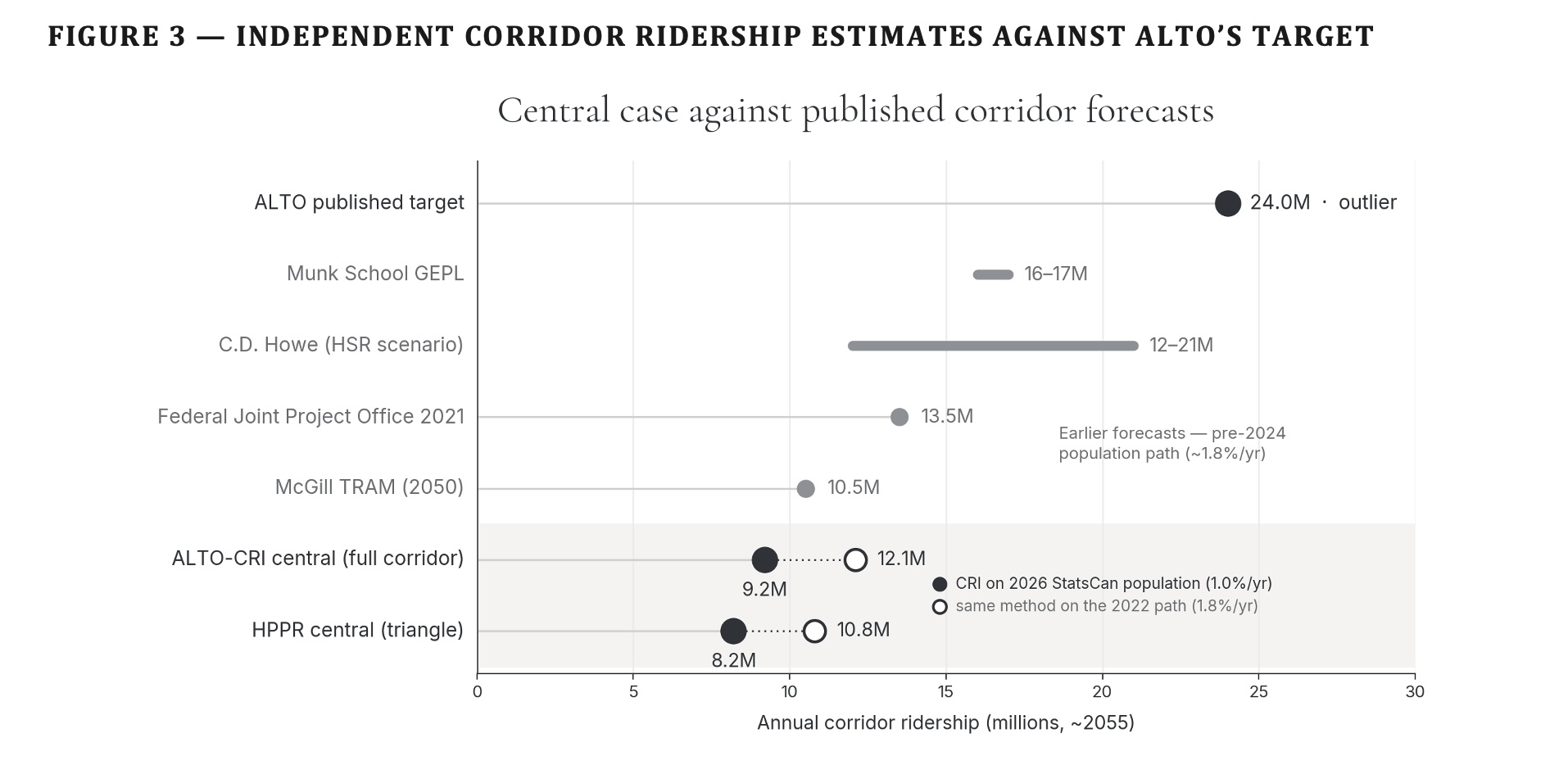
Central independent ridership sits at 8–9 million a year, rising toward 10 at maturity — less than half of Alto’s 24-million target. The three markets a fast service actually converts (car, air, and existing rail) sum to about that level. The reference-class floor from comparable car-dependent corridors is 4–5 million. Alto’s 24-million target stands alone above every published independent forecast.
Download
Undressing the Addressable Market — Full Brief (PDF)
Technical brief with methodology, tables, figures, and full source citations
In an April 17, 2026 opinion piece published in the Toronto Star and La Presse and reproduced on altotrain.ca, Alto’s chief executive set out the demand case for the Toronto–Québec City high-speed line. Its central figures are a headline market of ninety-five million intercity trips a year across the corridor, rising to one hundred and forty million by 2049; a population of eighteen million reaching twenty-two million within fifteen years; and a target of twenty-four million annual passengers by 2055, presented as consistent with international outcomes. The piece is framed to reassure — its very title insists that high-speed rail is no leap of faith.
This brief tests the claim on its own terms. It does not dispute that the corridor is large, that it is growing, or that its intercity system is under strain — all three are true. It disputes the inference the commentary draws from them: that a twenty-four-million forecast is therefore measured, modest, and safe.
Read against three independent bodies of evidence — the corridor’s roadside traffic counts, the population path Statistics Canada now projects, and the international record of what comparable high-speed lines actually carry — the demand case rests on optimistic framing rather than measurement. Where the commentary offers large round numbers and a single favourable analogue, the evidence points to central ridership near a third of the headline, and to a growth story built on a population Canada has already walked back.
What the Evidence Shows
Six findings
The findings rest on four independent methods, each built to be reproducible from public data: a reference class of comparable corridors, a modal-shift ridership model, a market-by-market demand build-up, and a re-basing on Statistics Canada’s current population. A fifth lens — the standard appraisal treatment of optimism bias — governs how all four are read.
Central independent ridership is 8–9 million a year, not 24
Rising toward 10 at maturity. The risk-adjusted floor from comparable car-dependent corridors is 4–5 million. Alto’s 24-million target sits above every published independent forecast of the corridor.
The demand builds from three real sources, not a 95-million abstraction
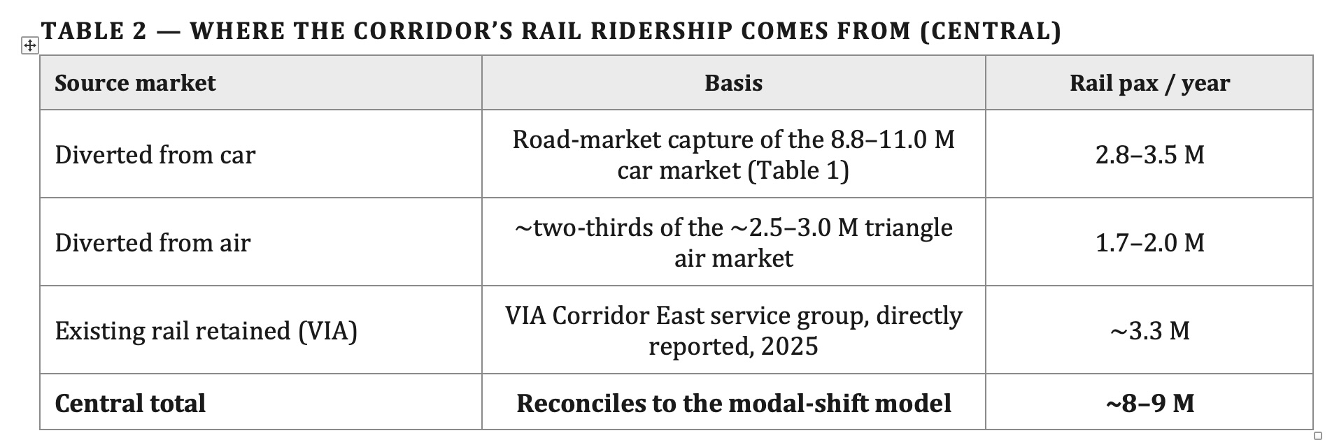
The market a fast service actually converts is measurable: the cars crossing the corridor, the air travellers on the competitive pairs, and the existing VIA riders it retains. Added together — roughly 2.8–3.5 million from car, 1.7–2.0 million from air, and about 3.3 million retained rail (VIA’s directly reported 2025 Corridor East ridership) — they come to about 8 to 9 million. The 95-million figure is an all-modes, all-pairs total that no service captures.
The 95-million figure itself is unsourced
Stated in the commentary without citation, and absent from Fast Forward (March 2025), the Corporate Plan Summary 2024-25 to 2028-29, and the June 2026 What We Heard consultation report. No independent analyst has adopted it. The denominator that anchors the modest-quarter framing is not just broad but unpublished.
The demand-growth story reverses the per-capita trend
Ninety-five to one hundred and forty million over 2026–2049 is about 1.7 per cent a year, faster than the corridor’s own population growth. The gap implies rising travel per resident — against the grain of hybrid work and videoconferencing.
The population base is the pre-cap one
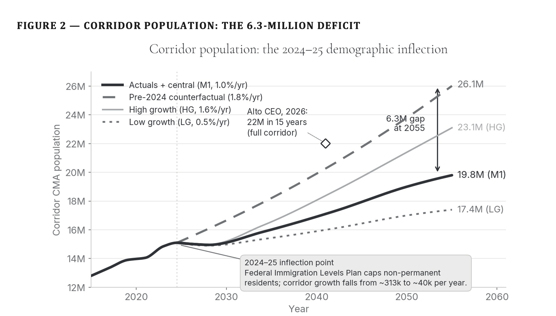
Twenty-two million in fifteen years extrapolates the 2015–2025 immigration surge. Statistics Canada’s January 2026 projection is lower; on the current path the corridor is about 6.3 million people smaller by 2055 than the counterfactual Alto’s numbers assume.
The one comparator offered is a best case
Madrid–Barcelona is among the strongest high-speed successes on record. The honest reference class — the full distribution of high-speed outcomes, many of which undershot their forecasts — brackets the answer far below 24 million.
Method 1 · Reference Class
What comparable corridors actually carry
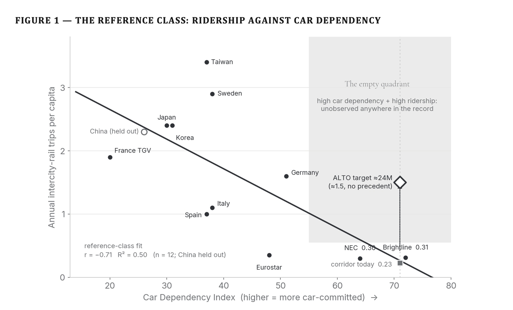
Rather than model the corridor from assumptions, the reference-class method asks what corridors with similar car dependence, density, and trip lengths actually achieve once fast rail opens. Each candidate corridor is scored on a Car Dependency Index (CDI) — a composite of car mode share, population density, and transit provision at the endpoints. The Toronto–Québec City corridor’s high car dependence places it with reference cases that, rescaled to this line, carry the equivalent of roughly 4 to 5 million corridor trips a year at maturity. This is the risk-adjusted floor: what the evidence says the corridor is most likely to do before any speed, fare, or density assumption is layered on.
Figure 1 — The reference class: ridership against car dependency. Comparable intercity-rail corridors scored by their Car Dependency Index. The Toronto–Québec City corridor’s high car dependence places it with reference cases that, rescaled to this line, carry the equivalent of roughly 4 to 5 million corridor trips a year — the risk-adjusted floor.
Methods 2 & 3 · The Three Markets
Demand, counted not modelled
A fast service on this corridor draws from three distinct current populations: the car market, the air market on the competitive city pairs, and the existing rail riders. Each is measurable from public data. Because they are distinct populations, they add without double-counting.
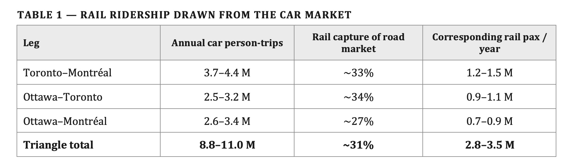
The car market is read at the Highway 401 screenline where it crosses into Québec, after Ottawa-bound traffic has left via Highway 416 and Cornwall-local traffic has loaded, stripped of the 30 to 35 per cent commercial-truck share and short regional trips: roughly 8.8 to 11.0 million end-to-end car person-trips a year across the triangle at an occupancy of 2.0. Applying the road-market capture rates converts these into the rail ridership the car market alone would yield.
Table 1 — Rail ridership drawn from the car market. Capture rates are road-market shares from the modal-shift analysis at a moderate-fare regime; they express rail’s share of the combined car-and-rail market. Only Toronto–Montréal is confirmed by roadside counts; the Ottawa legs are demand-sized.
The car market is only one of three. A fast corridor service also draws from the air travellers on the same city pairs, and it retains the passengers already riding the train. The corridor air market on the competitive pairs — Toronto–Montréal, Toronto–Ottawa, and the smaller Ottawa–Montréal — is on the order of 2.5 to 3.0 million point-to-point passengers a year, of which a fast train on these distances captures about two-thirds.
Existing conventional rail is now reported directly in VIA’s 2025 annual results: 3.34 million passengers a year on the Corridor East service group (Québec City–Montréal–Ottawa–Toronto), within a Québec City–Windsor corridor total of 4.18 million. Essentially all of the triangle share is retained by a faster, more reliable service. VIA’s audited subsidy figures also fix the shape of the trip-length distribution: 48.51 dollars per passenger over 0.22 dollars per passenger-mile is an average trip of about 355 kilometres — roughly a third of the end-to-end corridor distance. Even the passengers already choosing rail are, on average, taking journeys well short of the full corridor.
Table 2 — Where the corridor’s rail ridership comes from (central). Car, air, and existing-rail travellers are distinct current populations, so the three sources add without double-counting. The rail line uses VIA’s Corridor East service group directly, rather than deriving a triangle share of the wider Québec City–Windsor total. The total is the central case around 2055; it rises toward 10 million at maturity as the ramp completes, and remains far below 24 million.
Method 4 · The Population Basis
The 6.3-million deficit
Every ridership figure scales with the population beneath it, so the choice of population path is decisive. The brief uses Statistics Canada’s January 2026 projection (catalogue 17-20-0003), which incorporates the 2024–25 federal Immigration Levels Plan.
Against the pre-2024 growth path that older corridor forecasts — and the commentary’s twenty-two-million figure — assume, this is materially lower: the corridor reaches about 19.8 million by 2055 on the current path, versus 26.1 million on the counterfactual, a deficit of 6.3 million. Because ridership scales with population, a forecast on the old path is inflated by roughly the same proportion the population has been cut — before any question of mode share or capture even arises.
Figure 2 — Corridor population: the 6.3-million deficit. The pre-2024 counterfactual (~1.8%/yr) reaches 26.1 million by 2055; Statistics Canada’s post-cap January 2026 projection (~1.0%/yr) reaches 19.8 million — a 6.3-million gap that every ridership figure scales with. The open diamond marks Alto’s own forecast of 22 million within fifteen years; its implied ~1.35%/yr growth runs above the current path.
Triangulation
Where Alto’s target sits against every independent forecast
The three methods converge. The demand-side build-up sums to about 8 to 9 million a year; the bottom-up modal-shift model lands in the same place; the reference class puts a floor near 4 to 5 million. Set beside the full band of independent corridor estimates, Alto’s 24-million target stands alone above every one.
Figure 3 — Independent corridor ridership estimates against Alto’s target. Annual corridor ridership around 2055. Alto’s 24-million target stands alone above every independent forecast — the Munk School, C.D. Howe, the Joint Project Office, and McGill — and above the Initiative’s own central case (filled markers). The open markers plot the Initiative’s method on the pre-2024 population Alto’s numbers assume; even then it stays within the published band, so the distance is population basis, not method.
The Claim, Audited
Where the 95-million figure appears — and where it doesn’t
A demand denominator on which a $60–90 billion capital commitment rests should be reproducible from published sources. Alto’s is not. The ninety-five-million and one-hundred-and-forty-million figures are stated in the April 2026 commentary without citation and are absent from every canonical planning document the corporation has published.
PresentImbleau, M., “High-speed rail is not a leap of faith: why it matters for Canada’s growth” — Op-ed, Toronto Star and La Presse, April 17, 2026; reproduced on altotrain.ca. The single document in which the 95-million and 140-million figures appear. Stated without citation, methodology, or reference to any underlying study.
AbsentFast Forward: Shaping Canada’s Future with a High-Speed Rail Network (March 2025) — Alto’s own public-facing explanatory document. Discusses ridership growth from ~3 million (2024) to 24 million (2055) and 43 million (2084), but does not reference the 95-million intercity-trip figure or provide any market-total denominator on that scale.
AbsentVIA HFR – VIA TGF Inc., Corporate Plan Summary 2024-25 to 2028-29 (November 2024) — the corporation’s tabled planning document referenced by the Library of Parliament backgrounder on the project. Contains ridership targets (“17 million by 2059” for HFR, before the HSR rebrand) but no 95-million total-market figure.
AbsentJune 2026 What We Heard Report on the corridor study area — Alto’s own summary of the January–April 2026 consultation, running to more than 130 pages. Does not reference a 95-million figure.
AbsentQuarterly Financial Reports through Q3 2025-26 — Alto’s mandatory reporting to Parliament. Does not reference a 95-million figure.
AbsentIndependent published analyses of the corridor — the C.D. Howe Institute’s All Aboard study (March 2026), the Munk School Global Economic Policy Lab’s HSR analysis, Transportation Research at McGill’s corridor demand modelling, and Michael Schabas’s Senate submission on Bill C-15 (January 2026, 65 pp.). None uses the 95-million figure.
The finding does not, on its own, resolve whether the 95-million figure is defensible. It resolves whether the figure is auditable. On the public record as it stands, it is not: no derivation has been published, no methodology has been described, and no independent source has adopted it.
Recommendation
Three things follow
The demand case that anchors a 1,000-kilometre corridor, a $60–90 billion capital commitment, and a multi-decade delivery programme cannot responsibly rest on figures that have not been made auditable. Three steps would meet the standard.
Release the demand model for independent audit
A forecast that anchors an alignment and a multi-decade capital commitment cannot responsibly remain unpublished. In particular, the derivation of the ninety-five-million and one-hundred-and-forty-million intercity-trip figures cited in the April 2026 commentary should be published alongside the underlying model.
Adjust toward the reference class and current population
Standard megaproject appraisal requires promoter forecasts to be adjusted toward the reference class rather than accepted at face value. Alto’s should also be re-based on Statistics Canada’s January 2026 population projection, rather than the pre-2024 path the current forecast assumes.
Size the corridor decision to the audited demand
Not to a ninety-five-million headline or a twenty-four-million target that no independent method reaches. High-speed rail need not be a leap of faith. But the demand case as currently stated is closer to one than the corridor’s own numbers allow.
Download Full Brief
Undressing the Addressable Market (PDF)
Full methodology, tables, figures, basis and limitations, and complete source citations
Every figure in this analysis is drawn from the public sources or companion analyses set out below and is reproducible from them. Sources are grouped by the claim or quantity they support.
1.The claim examined. Imbleau, M., President and Chief Executive Officer of Alto. “High-speed rail is not a leap of faith: why it matters for Canada’s growth.” Commentary, altotrain.ca, April 17, 2026. altotrain.ca. The source, stated without further citation, of the ninety-five-million and one-hundred-and-forty-million intercity-trip figures, the eighteen-to-twenty-two-million population claim, and the twenty-four-million passenger target for 2055.
2.Alto planning documents in which the 95-million figure does not appear. Alto, Fast Forward: Shaping Canada’s Future with a High-Speed Rail Network (March 2025). VIA HFR – VIA TGF Inc., Corporate Plan Summary 2024-25 – 2028-29. Alto, June 2026 What We Heard Report on the corridor study area public consultation. All at altotrain.ca.
3.Companion research, Citizen Research Initiative.Intercity Car Trips Between Toronto, Ottawa and Montréal (2026) — road-side measurement of end-to-end car travel at the Highway 401 Québec-boundary screenline, the per-leg car person-trips of Table 1, and the road-market capture rates of Table 2. HPR Research Report — Ridership (2026) — the demand reference class and Car Dependency Index (Figure 1); the modal-shift model, R = P × μ × s × φ(t); the population basis (Figure 2) and the 6.3-million deficit; and the triangulation against independent forecasts (Figure 3). All at citizenresearch.ca.
4.Traffic and travel-demand data. Ministry of Transportation of Ontario, Provincial Highways Traffic Volumes — annual average daily traffic on Highway 401, sections between the Highway 416 interchange and the Québec boundary. VIA Rail Canada, 2025 Annual Report (Montréal, March 2026): 4.40 million passengers system-wide and 986 million passenger-miles; 4.18 million on the Québec City–Windsor corridor and 3.34 million on the Corridor East service group; audited service-group subsidy figures implying an average Corridor East trip of about 355 kilometres. Statistics Canada, Air passenger traffic at Canadian airports (table 23-10-0253), together with airport-authority passenger statistics for Toronto Pearson, Montréal–Trudeau, and Ottawa Macdonald–Cartier. Transport Canada, Transportation in Canada annual report.
5.Population. Statistics Canada, Population Projections for Canada, Provinces and Territories, January 2026 vintage (catalogue 17-20-0003), which incorporates the 2024–25 federal Immigration Levels Plan; and Census of Population, 2021, for the corridor’s census-metropolitan-area populations. These underpin the 19.8-million (post-cap) and 26.1-million (pre-2024 counterfactual) 2055 corridor figures and the 6.3-million deficit.
6.Comparator corridor forecasts. Transport Canada and the EcoTrain consortium, Updated Feasibility Study of a High-Speed Rail Service in the Québec City–Windsor Corridor (2011). Federal Joint Project Office and the VIA High Frequency Rail baseline (2021). Transportation Research at McGill (TRAM), corridor demand modelling. C.D. Howe Institute (2026), high-speed-rail scenario. Munk School Global Economic Policy Lab, corridor demand. Schabas, M., Alto High-Speed Rail: Conceptual Design and Business Case, Senate submission on Bill C-15 (January 2026). These supply the independent ridership band of Figure 3.
7.Forecasting method and optimism bias. B. Flyvbjerg, “Survival of the Unfittest: Why the Worst Infrastructure Gets Built — and What We Can Do About It” (Oxford Review of Economic Policy, 2009), and related work establishing reference-class forecasting; B. Flyvbjerg and D. Gardner, How Big Things Get Done (2023). HM Treasury (United Kingdom), The Green Book and its supplementary guidance on optimism bias. Oxford Global Projects, reference-class forecasting datasets and practice. UK National Audit Office, successive reports on High Speed 2 (HS2) documenting systematic optimism in demand forecasts and cost escalation.
ALTO HSR Citizen Research Initiative · citizenresearch.ca · Corridor Demand Brief · July 2026
Independent, non-partisan research on the proposed Toronto–Québec City high-speed rail corridor.
Alto’s own freight report builds its economic case on removing passenger trains from the shared Toronto–Montreal corridor — the same line VIA Rail runs through Eastern Ontario.
ALTO HSR Citizen Research Initiative · Research Brief · June 2026
⚠ Companion to “VIA Rail on the Kingston Subdivision”
In April 2026 we set out how Alto would foreseeably erode intercity passenger service on the Kingston Subdivision. Alto’s own June 2026 freight report now supplies the missing piece from the proponent’s side: a business case in which that erosion is not a risk to be managed but a source of value to be captured. Read the April brief →
The finding in brief
In June 2026 Alto published a report, High-Speed Rail and Freight Capacity (CPCS in association with HDR), whose central benefit is the capacity freed by lowering the number of passenger trains on the shared CN corridor between Toronto and Montreal — the Kingston Subdivision that carries VIA Rail through Oshawa, Cobourg, Belleville, Kingston, Brockville and Cornwall.
The benefit grows as passenger service shrinks. In the report’s own words it “would be shared between passenger and freight, depending on the level of passenger rail services that may be maintained on the CN corridor.” The party positioned to decide how much survives is Alto’s own development partner, the Cadence consortium — also slated to operate the corridor’s existing passenger trains. The risk falls squarely on VIA Rail.
The report is right about one thing: separating passenger and freight traffic relieves both. But Alto achieves that separation by removing the passengers. A dedicated passenger spine along the same corridor achieves the same separation while keeping the lakeshore served — the constructive alternative set out below.
The report’s stated purpose is to show how Alto could “generate economic and strategic benefits for freight rail by lowering passenger traffic on the shared corridor.” It documents that the Toronto–Montreal segment runs on CN-owned track with a passenger-to-freight mix close to 50-50, and that passenger trains — because of higher speeds and precise scheduling — consume more track capacity than freight trains.
From this it assembles a set of claimed freight benefits: deferred or avoided capital investment in the CN corridor; headroom to “protect for” 55 per cent higher freight volumes over 30 years; induced freight demand and mode shift; new rail-adjacent industrial development; and roughly $90 million a year in avoided societal costs from shifting one daily intermodal train off Highway 401. Every one of these flows from the same source: fewer passenger trains on the shared line.
The Mechanism
The benefit is the removal of passenger trains
The report is explicit that the enabling condition is fewer passenger trains, and it ties the size of the avoided-investment benefit directly to how much passenger service is cut: the benefit “would be shared between passenger and freight, depending on the level of passenger rail services that may be maintained on the CN corridor.” Read plainly, the fewer passenger paths retained on the Kingston Subdivision, the larger the freight benefit Alto can claim.
The report then treats the retreat of passenger rail as an inducement to development, suggesting that reducing the volume of passenger trains may signal to industry that rail-adjacent parcels have become more desirable. Yet the same report opens with a disclaimer that its introduction is “not assumed to result in the discontinuation of local passenger rail services.” These two positions cannot both hold at full strength: the benefit is defined as the capacity released by removing passenger trains, while the disclaimer promises they will not be removed. The gap is bridged only by soft language — and by recasting intercity trains as “local offerings” that feed the high-speed line.
Who Benefits, and How
Who gains from fewer VIA trains
Freight does gain — that much is the report’s central claim: CN, the freight railway, avoids the spending it would otherwise need to expand its own line. But CN does not decide how much VIA service survives, and it is not the only party that gains. The consortium positioned to make that decision, Cadence, runs no freight and earns nothing from it — its stake is in Alto. So the pressure to thin VIA’s service comes not from freight alone, but from four further interests the report’s framing keeps in the background.
Alto’s ridership depends on it
Cadence is paid to fill Alto, whose business case rests on very high ridership: a target of 24 million passengers a year by 2055 — roughly eight times the three million or so the corridor carries today. The only independent modelling of the route (University of Toronto’s Munk School) projects about 9 to 10 million, and a reference-class adjustment for the ~65 per cent overstatement typical of rail forecasts lands near 8 million. As a single concessionaire with no open-access competition, Cadence has every reason to price for yield, not volume — making a cheaper conventional train on the same corridor competition to be minimized, not preserved.
It makes the case for building Alto look better
The report’s headline “avoided investment” benefit is explicitly larger the more passenger service is cut, inflating the benefit-cost ratio used to justify the project — the very project that gives the consortium’s contract its reason to exist.
It lowers the subsidy the government pays
VIA Rail’s Toronto–Montreal corridor service ran an operating shortfall of about $117 million in 2025 — roughly $50 of public subsidy per passenger, at a corridor cost-recovery ratio near two-thirds (VIA Rail, 2025 Annual Report). Shrinking that service, or folding it into the Alto concession, reduces what the federal funder pays; the party deciding the corridor’s future is also the party writing that cheque.
It sheds the cost of using CN’s track
Passenger trains on the Kingston Subdivision run on CN-owned track under access and cost-sharing arrangements — including, as the report notes, payments to CN to maintain track at passenger speeds. Moving intercity trains onto Alto’s dedicated line sheds those payments.
The gains flow to Cadence, to CN, and to the federal treasury. VIA Rail — and the passengers between Toronto and Montreal — bear the loss.
The Consequence
The risk to VIA Rail
What Alto describes is two passenger railways on one corridor. A dedicated high-speed line, built and operated by Cadence, would carry the fast intercity market. What remains on the Kingston Subdivision — the trains that serve Oshawa through Cornwall — is left as a residual “local” service, running between freight trains on CN-owned track, with no committed frequency and no protected floor.
Under the project’s public-private structure, even that residual service is not assured to remain with VIA Rail: the existing corridor passenger operations, designated the “Local Services” in the procurement, are slated to pass to the same Cadence consortium as feeders to the high-speed line. And this is not a distant hypothetical. VIA Rail’s corridor on-time performance has already collapsed — from 72 per cent to 30 per cent inside a single year — as passenger trains are squeezed on infrastructure the operator does not own.
The National Dimension
The risk reaches the whole network
The danger does not stop at the lakeshore. The Quebec City–Windsor corridor is not merely VIA Rail’s busiest route — it is the financial engine of the entire national network. More than 90 per cent of VIA’s passengers, and about 80 per cent of its revenue, come from this one corridor (VIA Rail, 2025 Annual Report). That revenue is what helps sustain the long-distance and regional trains connecting the rest of the country — Vancouver and Prince Rupert, the Prairies, Churchill, and the Maritimes.
Hand the corridor’s ridership and revenue to a private consortium, and VIA is left, in the words of the federal NDP transport critic Taylor Bachrach, with “the crumbs” — a fraction of the revenue it uses to operate rail across Canada. Alto’s own answer is that corridor services will “eventually” be “integrated with Alto services into a single network”; asked what the loss of that revenue would mean for VIA, the proponent did not say. The choice being made on the busiest corridor, in other words, quietly decides the future of passenger trains in places thousands of kilometres away. CBC News reported the warning.
A Constructive Alternative
A straighter, quieter line
The freight report identifies a real prize: separating passenger and freight traffic on the Toronto–Montreal corridor relieves the mixed-traffic conflict that degrades both. The question is how that separation is achieved. Alto achieves it by removing the passengers — routing a 300 km/h greenfield line inland through Peterborough and Ottawa, past the lakeshore communities entirely, and leaving VIA’s corridor service to wither.
There is a straighter, quieter way to reach the same result. Build a dedicated, lower-speed passenger spine along the existing Toronto–Montreal transportation corridor — the lakeshore route the CN Kingston Subdivision and Highway 401 already follow. Give passengers their own tracks, engineered for reliable service at conventional-to-higher-performance speeds (up to about 200 km/h), and the passenger–freight conflict is resolved the same way — by separation — but without deleting the service the corridor’s communities depend on. The strong Toronto–Montreal market runs fast and reliably on the direct line; Ottawa and Quebec City are reached on upgraded existing track; and Kingston, Cobourg, Belleville, Brockville and Cornwall stay on the intercity network rather than being bypassed. The routing and demand-density case for this spine is set out in our companion brief, A Straighter Line. And because the spine stays in public hands, the fare revenue from the country’s busiest corridor keeps flowing to VIA rather than to a private concession — sustaining, rather than starving, the national network it helps fund.
Alto as planned
A dedicated passenger spine
A 300 km/h greenfield line detouring inland via Peterborough and Ottawa, roughly 900 km of all-new track.
A direct passenger line along the existing lakeshore corridor, far less new build, largely alongside the rail line and Highway 401 already there.
Cobourg, Belleville, Kingston, Brockville and Cornwall are bypassed entirely.
The lakeshore communities stay on the intercity network, served on the way through.
Today’s VIA corridor service is demoted to a residual “Local Service,” slated to the private concession, with no protected floor.
The corridor service is the spine — upgraded, reliable, and kept in the public interest.
Freight relief is delivered by removing passenger trains from the shared line.
Freight relief is delivered by giving passengers their own dedicated line within the existing corridor.
Operated by a single private consortium pricing for premium yield, with a $60–90 billion cost baseline.
Operated in the public interest at affordable conventional fares, at a fraction of the greenfield cost.
Corridor fare revenue flows to the private concession, weakening the cross-subsidy that helps fund VIA’s national network.
Corridor revenue stays in the public system, where it can keep supporting long-distance and regional service across Canada.
In plain language
The freight report is right that passengers and freight should not have to fight over the same tracks. But there are two ways to end that fight: take the passengers away, or give them their own line. Alto takes them away — and prices the loss as a benefit.
The alternative keeps the trains and separates the traffic: a dedicated passenger spine down the existing Toronto–Montreal corridor, reliable and affordable, serving the lakeshore towns Alto would leave behind. It delivers the genuine freight dividend the report identifies — without the vanishing train.
Sources
Primary sources
1
High-Speed Rail and Freight Capacity: Potential Freight Benefits of Alto (June 2026). Prepared for Alto by CPCS in association with HDR. Cited pages: 5, 6, 8, 11, 18, 19. Read the report.
2
VIA Rail on the Kingston Subdivision: Service Erosion, Funding Collapse, and the National Rail Risk from ALTO HSR (April 2026). ALTO HSR Citizen Research Initiative. Read the brief.
3
VIA Rail Canada, 2025 Annual Report — Toronto–Montreal corridor operating shortfall of roughly $117 million, per-passenger subsidy of about $50, and corridor cost recovery near two-thirds.
4
On the ridership targets: this Initiative’s ridership analysis, setting Alto’s stated 24 million (2055) and 43 million (2084) figures against the corridor’s current ridership of roughly three million; the University of Toronto Munk School (Global Economic Policy Lab) independent projection of about 9 to 10 million; and the reference-class forecasting literature (Flyvbjerg) finding rail ridership overstated by an average of 65 per cent.
5
On the operating model and the transfer of corridor “Local Services” to the private consortium: Government of Canada, “Canada is getting high-speed rail” (news release, 19 February 2025); Transport Action Canada, “Cadence wins $3.9B High-Speed Rail development contract” (2025).
6
On the national-network risk: A. Kurjata, “NDP warns privatizing high-speed rail from Toronto to Quebec could kill passenger trains in rest of Canada,” CBC News (19 February 2025) — corridor revenue as roughly 80 per cent of VIA’s total; MP Taylor Bachrach’s warning on cross-subsidy of national service.
7
A Straighter Line (June 2026). ALTO HSR Citizen Research Initiative — routing and reference-class demand-density analysis for the dedicated passenger spine.
What the ranking actually measures — and the route it does not describe.
ALTO HSR Citizen Research Initiative · Research Brief · Published June 2026
⚠ Source: Disclosed under the Access to Information Act
The slide below is page 206 of a 294-page record released by the Canada Infrastructure Bank under access request A-2022-005 — a request for all studies, analyses, and reports related to the federal government’s high-frequency and high-speed rail file, disclosed in part. The briefing deck it belongs to is stamped “Privileged and Confidential — Do Not Share and/or Copy,” and its own footer marks it “DRAFT.” Adjacent pages were withheld under the Act’s economic-interest and advice exemptions (s. 18 and s. 21). The deck, as disclosed, is posted in full here: Ministerial Briefing — HFR and HSR (PDF).
The marking is part of the point: this is a draft analysis the department preferred not be seen, and it is the evidence being used to vouch for the corridor.
Section 4.2, “Success Factors: Where HSR Works Best.” Page 206 of the Canada Infrastructure Bank release, A-2022-005 (disclosed in part; marked DRAFT). The three highlighted bars are Toronto–Montreal, Toronto–Ottawa, and Montreal–Quebec City.
The finding in brief
The slide ranks Toronto–Montreal sixth among North American city pairs for high-speed rail demand. The ranking is real. What it measures is the market between two endpoint metros — not the route now being built.
The number describes the direct Toronto–Montreal corridor. The alignment taking shape runs Toronto–Peterborough–Kingston–Ottawa–Montreal — a longer, meandering route. On the very methodology the slide cites, every one of those detours lowers the score rather than raising it. And the segment actually proceeding first, Ottawa–Montreal, does not appear on the chart at all.
The Methodology
What the ranking measures
The “sixth in North America” figure comes from America 2050’s screen of tens of thousands of city pairs, a methodology published in full by the Regional Plan Association. It scores the market between two endpoint metros: downtown employment, population density, transit reach, and the existing air and road travel between them. On those inputs Toronto–Montreal scores well. The endpoints are large, dense, and already heavily travelled.
Two features of that method decide everything that follows, and both are explicit in the source.
It is calculated per mile. Adding distance without adding a major generator pulls a corridor’s score down, not up. The screen normalizes precisely so that longer routes cannot coast on length.
Intermediate stations only help when they are themselves large. The report is clear that longer corridors out-rank shorter ones only when the cities in between are medium or large generators. Otherwise the additional miles are a penalty. The top-ranked corridor on the chart, New York–Washington, scores as it does because the dense intermediate cities of Philadelphia and Baltimore sit directly on the shortest path between the endpoints.
The Route
The corridor on the chart is not the corridor being built
The favourable score belongs to the direct Toronto–Montreal market — the existing lakeshore line, the shortest path, with a dense string of intermediate communities along it. The alignment now taking shape is the opposite of that. From Toronto it runs north to Peterborough; then — assuming the Kingston stop and southern routing the federal government added to its consideration in June 2026 come to pass — it doubles back south to Kingston, climbs north again to Ottawa, and drops south once more to Montreal. The result is a corridor that zigzags between its cities rather than running directly between its endpoints.
The projected Toronto–Quebec City corridor. Rather than following the direct lakeshore line, the alignment meanders — north to Peterborough, south to Kingston, north to Ottawa, south to Montreal, and on toward Quebec City.
The direct corridor (what the bar scores)
The alignment being built
Toronto–Montreal, direct. The existing Lake Ontario lakeshore line, on the order of 540 km — the shortest path between the two endpoints.
Toronto–Peterborough–Kingston–Ottawa–Montreal. Roughly 610 km via Ottawa — about 13 per cent longer for the identical endpoints, and longer still with a Kingston dogleg. (This path assumes the Kingston stop and southern routing added to federal consideration in June 2026 proceed.)
Dense intermediate string. Oshawa, Cobourg, Belleville, Kingston — population and employment added steadily along the path.
Sparse flanks, weak axis. Peterborough is small and the stretches on either side of it are thinly populated; reaching Ottawa means importing the Toronto–Ottawa axis the same chart ranks near the bottom.
Highest possible per-mile score for these two endpoints.
A lower per-mile score: more kilometres, less density per kilometre, and a low-scoring leg folded in.
There is a particular irony in Kingston. It is the natural intermediate city on the direct corridor — precisely the stop that would have helped the Toronto–Montreal score. The chosen alignment runs north to bypass it. Now it is being considered for re-inclusion, bolted back onto a route designed to avoid it.
On the Method’s Own Terms
What each detour does to the score
Re-run the published methodology on the alignment actually on the table, and the per-mile score falls below the sixth-place bar. Each of the route’s defining choices works against it:
Length is a straight penalty
Per-mile normalization spreads the same Toronto and Montreal endpoint demand over more kilometres. A longer, more circuitous route scores lower for the identical endpoints — that is what the normalization is designed to do.
Peterborough adds miles faster than density
Intermediate stops only lift the score if they add population and employment per kilometre faster than the corridor’s average. Peterborough is too small, and the stretches on either side are sparse, so it adds length faster than it adds riders — a net penalty.
A Kingston dogleg is more of the same
Re-adding the one city the alignment was routed to avoid means a southern detour off the northern line: a modest generator bought with extra kilometres — again, length outpacing density.
Reaching Ottawa imports a weak leg
Ottawa is the one genuine generator among the added stops. But reaching it is the Toronto–Ottawa axis the same chart already ranks near the bottom of its field. The detour swaps the strong direct Toronto–Montreal axis for a leg the deck itself scores as weak.
Sequencing
What is actually being built first
There is a further mismatch between the headline number and the build. The first segment to proceed is not Toronto–Montreal at all — it is Ottawa–Montreal, confirmed in December 2025 as the opening phase, with construction targeted for 2029. Ottawa–Montreal does not appear anywhere on the chart.
And by the government’s own account, it was chosen first not for demand but for buildability: a relatively short and straight portion of the overall route, since high-speed trains do not handle curves well — the same logic that led California to build its first section across the flat Central Valley, avoiding tunnelling and urban construction. A constructability rationale, not a ridership one.
The corridor that scores sixth, Toronto–Montreal, is only realized once the full line is complete — including the Toronto–Ottawa leg that sits near the bottom of this very chart — work not expected to finish until the 2040s. So the headline ranking and the actual build diverge twice over: the number describes a market the first segment does not deliver, assembled from legs the chart scores unevenly, with the strongest part of the case deferred to last.
In plain language
Strip away the methodology and the point is simple. The federal government’s own briefing says high-speed rail makes the most sense between Toronto and Montreal — two large cities with heavy travel between them. It says nothing in favour of the winding route now being built.
That route keeps collecting stops the demand evidence does not support: north to Peterborough, a proposed southern dogleg to Kingston, and Trois-Rivières on the Quebec leg. Each one adds distance and cost while the case for the line still rests on the direct Toronto–Montreal market. When stations are added that do not earn their place on the numbers, the usual explanation is political — spreading the visible benefits of a marquee project across as many communities as possible to assemble support for it.
This is one of the central problems with the project, and it is a familiar one. Bent Flyvbjerg’s research on megaprojects — the body of work behind this Initiative’s reference-class approach — finds that large infrastructure projects routinely run over budget and under-deliver because their scope and routing are shaped by political bargaining and the need to sell the project, rather than by the demand evidence. A corridor designed around who gets a station rather than where the riders are is precisely the pattern that research warns about.
In Summary
What the slide does and does not say
The “sixth in North America” finding endorses a Toronto–Montreal market. It says nothing in favour of the Peterborough-routed, Kingston-doglegged, Ottawa-and-Montreal-served alignment. On the methodology’s own terms, those inclusions are exactly the choices it would mark down.
A strong endpoint market is a real asset. It is not the same thing as a strong route — and a briefing that uses the first to vouch for the second is measuring the wrong thing. That the slide is marked “DRAFT,” and that adjacent pages were withheld under the Act’s economic-interest and advice exemptions, only sharpens the question: this is the analysis on the record, and on its own terms it does not say what it is being used to say.
A note on method. The deck describes its result as a “sample calculation.” The disclosed page does not show how the path was drawn or scored. The standard America 2050 methodology and the headline result both point to the direct corridor as the basis for the sixth-place figure; if the underlying calculation is obtained, the path it used is the detail to confirm.
Anticipated Objection
“Doesn’t the line serve all those city pairs — Toronto–Ottawa, Ottawa–Montreal, Montreal–Quebec — not just Toronto–Montreal? Combine them and the project makes sense.”
It is true that a corridor serves a whole matrix of city pairs, not only its endpoints. But that observation concedes the point rather than answering it. The “sixth in North America” figure is the score for the direct Toronto–Montreal pair. The moment the case leans on Toronto–Ottawa, Ottawa–Quebec, and Toronto–Quebec, it is no longer resting on that figure — and those are precisely the legs the same chart rates weakest: Toronto–Ottawa sits second from the bottom, Montreal–Quebec City is last, and Ottawa–Quebec, Toronto–Quebec, and Ottawa–Montreal do not appear on it at all.
Two things make “combine the figures” fail on the slide’s own terms. The bars are demand-strength rankings — built from population, GDP, density, and corridor length — not passenger counts that can be summed; a sixth-place pair plus a near-last pair does not add up to a stronger corridor. And because the screen normalizes per mile, stringing the one strong pair onto a longer, detouring alignment spreads the same demand across more track-kilometres, which lowers the score rather than raising it.
The logic in fact argues for the line this brief describes. If the goal is to capture Toronto–Montreal and the markets in between, the alignment that does it best is the direct lakeshore corridor — it serves the sixth-place pair at full strength and threads a dense string of real intermediate cities (Oshawa, Cobourg, Belleville, Kingston) on the way. Adding up the pairs does not rescue the meandering route; it makes the case for the direct one.
Sources
Primary documents and statements
1.
Canada Infrastructure Bank, completed access-to-information release A-2022-005 (disclosed in part), “Success Factors: Where HSR Works Best,” draft briefing slide, page 206. Released under the Access to Information Act; deck marked “Privileged and Confidential — Do Not Share and/or Copy” and “DRAFT.” View the disclosed deck (PDF)
2.
America 2050 / Regional Plan Association, High-Speed Rail in America, January 2011 — the published methodology scoring rail corridors by ridership demand on a per-mile basis.
3.
America 2050, Where High-Speed Rail Works Best — the precursor study of city pairs that the briefing slide reproduces.
4.
Transport Canada / Alto, “Full speed ahead: Ottawa–Montreal chosen as starting point for Alto High-Speed Rail,” December 12, 2025. canada.ca · altotrain.ca
5.
“First segment of Canadian high-speed rail to be built between Montreal, Ottawa,” Trains, December 12, 2025 — carries the Minister of Transport’s rationale for selecting the segment as a short, straight portion of the route. trains.com
6.
“Ottawa-Montreal chosen as 1st segment of promised high-speed rail line,” CBC News, December 12, 2025 — remaining segments (Quebec City–Montreal and Ottawa–Toronto) to begin at a later, unspecified date. CBC News
7.
Federal government statement, June 22, 2026, indicating an additional stop at Kingston would be considered for the corridor.
8.
Bent Flyvbjerg, Nils Bruzelius & Werner Rothengatter, Megaprojects and Risk: An Anatomy of Ambition (Cambridge University Press, 2003); Flyvbjerg, “Survival of the Unfittest: Why the Worst Infrastructure Gets Built — and What We Can Do About It,” Oxford Review of Economic Policy 25, no. 3 (2009): 344–367; and Flyvbjerg, “Design by Deception: The Politics of Megaproject Approval,” Harvard Design Magazine no. 22 (2005) — on strategic misrepresentation, perverse incentives, and the political shaping of megaproject scope and routing.
A plain-language guide to how we evaluated the cost of the proposed ALTO high-speed rail line — starting from one simple rule that every railway in the world has to obey, and following it through to a number the government’s own claims do not match.
ALTO HSR Citizen Research Initiative · Financial Framework · Published May 2026
⚠ What this is
This is the readable version of a longer technical paper. The full document and slide deck show every calculation; this post explains, in everyday terms, what we did, why, and what we found — with no maths background assumed.
The short version: the project’s likely capital cost is roughly double what the government has stated; the trains cannot pay for themselves at any realistic ticket price; and the project’s headline ridership target of 24 million passengers a year sits outside the range that any comparable line has ever achieved.
The one idea to take away
Every operating railway in the world has a bill that has to balance every year. What it costs to build and run the line on one side; where the money to cover that comes from on the other. The money can only come from three places: ticket sales, a government subsidy, or value captured from land near the stations.
You can argue about any single number. What you cannot do is leave one side of the bill short. If a proponent quotes you a low cost and a high number of riders but never tells you the subsidy, the subsidy is simply the part of the bill they haven’t shown you — it doesn’t disappear. Our whole method is just: fill in every blank on the bill using independent evidence, and see what the missing number turns out to be.
Read in full
A Framework for Independent Evaluation of the ALTO HSR Project
The complete methodology, every rubric and dataset, and a slide deck version — all published and reproducible
Imagine your household budget. Whatever you spend has to be matched by money coming in — from your salary, your savings, a loan. A railway is no different, just bigger. There are two kinds of cost: the enormous one-time cost of building the line (paid off gradually, like a mortgage), and the ongoing cost of running it every year — staff, electricity, maintenance, replacing worn-out trains.
Those costs have to be paid for. There are only three sources. Here is the whole thing on one line:
The annual fiscal ledger
Cost to build (yearly share) + cost to run=ticket sales + government subsidy + land value capture
The left side is what the railway costs each year. The right side is where that money comes from. The two sides must be equal — that’s what “balance” means.
In plain terms
“Land value capture” means a railway can sometimes raise money from the rise in nearby land prices that a new station creates — for example by developing land around the station. It’s a real tool, but a modest one in Canada, and ALTO has named no such mechanism. So for ALTO that third source is effectively zero, which leaves only two: tickets and subsidy.
Here is the consequence that does all the work. Once you’ve pinned down the cost, the ticket revenue, and the land capture using evidence, the subsidy isn’t a choice anyone gets to make — it’s whatever is left over to make the bill balance. It’s a leftover, not a decision. That single insight is why a project can claim to be “self-sustaining” and still, on its own numbers, need billions of dollars of public money a year. The subsidy was always there; it just wasn’t written down.
The Method
Seven steps to fill in the blanks
To fill in each part of that bill honestly, we built a seven-step process. Each step answers one question using published evidence rather than the project’s own marketing, and each step shows its work so that anyone who disagrees can re-run it with their own assumptions. Here is what each step asked, and what it found for ALTO.
1
How hard is this to build?
Engineering complexity, compared to rail lines around the world
We scored the corridor’s technical difficulty against an international database of comparable projects. ALTO lands in the upper “High” band — among the most demanding corridors anywhere in the world. Hard things cost more and run late more often; this matters for every number that follows.
2
How smooth will getting it approved and built be?
Community, consultation and consent risk
We measured the friction the project faces from communities, landowners and the consultation process. The score lands in the band where comparable megaprojects’ cost overruns tend to cluster — another reason to expect the final bill to climb.
3
What will it really cost to build?
Capital cost, calibrated against similar projects
The government states $75 billion. Comparing ALTO to a reference class of similar railways and adjusting for its difficulty, our central estimate is $143 billion — nearly double — with a worst-case ceiling of $264 billion. The stated budget sits at the very bottom of the plausible range.
4
What will it cost to run, every year?
Operating cost, built up from the actual assets
Adding up staff, operations, maintenance and replacing trains as they wear out gives about $2.15 billion a year. To cover just that running cost from fares, the line would need roughly 12.5 million passengers a year — and even then it only recovers about 80 cents of every dollar.
5
How many people would actually ride it?
Realistic ridership, and the subsidy that follows
Based on how many travellers comparable lines actually pull off the roads and out of the air, a realistic range is 5 to 12 million riders a year, with a sensible target near 8 million. ALTO’s headline figure of 24 million sits outside that range entirely.
6
Is it worth it?
Benefits weighed against costs
Weighing all the benefits against all the costs gives a ratio of about 0.11 — roughly eleven cents of benefit for every dollar spent. To make the 24-million target pay, tickets would need to cost between $381 and $1,596 — and 24 million riders is unreachable anyway.
7
Would a serious gatekeeper approve it?
Tested against Norway’s independent project-review system
Norway runs big projects through two independent quality gates before funding. Run through those gates, ALTO fails most of the criteria at both stages — described as a textbook example of exactly the kind of project the Norwegian system was built to catch.
What “reference class” means
Rather than trust a project’s own optimistic forecast, you line it up against a large group of similar projects that have already been built, and ask: what actually happened to those? It is one of the most reliable ways known to forecast cost and ridership, precisely because it sidesteps wishful thinking.
The Headline Figures
Three numbers that frame the whole thing
Cost to build
$143B
Our central estimate — against a stated budget of $75B
Value for money
11¢
Of benefit returned per dollar spent (a benefit-cost ratio of 0.11)
Ridership gap
24M
The stated target — against a realistic ceiling near 12M
None of these is a guess plucked from the air. Each one is the output of one of the seven steps above, and each step publishes the data and the scoring behind it. The point of putting them together is simple: a project whose costs are understated, whose value-for-money is low, and whose ridership is overstated does not become viable just because its three weaknesses are described in separate documents.
The Part Nobody Mentions
No ticket price makes the bill disappear
Here is where the “bill that has to balance” idea pays off. There is a temptation to think the subsidy could be designed away — charge higher fares, or fill more seats. So we tested the three obvious strategies. In every case, a large public subsidy remains. The only thing that changes is how the cost is split between the passenger and the taxpayer.
Charge premium fares
~$1B / yr
Trade-off:High ticket prices, so fewer riders. Lowest subsidy — but still about a billion a year.
Match airline fares
~$2B / yr
Trade-off:Prices in line with flying. A moderate middle path — roughly two billion a year.
Deep discounts, fill seats
~$3.5B / yr
Trade-off:Cheap tickets, more riders — but the lowest fares mean the largest subsidy.
Notice what this means. Choosing among these isn’t a choice between “subsidised” and “unsubsidised” — every option is subsidised. It’s only a choice about who pays: the rider at the ticket window, or the taxpayer through the public purse. That is a perfectly legitimate political decision to make out in the open. What isn’t legitimate is pretending the choice doesn’t exist.
And that is exactly why one specific government claim does not hold up. On 22 April 2026, the government stated the operation would be “financially self-sustaining” — meaning fares alone would cover running costs. But no realistic level of ridership produces enough ticket money to cover the $2.15 billion annual running cost. Measured against every comparable high-speed line operating in the world, that claim simply isn’t consistent with the evidence.
The Bottom Line
What the filled-in bill shows
Put the seven steps together and the picture is consistent, not cherry-picked:
Roughly double the cost
The likely cost to build is about twice the stated budget — and the stated figure sits at the bottom edge of what’s plausible.
Cannot pay its own way
At no realistic fare do ticket sales cover even the cost of running the trains, let alone building the line.
Eleven cents on the dollar
The central value-for-money ratio is about 0.11 — far below the level at which a project is normally considered worthwhile.
A ridership target out of reach
The 24-million figure lies outside the range any comparable line has achieved, and the subsidy is required no matter what.
Measured against Norway’s independent review standard — one of the most respected gatekeeping systems for large public projects — ALTO fails the majority of the tests at both the early-concept stage and the pre-funding stage.
In Fairness
This is a recommendation, not a verdict
It matters how this is meant to be read. The seven-step process produces a recommendation, not a decision. The decision belongs to elected officials and the public — ideally informed by an independent authority such as the Parliamentary Budget Officer.
The purpose of all this work is narrow and, we hope, fair: to put a balanced, contestable record on the table, so that the choice about which rail corridor Canada builds rests on evidence rather than on headline numbers. Every step publishes its rubric, its scoring, and its data. If you disagree with any finding, you are invited to re-run it under your own assumptions — that openness is the whole point.
A good public investment can survive this kind of scrutiny. The questions below are the ones any major rail proposal should be able to answer plainly.
On cost: If the stated budget sits at the bottom of the plausible range, what is the realistic central figure — and what happens to the case if the cost lands there?
On the subsidy: Since fares cannot cover running costs at any realistic ridership, what annual public subsidy is the government planning for, and who decided how to split the cost between riders and taxpayers?
On ridership: What evidence supports 24 million riders a year when comparable lines top out far below that — and what does the business case look like at a realistic 8 to 12 million?
None of these questions presupposes opposition to passenger rail, which many people support. Each asks only that the project state plainly what its own numbers imply — so the public can weigh a real proposal rather than a hopeful one.
Read the full framework
A Framework for Independent Evaluation of the ALTO HSR Project
The complete methodology, the seven-stage pipeline, and every rubric, score and dataset — published and reproducible
Citizen Research Initiative · Modal Shift Analysis · Note 3
The Ridership Envelope for the ALTO Corridor, 2035–2080
What can the corridor actually carry? Population times trips-per-resident times modal share, scaled by a realistic phased opening — and measured against ALTO’s published 24-million target and every other independent forecast.
ALTO HSR Citizen Research Initiative · Modal Shift Note 3 · Published May 2026
⚠ What This Note Examines
This note builds a 45-year ridership envelope from three multiplicands — corridor population, per-capita intercity trips, and ALTO’s modal share under three fare-and-subsidy regimes — using the modal-shift machinery from the two companion notes on rail–air and rail–car substitution, and scaling the result by ALTO’s announced three-phase opening.
The resulting envelope is then compared against ALTO’s published forecasts, the McGill TRAM stated-preference projection, the Munk School GEPL model, the C.D. Howe scenario analysis, and the federal government’s own 2021 Joint Project Office business case.
Summary
The corridor population baseline is about 14.9 million across the directly-served CMAs in 2025. The 2024–25 federal cap on non-permanent residents produced a structural inflection — Toronto’s CMA shrank by ~1,000 people in 2024–25 after gaining 269,000 the year before — creating a credible lower trajectory (0.5%/yr) that did not exist in pre-2024 forecasts and bounding the upper trajectory (1.6%/yr) below pre-2024 expectations.
Three regimes span the policy envelope: heavy subsidy ($2.5–4.5B/yr, ~38–42% capture), moderate subsidy at parity with air ($1.5–2.5B/yr, ~28–32% — the canonical business-case configuration), and minimal subsidy under P3 yield management ($0.5–1.5B/yr, ~20–23%). The combined envelope at mature operation runs from 6.1 to 25.7 million by 2080, central case 12.5 million. The 2055 reading — ALTO’s headline year — is 3.7 to 17.2 million, central case 9.2 million; the corridor is not yet at mature operation in 2055 under the announced phasing.
ALTO’s published 24-million-by-2055 figure sits ~40% above the upper bound for 2055 and is incompatible with the announced phasing under any plausible ramp curve. Every forecast built from a disclosed methodology — TRAM, Munk GEPL, the federal JPO — sits within or close to the CRI envelope. ALTO’s published targets are the outlier against every other forecast for the corridor.
Download
Modal Shift Note 3 — Ridership Envelope Research Note (PDF)
The full note with all figures and tables: the population trajectories, the three regimes, the phasing and ramp framework, the 2035–2080 envelope, and the comparison with every published forecast
ALTO’s annual ridership in any year is the product of three quantities: the corridor population served, the average number of intercity trips each resident makes per year across air, rail and car, and ALTO’s share of those trips. Forecasting ridership therefore means forecasting each multiplicand and combining their realistic ranges into an envelope of outcomes.
The two companion notes supply the modal-share machinery. Note 1 derives the air-substitution S-curve and locates the corridor’s three rail scenarios on it at travel time and price. Note 2 extends the framework to road–rail under a North American calibration anchored on VIA’s 13% rail share against road, and develops the price-ratio, group-size, gas-price and reliability sensitivities. What the two notes do not provide is the population denominator that converts share into absolute volume, the per-capita trip generation that scales the market with demographic change, the temporal phasing that distinguishes opening-year from mature ridership, and the explicit fare-and-subsidy regimes. This note adds those four pieces.
Ridership = corridor population × intercity trips per capita × ALTO modal share, scaled by ramp-up. Each multiplicand has a defensible range. The envelope combines them.
2 · Population
The baseline and the 2024 demographic break
ALTO directly serves CMAs from Toronto to Québec City. The 2025 baseline is about 14.9 million — Toronto (7.10M), Montréal (4.62M), Ottawa-Gatineau (1.55M), Québec City (0.86M), plus the smaller served centres (~0.8M combined).
The 2024–25 demographic year produced a structural inflection. The federal Immigration Levels Plan announced in October 2024 was the first to cap temporary residents, requiring a multi-year drawdown. The effect on the two largest CMAs was immediate: Toronto’s CMA shrank by ~1,000 people in 2024–25, following a gain of 269,000 the year before, and Greater Golden Horseshoe growth collapsed from ~313,000/yr to ~40,000. This is a structural break from the baseline pre-2024 forecasts assumed — it invalidates the linear extrapolation of the 2022–24 surge.
Table 1. Three population trajectories for the directly-served corridor CMAs, anchored on the 2025 baseline of ~14.9M. The central trajectory is the working assumption for the envelope; the upper and lower trajectories define the population-side bounds. Anchored on StatCan’s January 2026 projections (LG / M1 / HG scenarios) with a ~0.4-point corridor-CMA growth premium.
Trajectory
Annual growth
2050
2080
Driver
Lower
0.5%
16.9M
19.6M
NPR drawdown is structural; aging accelerates
Central
1.0%
19.1M
25.7M
NPR drawdown is one-off; immigration normalises
Upper
1.6%
22.2M
35.6M
Pre-2024 pace partly resumes after political cycle
Figure 1. Corridor population trajectories, 2025–2080, comparing pre-2024 (dashed) and post-2024 (solid) demographic assumptions on the same axis. The dashed lines represent the population input comparable published forecasts used; the solid lines reflect the 2024 federal cap and the StatCan data released January 2026. By 2080 the gap is striking — ~50M vs 35.6M (upper), 33.8M vs 25.7M (central), 23.1M vs 19.6M (lower). The post-2024 upper trajectory sits below the pre-2024 central across much of the horizon. Roughly 15 to 25% of the gap between the CRI envelope and the other forecasts is attributable to this single demographic correction alone.
The trajectories are anchored on Statistics Canada’s official projections (released 27 January 2026), with a ~0.4-point corridor-CMA growth premium reflecting the directly-served CMAs’ historically faster growth — population-weighted ~1.8%/yr over 2000–2025 against the national 1.23%, moderated for Quebec’s projected demographic-weight decline and the Western redirection of interprovincial migration. The 0.4-point premium is a deliberately conservative reading, chosen so the envelope is not vulnerable to the argument that it underweights the corridor’s growth advantage.
3 · Trip Generation
Per-capita intercity trips
The three principal pairs together carry ~19.9 million annual person-trips across air, rail and car (Note 2). Adding the secondary pairs and intermediate-station traffic brings the addressable market to about 25 million annual person-trips — against a 2025 population of 14.9 million, a per-capita rate of about 1.68 trips per resident per year.
Over a 45-year horizon, competing effects roughly cancel. Hybrid work has structurally reduced corridor business travel below the pre-pandemic baseline, and AI-mediated meetings continue to erode marginal demand for in-person business travel — the literature consistently finds business travel adjusts more elastically to communication technology than leisure travel does. On the supporting side, urbanisation, economic concentration into the corridor, and rising affluence in the secondary centres lift demand. The net effect is roughly stable to mildly declining; this note uses a range of 1.6 to 1.8 trips per capita, central case ~1.7.
4 · Modal Share by Regime
Three fare-and-subsidy regimes
ALTO’s share of the addressable market is the third multiplicand — and the dimension on which the corridor decision turns most directly. The aggregate share is a weighted blend across air, current rail and car markets on the three principal pairs, with realistic group composition (a mix of solo, couple and family travellers) rather than the solo-traveller readings that anchor the time-and-price geometry.
A
Heavy operating subsidy — low fares
Fares at VIA-equivalent levels (rail-to-air ratio 0.4–0.5; per-person rail-to-car ~1.0 solo), capital absorbed into the public account. Annual subsidy $2.5–4.5 billion. Captures ~85% of the air market, ~100% of existing VIA demand, ~22% of the rail+car market on a group-weighted basis. Aggregate share: ~38–42%.
B
Moderate subsidy — parity with air (canonical)
Fares at parity with air (rail-to-air ratio ~1.0; per-person rail-to-car ~2.0–2.4 solo). Annual subsidy $1.5–2.5 billion. Captures ~70% of air, ~95% of existing VIA demand, ~9–11% of rail+car. Aggregate share: ~28–32%. This is the configuration under which the 24-million headline is implicitly framed.
C
Minimal subsidy — P3 yield management
Fares above air parity (rail-to-air ratio 1.1–1.4; per-person rail-to-car 3–4 solo, above 12 for a family of four). Annual subsidy $0.5–1.5 billion — still positive, because the fully self-funded P3 model is not survivable arithmetic at any modal share consistent with the framework. Captures ~50% of air, ~80% of existing VIA demand, ~4% of rail+car. Aggregate share: ~20–23%.
Table 2. Three fare-and-subsidy regimes, with implied modal capture and aggregate share of corridor person-trips. The factor-of-two range across regimes operates independently of the infrastructure choice — the same physical asset produces double or half the ridership depending on the fare-and-subsidy decision. No regime delivers self-funding at any modal share consistent with the framework.
Regime
Fare structure
Annual subsidy
Air capture
Car capture
Aggregate share
A — Heavy
T–Mtl ~$80–130; rair ≈ 0.4–0.5
$2.5–4.5B/yr
~85%
~22%
38–42%
B — Moderate
T–Mtl ~$150–220; rair ≈ 0.9–1.0
$1.5–2.5B/yr
~70%
~9–11%
28–32%
C — Minimal
T–Mtl ~$220–350+; rair ≈ 1.1–1.4
$0.5–1.5B/yr
~50%
~4%
20–23%
5 · Phasing & Ramp
Opening-year is not mature-year
Ridership in any specific year depends on three timing variables: the construction schedule, the segment opening sequence, and the ramp curve on each opened segment. The 2026–2034 period is consumed by consultation, environmental assessment, expropriation, design, P3 negotiation and enabling works — none of it revenue service. Canadian P3 megaproject experience (Eglinton Crosstown, Confederation Line, Ontario Line) suggests timelines slip rather than compress; the earliest plausible phased opening is ~2038, central scenario closer to 2040.
Phase 1 — Montréal–Ottawa
Opens first: shortest (~190 km), simplest engineering, but the smallest pair. Serves only the Ottawa–Montréal demand pool (~20% of corridor) — it cannot draw Toronto flows because Toronto isn’t connected yet. Early-year ridership is structurally small.
Phase 2 — Toronto extension
The demand inflection point. Adds ~450 km and unlocks Toronto–Ottawa and Toronto–Montréal — ~60% of corridor demand. Cumulative Phase 1+2 coverage is ~80%: the full Toronto–Ottawa–Montréal triangle. Plausible window 2042–2046.
Phase 3 — Québec City extension
The most schedule-vulnerable: the St-Lawrence crossing, Leda clay risk, an unsettled routing, and an unresolved federal-provincial cost-share with Québec. Adds the final ~20%. Window 2047–2052, with a credible permanently-deferred scenario.
The ramp curve in the North American context is meaningfully slower than European comparators. Madrid–Barcelona took ~4 years to decisively overtake the air bridge, under conditions far more favourable to rail than ALTO faces; Brightline Miami–Orlando remains in financial ramp-up with bond ratings downgraded to CCC+. The envelope is calibrated against the Brightline profile for the lower and central cases and Madrid–Barcelona for the upper case.
Table 3. Ramp factors applied to each opened segment — the fraction of that segment’s mature ridership realised in each year post-opening. Regime C (yield management) ramps slowest; Regime A (low fares) fastest. Applied separately to each phase, with each segment’s clock starting from its own opening year.
Years post-opening
Lower (Regime C)
Central (Regime B)
Upper (Regime A)
Year 1
15%
25%
35%
Year 3
35%
50%
65%
Year 5
55%
70%
80%
Year 8
75%
85%
92%
Year 10+
90%
95%
100%
Table 4. Phase opening schedule by scenario. The fare-and-subsidy regime correlates with delivery pace: heavily-funded projects face political pressure for early openings and federal cost-overrun absorption removes renegotiation friction; lean P3 structures slip. Phase 3 moves most widely because of the St-Lawrence crossing and the Québec cost-share. Defensible bounds extend each year by ±2–3.
Scenario
Regime
Phase 1 (Mtl–Ott)
Phase 2 (Ott–Tor)
Phase 3 (Mtl–QC)
Lower
C — minimal
2042
2048
2055
Central
B — moderate
2040
2045
2050
Upper
A — heavy
2038
2042
2046
Under the central scenario, the corridor is at ~29% of mature potential in 2045, ~65% in 2050, and ~88% in 2055 — genuine full-corridor maturity is not reached until around 2060. ALTO’s 24-million-by-2055 figure is incompatible with the announced phasing under any plausible ramp curve: the corridor cannot be mature in 2055 if Phase 3 only opens in 2050. If Phase 3 is permanently deferred but Phases 1–2 complete, mature ridership is ~4.9 to 20.5 million across regimes — the more credible of the downside readings given Québec’s negotiating position.
6 · The Envelope
Ridership, 2035–2080
Combining population, trip generation, regime and phasing produces the envelope below. The lower bound combines Regime C with the lower population trajectory and 1.6 trips/capita; the central case combines Regime B with the central trajectory and 1.7; the upper bound combines Regime A with the upper trajectory and 1.8 — each paired with its corresponding ramp curve and opening schedule.
9.2M
CRI central case at 2055 (Regime B)
3.7–17.2M
Full 2055 envelope across regimes and demographics
24M
ALTO’s published 2055 target — ~40% above the upper bound
Table 5. ALTO annual ridership envelope, 2035–2080, in millions, with the three-phase opening sequence and ramp applied. Lower: Regime C × lower population × 1.6 trips/cap. Central: Regime B × central × 1.7. Upper: Regime A × upper × 1.8. The 2040 figures reflect Phase 1 alone; 2045 reflects Phase 2 just opening; 2050 reflects Phase 3 just opening. Full-corridor maturity is reached around 2060, not 2055.
Year
Status
Lower (M)
Central (M)
Upper (M)
2035
Construction; no revenue service
0
0
0
2040
Phase 1 (Mtl–Ott) opening years
0
0.4
1.8
2045
Phase 1 maturing; Phase 2 opens
0.5
2.8
9.2
2050
Phase 1+2 maturing; Phase 3 opens
1.9
6.7
14.8
2055
Phase 1+2 mature; Phase 3 ramping
3.7
9.2
17.2
2060
All phases near-mature plus growth
4.8
10.2
18.7
2070
Mature plus sustained growth
5.8
11.3
21.9
2080
Mature plus full forecast growth
6.1
12.5
25.7
Figures 2a–2c plot the year-by-year trajectory under each regime separately. Within each figure, the three lines are the demographic trajectories; the spread within a figure shows demographic uncertainty, and the spread across the figures shows the fare-and-subsidy choice — a policy decision, not an infrastructure one. The 24-million target is marked on each as a reference.
Figure 2a. Regime A (heavy subsidy, VIA-equivalent fares, $2.5–4.5B/yr). Aggregate share 38–42%. Phase openings 2038/2042/2046. The 2055 readings are 11.0 / 13.6 / 17.2M; the 2080 readings 12.5 / 17.5 / 25.7M. Even the most favourable combination — Regime A with upper demographic growth — leaves the 24M target ~40% above the trajectory at 2055.Figure 2b. Regime B (moderate subsidy, parity with air, $1.5–2.5B/yr) — the canonical configuration under which the published business case is implicitly framed. Aggregate share 28–32%. Phase openings 2040/2045/2050. The 2055 readings are 7.4 / 9.2 / 11.6M; the 2080 readings 8.9 / 12.5 / 18.3M. The target sits above the achievable range by a factor of ~2.1 to 3.2 at 2055.Figure 2c. Regime C (minimal subsidy, P3 yield management, fares above air parity, $0.5–1.5B/yr) — the configuration most consistent with the consortium’s announced commercial structure. Aggregate share 20–23%. Phase openings 2042/2048/2055. The 2055 readings are 3.7 / 4.6 / 5.8M; the 2080 readings 6.1 / 8.5 / 12.4M. Even the upper demographic falls below the McGill TRAM projection at 2055.
Three patterns emerge. The regime choice (a policy lever) shifts 2080 central ridership by a factor of ~2 — 17.5M (A), 12.5M (B), 8.5M (C). The demographic choice shifts it by another factor of ~2 — 12.5M (lower) to 25.7M (upper) under Regime A. And the 24-million target sits above every plausible 2055 trajectory in every figure: the closest reading, Regime A with upper growth, produces 17.2M — 28% below the target. Reaching 24M by 2055 requires the most favourable regime, a demographic trajectory above the upper case, and a corridor fully mature by 2055 — three conditions that cannot all hold under the announced phasing. The Regime A upper trajectory does reach the 24M neighbourhood — but a full quarter-century later, in 2080.
7 · Comparison
ALTO’s target is the outlier
The CRI envelope can be placed alongside the other published forecasts for the same corridor. The pattern is unambiguous: every forecast built from a disclosed methodology clusters near the CRI envelope, and ALTO’s public targets stand alone above all of them.
Table 6. Published and modelled ridership forecasts for the corridor. Not strictly comparable across columns — ALTO’s 2055 figure assumes full-corridor completion well before 2055; the Munk GEPL figures are Toronto–Montréal scaled to a corridor equivalent; C.D. Howe applies sensitivity analysis to VIA’s forecasts; the JPO 2021 figure is for the predecessor HFR 177 km/h spec. The pattern is robust: every disclosed-methodology forecast sits within or close to the upper end of the CRI envelope, and well below the ALTO public targets.
Source
Method
By 2050
By 2055
By ~2080–85
ALTO public targets
Not disclosed
—
24M (2055)
43M (2084)
ALTO Corporate Plan
Treasury Board filing (incl. Local Services)
—
17M (2059)
—
McGill TRAM
Stated-preference survey, n ≈ 8,300
10.5M
—
~19.7M (yr 50)
Munk School GEPL
Disclosed logit with induced demand
~16–17M
~18–19M
—
C.D. Howe
Scenario analysis on VIA’s forecasts
12–21M
—
—
Federal JPO 2021
Pre-procurement business case (HFR spec)
~13.5M
—
—
Flyvbjerg adjustment
ALTO −65% reference class
—
8.4M (from 24M)
15M (from 43M)
CRI envelope
Modal-shift × population × regime
1.9 / 6.7 / 14.8
3.7 / 9.2 / 17.2
6.1 / 12.5 / 25.7
The dispersion among the disclosed-methodology forecasts is narrow — TRAM at 10.5M by 2050, Munk GEPL at 16–17M corridor-equivalent, the JPO 2021 at 13.5M, and C.D. Howe’s 12–21M range all sit in the same zone. The CRI central case sits on the conservative side of this cluster; the CRI upper bound sits centrally within it. The dispersion between the cluster and ALTO’s public targets, by contrast, is wide: the 24-million figure is ~40% above the CRI upper bound for that year, more than double the TRAM number, and 14% above the top of the C.D. Howe range. Notably, ALTO’s own Corporate Plan figure of 17M by 2059 — filed with Treasury Board — is ~30% below its public 24M figure and closer to the CRI upper bound; the reconciliation of the two ALTO figures is not publicly disclosed.
Every forecast for the corridor built from a disclosed methodology — TRAM survey, Munk GEPL logit, federal JPO business case — sits within or close to the CRI envelope. ALTO’s 24-million public target sits 40 per cent above the upper bound at 2055 and is the outlier in the published literature.
8 · Why the Gap
Why the CRI envelope sits below the cluster
The CRI central case sits below the disclosed-methodology cluster, and its upper bound sits centrally within it. This is not a forecasting error in those studies — they were built for different purposes, finalised on different timelines, and applied different assumptions where the modal-shift literature offers latitude. Six factors account for the bulk of the divergence, in roughly descending order of impact.
1. The 2024 demographic inflection is post-cutoff for every other forecast
The single largest source. Every published forecast was finalised before the federal NPR caps produced observable effects. The January 2026 StatCan data was not available to any of them. ~15–25% of the gap, before any other consideration.
2. North-American modal-shift recalibration
The comparators use European-anchored elasticities. Note 2 recalibrates the rail–car curve against VIA’s ~13% road share, shifting the inflection from τ₀ = 0.65 to 0.46. ~15–25% of the gap, largest on the road-substitutable share.
3. Explicit phased opening
The CRI envelope models each phase’s own opening date and ramp; the comparators assume an implicit step-change to maturity. ~30–40% of the gap at the 2050–2055 horizon specifically, converging by 2070–2080.
4. Group-composition weighting
Family and 3+ travel essentially cannot be captured by rail at any defensible fare. Most models use an average traveller; the CRI weights across realistic solo/couple/family proportions. ~5–15% of the gap, largest on the car-substitutable share.
5. Canadian P3 vs European open-access pricing
Madrid–Barcelona’s gains came from open-access competition (25–50% fare cuts). The Cadence monopoly concession, with Air Canada’s equity stake, eliminates that mechanism. ~10–20% of the gap, largest on the lower-end scenarios.
6. Bottom-up vs top-down or stated-preference
ALTO’s targets are top-down (subject to the Flyvbjerg ~65% optimism bias); TRAM is stated-preference (overstates realised behaviour). The CRI is built bottom-up from observed VIA shares. ~5–15% of the gap, operating as a multiplier on the rest.
Taken together, the six factors are not independent surprises pushing the same way — they are mostly visible to the other forecasts too, but each embedded different assumptions where the literature offers latitude. The CRI envelope’s central case sits below the cluster because it applies all six defensible positions at once; its upper bound, by construction, relaxes the unfavourable end of each while staying internally consistent, and sits centrally within the cluster. By 2080, when the demographic, phasing and ramp factors have all played out, the CRI upper bound of 20.7M sits in the centre of the published cluster’s mature-state range. None of the comparators is wrong; each answers a different question. The CRI envelope answers a sixth: what realised annual ridership is consistent with current empirical evidence, the announced phasing, and the modal-shift literature applied to the Canadian context.
Download Full Note
Modal Shift Note 3 — Ridership Envelope Research Note (PDF)
Reference document with the full framework, all six tables, the four figures, and the complete source list
Statistics Canada (27 January 2026). Population projections for Canada (catalogue 17-20-0003; dashboard 71-607-X-2022015), LG / M1 / HG scenarios. — and the 2024–25 demographic estimates and the federal Immigration Levels Plan (October 2024) cap on non-permanent residents.
2.
El-Geneidy, A. et al. — Transportation Research at McGill (TRAM), stated-preference corridor projection (March 2026), n ≈ 8,300. tram.mcgill.ca
3.
Munk School Global Economic Policy Lab, University of Toronto — disclosed logit corridor model with induced demand.
4.
Jones & Fariha (February 2025). All Aboard. C.D. Howe Institute scenario analysis. cdhowe.org
5.
Federal Joint Project Office (2021) pre-procurement business case (HFR 177 km/h specification), released through Access to Information, November 2025.
6.
Flyvbjerg, B., Holm, M.S. & Buhl, S. — meta-analysis of rail-project ridership forecast accuracy (mean ~65% overstatement).
7.
VIA Rail Canada Annual Report 2023; corridor person-trip volumes and modal shares as developed in Note 2, Table 1. — and Brightline Florida (2024–2026) ridership reports and KBRA bond rating actions; Madrid–Barcelona AVE ramp and open-access pricing record.
8.
ALTO public communications (the Imbleau / Fast Forward 24- and 43-million figures) and the ALTO Corporate Plan filed with Treasury Board (17M by 2059, including Local Services).
What the published 24-million target implies for how many travellers must abandon air and car for the train — and what the modal-shift evidence, the demographic baseline, and the operating-subsidy frontier say is actually reachable on the corridor.
ALTO HSR Citizen Research Initiative · Modal Shift & Ridership Brief · Published May 2026
⚠ What This Brief Synthesises
This brief draws together four CRI research notes — on rail–air substitution (Note 1), rail–car substitution (Note 2), the ALTO ridership envelope (Note 3), and the operating-subsidy frontier (Note 4) — into a single test of one number: ALTO’s published target of 24 million annual passengers by 2055.
Each note is built from the same starting point as the proponent’s own forecasts, but corrected for two things older studies omit: the North-American calibration of modal-shift behaviour, and the 2024 federal cap on non-permanent residents that broke the corridor’s demographic trajectory.
Headline Finding
ALTO’s published target of 24 million annual passengers by 2055 sits 2.6× above the CRI central case of 9.2 million, and is incompatible with every other independent forecast for the corridor.
The gap is not a matter of optimism versus pessimism. Reaching 24M requires a modal share above the ceiling the modal-shift curves allow in a North-American setting; it assumes a population trajectory the federal government’s own immigration policy has already foreclosed; and pushing ridership toward the target through deeply discounted fares drives operating subsidy past $5 billion a year. The target fails three independent feasibility tests at once.
Download
ALTO Ridership Against the Modal-Shift Evidence — Full Slide Deck (PDF)
Seven slides synthesising the modal-shift S-curves, the price families, the 2055 ridership envelope, and the three-test verdict on the 24-million target
Note 4The operating-subsidy frontier — the trilemma of ridership, subsidy and P3 break-even, and why 24M sits off the frontier
The Question
How many people would actually have to switch?
A ridership target is, underneath, a claim about behaviour. To carry 24 million passengers a year, the corridor must persuade a very large share of the people now flying or driving between Toronto, Ottawa, Montreal and Quebec City to take the train instead. That share — the modal shift — is the quantity every forecast turns on, and it is the quantity this brief examines first.
Modal shift is not a free parameter. Decades of evidence from operating high-speed lines show it follows a predictable shape: rail captures most of the market on short, fast journeys and loses it on long ones, with a sharp transition in between. The question for ALTO is not whether modal shift happens — it plainly does — but how high the curve can realistically reach on this corridor, in this country, at the fares the project would have to charge.
Three forces set that ceiling: the journey-time geometry against air, the harder competition against the car in a North-American setting, and the price the traveller actually faces. The notes treat each in turn before combining them into a ridership envelope and testing the 24-million figure against it.
Note 1 · Rail vs Air
Modal shift versus air follows a logistic S-curve
Against air, rail’s market share is governed almost entirely by station-to-station journey time. The relationship is a logistic S-curve: below about two hours rail dominates, between two and four hours the two modes compete and infrastructure quality is decisive, and beyond about five hours rail share collapses to only the price-sensitive or rail-loyal traveller. The inflection point — where rail and air split the market evenly — sits at roughly 3.5 hours.
< 2 h
Rail dominates — near-full capture of the rail+air market
2–4 h
Competitive zone — 60–80% rail share, infrastructure decisive
> 5 h
Rail share collapses — only price-sensitive or rail-loyal travellers
This is not theory. The world’s operating high-speed lines trace the same curve, and they are the empirical anchors the note is calibrated against:
Paris–Lyon (TGV): rail share rose from 40% to 72% after high-speed service opened.
Madrid–Barcelona (AVE): roughly 75% rail share at a 2 h 30 min journey time.
Madrid–Seville: rail share rose from 16% to 52%.
Beijing–Shanghai: 1,318 km covered in 4 h 18 min, rail-dominant despite the distance.
For ALTO, the implication is straightforward: the air-substitution share the corridor can win is bounded by where each city-pair sits on this curve. Pairs that fall inside the two-to-four-hour competitive zone can deliver strong rail capture; pairs that fall outside it cannot, regardless of how the target is set.
Note 2 · Rail vs Car
Modal shift versus the car is harder in North America
The car is the larger and more stubborn competitor, and here the North-American context shifts the whole curve against rail. The note re-calibrates the rail-vs-car S-curve on VIA Rail’s observed performance — a rail share of roughly 13% against road — and finds the inflection point moves sharply left: from τ = 0.65 in the European setting to τ = 0.46 in the North-American one, a 19-point shift.
Why North America shifts the curve
Toll-free highways run the 401/A20 corridor end to end. Fuel taxes are roughly one-third of European levels. There is no congestion charging anywhere in Canada. And family-car economics are decisive: per-person car cost divides among the occupants, while rail charges per ticket.
What this does to predicted share
The same corridor that would capture a healthy rail share in Europe captures materially less here. The gap between the European and North-American readings is the single largest correction separating the CRI work from the older forecasts.
Carried through to the ALTO city-pairs, the North-American calibration produces predicted rail shares of the rail+car market that sit well below the European equivalents:
ALTO Toronto–Ottawa (τ ≈ 0.44): about 51% North-American versus 67% European.
ALTO Toronto–Montreal (τ ≈ 0.56): about 41% North-American versus 58% European.
HPR on both pairs (τ ≈ 0.65–0.67): about 33% North-American versus 50% European.
The lesson is that a forecast borrowed from European experience — as the older studies effectively are — systematically overstates how much of the road market the corridor can win. The car does not behave here the way it behaves there.
Notes 1 & 2 · Price
Price shifts the whole modal-shift curve
Journey time fixes the shape of the S-curve; price selects which curve in the family the corridor actually sits on. The relevant variable is the fare-to-comparator price ratio (r) — rail’s price relative to the air fare or the per-person car cost it competes with. A lower ratio lifts the entire curve; a higher ratio depresses it.
Elasticity differs by mode
Road–rail substitution is more price-sensitive than air–rail (γ = 1.5 versus 1.0). Travellers deciding between train and car respond more sharply to fare changes than those choosing between train and plane.
Group travel hurts rail
Per-person car cost divides among the occupants; rail charges per ticket. A family of four therefore faces an effective price ratio roughly four times higher than a solo traveller — pushing them down the curve toward the car.
The note maps three fare regimes onto the curve family. Regime A (r ≈ 0.55) is deeply discounted, lifting share but requiring heavy subsidy. Regime B (r ≈ 1.0) sets fares at parity with air. Regime C (r ≈ 1.4) prices above the comparator. Each selects a different curve — and, as Note 4 shows, a different point on the subsidy frontier. The crucial consequence is that the high-share outcomes the 24-million target needs are only available at the discounted end, where the fares no longer cover the cost of carrying the passenger.
Note 3 · The Ridership Envelope
The 2055 envelope is 3.7 to 17.2 million
Combining the modal-shift ceiling with the corridor’s demographics produces a ridership envelope, not a single number. The framework is deliberately transparent: ridership = population × per-capita trips × modal share × ramp-up. Each input is drawn from published data and stated openly.
9.2M
CRI central case at 2055, Regime B (fares at parity with air)
3.7–17.2M
Full 2055 ridership envelope across regimes and demographic paths
24M
ALTO’s published target — 2.6× the central case
The demographic inputs are post-2024 and this is where the CRI analysis departs most sharply from the others. The corridor population is 14.9 million (2025), residents make about 1.68 intercity trips each, and StatCan’s low / medium / high growth scenarios run at 0.5% / 1.0% / 1.6% per year. Critically, these trajectories reflect the 2024 federal cap on non-permanent residents — a structural break the older forecasts predate.
Under Regime B, the central reading is 9.2 million in 2055, rising to a central 12.5 million by 2080 within an 8.9–18.3 million envelope. ALTO’s 24-million target sits above the top of the 2055 envelope entirely — not at its optimistic edge, but beyond it.
Regime B ridership envelope, 2030–2080. The central demographic path reaches 9.2M in 2055 and 12.5M in 2080; the ALTO target of 24M (2055) sits above the upper bound of the envelope. Figure from Note 3 — Ridership envelope for the ALTO corridor.
Note 3 · The Comparison
The 24M target is the outlier
Set against the independent literature, the pattern is unambiguous: every other forecast clusters near the CRI central case, and the 24-million target stands alone above all of them. The reason the CRI figure sits lower than the academic studies is not methodological pessimism — it is one correction the others have not made.
The immigration inflection
The 2024–25 federal cap on non-permanent residents broke the corridor’s demographic trajectory, lowering the central forecast relative to pre-2024 expectations. Only the CRI analysis incorporates the NPR cap.
Pre-cap demographics elsewhere
All the independent forecasts — including the 2025 McGill and C.D. Howe studies — rest on pre-2024 population assumptions. They model a population surge that federal policy has since foreclosed.
Structural travel decline
Hybrid work and AI-mediated meetings structurally reduce corridor business travel below the pre-2020 baseline — a head-wind absent from the older forecasts entirely.
In other words, the daylight between ALTO’s target and the independent consensus is not a disagreement about how good high-speed rail is. It is the difference between forecasts built on a demographic future that is no longer the official plan and a forecast built on the one that is.
The Verdict
The 24-million target fails three independent feasibility tests
Each note tests the target from a different direction. The target does not fail one of them narrowly — it fails all three, and each failure is sufficient on its own.
1
Modal-shift framework
Reaching 24M requires a modal share above the 40 per cent ceiling implied by the North-American-calibrated S-curves in Notes 1 and 2. Even ALTO’s heaviest-subsidy regime, with deeply discounted fares, plateaus near 11–12 million annual riders at the modal-shift ceiling.
2
Demographic baseline
The 2024 federal Immigration Levels Plan capped non-permanent residents, producing a structural break in corridor population growth. Pre-2024 forecasts assumed continued surge; post-2024 trajectories are materially lower. 15–25 per cent of the gap to ALTO is demographic alone.
3
Subsidy frontier
Pushing past Regime A toward 24M requires operating subsidy above $5 billion per year, with full federal cost approaching $7 billion per year under the proponent’s own $75B capex base case — outside any defensible operating-regime choice on the corridor.
Side by Side
Three tests, one number
Read together, the three tests converge from independent premises on the same conclusion. They are not three versions of one argument; they are three different constraints, each of which the target violates.
Modal-shift ceiling
Limit:~40% share ceiling (NA-calibrated)
Reaches:~11–12M even at heaviest subsidy
vs 24M?Falls short by half
Demographic baseline
Limit:Post-2024 NPR cap; 0.5–1.6%/yr growth
Reaches:9.2M central; 3.7–17.2M envelope
vs 24M?Above the upper bound
Subsidy frontier
Limit:Defensible operating regimes (A–C)
Reaches:24M needs >$5B/yr operating subsidy
vs 24M?Outside any defensible regime
The convergence is the point. A target that merely sat at the optimistic edge of one analysis could be defended as ambition. A target that exceeds the modal-shift ceiling, sits above the demographic envelope, and requires an indefensible operating subsidy is not ambitious — it is, on the evidence of all four notes, 2.6× above what the corridor can carry.
For the next federal statement
Three questions to ask
Where the next federal or proponent statement on ALTO ridership is concerned — whether in a business case, a consultation report, or a public communication — three questions follow directly from the notes.
On modal share: What rail share of the rail+air and rail+car markets does the 24-million target assume on each city-pair, and is that share calibrated on North-American or European travel behaviour?
On demographics: Does the ridership forecast incorporate the 2024 federal cap on non-permanent residents, or does it rest on pre-2024 population assumptions that the cap has since superseded?
On subsidy: At the fare level required to reach the target, what is the projected annual operating subsidy — and how does it compare with the $5 billion-plus the subsidy frontier implies under the proponent’s own capex base case?
None of these questions presupposes opposition to passenger rail, which is a widely shared public good. Each asks only that the project reconcile its headline number with the same evidence base — modal-shift behaviour, the demographic baseline, and the operating economics — that every other forecast for the corridor is built on.
Download Full Deck
ALTO Ridership Against the Modal-Shift Evidence (PDF)
Reference deck for federal decision-makers, parliamentarians, journalists, and residents along the corridor
As of May 2026, ALTO’s public ridership figure is 24 million annual passengers by 2055. The independent evidence base — modal-shift behaviour calibrated to North America, a demographic baseline corrected for the 2024 immigration cap, and an operating-subsidy frontier built from the proponent’s own cost figures — places the corridor’s central case at 9.2 million. The two numbers are not a matter of optimism versus caution. The lower one incorporates evidence the higher one omits, and only the higher one has been put to the public.
Sources
Underlying notes and references
1.
Note 1 — Modal shift between high-speed rail and air on the ALTO corridor. ALTO HSR Citizen Research Initiative. Source of the logistic rail–air S-curve, the 3.5-hour inflection, the short-haul / competitive-zone / long-haul thresholds, and the Paris–Lyon, Madrid–Barcelona, Madrid–Seville and Beijing–Shanghai empirical anchors.
2.
Note 2 — Modal shift between rail and car on the ALTO corridor. ALTO HSR Citizen Research Initiative. Source of the North-American-calibrated rail–car S-curve anchored on VIA Rail’s ~13% road share, the inflection shift from τ = 0.65 (EU) to τ = 0.46 (NA), and the predicted rail shares for the Toronto–Ottawa, Toronto–Montreal and HPR city-pairs.
3.
Note 3 — Ridership envelope for the ALTO corridor, 2035–2080. ALTO HSR Citizen Research Initiative. Source of the ridership framework (population × per-capita trips × modal share × ramp-up), the post-2024 demographic inputs reflecting the federal NPR cap, the 9.2M central case, and the 3.7–17.2M envelope.
4.
Note 4 — Operating-subsidy frontier for the ALTO corridor. ALTO HSR Citizen Research Initiative. Source of the Regime A/B/C fare mapping, the subsidy frontier corrected to be operating-cost-consistent, and the >$5B/yr operating subsidy (~$7B/yr full federal cost) implied by pushing ridership toward 24M under the $75B capex base case.
5.
El-Geneidy, A., et al. Transportation Research at McGill (TRAM), McGill University (2025). Independent corridor ridership forecast built on pre-2024 population assumptions. tram.mcgill.ca
6.
C.D. Howe Institute (2025). Independent assessment of the high-speed rail corridor, using pre-2024 demographic inputs. cdhowe.org
7.
Statistics Canada — population projections (low-growth / medium / high-growth scenarios) and the corridor population base; and the 2024 Immigration Levels Plan establishing the cap on non-permanent residents. statcan.gc.ca
8.
ALTO HSR Citizen Research Initiative companion briefs: Reading the Answer (cost, ridership and subsidy claims) and The Report That Vanished. This brief is intended to be read alongside them.
Citizen Research Initiative · Modal Shift Analysis · Note 1
Modal Shift Between High-Speed Rail and Air on the ALTO Corridor
When does rail substitute for air — and how much of that substitution does ALTO’s 300+ km/h capability actually buy, once the price of the ticket is admitted into the analysis?
ALTO HSR Citizen Research Initiative · Modal Shift Note 1 · Published May 2026
⚠ What This Note Examines
This note applies the international evidence on rail–air substitution to the two corridor pairs that account for the bulk of air-substitutable demand — Toronto–Ottawa and Toronto–Montréal — and compares three scenarios on both travel time and price: current VIA Rail service, a High Performance Rail (HPR) alternative at 200 km/h, and ALTO at 300+ km/h.
The headline question is not whether modal shift happens — the evidence is clear that it does — but where the modal-shift returns sit on the curve, and whether ALTO’s incremental speed is a cost-effective way to capture them.
Summary
The international literature converges on a logistic S-curve: rail captures the majority of the combined rail+air market on city pairs with station-to-station times of two to four hours, and rail’s share collapses rapidly above five hours. Both principal Toronto pairs fall inside that competitive zone under any modern dedicated-track scenario.
The majority of the achievable modal shift on each pair is captured by moving from VIA’s current shared-track service to a dedicated, electrified HPR corridor at conventional 200 km/h speeds. ALTO’s additional 300+ km/h capability captures a further 19 to 20 percentage points at price parity — a real but residual gain.
Once price enters the analysis, the picture shifts. Under canonical price assumptions — VIA at r ≈ 0.5, HPR at r ≈ 0.7, ALTO at r ≈ 1.0 — ALTO’s apparent 19–20-point time-only advantage shrinks to 11–13 points on the principal Toronto pairs. The cost-per-point of that incremental modal shift is several billion dollars; the cost-per-point of the larger HPR step that precedes it is much lower.
Download
Modal Shift Note 1 — Air–Rail Research Note (PDF)
The full 16-page note with all seven figures, the segment-level travel-time and price analysis, and the methodology and sources
The empirical literature on rail–air substitution converges on a consistent set of travel-time thresholds. Studies in Europe, China and Japan identify a competitive break-even of roughly 400 to 600 km (about 2 to 3 hours door-to-door) for short-haul routes, beyond which aviation begins to regain a time advantage. Medium-distance corridors of 600 to 1,100 km show the greatest demand elasticity. Long-haul segments above 1,400 km show minimal substitution — typically below 10 per cent.
The mechanism is the door-to-door time calculation. Below roughly 700 km, the overhead of reaching the airport, checking in, clearing security, boarding, taxiing and reaching the destination city centre adds enough that total air journey time matches or exceeds high-speed rail. Above this distance, air’s faster line-haul speed begins to dominate, and rail’s share falls steeply once journeys exceed about 4.5 hours.
This relationship is conventionally modelled as a logistic S-curve. The shape is characteristic: under two hours rail captures essentially the entire air market; between three and four hours rail typically captures 60 to 80 per cent; between four and five hours rail’s share collapses; above five hours rail captures only a residual share. Frequency, station centrality, fare structure and reliability shift the curve up or down by several points but do not change its overall shape.
Figure 1. Modal-shift S-curve showing rail’s share of the combined rail+air market as a function of station-to-station rail journey time. Logistic curve fitted with inflection at 3.5 hours and steepness parameter k = 1.3. A short-haul band below 2 hours where rail dominates; a competitive zone between 2 and 4 hours where infrastructure investment can decisively shift modal share; and a long-haul band above 4 hours where rail’s share collapses. All major HSR services in the competitive zone achieve rail shares of 70 to 85 per cent on the rail-vs-air pair.
Empirical anchors
Three European routes anchor the baseline. On Paris–Lyon, the TGV cut travel time from almost four hours to about two; rail’s share of the rail+air market rose from 40 to 72 per cent, while air collapsed from 31 to 7 per cent. On Madrid–Seville (471 km, completed 1992), rail share rose from 16 to 52 per cent of all modes. The Madrid–Barcelona AVE — at 621 km and 2 h 30 min the cleanest modern parallel to ALTO’s longer pairs — now carries roughly 75 per cent of travellers on the rail-vs-air pair.
Asian comparators reach further. The 2019 World Bank review found Chinese 350 km/h services remain competitive with air up to about 1,200 km. Beijing–Shanghai (1,318 km, 4 h 18 min) is the canonical case where high frequency and operating speed maintain rail dominance at distances that would normally favour air; Tokyo–Osaka (552 km, 2 h 22 min) is another textbook 80+ per cent rail-dominant pair.
Rail wins decisively under three hours, competes strongly at three to four hours, and degrades rapidly after that — with high frequency and central-station access being decisive variables alongside line-haul time.
2 · Price
The elasticity factor
The S-curve in Figure 1 holds prices implicitly at parity. Real modal choice is two-dimensional: passengers weigh both time and price, and the relative price of rail to air shifts the entire curve up or down. A logit choice model with a price-utility term captures this directly — each doubling of the rail-to-air price ratio shifts the curve’s inflection point earlier by an amount that depends on the price coefficient.
Figure 2. Family of modal-shift S-curves at six rail-to-air price ratios (r = rail price ÷ air price). The middle navy curve is the r = 1.0 parity case from Figure 1. Curves above it show rail priced below air — the whole curve lifts; curves below show rail priced above air, and a corresponding loss of share. The shift is symmetric in log-price.
How to read the chart
The simplest use of Figure 2 is as a lookup. Pick a travel time, pick the curve matching the route’s price ratio, and read off the predicted share. A 3-hour journey at parity (r = 1.0) sits at roughly 60 per cent; the same journey at half the air fare (r = 0.5) sits closer to 75 per cent; at 1.5× the air fare (r = 1.5) it drops to around 45 per cent. A faster service at a higher price can deliver lower share than a slower service at a lower price — the family shows how the two effects combine.
Price sensitivity differs by traveller
Business travellers show much lower price sensitivity than leisure travellers — elasticities of roughly −0.4 to −0.7 for business against −1.0 to −1.6 for leisure. Each curve is really a weighted average of a flatter business curve and a steeper leisure one.
Air’s connecting-flight advantage
Air retains a structural edge the simple model misses: the connecting-flight network. Travellers continuing to long-haul destinations face mode-switching friction at the hub. The modal-share envelope should be read as a ceiling for the rail-substitutable portion of the market, not the air market as a whole.
On the empirical side, the high-share international routes combine competitive times with rail fares well below air: Madrid–Barcelona AVE Básico fares of €40–70 against air fares of €100–200 put the price ratio in the 0.4–0.6 band. Tokyo–Osaka is the contrasting case — prices roughly comparable (0.7–0.9), but central-station access and reliability sustain rail dominance without a price advantage.
Modal share depends on time, price, traveller type, and itinerary structure. The family of S-curves captures the first two; the third and fourth shift the realistic envelope further.
3 · Travel Time on the Corridor
Where the corridor sits on the curve
The corridor is not a single market. It is a sequence of overlapping city pairs whose distances place each segment in a different position on the curve. The bulk of air-substitutable demand is concentrated in two pairs: Toronto–Ottawa and Toronto–Montréal. The Toronto–Montréal air market alone runs 900,000+ annual seats. ALTO’s published target times — about 2 hours Toronto–Ottawa and just over 3 hours Toronto–Montréal — both fall inside the zone where international comparators capture 70 to 90 per cent of the rail+air market.
VIA’s existing Corridor service sits well outside that zone. Toronto–Montréal averages 5 h 13 min over 538 km; Toronto–Ottawa runs 4 to 4.5 hours. Trains are limited to 160 km/h on track shared with CN freight — the principal cause of both slow line-haul speed and poor reliability (on-time performance around 67 per cent as of 2021). Yet the Corridor is VIA’s commercial backbone, contributing 81 per cent of revenue and 95 per cent of ridership.
Table 1. Indicative travel times for the principal corridor city pairs under each scenario. HPR values are Express journey times published in the CRI HPR Strategy (a dedicated, electrified 401-corridor mainline at 200 km/h); ALTO values are the published targets for the 300+ km/h network. *Toronto–Montréal under current VIA service runs 5 h 13 min on the 538 km direct routing.
City pair
Distance
VIA current
HPR (200 km/h)
ALTO (300+ km/h)
Toronto–Ottawa
~450 km
~4 h 30 min
~2 h 55 min
~2 h
Toronto–Montréal
~540 km
5 h 13 min*
~3 h 38 min
~3 h
Ottawa–Montréal
~190 km
~1 h 55 min
~1 h 30 min
~1 h
Plotted onto the S-curve, these times produce three pictures. Each panel highlights the two principal Toronto pairs under one scenario; the contrast between panels traces the modal-shift trajectory at price parity as corridor infrastructure improves.
Figure 3a. Current VIA Rail service. Both principal Toronto pairs sit well below the inflection point: Toronto–Ottawa at ~4 h 30 min captures around 21% of the rail+air market, and Toronto–Montréal at 5 h 13 min around 10%. The corridor’s air-substitutable demand is structurally outside the competitive zone.Figure 3b. High Performance Rail at 200 km/h on a dedicated, electrified 401-corridor mainline (CRI HPR Strategy Express times). Toronto–Ottawa moves to ~68% rail share at price parity; Toronto–Montréal to ~46% — across the inflection but still in the steeper portion of the curve.Figure 3c. ALTO at 300+ km/h on a dedicated 1,000 km HSR network (published targets). Toronto–Ottawa moves onto the upper plateau at ~88% rail share at price parity; Toronto–Montréal to ~66% — still on the steeper portion, where additional time savings continue to produce meaningful gains.
Table 2. Predicted rail share of the combined rail+air market on each principal pair under each scenario, derived from the logistic curve in Figure 1 with prices held at parity. Order-of-magnitude estimates; actual shares would also depend on fare structure, frequency, reliability, station accessibility, and traveller mix.
City pair
VIA current
HPR (200 km/h)
ALTO (300+ km/h)
Toronto–Ottawa
~21%
~68%
~88%
Toronto–Montréal
~10%
~46%
~66%
These are the time-only readings — what each scenario would deliver if its fares matched air. In practice, fares depend on capital structure, and the three scenarios sit at quite different points on the price axis.
4 · Price on the Corridor
Where the corridor sits on the price axis
Current VIA Toronto–Montréal Economy fares of $80–120 against Air Canada fares of $200–400 put VIA at a price ratio of roughly 0.5 — the same band as Madrid–Barcelona. The structural fare advantage is already in place; the binding constraint on current rail share is travel time, not price.
Whether each new-build scenario preserves a fare advantage depends on capital-cost recovery. The CRI HPR Strategy estimates corridor capital in the order of $19 million/km — roughly $19–25 billion for the full Windsor–Montréal programme — producing annual debt service of $1.0–1.3 billion. Under the standard public-infrastructure subsidy model, HPR fares could plausibly sit at a modest premium over current VIA, placing HPR at r ≈ 0.7. ALTO’s $60–90 billion envelope produces debt service three to four times higher; under a fare cap holding the ratio at parity, ALTO settles at r ≈ 1.0, with subsidy absorbing the capital-cost gap.
For the corridor’s three scenarios, plausible operating price ratios are: VIA at r ≈ 0.5 (current subsidised rail), HPR at r ≈ 0.7 (modest premium, partial capital recovery), ALTO at r ≈ 1.0 (parity with air, subsidy absorbing the larger debt-service gap).
Figure 4. Modal share as a function of rail-to-air price ratio, with each scenario’s travel time held fixed at its published value. Markers indicate the canonical operating ratio: VIA at r = 0.5, HPR at r = 0.7, ALTO at r = 1.0. The vertical separation between lines shows how much share is driven by infrastructure; the slope of each line shows how price-sensitive that scenario is at its operating point.
At their canonical ratios, the Toronto–Montréal scenarios deliver 18 per cent (VIA), 55 per cent (HPR) and 66 per cent (ALTO). ALTO retains an 11-point advantage over HPR — markedly smaller than the 20-point gap the price-parity readings imply, because ALTO’s higher capital cost drags its price ratio up the curve while HPR keeps a price advantage. On Toronto–Ottawa, both new-build scenarios sit high on the curve where price effects are smaller: ALTO ~88%, HPR ~75% — a 13-point gap. If HPR were held at the current VIA ratio (r ≈ 0.5), the gaps would close to 3 and 7 points respectively.
The HPR pricing lever, with ALTO held at parity
Fixing ALTO at parity and varying HPR’s fare relative to it puts the pricing decision directly in front of the reader.
Figure 5. HPR and ALTO modal share as a function of the HPR-to-ALTO fare ratio, ALTO fixed at parity (r = 1.0). ALTO’s share appears as a flat reference; HPR’s varies along the gold curve. Markers show the canonical HPR/ALTO = 0.7 operating point.Figure 6. ALTO − HPR modal-share differential. The gap rises from ~7 points (Toronto–Ottawa) and 3 points (Toronto–Montréal) at HPR/ALTO = 0.5, to 19–20 points at parity. The diamond marks the canonical 0.7 point: 12 points on Toronto–Ottawa, 11 on Toronto–Montréal.
The two figures make explicit what the canonical readings imply: ALTO’s modal-shift advantage is highly contingent on HPR’s pricing model. Hold HPR fares near current VIA levels and the gap is 3 to 7 points; let them drift to 70 per cent of ALTO’s and the gap is 11 to 13; let them converge entirely and the full 19–20-point time-only advantage returns. The corridor decision is as much a question about HPR’s intended subsidy structure as about the choice of infrastructure — a question in the operator’s hands, not the engineer’s.
5 · Where the Returns Sit
Where the modal-shift returns sit on the curve
Because the curve is logistic — flat at the top, steep in the middle, flat at the bottom — the value of additional time savings depends critically on where a route starts. On Toronto–Montréal, moving from VIA’s 5 h 13 min to HPR’s 3 h 38 min crosses much of the steep middle and delivers a large gain; the further move to ALTO’s 3-hour service stays in the steeper portion and adds a meaningful increment. On Toronto–Ottawa, HPR’s 2 h 55 min already places the route high on the curve, so ALTO’s 2-hour service produces smaller share gains.
Figure 7. Decomposition of modal-shift gain by investment step. Gold bars show the percentage-point gain from VIA to HPR; terracotta bars show the additional gain from HPR to ALTO. At price parity, the HPR step delivers 36–47 points across the two pairs; the additional ALTO step delivers 19–20 points.
On Toronto–Ottawa, the VIA-to-HPR move captures an estimated 47 points of modal shift; the further HPR-to-ALTO move adds 19. On Toronto–Montréal, HPR captures 36 and ALTO adds 20. The HPR step delivers the majority of the achievable shift on both pairs (roughly 65 to 70 per cent of the total), but the residual ALTO increment is real at price parity.
36–47
Percentage points captured by the VIA → HPR step (at parity)
19–20
Additional points from HPR → ALTO at parity — 11–13 once priced
$3–6B
Incremental capital cost per percentage point of ALTO-only modal shift
HPR delivers the majority of the achievable modal shift on both Toronto pairs at price parity. ALTO’s additional speed adds 19 to 20 percentage points — a residual that shrinks to 11 to 13 once the canonical price assumptions are applied.
The cost-effectiveness comparison sharpens this. ALTO’s $60–90 billion envelope is an incremental investment of $40–70 billion above the HPR option. Spread across the 11 to 13 incremental points ALTO captures over HPR under realistic pricing, that works out to roughly $3 billion to $6 billion per percentage point — several times worse than the HPR step that precedes it.
6 · Implications
What this means for the corridor decision
Four conclusions follow from putting the international literature, segment-level travel times, and the price dimension alongside one another.
The opportunity is real and concentrated
The corridor’s modal-shift potential is well-supported by international evidence and concentrated in two pairs — Toronto–Ottawa and Toronto–Montréal. Modelling the corridor as a single 1,000 km market obscures this. The real question is segment-level time and price, not headline line-haul speed.
HPR does the larger part of the work
On time alone, HPR’s Express times place both principal pairs into the upper portion of the curve. ALTO captures a real 19–20-point incremental gain — but residual relative to the larger HPR step, and several times more expensive per point of shift purchased.
Price reduces ALTO’s advantage
Under canonical ratios, ALTO’s advantage narrows from 20 points at parity to 11 points on Toronto–Montréal and 13 on Toronto–Ottawa. If HPR ran at the current VIA ratio, the gap would close further still — to 3 and 7 points.
This is the HPR regime
This is precisely where the literature finds frequency, reliability, station-centrality and price to matter more than headline speed. Capturing the bulk of the opportunity does not require operating at the global frontier of high-speed technology.
The corridor is a textbook case of why high-speed-rail claims need to be unbundled. The modal-shift opportunity is genuine. The majority of it is captured by conventional high-performance speeds on a dedicated, electrified, reliable corridor priced competitively against air. ALTO’s additional 300+ km/h capability buys a real but reduced gain once realistic pricing is admitted — between 11 and 13 percentage points on the principal Toronto pairs, at an incremental capital cost of $40–70 billion. Whether the corridor decision turns on the right framework — segment-level, two-dimensional analysis of time and price — is what determines whether the public investment achieves the modal-shift outcome it is intended to produce.
Download Full Note
Modal Shift Note 1 — Air–Rail Research Note (PDF)
Reference document with the full methodology, sensitivity analysis, and the complete source list
The S-curve is a standard logistic of the form S(t) = 1 / (1 + exp(k·(t − t₀))), where S(t) is rail’s share of the combined rail+air market as a function of station-to-station journey time t. The parameters are k = 1.3 and t₀ = 3.5 hours, calibrated by visual fit to the international comparator data. The family of curves adds a price-utility term: S(t, r) = 1 / (1 + exp(k·(t − t₀) + γ·ln r)), where r is the rail-to-air price ratio and γ = 1.0 the price coefficient.
This binary-logit specification is the simplest defensible form of the time–price modal-choice model used routinely in transport demand work. More elaborate discrete-choice models add regressors for frequency, station access, reliability and demographics, but tend to confirm the same S-shaped relationship and the same direction of the price effect. The parameters here should be treated as illustrative rather than predictive; sensitivity analysis at k between 1.0 and 1.6, t₀ between 3.0 and 4.0 hours, and γ between 0.6 and 1.4 produces the same qualitative conclusions about HPR’s performance and ALTO’s price-driven degradation of the time advantage.
Sources
Principal sources
1.
ALTO HSR Citizen Research Initiative (2026). HPR Strategy, Chapter 4 — High Performance Passenger Rail (Express journey times). citizenresearch.ca
2.
International Council on Clean Transportation (2022). The bullet train to lower-carbon travel.
3.
Mineta Transportation Institute (2017). Modal Shift and High-Speed Rail: A Review of the Current Literature. P. Haas.
4.
World Bank Group (2019). China’s High-Speed Rail Development.
5.
Bergantino, A. & Madio, L. (2020). Intermodal competition and substitution: HSR versus air transport. Research in Transportation Economics, 79.
6.
AECOM (2011). High-Speed Rail Overseas Experience Report. C. Nash.
7.
Sun, X. et al. (2024). A review on research regarding HSR interactions with air transport. Transport Policy, 157.
8.
Wardman, M. (2014). Price Elasticities of Surface Travel Demand: A Meta-analysis of UK Evidence. Journal of Transport Economics and Policy, 48.
9.
Ben-Akiva, M. & Lerman, S. (1985). Discrete Choice Analysis: Theory and Application to Travel Demand. MIT Press. — and Train, K. (2009). Discrete Choice Methods with Simulation, 2nd ed. Cambridge University Press.
10.
Comisión Nacional de los Mercados y la Competencia (CNMC), annual rail market reports for Spain; VIA Rail Canada Annual Report 2023 and published timetables, travel times and Economy fare ranges; Alto Inc. published travel-time targets and corridor descriptions (February 2025 announcement).
11.
Energies (2025). Emission Reductions in the Aviation Sector: A Systematic Review of the Sustainability Impacts of Modal Shifts.
12.
ALTO HSR Citizen Research Initiative companion material: the Modal Shift & Ridership synthesis brief, which sets this note alongside Notes 2–4 (rail–car substitution, the ridership envelope, and the operating-subsidy frontier).