Tag: modal shift

  • Modal shift HSR car

    Citizen Research Initiative · Modal Shift Analysis · Note 2

    Modal Shift Between Rail and Car on the ALTO Corridor

    The car competes with rail at every distance, costs are weighed on fuel rather than full economics, and a full car of four tilts the comparison decisively toward driving. Why North American road–rail substitution is structurally harder — and how much of it ALTO’s speed actually buys.

    ⚠ What This Note Examines

    This note applies the evidence on rail–car substitution to the two principal corridor pairs — Toronto–Ottawa and Toronto–Montréal — in the North American context, comparing current VIA Rail, a High Performance Rail (HPR) alternative at 200 km/h, and ALTO at 300+ km/h.

    The road–rail comparison differs structurally from the rail–air analysis in Note 1: the car carries no fixed access penalty, perceived driving cost is dominated by fuel rather than full lifecycle cost, group travel decisively favours the car, and modal choice is more responsive to price than to time.

    Summary

    The right competitive variable is not absolute rail time but the ratio τ of rail time to car drive time: τ = 0.5 means rail takes half as long as driving, τ = 1.0 means equal time. Because car drive time scales with distance, the same τ implies the same competitive geometry on any route length.

    The corridor’s road-substitutable demand is far larger than its air-substitutable demand — highway flow on the 401 between Toronto, Kingston, Ottawa and Montréal is several times the corridor’s annual air person-trips. Three structural features make North-American competition harder than European comparators: the 401/A20 is toll-free end-to-end, there is no congestion charging anywhere in Canada, and per-person car cost divides among occupants while rail charges per ticket. A family of four faces a per-person rail-to-car price ratio four times higher than a solo traveller.

    Under canonical conditions — solo traveller, current Canadian gas prices, near-parity pricing — on a North-American–calibrated curve anchored on VIA’s ~13% rail share, the model predicts ALTO captures about 51% of the rail+car market on Toronto–Ottawa and 41% on Toronto–Montréal; HPR captures about 33% on both. European-equivalent upper bounds — readings that would apply only if North American transport policy shifted toward European fuel taxes, tolls and station-area land use — are 67% and 58% for ALTO and around 50% for HPR.

    Download
    Modal Shift Note 2 — Road–Rail Research Note (PDF)
    The full 26-page note with all eleven figures, the European and North-American calibrations, the group-size and gas-price levers, the reliability analysis, and the methodology and sources
    Download PDF
    1 · Travel Time

    The competitive zone for road

    The literature on rail–car substitution differs sharply from the rail–air literature. The car carries no fixed time penalty equivalent to airport access, security and downtown-airport transit; parked at origin and arriving at destination, it has near-zero access cost on both ends, and its line-haul time degrades only slightly across the 100–1,000 km range. The result is that car competes against rail at every distance — including short-haul corridors where rail would dominate the air comparison.

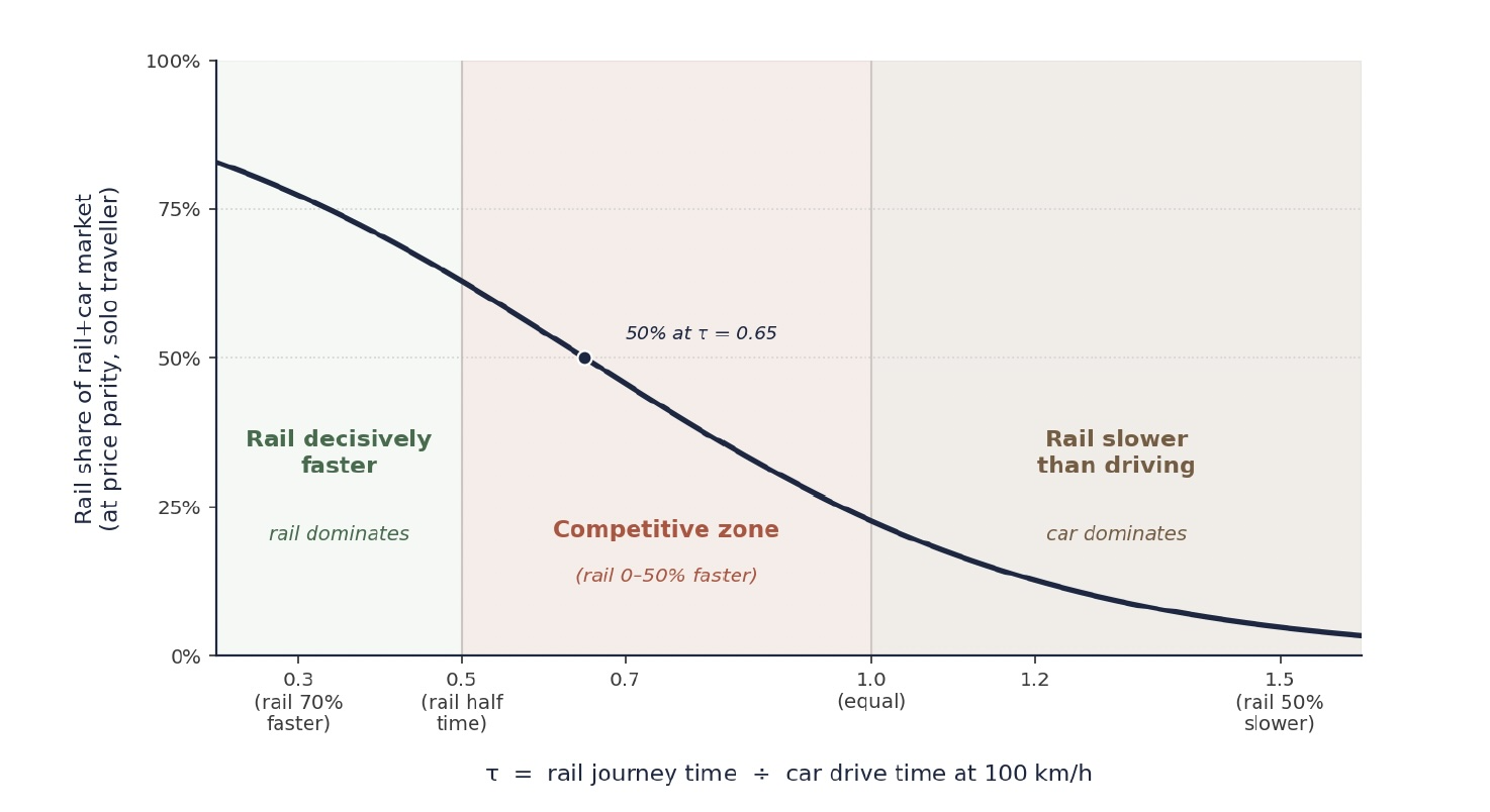
    The right measure is therefore not absolute rail journey time but the ratio of rail time to car time. Defining τ = (rail time) ÷ (car drive time at 100 km/h) gives a distance-invariant measure of rail’s advantage: τ = 0.5 means rail takes half as long as driving; τ = 1.0 means equal time; τ > 1.0 means rail is slower. A 3-hour rail journey on a 540 km route (τ = 0.56) is competitively equivalent to a 1.5-hour journey on a 270 km route. This is the key structural difference from the rail-vs-air analysis, where rail’s fixed advantage at the access stage means absolute time is what matters.
    Road-rail modal-shift S-curve plotting rail share of the rail+car market against the time ratio tau, European calibration
    Figure 1. Modal-shift S-curve for rail–car substitution, plotting rail’s predicted share of the combined rail+car market against the time ratio τ = (rail journey time) ÷ (car drive time at 100 km/h). Logistic curve fitted with inflection at τ = 0.65 (rail captures 50% at price parity when ~35% faster than driving). Three zones: rail decisively faster (τ < 0.5); the competitive zone (0.5 < τ < 1.0); and rail slower than driving (τ > 1.0). Calibrated against the TGV Paris–Lyon pre/post comparison.

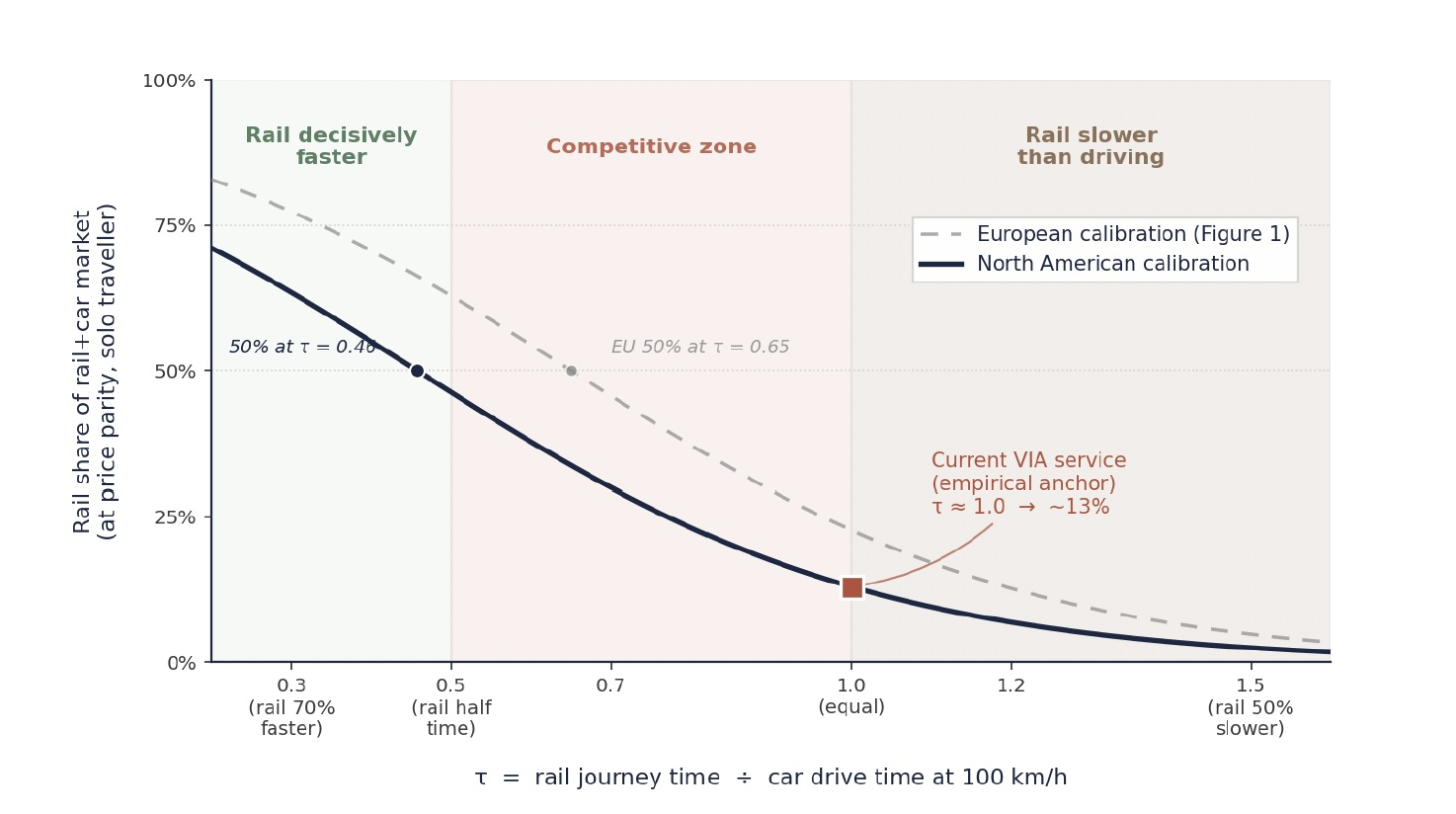
    The European calibration in Figure 1 represents what rail can achieve under conditions that favour modal shift — high fuel taxes, congestion charging, dense feeder transit, central stations, and a cultural baseline of rail use. North American conditions are systematically less favourable, and the same τ produces lower rail shares.
    North-American-calibrated S-curve anchored on current VIA Rail's 13% rail share, with the European curve shown for comparison
    Figure 1b. North-American–calibrated S-curve, anchored on current VIA Rail service (~13% rail share of the rail+car market at τ ≈ 1.0). The faded grey dashed curve is the European calibration from Figure 1. Inflection shifts left from τ = 0.65 to τ = 0.46: under North American conditions, rail must be ~54% faster than driving — rather than 35% — to capture half the market at parity. Equivalent to a constant utility penalty α ≈ 0.67 reflecting toll-free highways, low fuel taxes, free parking, dispersed land use, weak feeder transit, and a cultural autonomy preference.

    Read together, Figures 1 and 1b bracket the realistic range. The European curve represents what is achievable in principle if rail-favourable conditions were created; the NA curve gives what is achievable under prevailing structural conditions. The remainder of this note uses the NA calibration, with European-equivalent figures quoted alongside where the comparison is informative. The gap between them is policy-relevant: roughly 10 to 15 percentage points of modal share depend not on which infrastructure is built but on whether the broader transport-policy environment supports modal shift.

    Empirical anchors and the North American context

    The Paris–Lyon TGV cut journey time from ~4 hours to under 2 and lifted rail’s share against road from ~30% to ~67% — a 37-point shift. Madrid–Barcelona AVE and Tokyo–Osaka Shinkansen deliver comparable shares against parallel highways. But all operate under conditions the corridor does not share. North America carries none of these reinforcements: the 401/A20 is toll-free end-to-end, Canadian fuel taxes are roughly one-third of European levels, there is no congestion charging in any Canadian city, and land use at both ends is car-oriented. The cross-elasticity literature confirms rail and car barely substitute — a 10% rise in fuel prices produces only a 1 to 4% rise in transit ridership.

    Rail’s competitive position against the car turns on the time ratio τ, not absolute journey time. The North American absence of tolls, congestion charges, and high fuel taxes means realised modal share will likely sit substantially below the European-anchored model’s predictions.
    2 · Price

    Elasticity, group size, and perceived cost

    The road–rail price comparison differs from rail–air in three ways: the elasticity of substitution is higher, the per-person ratio depends decisively on group size, and the cost of driving travellers actually weigh is the perceived cost (mostly fuel), not the full economic cost. The same logit form applies, but with a larger price coefficient (γ = 1.5 against 1.0 for rail–air), reflecting own-price elasticities of −1.0 to −1.6 for leisure demand against −0.4 to −0.7 for business.

    European price family

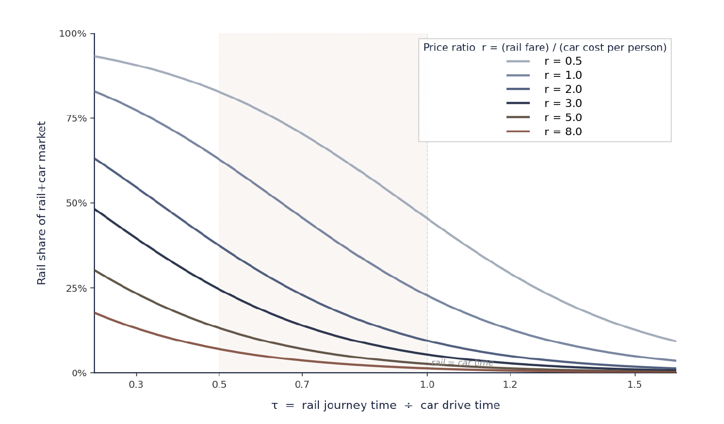
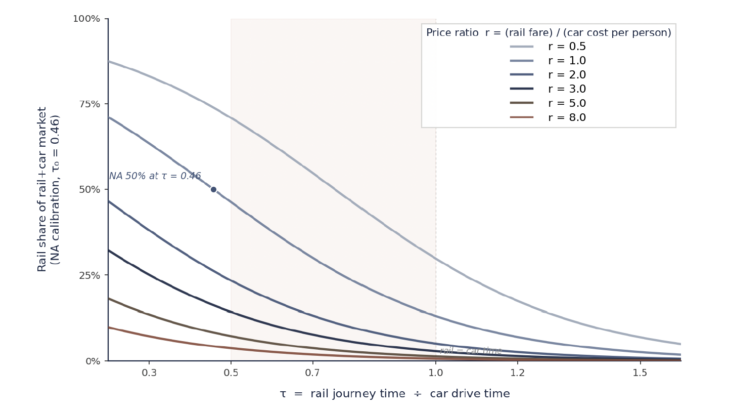
    Figure 2a shows the curve family at six price ratios under the European calibration. The wide range (0.5 to 8.0) reflects that group travel can drive the per-person ratio well above 5 even at parity-pricing intentions, since car cost divides among occupants while rail fare does not.

    North American price family

    Figure 2b applies the same six ratios under the NA calibration (τ₀ = 0.46). Each curve sits 15 to 20 points below its European counterpart at every τ. This family drives the corridor predictions in the rest of the note.
    Family of road-rail S-curves at six rail-to-car price ratios, European calibration
    Figure 2a. Family of road–rail S-curves at six rail-to-car-per-person price ratios (r = rail fare ÷ car cost per person), European calibration. The middle navy curve at r = 1.0 is price parity. The family spans 0.5 to 8.0, reflecting that group travel can push the per-person ratio well above 5.
    Family of road-rail S-curves at six price ratios, North American calibration
    Figure 2b. The same six ratios under the North American calibration (τ₀ = 0.46). Each curve sits 15 to 20 points below its European counterpart. This family is used throughout the rest of the note.

    Perceived versus full cost of driving

    Drivers compare rail fare against the perceived cost of driving, not the full economic cost. On Toronto–Montréal, one-way fuel for a typical car (9.4 L/100 km at ~$1.65/L) is about $84; the full economic cost — depreciation, insurance, maintenance — is more than three times that, around $300. But fixed costs are not perceived at the moment of choice; the car is owned regardless. A VIA Economy fare of ~$80 against perceived car cost of $84 produces a price ratio near 1.0 for a solo traveller. Against full cost the same fare would imply a ratio of 0.27 — and would predict a far larger rail share than the corridor actually carries, the empirical tell that perceived cost is the right input.

    The group-size effect

    Cars carry one to four passengers at a single fuel cost; rail charges per ticket. The per-person rail-to-car ratio is therefore ~1.0 for a solo traveller, 1.9 for a couple, 2.9 for three, and 3.8 for a full car of four. Family travel and any leisure trip with two or more travellers structurally favours the car — a multiplier with no analogue in the rail–air comparison. At parity pricing, ALTO’s Toronto–Ottawa share drops from ~51% solo to ~12% for a family of four; on Toronto–Montréal from 41% to 8%.

    Gas price as a modal-shift lever

    Because perceived car cost is dominated by fuel, the price ratio is sensitive to gas prices in a way the air comparison is not. A swing from $1.30 to $2.00/L — well within historic range — moves the solo Toronto–Montréal ratio from 1.21 to 0.79. Carbon pricing and fuel-tax policy are levers on rail modal share that operate as strongly as line-haul speed, at much lower capital cost.

    Group-size effects can suppress predicted rail share by 75 to 90 per cent; gas-price swings can move it by 10 to 20 percentage points. These dimensions matter as much as infrastructure choice.
    3 · Travel Time on the Corridor

    Where the corridor sits on the curve

    The same two principal pairs carry the bulk of rail-substitutable demand, but the absolute road flow is very large. The 401 between Toronto, Kingston, Ottawa and Montréal carries tens of millions of person-trips a year — several times the corridor’s air person-trips. Even a small percentage shift represents a meaningful absolute volume.

    Table 1. Approximate annual person-trip volumes (both directions) by mode on each principal pair, and resulting current modal shares. Order-of-magnitude estimates (±25% air/rail, ±30% car). Bus volumes excluded for clarity.
    City pairAirRail (VIA)CarRail share of rail+airRail share of rail+car
    Toronto–Montréal~1.9 M~800 K~6 M~30%~13%
    Toronto–Ottawa~0.9 M~800 K~4.5 M~47%~14%
    Ottawa–Montréal~0.45 M~525 K~4 M~54%~12%

    Three observations follow. The road-substitutable market dwarfs the air-substitutable market on every pair — car volumes are three to ten times rail+air combined. Current rail-vs-air shares are already meaningful (~30% on Toronto–Montréal, ~half on the shorter pairs), but rail-vs-car shares sit in the 12 to 14% range across all three. And the structural similarity of road–rail shares despite very different distances confirms the τ-normalisation: current VIA service produces τ values close to 1.0 on every pair.

    Table 2. Approximate segment-level travel times for car (driving on 401/A20, no congestion) alongside rail under three scenarios. *Toronto–Montréal under current VIA runs 5 h 13 min on the 538 km direct routing; the parallel car drive is ~5 h 30 min.
    City pairDistanceCar (401)VIA currentHPR (200 km/h)ALTO (300+ km/h)
    Toronto–Ottawa~450 km~4 h 30 min~4 h 30 min~2 h 55 min~2 h
    Toronto–Montréal~540 km~5 h 30 min5 h 13 min*~3 h 38 min~3 h
    Ottawa–Montréal~190 km~2 h~1 h 55 min~1 h 30 min~1 h
    Modal-shift progression for Toronto-Montreal under VIA, HPR and ALTO at solo, near-parity pricing on the NA-calibrated curve
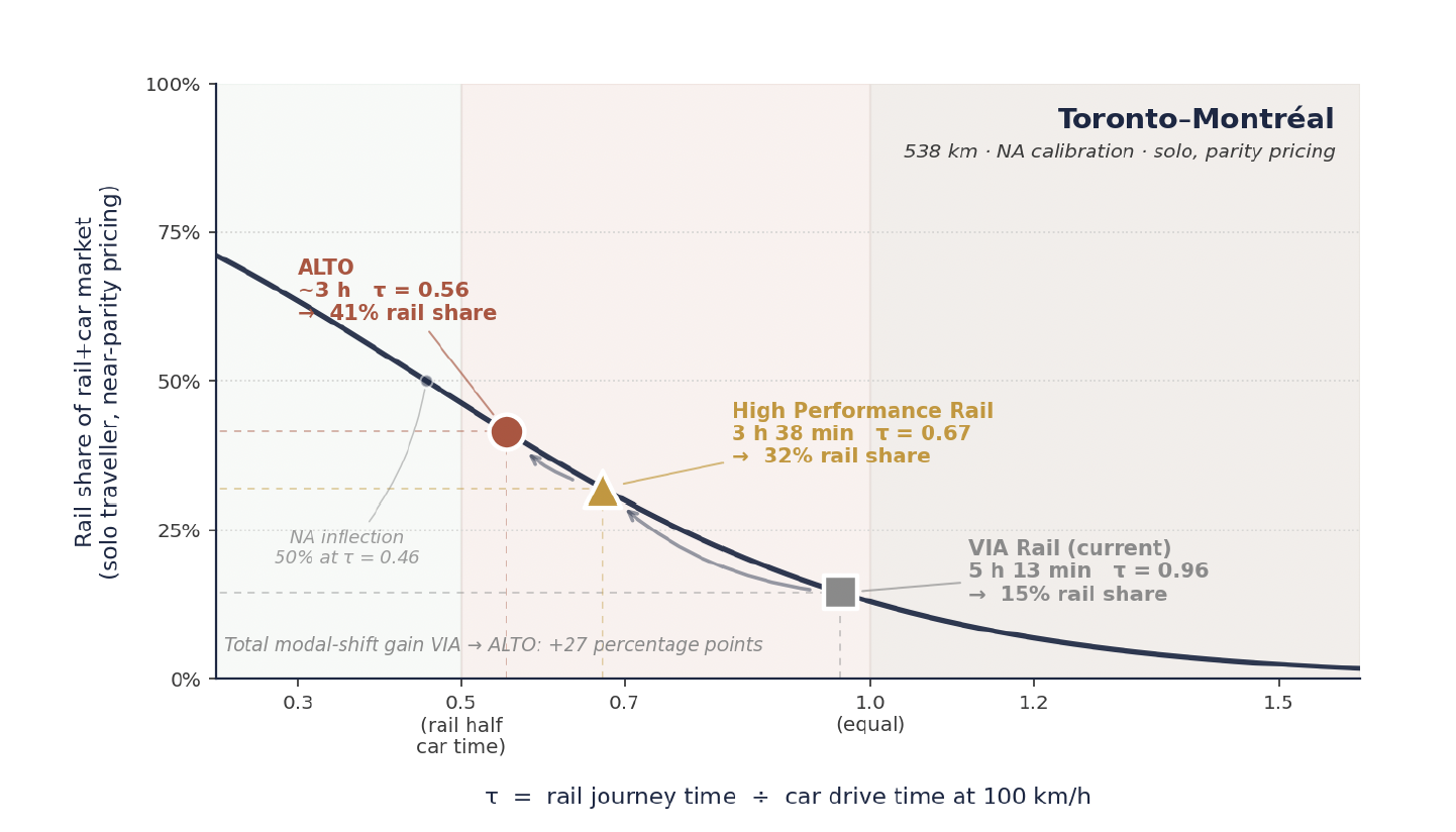
    Figure 3. Modal-shift progression for Toronto–Montréal under the three rail scenarios, plotted on the North-American–calibrated S-curve at solo traveller and near-parity pricing. Predicted rail share of the rail+car market rises from ~15% under VIA, to 32% under HPR, to 41% under ALTO — a total gain of ~27 points, of which 17 points (about two-thirds) are captured by the HPR step alone.
    Table 3. Predicted rail share of the combined rail+car market on each principal pair under each scenario (NA calibration, near-parity, solo, current gas, current VIA-equivalent fares). The VIA shares match the Table 1 anchors, validating the calibration. HPR/ALTO values are order-of-magnitude estimates.
    City pairVIA currentHPR (200 km/h)ALTO (300+ km/h)
    Toronto–Ottawa~13%~34%~51%
    Toronto–Montréal~15%~32%~41%

    These are the time-only readings under the most favourable price configuration. Real corridor traffic is a mix of solo, couple and family travel, with fares that may rise above current VIA levels if HPR or ALTO recover more capital from passengers. Section 4 produces a more realistic envelope.

    4 · Price and Group Size on the Corridor

    Where the corridor sits on the price axis

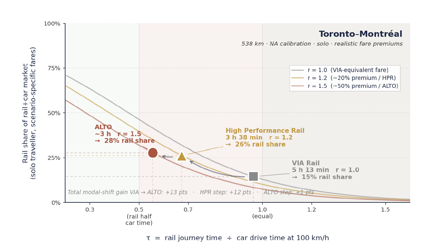
    Figure 3 plotted the scenarios at price parity — the most favourable assumption for rail. But HPR and ALTO carry higher capital and operating costs than VIA’s shared-track service, and any realistic operating model recovers part of that from passengers. International HSR and the Brightline comparator place premium fares 30 to 80% above conventional rail. This analysis takes a moderate set: HPR at ~20% premium (r = 1.2), ALTO at ~50% premium (r = 1.5).
    Modal-shift progression for Toronto-Montreal with realistic fare premiums applied: VIA r=1.0, HPR r=1.2, ALTO r=1.5
    Figure 4. Toronto–Montréal under realistic scenario-specific fare premiums — VIA at r = 1.0, HPR at ~20% premium (r = 1.2), ALTO at ~50% premium (r = 1.5). Predicted shares: VIA 15%, HPR 26%, ALTO 28%. The total VIA → ALTO gain collapses from +27 points at parity to +13 points, with the HPR step doing essentially all the work (+12 pts) and the ALTO step adding only +1 to +2.

    Three observations follow. First, ALTO’s modal-share advantage over HPR — already modest at parity (+9 points on Toronto–Montréal) — essentially disappears once realistic fare premiums are applied, the two converging to within a point of each other. Second, this is robust: sensitivity at ALTO premiums between 30 and 80% produces ALTO shares between 30 and 24%, all within a few points of the HPR 26% reading. Third, the HPR step from current VIA to a dedicated 200 km/h corridor at VIA-equivalent fares captures essentially all of the realistically achievable road–rail modal shift; ALTO’s 300+ km/h capability is real but largely cancelled by the fare premium needed to fund it.
    Modal share as a function of per-person rail-to-car price ratio for each scenario on both Toronto pairs
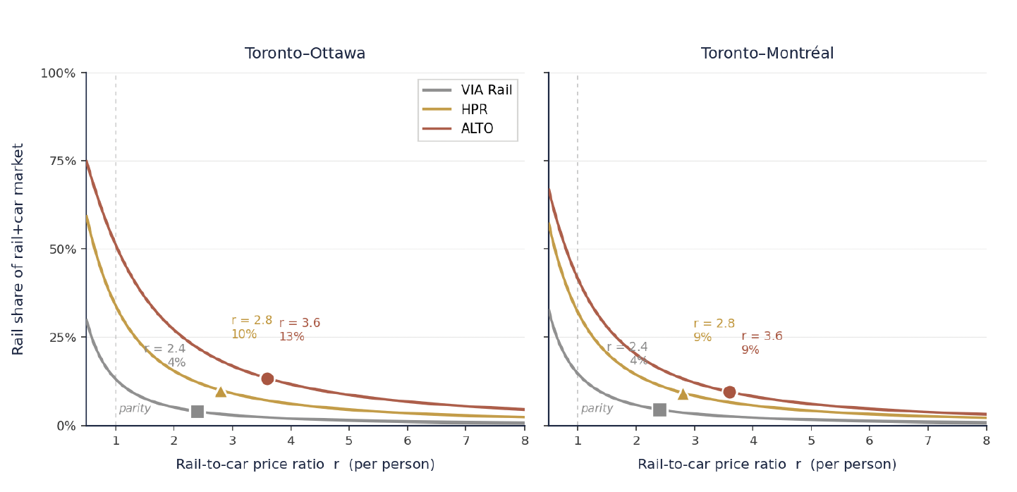
    Figure 5. Modal share as a function of per-person rail-to-car price ratio, travel time held fixed. Reference operating points combine the solo/current-gas baseline with the realistic premiums: VIA at r = 2.4, HPR at r = 2.8, ALTO at r = 3.6. Predicted shares: VIA ~4% on both pairs; HPR ~10% (Toronto–Ottawa) and ~9% (Toronto–Montréal); ALTO ~13% and ~9%. Share falls steeply as the ratio rises, reflecting the higher price coefficient.
    Modal share as a function of group size from 1 to 4 passengers per car for each scenario
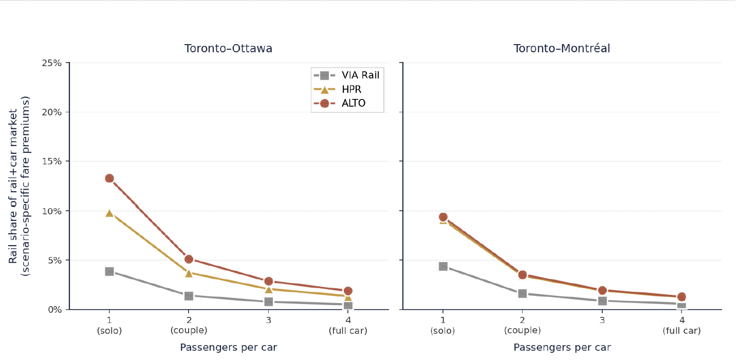
    Figure 6. Modal share against group size (1 to 4 passengers per car), each scenario scaling linearly from its base ratio. Toronto–Ottawa solo shares of 4% (VIA), 10% (HPR), 13% (ALTO) fall to ~1% across all three for a family of four; Toronto–Montréal similarly. The HPR and ALTO lines converge rapidly — a couple essentially eliminates the ALTO advantage.

    The rail-substitutable portion of corridor road traffic is concentrated on solo travellers paying single-person fares against per-person fuel costs. A second passenger halves rail share again; a car of three or four cannot be captured at any travel time or defensible fare. This narrows the realistic market to a small fraction of total road flow — predominantly business, single-traveller leisure, and downtown-to-downtown trips.
    Modal share as a function of gas price from $1.00 to $2.50 per litre for each scenario
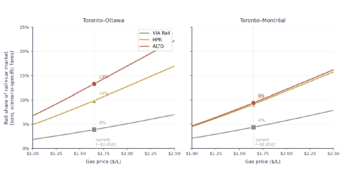
    Figure 7. Modal share against gas price ($/L) at solo travel, anchored at the current ~$1.65/L (VIA r = 2.4, HPR r = 2.8, ALTO r = 3.6). A swing from $1.00 to $2.50 roughly triples rail share for each scenario, but absolute levels remain modest. HPR and ALTO converge almost exactly on Toronto–Montréal at all gas prices — fare premiums largely cancel ALTO’s speed advantage.

    Two policy implications follow. The corridor’s modal-shift outcomes are not solely a function of which infrastructure is chosen — they also depend on fuel pricing, carbon pricing and the broader transport-policy environment. And the comparative performance of HPR and ALTO is roughly stable across the gas-price range, so the scenario comparison is robust to fuel-price assumptions even if the absolute levels are not.

    5 · Reliability

    On-time performance and reliability

    Reliability operates as an effective time penalty whenever on-time performance (OTP) drops below a threshold travellers can rely on. Unreliable service makes travellers take an earlier departure than schedule alone requires, inflating their effective journey time by the buffer they carry. The model adds a utility term δ·(OTP_ref − OTP), with δ = 2.0 (the Wardman midpoint) and OTP_ref = 0.85 (VIA’s 2023 reported figure).
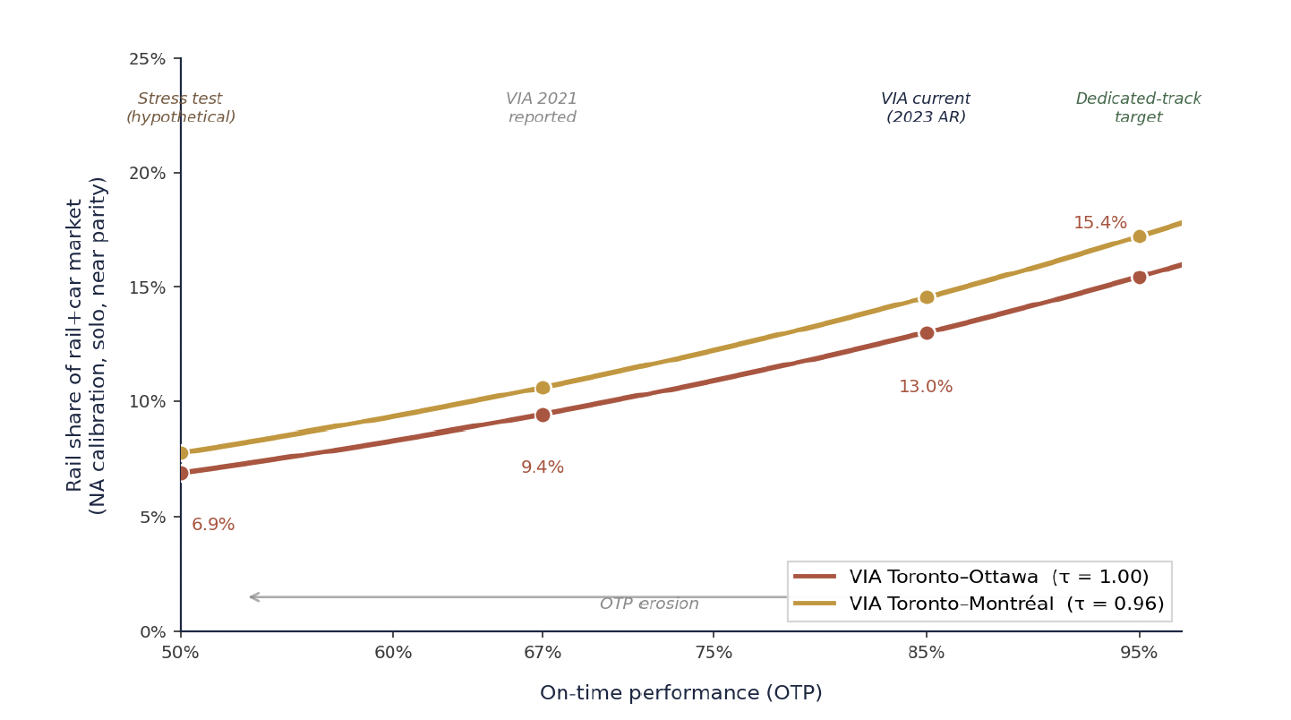
    Rail share of the rail+car market as on-time performance varies from 95% down to 50% for both Toronto pairs
    Figure 8. Rail share of the rail+car market for VIA Toronto–Ottawa and Toronto–Montréal as OTP varies from a 95% dedicated-track target down to a 50% stress-test floor. Reference points: dedicated-track target (95%), current VIA (85%), VIA’s 2021 figure (~67%, during heavy freight conflict), and a 50% stress test. As OTP erodes from 95 to 50%, Toronto–Ottawa share roughly halves (15.4% to 6.9%); Toronto–Montréal falls 17.2% to 7.8%.

    Three points follow. OTP is a meaningful but not dominant lever — its dynamic range across the observed band is about ±5 points, comparable to a $0.50/L fuel swing or a solo-to-couple shift. OTP and price are partial substitutes: a 10-point OTP improvement is worth roughly a 14% fare cut, which is why Brightline advertises 92% OTP precisely to support a fare premium. And crucially, the OTP gain inheres in the dedicated-track step, not the speed step — both HPR and ALTO eliminate the freight-train conflicts on shared CN track that cause VIA’s reliability problems, so OTP is not a differentiator between them.

    OTP erosion from 95 to 50 per cent halves VIA’s predicted rail share. The reliability gap between shared-track service and a dedicated alternative is real, but it is captured equally by HPR and ALTO — the speed step adds nothing to reliability.
    6 · Where the Returns Sit

    Where the modal-shift returns sit on the curve

    Because the curve is logistic, the value of additional time savings depends on where a route starts. On Toronto–Ottawa under the NA calibration, moving from VIA (τ = 1.00, ~13%) to HPR (τ = 0.65, ~34%) approaches the inflection and delivers the largest single increment; the move to ALTO (τ = 0.44, ~51%) adds another as the curve crosses its inflection. On Toronto–Montréal, the moves go from VIA at ~15% to HPR at ~32% to ALTO at ~41%.
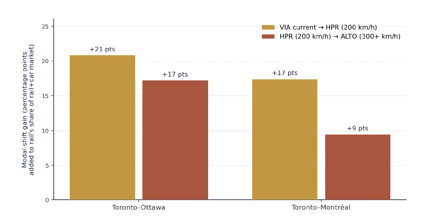
    Decomposition of road-rail modal-shift gain by investment step: VIA to HPR versus HPR to ALTO on each pair
    Figure 9. Decomposition of road–rail modal-shift gain by investment step (solo, near-parity, NA calibration). Gold bars show the gain from VIA to HPR; terracotta bars the additional gain from HPR to ALTO. The HPR step adds 21 points on Toronto–Ottawa and 17 on Toronto–Montréal; the ALTO step adds 17 and 9. Under the European calibration the comparable figures would be 27/23 (HPR) and 17/10 (ALTO).
    17–21
    Percentage points captured by the VIA → HPR step (NA, near-parity)
    9–17
    Additional points from HPR → ALTO — shrinking under realistic premiums
    $2.5–8B
    Incremental capital cost per percentage point of ALTO-only road–rail shift

    The cost-effectiveness comparison is more challenging for ALTO than for HPR. ALTO’s $60–90 billion envelope is an incremental investment of $40–70 billion above the HPR option. Spread across the additional 9 to 17 points ALTO captures over HPR at canonical NA conditions, that works out to roughly $2.5 billion to $8 billion per percentage point — with the important caveat that road–rail shift, in absolute trip volumes, represents a much larger total person-trip diversion than the air–rail equivalent.

    The corridor’s road traffic is several times its air traffic, and even an NA-realistic 30 to 50 per cent rail share of rail+car represents a larger absolute volume than full capture of the rail+air market.
    7 · Implications

    What this means for the corridor decision

    Six conclusions follow from putting the road–rail evidence alongside the air–rail analysis.

    Structurally different from rail-vs-air

    The car competes at all distances; the competitive zone is narrower (1.5 to 3 hours); perceived cost is dominated by fuel; group travel tilts decisively toward driving; cross-elasticities are remarkably low; and structural North American conditions all suppress rail’s position relative to European comparators.

    The road prize is bigger

    Despite the headwinds, road-substitutable demand is far larger in absolute terms than air-substitutable demand. Even modest rail shares translate to large absolute diversions — between 1.4 and 3 million additional rail trips a year on the principal pairs. The road prize is bigger; it is just structurally harder to capture.

    Policy levers rival infrastructure

    Group size and fuel pricing are levers as substantial as the HPR/ALTO choice. Family travel suppresses rail share by ~75%; sustained higher fuel prices lift it by 15 to 30 points. Carbon pricing, fuel tax, congestion charging and parking pricing operate at much lower capital cost.

    Reliability is a dedicated-track gain

    OTP is substantial but bounded, and the gap between shared-track and dedicated service is captured by the move from VIA to either HPR or ALTO. The OTP step is inherent in the dedicated-track decision, not the speed decision.

    Sixth, this is the regime in which the High Performance Rail framework is most defensible on modal-shift grounds. The HPR step from VIA’s shared-track service to a dedicated, electrified 200 km/h corridor at VIA-style fares captures the majority of the road–rail opportunity on both pairs — adding 21 points on Toronto–Ottawa and 17 on Toronto–Montréal. ALTO’s additional speed adds 9 to 17 points at solo, near-parity conditions, but those points cost $40–70 billion above HPR, and under realistic group-mix and price assumptions the incremental advantage shrinks further.

    Taken together with the parallel rail–air analysis, the corridor decision turns on whether the right framework is being used. Modal-shift performance is multi-dimensional — time, price, group size, fuel cost, traveller type, structural context — and the headline time-only advantage that motivates ALTO’s case shrinks substantially once these dimensions are admitted. The High Performance Rail framework delivers the bulk of the corridor’s achievable modal-shift outcomes — on both the air market and the road market — at roughly a quarter of ALTO’s capital cost.

    Download Full Note
    Modal Shift Note 2 — Road–Rail Research Note (PDF)
    Reference document with the full methodology, both calibrations, sensitivity analysis, and the complete source list
    Download PDF
    Methodology

    Modelling approach

    The S-curve is a standard logistic of the form S(τ) = 1 / (1 + exp(K·(τ − τ₀))), where S(τ) is rail’s share of the combined rail+car market as a function of the time ratio τ = (rail time) ÷ (car drive time at 100 km/h). The τ-normalisation is a meaningful departure from the absolute-time framing of the rail–air analysis: because the car comparator scales with distance, τ gives a distance-invariant measure of rail’s competitive position. Parameters are K = 3.5 and τ₀ = 0.65 (European). The price family adds a utility term: S(τ, r) = 1 / (1 + exp(K·(τ − τ₀) + γ·ln r)), with γ = 1.5 — larger than the rail–air γ = 1.0, reflecting higher own-price elasticities for car-vs-rail substitution. For group travel, r_effective = r_solo × n.

    Two calibrations are presented. The European calibration (τ₀ = 0.65) is fitted to the TGV Paris–Lyon pre/post comparison. The North American calibration (τ₀ = 0.46) is anchored on current VIA’s ~13% rail share at τ ≈ 1.0; the two differ only in τ₀, the shift equivalent to a constant penalty α ≈ 0.67. The parameters are illustrative rather than predictive; sensitivity at K between 2.5 and 4.5, τ₀ between 0.40 and 0.75, and γ between 1.2 and 1.8 produces the same qualitative conclusions. An important caveat: the binary-logit model captures time-and-price geometry but not the structural North American factors — free parking, dispersed land use, weak feeder transit, family-travel norms, cultural autonomy preference — that suppress rail share. Model predictions should be read as upper bounds; realised share is likely 30 to 50% below them. Brightline Miami–Orlando, the closest North American analogue, is in extended ramp-up with bond ratings downgraded to CCC+, indirect confirmation that achievable shares emerge slowly here.
    Sources

    Principal sources

    1.
    ALTO HSR Citizen Research Initiative (2026). HPR Strategy, Chapter 4 — High Performance Passenger Rail (Express journey times). citizenresearch.ca
    2.
    VIA Rail Canada Annual Report 2023; published timetables, station-pair travel times and Economy fare ranges; ridership via Statista (2024) — Montréal–Ottawa–Toronto triangle at 2.1 million passengers.
    3.
    Cirium aviation analytics (2025), via Simple Flying — Toronto Pearson top destinations by capacity; ~930,000 one-way Toronto–Montréal seats on YYZ–YUL alone.
    4.
    Quebec City–Windsor Corridor reference data — ~108 flights per workday within the Toronto–Ottawa–Montréal triangle.
    5.
    Ministry of Transportation of Ontario (2019, 2024). Highway 401 Annual Average Daily Traffic counts; Toronto-area AADT exceeds 450,000 vehicles/day.
    6.
    Statistics Canada Tables 23-10-0253-01 (Air passenger traffic) and 51-204-X (Air Passenger Origin and Destination, Domestic).
    7.
    Currie, G. & Phung, J. (2007). Transit Ridership, Auto Gas Prices, and World Events. Transportation Research Record, 1992. — and Lago, A.M., Mayworm, P.D. & McEnroe, J.M. (1992). Ridership Response to Changes in Transit Services. Transportation Research Record, 818.
    8.
    Wardman, M. (2014). Price Elasticities of Surface Travel Demand: A Meta-analysis of UK Evidence. Journal of Transport Economics and Policy, 48.
    9.
    Mineta Transportation Institute (2017). Modal Shift and High-Speed Rail. P. Haas. — and Moeckel, R. et al. (2013). Mode Choice Modeling for Long-Distance Travel (nested logit, TSRC).
    10.
    Federal Highway Administration (2015). Analysis of Automobile Travel Demand Elasticities With Respect To Travel Cost. — and Litman, T. (VTPI). Transportation Elasticities. vtpi.org
    11.
    International Transport Forum (2019). Roundtable 176: What is the Value of Saving Travel Time? OECD/ITF.
    12.
    Brightline Florida (2024–2026). Monthly Revenue and Ridership Reports; KBRA bond rating actions. — and Geotab (2025). Travel Time vs. Toll Costs: Toronto’s 407 and 401.
    13.
    Ben-Akiva, M. & Lerman, S. (1985). Discrete Choice Analysis. MIT Press. — and Train, K. (2009). Discrete Choice Methods with Simulation, 2nd ed. Cambridge University Press.
    14.
    ALTO HSR Citizen Research Initiative companion notes: Note 1 — Modal shift between high-speed rail and air, and the Modal Shift & Ridership synthesis brief that sets this note alongside Notes 1, 3 and 4.
  • Modal shift HSR air

    Citizen Research Initiative · Modal Shift Analysis · Note 1

    Modal Shift Between High-Speed Rail and Air on the ALTO Corridor

    When does rail substitute for air — and how much of that substitution does ALTO’s 300+ km/h capability actually buy, once the price of the ticket is admitted into the analysis?

    ⚠ What This Note Examines

    This note applies the international evidence on rail–air substitution to the two corridor pairs that account for the bulk of air-substitutable demand — Toronto–Ottawa and Toronto–Montréal — and compares three scenarios on both travel time and price: current VIA Rail service, a High Performance Rail (HPR) alternative at 200 km/h, and ALTO at 300+ km/h.

    The headline question is not whether modal shift happens — the evidence is clear that it does — but where the modal-shift returns sit on the curve, and whether ALTO’s incremental speed is a cost-effective way to capture them.

    Summary

    The international literature converges on a logistic S-curve: rail captures the majority of the combined rail+air market on city pairs with station-to-station times of two to four hours, and rail’s share collapses rapidly above five hours. Both principal Toronto pairs fall inside that competitive zone under any modern dedicated-track scenario.

    The majority of the achievable modal shift on each pair is captured by moving from VIA’s current shared-track service to a dedicated, electrified HPR corridor at conventional 200 km/h speeds. ALTO’s additional 300+ km/h capability captures a further 19 to 20 percentage points at price parity — a real but residual gain.

    Once price enters the analysis, the picture shifts. Under canonical price assumptions — VIA at r ≈ 0.5, HPR at r ≈ 0.7, ALTO at r ≈ 1.0 — ALTO’s apparent 19–20-point time-only advantage shrinks to 11–13 points on the principal Toronto pairs. The cost-per-point of that incremental modal shift is several billion dollars; the cost-per-point of the larger HPR step that precedes it is much lower.

    Download
    Modal Shift Note 1 — Air–Rail Research Note (PDF)
    The full 16-page note with all seven figures, the segment-level travel-time and price analysis, and the methodology and sources
    Download PDF
    1 · Travel Time

    The competitive zone

    The empirical literature on rail–air substitution converges on a consistent set of travel-time thresholds. Studies in Europe, China and Japan identify a competitive break-even of roughly 400 to 600 km (about 2 to 3 hours door-to-door) for short-haul routes, beyond which aviation begins to regain a time advantage. Medium-distance corridors of 600 to 1,100 km show the greatest demand elasticity. Long-haul segments above 1,400 km show minimal substitution — typically below 10 per cent.

    The mechanism is the door-to-door time calculation. Below roughly 700 km, the overhead of reaching the airport, checking in, clearing security, boarding, taxiing and reaching the destination city centre adds enough that total air journey time matches or exceeds high-speed rail. Above this distance, air’s faster line-haul speed begins to dominate, and rail’s share falls steeply once journeys exceed about 4.5 hours.

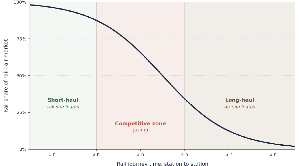
    This relationship is conventionally modelled as a logistic S-curve. The shape is characteristic: under two hours rail captures essentially the entire air market; between three and four hours rail typically captures 60 to 80 per cent; between four and five hours rail’s share collapses; above five hours rail captures only a residual share. Frequency, station centrality, fare structure and reliability shift the curve up or down by several points but do not change its overall shape.

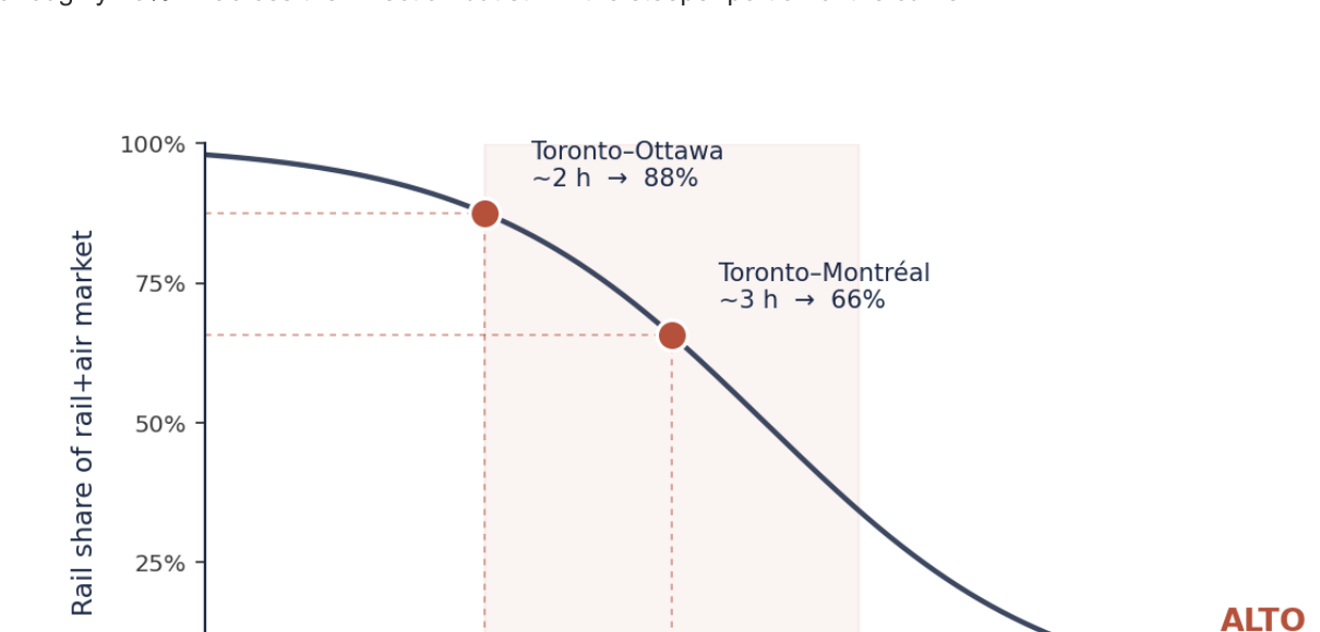
    Modal-shift S-curve: rail share of the combined rail+air market against station-to-station rail journey time, with short-haul, competitive and long-haul zones marked
    Figure 1. Modal-shift S-curve showing rail’s share of the combined rail+air market as a function of station-to-station rail journey time. Logistic curve fitted with inflection at 3.5 hours and steepness parameter k = 1.3. A short-haul band below 2 hours where rail dominates; a competitive zone between 2 and 4 hours where infrastructure investment can decisively shift modal share; and a long-haul band above 4 hours where rail’s share collapses. All major HSR services in the competitive zone achieve rail shares of 70 to 85 per cent on the rail-vs-air pair.

    Empirical anchors

    Three European routes anchor the baseline. On Paris–Lyon, the TGV cut travel time from almost four hours to about two; rail’s share of the rail+air market rose from 40 to 72 per cent, while air collapsed from 31 to 7 per cent. On Madrid–Seville (471 km, completed 1992), rail share rose from 16 to 52 per cent of all modes. The Madrid–Barcelona AVE — at 621 km and 2 h 30 min the cleanest modern parallel to ALTO’s longer pairs — now carries roughly 75 per cent of travellers on the rail-vs-air pair.

    Asian comparators reach further. The 2019 World Bank review found Chinese 350 km/h services remain competitive with air up to about 1,200 km. Beijing–Shanghai (1,318 km, 4 h 18 min) is the canonical case where high frequency and operating speed maintain rail dominance at distances that would normally favour air; Tokyo–Osaka (552 km, 2 h 22 min) is another textbook 80+ per cent rail-dominant pair.

    Rail wins decisively under three hours, competes strongly at three to four hours, and degrades rapidly after that — with high frequency and central-station access being decisive variables alongside line-haul time.
    2 · Price

    The elasticity factor

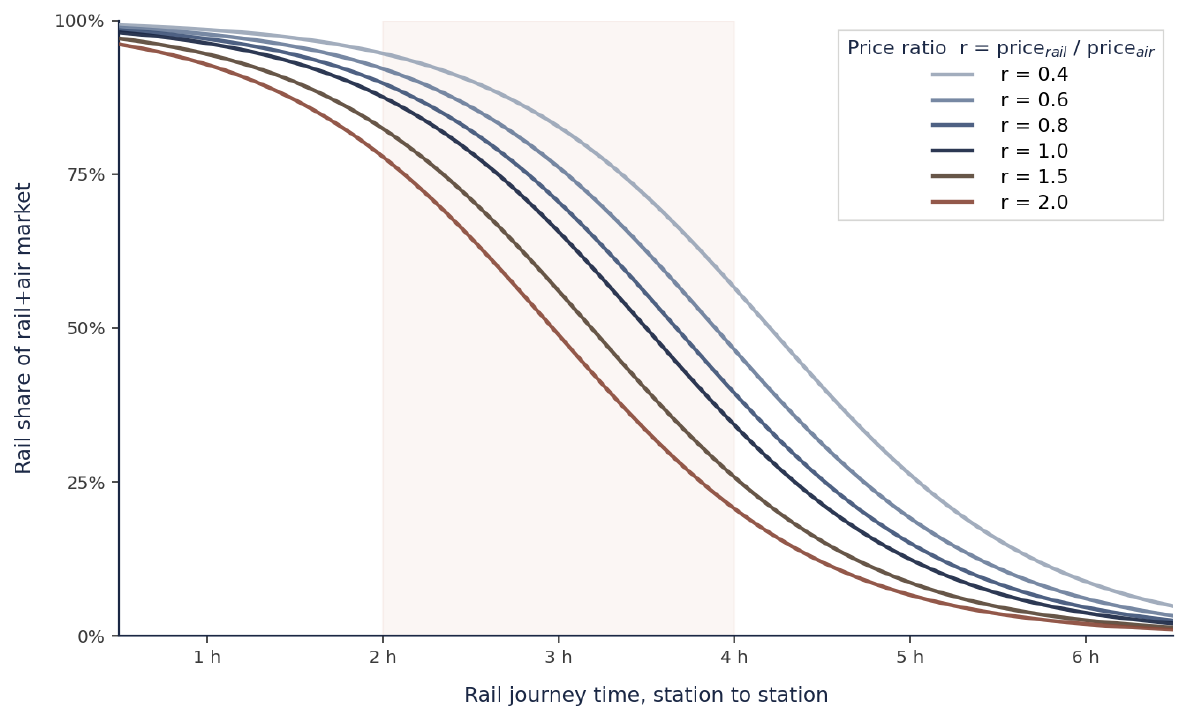
    The S-curve in Figure 1 holds prices implicitly at parity. Real modal choice is two-dimensional: passengers weigh both time and price, and the relative price of rail to air shifts the entire curve up or down. A logit choice model with a price-utility term captures this directly — each doubling of the rail-to-air price ratio shifts the curve’s inflection point earlier by an amount that depends on the price coefficient.

    Family of modal-shift S-curves at six rail-to-air price ratios from r=0.4 to r=2.0
    Figure 2. Family of modal-shift S-curves at six rail-to-air price ratios (r = rail price ÷ air price). The middle navy curve is the r = 1.0 parity case from Figure 1. Curves above it show rail priced below air — the whole curve lifts; curves below show rail priced above air, and a corresponding loss of share. The shift is symmetric in log-price.

    How to read the chart

    The simplest use of Figure 2 is as a lookup. Pick a travel time, pick the curve matching the route’s price ratio, and read off the predicted share. A 3-hour journey at parity (r = 1.0) sits at roughly 60 per cent; the same journey at half the air fare (r = 0.5) sits closer to 75 per cent; at 1.5× the air fare (r = 1.5) it drops to around 45 per cent. A faster service at a higher price can deliver lower share than a slower service at a lower price — the family shows how the two effects combine.

    Price sensitivity differs by traveller

    Business travellers show much lower price sensitivity than leisure travellers — elasticities of roughly −0.4 to −0.7 for business against −1.0 to −1.6 for leisure. Each curve is really a weighted average of a flatter business curve and a steeper leisure one.

    Air’s connecting-flight advantage

    Air retains a structural edge the simple model misses: the connecting-flight network. Travellers continuing to long-haul destinations face mode-switching friction at the hub. The modal-share envelope should be read as a ceiling for the rail-substitutable portion of the market, not the air market as a whole.

    On the empirical side, the high-share international routes combine competitive times with rail fares well below air: Madrid–Barcelona AVE Básico fares of €40–70 against air fares of €100–200 put the price ratio in the 0.4–0.6 band. Tokyo–Osaka is the contrasting case — prices roughly comparable (0.7–0.9), but central-station access and reliability sustain rail dominance without a price advantage.

    Modal share depends on time, price, traveller type, and itinerary structure. The family of S-curves captures the first two; the third and fourth shift the realistic envelope further.
    3 · Travel Time on the Corridor

    Where the corridor sits on the curve

    The corridor is not a single market. It is a sequence of overlapping city pairs whose distances place each segment in a different position on the curve. The bulk of air-substitutable demand is concentrated in two pairs: Toronto–Ottawa and Toronto–Montréal. The Toronto–Montréal air market alone runs 900,000+ annual seats. ALTO’s published target times — about 2 hours Toronto–Ottawa and just over 3 hours Toronto–Montréal — both fall inside the zone where international comparators capture 70 to 90 per cent of the rail+air market.

    VIA’s existing Corridor service sits well outside that zone. Toronto–Montréal averages 5 h 13 min over 538 km; Toronto–Ottawa runs 4 to 4.5 hours. Trains are limited to 160 km/h on track shared with CN freight — the principal cause of both slow line-haul speed and poor reliability (on-time performance around 67 per cent as of 2021). Yet the Corridor is VIA’s commercial backbone, contributing 81 per cent of revenue and 95 per cent of ridership.

    Table 1. Indicative travel times for the principal corridor city pairs under each scenario. HPR values are Express journey times published in the CRI HPR Strategy (a dedicated, electrified 401-corridor mainline at 200 km/h); ALTO values are the published targets for the 300+ km/h network. *Toronto–Montréal under current VIA service runs 5 h 13 min on the 538 km direct routing.
    City pairDistanceVIA currentHPR (200 km/h)ALTO (300+ km/h)
    Toronto–Ottawa~450 km~4 h 30 min~2 h 55 min~2 h
    Toronto–Montréal~540 km5 h 13 min*~3 h 38 min~3 h
    Ottawa–Montréal~190 km~1 h 55 min~1 h 30 min~1 h

    Plotted onto the S-curve, these times produce three pictures. Each panel highlights the two principal Toronto pairs under one scenario; the contrast between panels traces the modal-shift trajectory at price parity as corridor infrastructure improves.

    Current VIA Rail service plotted on the S-curve: Toronto-Ottawa at 21% and Toronto-Montreal at 10%
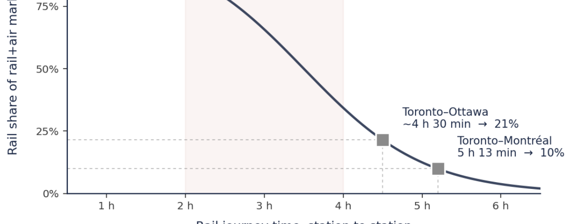
    Figure 3a. Current VIA Rail service. Both principal Toronto pairs sit well below the inflection point: Toronto–Ottawa at ~4 h 30 min captures around 21% of the rail+air market, and Toronto–Montréal at 5 h 13 min around 10%. The corridor’s air-substitutable demand is structurally outside the competitive zone.
    High Performance Rail at 200 km/h on the S-curve: Toronto-Ottawa at 68% and Toronto-Montreal at 46%
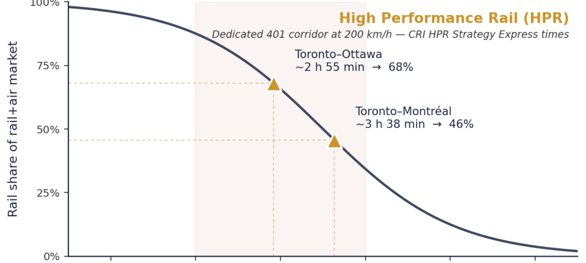
    Figure 3b. High Performance Rail at 200 km/h on a dedicated, electrified 401-corridor mainline (CRI HPR Strategy Express times). Toronto–Ottawa moves to ~68% rail share at price parity; Toronto–Montréal to ~46% — across the inflection but still in the steeper portion of the curve.
    ALTO at 300+ km/h on the S-curve: Toronto-Ottawa at 88% and Toronto-Montreal at 66%
    Figure 3c. ALTO at 300+ km/h on a dedicated 1,000 km HSR network (published targets). Toronto–Ottawa moves onto the upper plateau at ~88% rail share at price parity; Toronto–Montréal to ~66% — still on the steeper portion, where additional time savings continue to produce meaningful gains.
    Table 2. Predicted rail share of the combined rail+air market on each principal pair under each scenario, derived from the logistic curve in Figure 1 with prices held at parity. Order-of-magnitude estimates; actual shares would also depend on fare structure, frequency, reliability, station accessibility, and traveller mix.
    City pairVIA currentHPR (200 km/h)ALTO (300+ km/h)
    Toronto–Ottawa~21%~68%~88%
    Toronto–Montréal~10%~46%~66%

    These are the time-only readings — what each scenario would deliver if its fares matched air. In practice, fares depend on capital structure, and the three scenarios sit at quite different points on the price axis.

    4 · Price on the Corridor

    Where the corridor sits on the price axis

    Current VIA Toronto–Montréal Economy fares of $80–120 against Air Canada fares of $200–400 put VIA at a price ratio of roughly 0.5 — the same band as Madrid–Barcelona. The structural fare advantage is already in place; the binding constraint on current rail share is travel time, not price.

    Whether each new-build scenario preserves a fare advantage depends on capital-cost recovery. The CRI HPR Strategy estimates corridor capital in the order of $19 million/km — roughly $19–25 billion for the full Windsor–Montréal programme — producing annual debt service of $1.0–1.3 billion. Under the standard public-infrastructure subsidy model, HPR fares could plausibly sit at a modest premium over current VIA, placing HPR at r ≈ 0.7. ALTO’s $60–90 billion envelope produces debt service three to four times higher; under a fare cap holding the ratio at parity, ALTO settles at r ≈ 1.0, with subsidy absorbing the capital-cost gap.

    For the corridor’s three scenarios, plausible operating price ratios are: VIA at r ≈ 0.5 (current subsidised rail), HPR at r ≈ 0.7 (modest premium, partial capital recovery), ALTO at r ≈ 1.0 (parity with air, subsidy absorbing the larger debt-service gap).
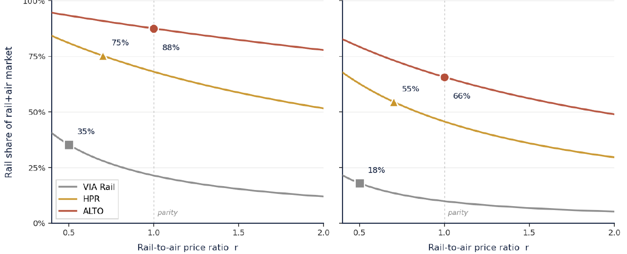
    Modal share as a function of rail-to-air price ratio for each scenario on Toronto-Ottawa and Toronto-Montreal
    Figure 4. Modal share as a function of rail-to-air price ratio, with each scenario’s travel time held fixed at its published value. Markers indicate the canonical operating ratio: VIA at r = 0.5, HPR at r = 0.7, ALTO at r = 1.0. The vertical separation between lines shows how much share is driven by infrastructure; the slope of each line shows how price-sensitive that scenario is at its operating point.

    At their canonical ratios, the Toronto–Montréal scenarios deliver 18 per cent (VIA), 55 per cent (HPR) and 66 per cent (ALTO). ALTO retains an 11-point advantage over HPR — markedly smaller than the 20-point gap the price-parity readings imply, because ALTO’s higher capital cost drags its price ratio up the curve while HPR keeps a price advantage. On Toronto–Ottawa, both new-build scenarios sit high on the curve where price effects are smaller: ALTO ~88%, HPR ~75% — a 13-point gap. If HPR were held at the current VIA ratio (r ≈ 0.5), the gaps would close to 3 and 7 points respectively.

    The HPR pricing lever, with ALTO held at parity

    Fixing ALTO at parity and varying HPR’s fare relative to it puts the pricing decision directly in front of the reader.

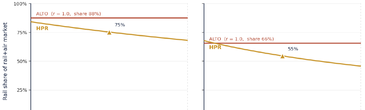
    HPR and ALTO modal share as a function of the HPR-to-ALTO fare ratio, ALTO held at parity
    Figure 5. HPR and ALTO modal share as a function of the HPR-to-ALTO fare ratio, ALTO fixed at parity (r = 1.0). ALTO’s share appears as a flat reference; HPR’s varies along the gold curve. Markers show the canonical HPR/ALTO = 0.7 operating point.
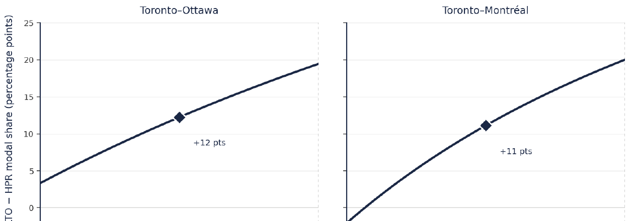
    ALTO minus HPR modal-share differential as a function of the HPR-to-ALTO fare ratio
    Figure 6. ALTO − HPR modal-share differential. The gap rises from ~7 points (Toronto–Ottawa) and 3 points (Toronto–Montréal) at HPR/ALTO = 0.5, to 19–20 points at parity. The diamond marks the canonical 0.7 point: 12 points on Toronto–Ottawa, 11 on Toronto–Montréal.

    The two figures make explicit what the canonical readings imply: ALTO’s modal-shift advantage is highly contingent on HPR’s pricing model. Hold HPR fares near current VIA levels and the gap is 3 to 7 points; let them drift to 70 per cent of ALTO’s and the gap is 11 to 13; let them converge entirely and the full 19–20-point time-only advantage returns. The corridor decision is as much a question about HPR’s intended subsidy structure as about the choice of infrastructure — a question in the operator’s hands, not the engineer’s.

    5 · Where the Returns Sit

    Where the modal-shift returns sit on the curve

    Because the curve is logistic — flat at the top, steep in the middle, flat at the bottom — the value of additional time savings depends critically on where a route starts. On Toronto–Montréal, moving from VIA’s 5 h 13 min to HPR’s 3 h 38 min crosses much of the steep middle and delivers a large gain; the further move to ALTO’s 3-hour service stays in the steeper portion and adds a meaningful increment. On Toronto–Ottawa, HPR’s 2 h 55 min already places the route high on the curve, so ALTO’s 2-hour service produces smaller share gains.

    Decomposition of modal-shift gain by investment step: VIA to HPR versus HPR to ALTO on each principal pair
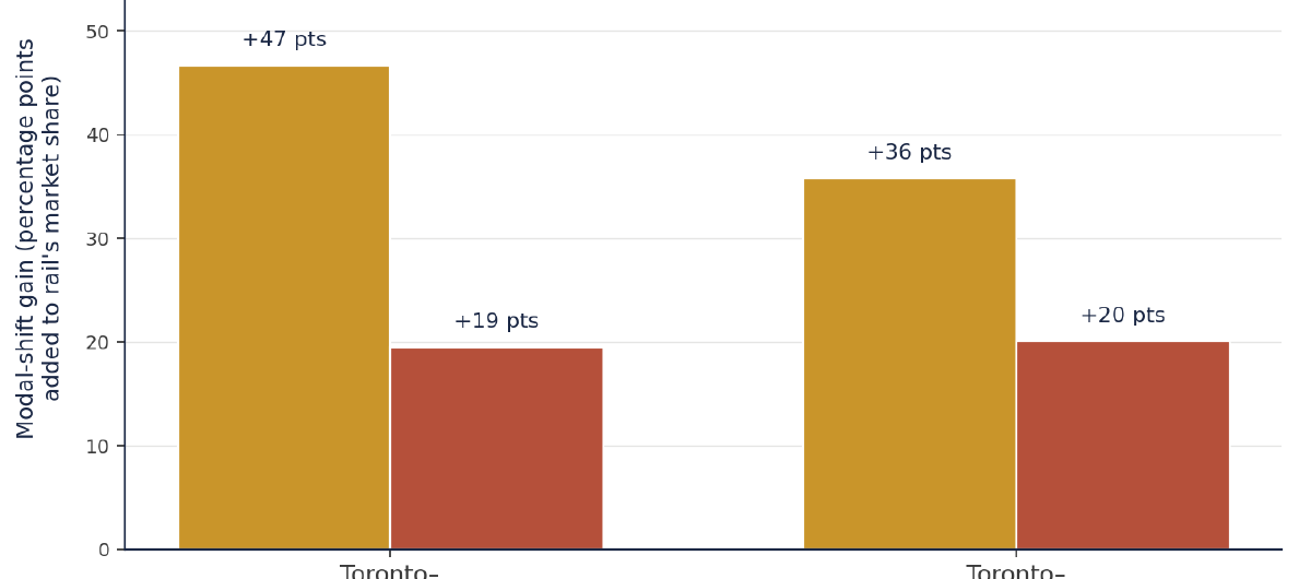
    Figure 7. Decomposition of modal-shift gain by investment step. Gold bars show the percentage-point gain from VIA to HPR; terracotta bars show the additional gain from HPR to ALTO. At price parity, the HPR step delivers 36–47 points across the two pairs; the additional ALTO step delivers 19–20 points.

    On Toronto–Ottawa, the VIA-to-HPR move captures an estimated 47 points of modal shift; the further HPR-to-ALTO move adds 19. On Toronto–Montréal, HPR captures 36 and ALTO adds 20. The HPR step delivers the majority of the achievable shift on both pairs (roughly 65 to 70 per cent of the total), but the residual ALTO increment is real at price parity.

    36–47
    Percentage points captured by the VIA → HPR step (at parity)
    19–20
    Additional points from HPR → ALTO at parity — 11–13 once priced
    $3–6B
    Incremental capital cost per percentage point of ALTO-only modal shift
    HPR delivers the majority of the achievable modal shift on both Toronto pairs at price parity. ALTO’s additional speed adds 19 to 20 percentage points — a residual that shrinks to 11 to 13 once the canonical price assumptions are applied.

    The cost-effectiveness comparison sharpens this. ALTO’s $60–90 billion envelope is an incremental investment of $40–70 billion above the HPR option. Spread across the 11 to 13 incremental points ALTO captures over HPR under realistic pricing, that works out to roughly $3 billion to $6 billion per percentage point — several times worse than the HPR step that precedes it.

    6 · Implications

    What this means for the corridor decision

    Four conclusions follow from putting the international literature, segment-level travel times, and the price dimension alongside one another.

    The opportunity is real and concentrated

    The corridor’s modal-shift potential is well-supported by international evidence and concentrated in two pairs — Toronto–Ottawa and Toronto–Montréal. Modelling the corridor as a single 1,000 km market obscures this. The real question is segment-level time and price, not headline line-haul speed.

    HPR does the larger part of the work

    On time alone, HPR’s Express times place both principal pairs into the upper portion of the curve. ALTO captures a real 19–20-point incremental gain — but residual relative to the larger HPR step, and several times more expensive per point of shift purchased.

    Price reduces ALTO’s advantage

    Under canonical ratios, ALTO’s advantage narrows from 20 points at parity to 11 points on Toronto–Montréal and 13 on Toronto–Ottawa. If HPR ran at the current VIA ratio, the gap would close further still — to 3 and 7 points.

    This is the HPR regime

    This is precisely where the literature finds frequency, reliability, station-centrality and price to matter more than headline speed. Capturing the bulk of the opportunity does not require operating at the global frontier of high-speed technology.

    The corridor is a textbook case of why high-speed-rail claims need to be unbundled. The modal-shift opportunity is genuine. The majority of it is captured by conventional high-performance speeds on a dedicated, electrified, reliable corridor priced competitively against air. ALTO’s additional 300+ km/h capability buys a real but reduced gain once realistic pricing is admitted — between 11 and 13 percentage points on the principal Toronto pairs, at an incremental capital cost of $40–70 billion. Whether the corridor decision turns on the right framework — segment-level, two-dimensional analysis of time and price — is what determines whether the public investment achieves the modal-shift outcome it is intended to produce.

    Download Full Note
    Modal Shift Note 1 — Air–Rail Research Note (PDF)
    Reference document with the full methodology, sensitivity analysis, and the complete source list
    Download PDF
    Methodology

    Modelling approach

    The S-curve is a standard logistic of the form S(t) = 1 / (1 + exp(k·(t − t₀))), where S(t) is rail’s share of the combined rail+air market as a function of station-to-station journey time t. The parameters are k = 1.3 and t₀ = 3.5 hours, calibrated by visual fit to the international comparator data. The family of curves adds a price-utility term: S(t, r) = 1 / (1 + exp(k·(t − t₀) + γ·ln r)), where r is the rail-to-air price ratio and γ = 1.0 the price coefficient.

    This binary-logit specification is the simplest defensible form of the time–price modal-choice model used routinely in transport demand work. More elaborate discrete-choice models add regressors for frequency, station access, reliability and demographics, but tend to confirm the same S-shaped relationship and the same direction of the price effect. The parameters here should be treated as illustrative rather than predictive; sensitivity analysis at k between 1.0 and 1.6, t₀ between 3.0 and 4.0 hours, and γ between 0.6 and 1.4 produces the same qualitative conclusions about HPR’s performance and ALTO’s price-driven degradation of the time advantage.

    Sources

    Principal sources

    1.
    ALTO HSR Citizen Research Initiative (2026). HPR Strategy, Chapter 4 — High Performance Passenger Rail (Express journey times). citizenresearch.ca
    2.
    International Council on Clean Transportation (2022). The bullet train to lower-carbon travel.
    3.
    Mineta Transportation Institute (2017). Modal Shift and High-Speed Rail: A Review of the Current Literature. P. Haas.
    4.
    World Bank Group (2019). China’s High-Speed Rail Development.
    5.
    Bergantino, A. & Madio, L. (2020). Intermodal competition and substitution: HSR versus air transport. Research in Transportation Economics, 79.
    6.
    AECOM (2011). High-Speed Rail Overseas Experience Report. C. Nash.
    7.
    Sun, X. et al. (2024). A review on research regarding HSR interactions with air transport. Transport Policy, 157.
    8.
    Wardman, M. (2014). Price Elasticities of Surface Travel Demand: A Meta-analysis of UK Evidence. Journal of Transport Economics and Policy, 48.
    9.
    Ben-Akiva, M. & Lerman, S. (1985). Discrete Choice Analysis: Theory and Application to Travel Demand. MIT Press. — and Train, K. (2009). Discrete Choice Methods with Simulation, 2nd ed. Cambridge University Press.
    10.
    Comisión Nacional de los Mercados y la Competencia (CNMC), annual rail market reports for Spain; VIA Rail Canada Annual Report 2023 and published timetables, travel times and Economy fare ranges; Alto Inc. published travel-time targets and corridor descriptions (February 2025 announcement).
    11.
    Energies (2025). Emission Reductions in the Aviation Sector: A Systematic Review of the Sustainability Impacts of Modal Shifts.
    12.
    ALTO HSR Citizen Research Initiative companion material: the Modal Shift & Ridership synthesis brief, which sets this note alongside Notes 2–4 (rail–car substitution, the ridership envelope, and the operating-subsidy frontier).
  • Reading the ledger

    Reading the Ledger

    The single equation every operating rail corridor has to balance — and what it tells us about ALTO.

    ◆ Foundational Framework

    Most public discussion of major rail projects gets lost in the detail of individual numbers — capital cost, ridership, ticket price, subsidy, projected GDP impact. Each is presented as a standalone claim, defended or contested on its own terms. The result is a debate that produces heat without resolution.

    There is a simpler approach. Every operating rail corridor in the world, public or private, has to balance the same equation every year. The five terms in that equation are not negotiable; the equation is an accounting identity. What is negotiable is which terms are filled in, which are left implicit, and which are quietly set to zero by the proponent’s framing.

    Critical Finding

    Every operating rail corridor has to balance the same five-term equation every year. Choose any three of the four right-hand terms, and the fourth is fixed by arithmetic — not by political assertion. ALTO’s published materials supply numbers for some of the five terms, leave others implicit, and assume one — land value capture — is zero. The result, when written out, does not balance.

    This brief sets out the equation, walks through what anchors each of its five terms, and applies it to ALTO. The point is not to settle the project on a single number. It is to give the reader a structure for reading any major rail project’s published materials and asking the simple question: do the numbers balance?

    Download Full Methodology Paper
    A Framework for Independent Evaluation of the ALTO HSR Project (PDF)
    The annual fiscal ledger framework, the seven-stage analytical pipeline, and the supporting research notes underpinning each ledger term — the full apparatus this brief summarises

    Download PDF

    The Equation

    The five terms every corridor balances

    The ledger looks like this:

    The Annual Fiscal Ledger
    Capex × CRF+O&M and fleet capital=Ridership × Fare+Public subsidy+Land value capture
    annual debt service+annual operating cost=annual farebox+annual subsidy+annual LVC

    In words: the cost of running the corridor in a given year — debt service on the capital outlay, plus operations and maintenance, plus the periodic replacement of the train fleet — must equal the revenue collected from those who ride, plus the public subsidy required to close any remaining gap, plus whatever supplementary revenue is captured from land value uplift around stations.

    The identity is an accounting truism. What makes it analytically useful is that each of its five terms is independently anchored. None can be set at will. Each has a defensible value that emerges from a specific empirical or engineering methodology, rather than from political assertion. A claim that does not specify all five terms is incomplete by construction.

    The five terms group naturally into three sections. The cost side has two: capital service and operating cost. The earned revenue side has one: farebox. The gap-closing section has two: public subsidy and land value capture. Each section is anchored by a distinct methodology, and each gives a particular reader a particular handle on the project.

    Section 01 · The Cost Side

    What it costs to run the corridor each year

    The two cost terms — capital service and operating cost — are anchored by entirely separate methodologies. Both have to be answered before any debate about ticket prices or ridership begins.

    ~$4.9B
    annual capital service at the proponent-stated capex
    $75B capex, 5% / 30-yr CRF
    ~$9.3B
    annual capital service at the reference-class central capex
    $143B central RCF estimate
    ~$2.15B
    annual operating cost: O&M + fleet capital
    Stage 4 bottom-up at MID service

    Capital service (Capex × CRF) is the annual cost of paying back the capital outlay. It is the capital expenditure multiplied by the capital recovery factor, which reflects the cost of capital and the amortisation period. At the proponent-stated $75 billion capex and a representative 5% / 30-year CRF, this is approximately $4.9 billion per year. At the reference-class-adjusted central capex of $143 billion — derived from international cost-overrun patterns calibrated by the corridor’s engineering and community complexity — the same calculation produces approximately $9.3 billion per year.

    Operating cost (O&M and fleet capital) is the annual recurring cost of running the corridor, built bottom-up from corridor asset inventory and service-level inputs across three streams: infrastructure maintenance and renewals, operating categories (traincrew, traction energy, station operations, network control, commercial, insurance, general overhead), and the periodic replacement of trainsets. At MID service intensity this produces approximately $2.15 billion per year — $1.27 billion in infrastructure maintenance, $700 million in operations, and $180 million in fleet capital recapitalisation. International comparators (SNCF Réseau, Network Rail HS1, California HSRA, Spanish ADIF) are used at the end of the build for cross-validation, not as the primary estimating method.

    The crucial methodological point: operating cost is built independently of capital cost. The bottom-up engineering estimate of recurring annual cost does not depend on whatever capex figure the proponent adopts. It is therefore independent of the optimism bias that pervades capital cost estimation in the cost-overrun reference class.

    Why this matters

    A reader who is told only the capital cost has been given half the cost picture. A reader who is told operating cost will be covered by farebox has been given an answer that depends on the next section. Neither of these is a complete account of the cost side of the ledger.

    Section 02 · The Earned Revenue

    What the corridor can actually sell

    The earned revenue side of the ledger has one term: farebox. It is the only revenue source that can in principle be raised by selling something to a willing buyer; everything else on the right-hand side is either a transfer from the treasury or a charge on third parties.

    ~$1.3B
    annual farebox revenue at the welfare-efficient operating point
    Regime B: ~8M riders at fare parity with air
    5–12M
    annual ridership envelope across the operating-regime spectrum
    Stage 5 modal-shift frontier
    24–43M
    ridership figures in ALTO’s published materials
    all sit outside the achievable frontier

    Farebox revenue (Ridership × Fare) is the product of two variables that cannot be chosen independently. Raising fares reduces ridership along the air-rail and road-rail modal-shift S-curves; lowering fares reduces revenue per rider. The achievable combinations of ridership, fare, and corresponding subsidy lie on a one-dimensional frontier through a four-variable space. Choose any one variable, and the other three are fixed by the modal-shift relationships and the corridor’s demographics.

    For ALTO, the modal-shift frontier produces three discrete operating regimes. Regime A (heavy subsidy, deep fare discount to air) lands at approximately 12 million annual riders, $5 billion annual operating subsidy. Regime B (welfare-efficient, fare parity with air) lands at approximately 8 million annual riders, $2 billion annual operating subsidy, with peak fare revenue of approximately $1.29 billion. Regime C (minimal subsidy, yield-managed premium fare) lands at approximately 5 million annual riders, $1 billion annual operating subsidy.

    The Government’s published ridership figures — 24 million annually in some materials, 1.21 billion trips over the first 40 years (averaging approximately 30 million annually) and 43 million annually by 2084 in the Q-923 reply — all sit outside this achievable frontier. The reply’s $100 billion fare-revenue projection over the same forty-year window implies an average fare of approximately $83 per trip, a (fare, ridership) pair the modal-shift framework does not produce.

    Why this matters

    A claim that pairs a ridership figure with no specified fare, or a fare with no specified ridership, is not internally consistent. The two are linked by the corridor’s modal-shift mathematics. The frontier is the single-degree-of-freedom constraint that makes this so — and it is the analytical reason ALTO’s headline ridership figures cannot be defended on the modal-shift evidence.

    Section 03 · The Gap Closers

    What closes the gap between cost and earned revenue

    If farebox revenue does not equal cost — and at every operating point on the modal-shift frontier for ALTO, it does not — the gap has to be closed by something. Two instruments are available.

    $3.6–10.2B
    implied annual public subsidy across the cost and operating-regime range
    the residual that closes the ledger
    5–15%
    share of capital service typically funded by LVC in international comparators
    HS1, Crossrail, MTR, Japan
    $0
    land value capture under ALTO’s currently published scope
    no disclosed LVC instrument

    Public subsidy is the dominant gap-closer in every operational HSR network in the world. Every HSR system except the four highest-density Japanese and Chinese trunks operates with a structural annual operating subsidy on top of capital service support. Even those four required the full capital outlay from public funding. Public subsidy is the residual term in the ledger: whatever closes the gap between annual cost and the sum of farebox plus LVC. It is bounded below by zero (the corridor cannot pay passengers to board) and above by total cost.

    Land value capture is the only large-scale supplementary mechanism with an empirical track record. The known instruments — HS1’s station-area development uplift, Crossrail’s Business Rate Supplement, Hong Kong’s MTR Rail+Property model, Japan’s private-railway joint development arrangements — produce typically five to fifteen per cent of capital service requirements across these comparators. The remainder, in every case, closes through public subsidy.

    ALTO’s published materials disclose no LVC mechanism. Bill C-15 (the High-Speed Rail Network Act) provides streamlined expropriation and right-of-first-refusal authority but no betterment levy, tax-increment financing district, special assessment district, joint development framework, or air-rights regime. The forecast 60,000 to 63,000 new residential units around stations is invoked as a downstream property-tax benefit accruing to municipalities — not as a financing source for the corridor. The Senior Director, Commercial and First Nations Financial Participation role addresses Indigenous equity in Alto itself, not station-area land value capture.

    Under the current published scope, therefore, the LVC term is zero. The entire gap closes through public subsidy.

    Why this matters

    A claim that does not name a mechanism for closing the gap is implicitly claiming that public subsidy will close it. A claim that the corridor will be “self-sustaining” is a claim about a specific term — operating cost coverage by farebox — that says nothing about the much larger term of capital service. The reader who treats “self-sustaining” as a description of the project’s lifetime public cost is reading it against the narrowest available technical definition.

    Side by Side · ALTO’s Ledger

    The published numbers, written out

    Plug ALTO’s published numbers into the equation. The result, in central-case figures for the full corridor at maturity, looks like this:

    Ledger term What ALTO has disclosed
    Capex × CRF — annual capital service. At the proponent-stated $75B capex and a representative 5% / 30-yr CRF, approximately $4.9B per year. At the reference-class central capex ($143B), approximately $9.3B per year. ALTO has disclosed the capex range ($60–90B, AACE Class 5), but has not disclosed the annual capital service figure or the amortisation assumption behind it. The Q-923 reply addressed in Reading the Answer describes operations as “self-sustaining”, a claim that is silent on capital service.
    Term status:Capex disclosed, debt service not
    O&M and fleet capital — annual operating cost, built bottom-up from corridor asset inventory at MID service: ~$2.15B per year. ALTO refers in Q-923 to bottom-up O&M built from operational benchmarks and lifecycle profiles, but no figure has been published. The Stage 4 bottom-up engineering estimate in the methodology paper supplies a defensible ~$2.15B per year.
    Term status:Method described, figure not disclosed
    Ridership × Fare — annual farebox revenue. At the welfare-efficient operating point (Regime B), approximately $1.29B per year. ALTO has disclosed multiple, non-reconciled ridership figures (24M annually, 30M average over forty years, 43M by 2084). Average implied fare of ~$83 per trip from the Q-923 $100B / 40-year revenue figure sits outside the corridor’s achievable modal-shift frontier.
    Term status:Ridership figures non-reconciled and off-frontier
    Land value capture — supplementary revenue from station-area land value uplift. International comparators fund 5–15% of capital service this way. No disclosed mechanism. The forecast 60,000–63,000 new residential units around stations is invoked as a downstream property-tax benefit accruing to municipalities, not as a financing source. The LVC term is zero by default.
    Term status:No mechanism disclosed
    Public subsidy — the residual that closes the gap. With LVC at zero, this is approximately $5.76B per year at proponent-stated capex; approximately $10.16B per year at the reference-class central. Not disclosed in any form. The Q-923 reply asserts operations will be “financially self-sustaining” and “eliminating the need for ongoing operating subsidies.” That framing speaks to the operating cost term, which is the smaller of the two cost terms. It does not speak to the capital service term, which is approximately twice as large.
    Term status:Not disclosed; framed as zero

    At the reference-class central capex of $143 billion, the implied annual subsidy rises to approximately $10.16 billion. At the proponent-stated capex but the high-ridership operating regime (Regime A), the implied subsidy is approximately $3.6 billion per year — lower than the welfare-efficient case because Regime A places a heavier subsidy directly on the operating account, with a larger fare-revenue base offsetting some of it.

    None of these subsidy figures appears in ALTO’s published materials. None appears in the Government’s response to Order Paper Question Q-923. The framing speaks to the operating cost term, which is the smaller of the two cost terms. It does not speak to the capital service term, which is approximately twice as large.

    The Honest Answer

    Does the equation balance?

    Not in any of the operating regimes the modal-shift frontier permits. The corridor at any defensible operating posture produces fare revenue substantially below the sum of capital service and operating cost. The gap, in central-case figures, is between $3.6 billion and $10.2 billion per year — corresponding to a 60-year present value, at standard social discount rates, of roughly $80 billion to $230 billion.

    This is not, in itself, an argument against the project. Most large infrastructure projects in most countries close their gaps through public subsidy and have done so since the nineteenth century. The question is not whether the gap exists — the equation guarantees that it does — but whether the gap is being honestly disclosed and whether the public benefit justifies its size.

    The first half of that question can be answered by reading the published materials carefully. The second half is the political-economy judgment that the institutional process is supposed to support.

    What the methodology developed here does is make the first half answerable. The equation forces the disclosure. Every term is independently anchored, and a published claim that does not specify all five terms is incomplete by construction. A reader who knows what the equation looks like can ask, at every turn, what the missing terms are.

    For the Next Federal Statement

    Three questions to ask of any major rail project

    Each question follows naturally from the ledger framework. None presupposes opposition to any project. Each is the kind of question the equation requires to be answered before any reader can form a judgment.

    1. On the cost side

    What is the annual capital service figure at the stated capex, and over what amortisation period? What is the annual operating cost figure at the planned service level? Are the two reported separately, or aggregated under a single label that conflates them?

    2. On the revenue side

    At what fare is the stated ridership achievable on the relevant modal-shift S-curves? Does the (fare, ridership) pair sit on the corridor’s achievable frontier, or does it require modal-shift behaviour the international evidence does not support?

    3. On the closing terms

    What is the implied annual public subsidy at the stated capex, operating cost, and farebox revenue? Is land value capture being assumed as a financing source? If so, through what disclosed instrument? If not, is the LVC term acknowledged to be zero, and the subsidy term enlarged correspondingly?

    None of these questions presupposes a view about whether ALTO should be built. Each is the kind of question a reasonable reader would ask before forming a view. Each is also the kind of question the parliamentary record has so far not been pressed to answer in the terms the equation requires.

    Sources

    Methodology and supporting documents

    This brief is a synthesis of the analytical methodology developed in the Initiative’s full methodology paper, A Framework for Independent Evaluation of the ALTO HSR Project (May 2026). The methodology paper contains the detailed derivations, reference-class calibrations, and stage-by-stage rubrics summarised here.

    1.ALTO HSR Citizen Research Initiative, A Framework for Independent Evaluation of the ALTO HSR Project (Methodology Paper), May 2026 — the annual fiscal ledger framework, Section 2; the seven-stage analytical pipeline, Sections 3 through 7.
    2.Capital service calibration — CAPEX Notes 1 through 4: Engineering Complexity Rubric; ALTO Engineering Complexity Scorecard; Community Friction and HSR Cost (international comparative analysis); Engineering Complexity and Community Friction as joint predictors of HSR cost.
    3.Operating cost — O&M Notes 1 through 3: Infrastructure Maintenance Costs for HSR; Operating Costs for HSR; Combined Cost Recovery for ALTO HSR.
    4.Modal-shift frontier — MS Notes 1 through 4: Air-rail modal-shift S-curve; Road-rail modal-shift S-curve; ALTO HSR ridership envelope 2035–2080; Subsidy frontier and optimisation.
    5.Land value capture analysis — Methodology Paper, Section 2 (LVC paragraph); LVC Note 1 (assessing the $12 billion claim in the McGill TRAM financial model).
    6.Order Paper Question Q-923, 45th Parliament, 1st session. Asked by Philip Lawrence MP (Northumberland–Clarke), March 5, 2026; answered by the Minister of Transport, April 22, 2026; reply signed by Mike Kelloway, Parliamentary Secretary. ourcommons.ca
    7.ALTO HSR Citizen Research Initiative, Reading the Answer (Cost & Ridership Brief), May 2026 — the companion brief reading the three numerical claims in Q-923 against the academic record.
    8.ALTO HSR Citizen Research Initiative, Reading the Footnote (Cost Estimation Brief), May 2026 — the companion brief on the AACE Class 5 classification and what it implies for the $60–90 billion figure.
    9.ALTO HSR Citizen Research Initiative, The Report That Vanished (Parliamentary Process Brief), May 2026 — the parliamentary record into which the Q-923 reply was placed.