Tag: ridership forecast

  • 3 claims 1 fare

    Three Claims, One Fare

    ALTO makes three promises about the high-speed railway. All three depend on one number it has never published — the price of a ticket.

    The argument in plain terms

    ALTO promises three things at once: that 24 million people a year will ride the new railway; that they will save 9.3 billion hours of travel time, worth $49.5 billion; and that ticket sales will cover the cost of running and maintaining the line. Each promise sits in a different part of the report, backed by different evidence.

    All three depend on one number the report never gives: the price of a ticket. Cheap tickets fill trains, which is what the first two promises need. Expensive tickets bring in the revenue the third promise needs. A fare cannot be cheap and expensive at the same time, so the three promises pull against one another.

    Work out the single fare at which all three could hold, and it comes to about 19 cents per kilometre travelled — roughly $83 for a typical 428-kilometre journey. At that price the railway breaks even only if 24 million people ride it, and 24 million people ride it only if the corridor is generating about 74 million intercity trips a year, by all modes. On ALTO’s own population figures, the corridor will generate about 34 million.

    So making all three promises at once means making a fourth one that is never stated: that by 2055 the corridor would have to be generating more than twice the intercity travel that ALTO’s own population figures produce. Nobody forecasts travel on that scale, and that is exactly the difficulty.

    ⚠ How to read the fares on this page

    Fares here are given per kilometre travelled, because that is how railway revenue is calculated. A passenger-kilometre is simply one traveller going one kilometre, so a fare of $0.15 per kilometre means a passenger pays 15 cents for every kilometre of their journey. Multiply by 428 km — the average journey — for a rough ticket price: $0.15 is about $64, $0.22 about $94, $0.28 about $120, and the $0.193 break-even fare about $83.

    Modal Shift Notes and O&M Notes, referred to throughout, are earlier papers in this series and are available at citizenresearch.ca.

    2.19×
    how much more intercity travel the corridor would have to generate for all three promises to hold: 73.9 million trips a year against 33.7 million forecast
    §6.1
    $0.193
    the only fare at which all three could hold — about $83 a journey. At that price the railway carries about 11 million riders, not 24 million
    §6.1
    63%
    the most of its running costs the railway can recover from fares at any price. Fares pay about 63 cents of every dollar; the rest comes from the public
    §8
    Download
    Three Claims, One Fare — Full Brief (PDF)
    The complete arithmetic, set out step by step, with every figure sourced so that any part of it can be checked or rejected

    Download PDF

    The Three Promises

    Three claims that are only ever made separately

    Where this comes from. ALTO is the company proposing the high-speed railway. In August 2026 it published a report, Canada’s Moment: The Economic Opportunity of High-Speed Rail, making the three claims set out below. This page is a plain-language version of an independent check of those claims against published population and travel data — in effect, a fact-check of ALTO’s report. Every step of the arithmetic is shown so that any part of it can be rejected.

    Three numbers do the persuasive work in ALTO’s report Canada’s Moment. They appear in different chapters, rest on different evidence, and are never set side by side. Put side by side, they turn out to want opposite things from the price of a ticket.

    The Promise What it needs the ticket price to do
    1. Ridership. 24 million passengers a year by 2055, rising after that. Be low. The cheaper the ticket, the more people ride — and for a family of three or more, driving already costs almost nothing extra.
    2. Economic benefit. 9.3 billion hours of travel time saved, worth $49.5 billion. Be low. Every benefit counted in the appraisal — time, car costs, safety, congestion, emissions — depends on how many people actually switch to the train.
    3. Paying its own way. “The railway pays for its own operations and maintenance.” Be high. Most of the cost of running the railway stays the same whether the trains are full or empty, so covering it depends on how much each passenger pays.

    The first two promises pull the fare down. The third pulls it up. That is not a criticism of high-speed rail; every high-speed railway ever built faces the same squeeze. The criticism is that the report presents all three as true at the same time without ever showing the fare that would deliver them.

    Why These Are One Promise

    Everything runs through the ticket price

    Picture a single dial: the price of a ticket. Turning that one dial moves all three of ALTO’s claims at the same time, because all three are calculated from it. Turn the price down and more people ride, which automatically raises the total hours saved, because total hours saved is just hours per person multiplied by the number of people. But turn the price down and each ticket brings in less money, so covering the railway’s costs gets harder. The three claims are not three separate discoveries. They are three readings taken off the same dial — and ALTO’s report never shows you the setting it used.

    The fare is not a detail to be settled later, once the business case is agreed. It is the number the business case turns on. It enters the arithmetic twice, pulling in opposite directions, and everything else follows automatically.

    1 — The fare sets how many people ride

    The fare sets how expensive the train is next to driving or flying, which sets the share of trips that choose rail. Apply that share to the total number of intercity trips in the corridor and you have annual ridership.

    2 — Ridership sets both the benefits and the revenue

    Riders multiplied by the length of the average journey gives total passenger-kilometres. That single quantity drives the hours saved and the ticket revenue. There is no way to improve one without damaging the other.

    3 — So the first two promises are the same promise

    If the hours saved per passenger are held at ALTO’s own figure, the economic benefit is simply the number of riders multiplied by a fixed amount. The $49.5 billion is the 24 million riders, restated in dollars. That leaves two propositions, not three: one about demand, one about covering costs.

    Three numbers agreeing is not three checks passing

    If one team checked ridership, another checked time savings and a third checked whether fares cover costs — each using its own method — and all three agreed, that would mean something. That is not what happens here. All three start from the same unpublished ticket price, so of course they agree. They are three shadows cast by the same object. They will always line up, and their lining up is no evidence that the object is the right shape.

    4 — And two propositions have one joint answer

    Two equations with two unknowns — the fare and the number of riders — will usually have a solution. The claims are not inconsistent with one another. The question is what that solution demands of the corridor.

    The Travel Market

    How much intercity travel there is to win

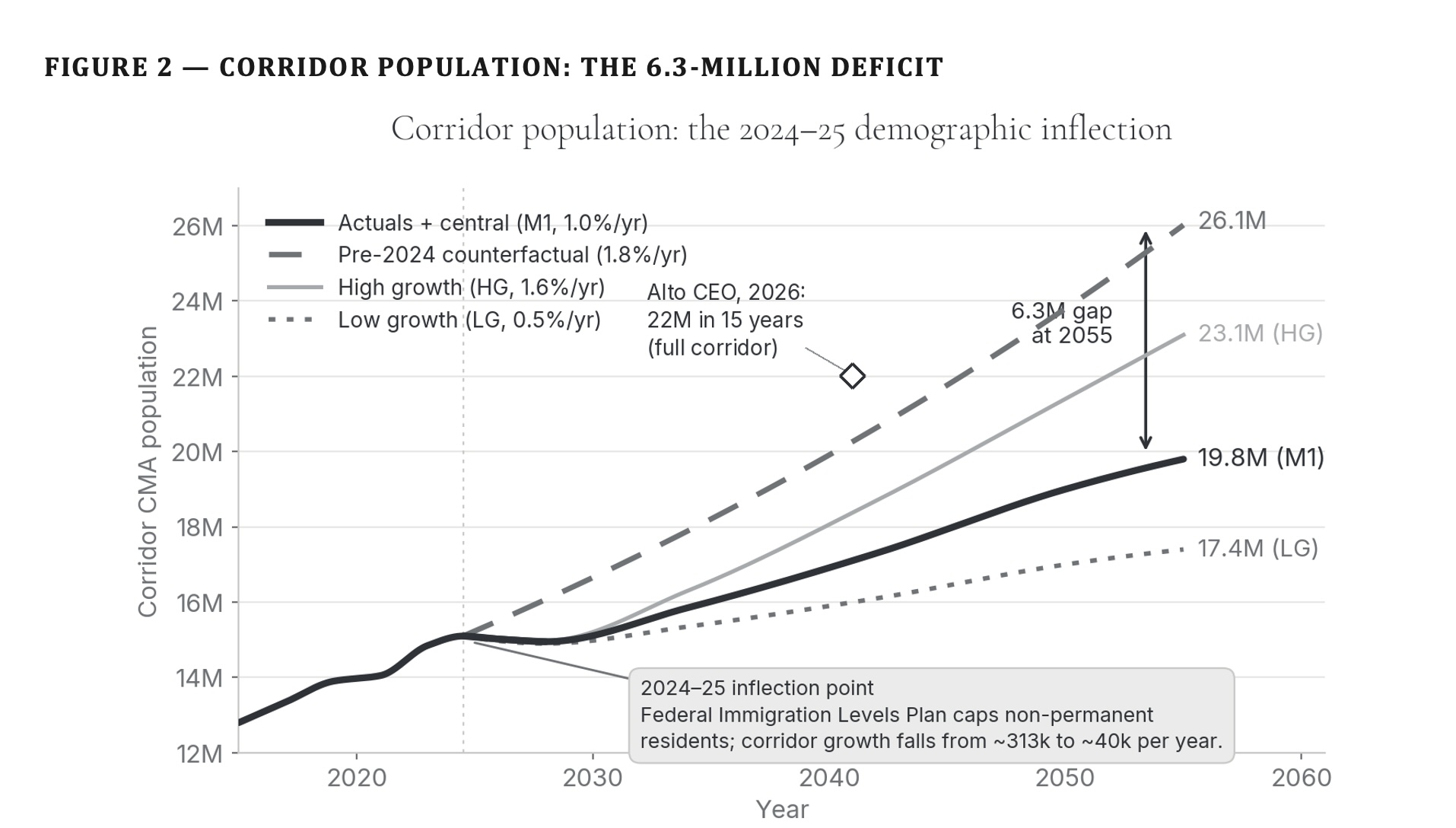
    The corridor’s total travel market is its population multiplied by the number of intercity trips each resident makes on the routes the railway would serve. Modal Shift Note 3 puts the 2025 corridor population at about 14.9 million across the cities directly served, growing at 1.0 per cent a year, and puts intercity travel at about 1.68 trips per resident per year.

    20.1M
    people living in the corridor in 2055, on the central growth path
    Modal Shift Note 3
    33.7M
    intercity trips a year in 2055, by every mode — car, air, bus and rail combined
    20.1M × 1.68 trips each
    71%
    the share of that entire market ALTO’s 24 million riders would represent
    24.0M ÷ 33.7M

    Seventy-one per cent of all intercity travel — car, air, bus and rail together — is a share no high-speed railway is known to have won. It is worth being precise about this, because the famous European figures look higher and are not the same measure. Roughly 75 per cent of Madrid–Barcelona travellers choose the train over the plane, and more than 80 per cent on Madrid–Seville; those are shares of the rail-and-air market, which excludes the car. Against a car that costs its driver almost nothing extra to fill, no comparable share of the whole market has been recorded. Nor is 71 per cent a forecast that fails at some fares and works at others. As the sections below show, no fare produces it.

    What Each Ticket Price Delivers

    Three realistic fare levels, and what each one buys

    Modal Shift Note 3 sets out three combinations of fare and subsidy spanning the realistic range of policy, and reports the share of the market each one wins. The dollar figures are this note’s translation of those descriptions into a fare per kilometre; Note 3 publishes no dollar figures, so the translation is an inference. Every figure below uses the version most favourable to the project.

    The Fare Level What it delivers
    A — Heavy subsidy. $0.15 per km (about $64 a journey). Fares held at today’s VIA Rail levels, with $2.5–4.5 billion a year of public money covering construction costs. 13.5 million riders a year — 38–42% of the market. $27.8 billion of benefit against the $49.5 billion claimed. Fares cover 54% of running costs.
    All three promises:Not met
    B — Moderate subsidy. $0.22 per km (about $94 a journey). Fares matched to airfares, with $1.5–2.5 billion a year of public money covering construction costs. The arrangement the published business case appears to assume. 10.1 million riders a year — 28–32% of the market. $20.9 billion of benefit. Fares cover 64% of running costs — the best result available at any price.
    All three promises:Not met
    C — Minimal subsidy. $0.28 per km (about $120 a journey). Fares set by a private operator to maximise revenue, above airfare levels, with $0.5–1.5 billion a year of residual public support. Closest to a commercially structured P3; ALTO has published no payment mechanism. 7.3 million riders a year — 20–23% of the market. $15.0 billion of benefit. Fares cover 63% of running costs.
    All three promises:Not met
    ALTO as published. No fare stated anywhere in the report. 24.0 million riders a year — 71% of the market. $49.5 billion of benefit. Fares cover 100% of running costs.
    Fare required to produce this:Never published

    Even on the most generous treatment — the heaviest subsidy, mature ridership rather than the slower build-up of the opening years, and ALTO’s own hours saved per passenger accepted exactly as published — the economic benefit is $27.8 billion, not $49.5 billion. That is a reduction of 44 per cent arising from the ridership side alone.

    Paying the Running Costs

    Why cheap tickets cannot fix the finances

    Think of a gym. It pays rent whether 10 people turn up or 1,000 — that cost is fixed. It also buys more towels and cleaning supplies as more people come — that cost varies with use. A railway works the same way, and the split matters more than it might sound.

    Running a railway costs money in two ways. Some costs stay the same however many people ride — track, structures, signalling, stations, head office, and buying the trains. Others grow with the number of trains you run. On ALTO’s own figures, spread over the life of the assets at its own 3.5 per cent rate, the fixed block is $1,130 million a year, and 61 per cent of the total cost does not move with ridership at all.

    That is why cutting fares to fill the trains does not fix the finances. It helps a little at first — more passengers spread across the same fixed cost — and then makes matters worse, because each extra passenger is paying less. Cost recovery does not simply improve as fares rise. It improves, peaks, and then falls back.
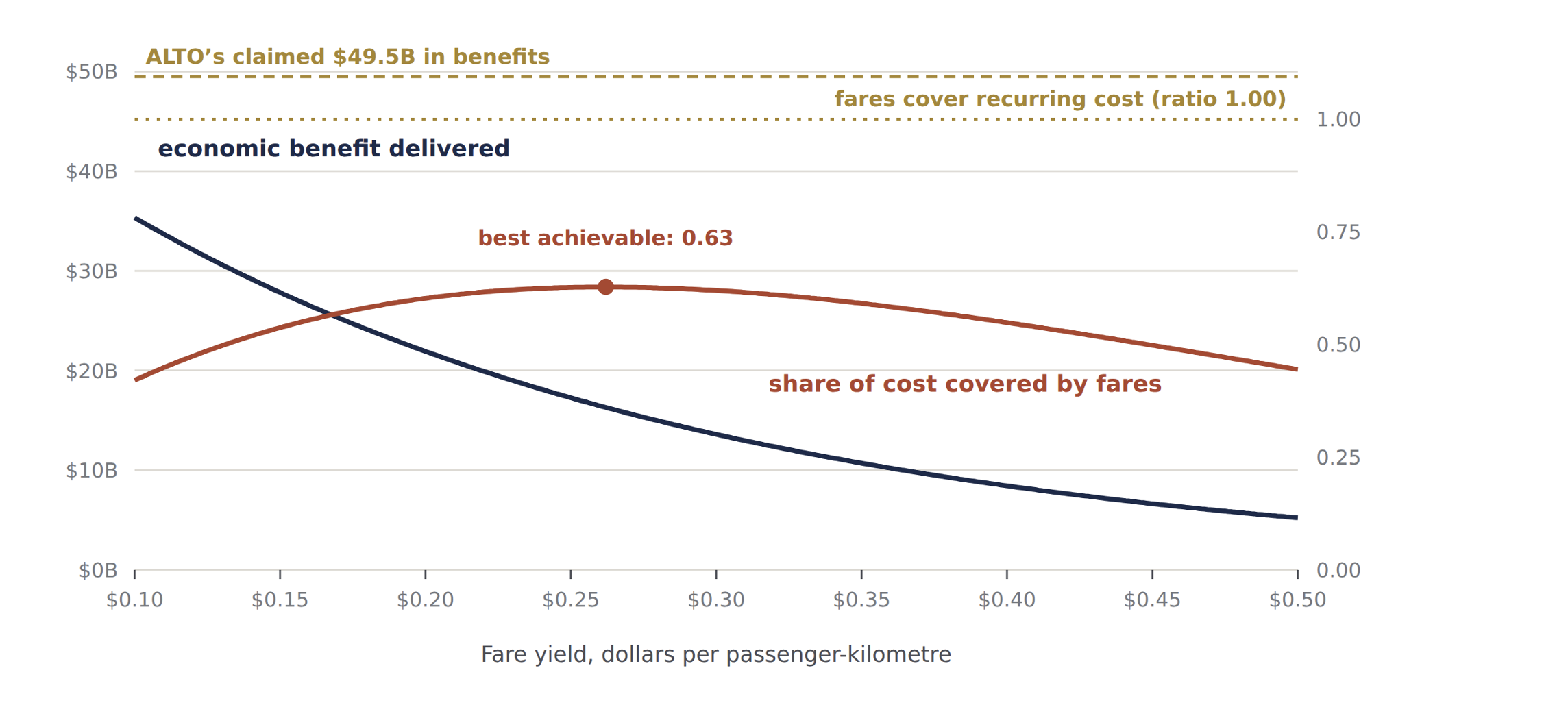
    Chart: economic benefit delivered and share of running costs covered by fares, at each fare. Neither of ALTO's two claims is ever reached.

    Figure 2. Neither promise is ever reached. The economic benefit delivered (navy, left axis) and the share of running costs covered by fares (rust, right axis), at each fare. The two gold lines are ALTO’s two claims. Benefit falls steadily as fares rise; cost recovery rises, peaks well short of covering everything, then falls away as riders drop off. The fare that comes closest to one claim is far from the other. The chart shows cost recovery as a ratio, so its peak of 0.63 is the 63 per cent described here, and the gold line at 1.00 is fares covering costs in full.

    The ceiling is about two-thirds

    The turning point sits at a fare near $0.26 per kilometre, where fares cover about 63 per cent of running costs. The best of the three published levels reaches 64 per cent. At no price in the corridor as forecast do fares cover the cost of running the railway. Fares pay about 63 cents of every dollar; the remaining 37 cents comes from the public, every year, forever.

    And the best fare for the finances is the worst for the benefits

    The fare that comes closest to paying for the railway delivers roughly $16 billion of the claimed $49.5 billion in benefits. The fare that comes closest to one promise is nowhere near the fare that delivers the other.

    Against the cost of building it, nothing reaches a dollar

    Construction of roughly $75 billion, spread across 2027–2037 and discounted at 3.5 per cent, is worth about $57 billion in today’s dollars. Measured against that, every dollar returns 49 cents of benefit at fare level A, 36 cents at level B and 26 cents at level C. ALTO’s own published benefits return 86 cents — and that failure is ALTO’s own arithmetic, not this note’s. None of these figures counts the operating shortfall above, which the public would have to fund on top.

    The Three Promises Joined Up

    There is exactly one answer, and it is about the corridor

    The obvious next step is to check the promises one at a time and report that none of them survives. That is true, and it is set out below. But it is the weaker exercise, because it invites the reply that the whole thing is merely a disagreement with three forecasts.

    A short detour, because the next step depends on it. Suppose you are told two things about a bag of marbles: it holds 18 marbles, and there are twice as many red ones as blue. Neither fact on its own tells you how many are red. Put them together and there is exactly one answer — 12 red and 6 blue. Two facts, each loose on its own, can lock onto a single exact answer once you require both to be true at the same time.

    The same move works on the railway. “24 million riders” is one fact. “Fares alone cover the running costs” is another. Neither tells you the ticket price by itself — plenty of low prices might draw 24 million riders, plenty of high ones might cover costs. Require both at the same price, and as with the marbles there is only one price where that is possible.

    The stronger exercise is to solve the two propositions together and ask what corridor would satisfy them. Covering costs fixes a relationship between the fare and the number of riders; so does the ridership promise. Two equations, two unknowns, one answer.

    The one fare, and the one market, that satisfy all three

    Covering 100 per cent of running costs at exactly 24 million riders requires a fare of $0.1935 per kilometre. At that fare the train wins 32.5 per cent of the market. For 32.5 per cent to equal 24 million riders, the corridor must be generating 73.9 million intercity trips a year. It is forecast to generate 33.7 million. The ratio is 2.19×.

    There is only one such point, and it is worth being clear about why. Above $0.193 the railway covers its costs but carries fewer than 24 million people; below it, it carries more but cannot pay for them. Only at $0.193 do the two meet, and where they meet is fixed by the size of the market. The three promises do not contradict each other. They contradict the corridor.

    That unstated assertion has a value, and it can be put in whichever units a reader finds easiest to judge:

    Expressed as Required by the three promises, against the forecast
    Intercity trips a year, all modes 73.9 million required, against 33.7 million forecast — 2.19×
    People living in the corridor in 2055 44.0 million required, against 20.1 million forecast — more people on the Toronto–Québec City axis alone than live in Canada today
    Intercity trips per resident, per year 3.68 required, against 1.68 — corridor residents travelling more than twice as often as the evidence supports, at a time when remote and hybrid working push the other way
    Annual population growth, 2025–2055 3.7 per cent a year sustained for three decades, against a central forecast of 1.0 per cent and a high forecast of 1.6

    Anyone wishing to defend all three promises therefore has exactly one thing to defend, and it is a claim about demand rather than about engineering or financing. Cheaper construction, faster trains and a different discount rate do not reach it. Only a larger travel market does.

    The Gap That Does Not Close

    No ticket price escapes the problem

    Within the corridor as forecast, is there some fare — between the three levels above, or beyond them — that escapes the problem? There is not, and the reason is structural rather than a matter of forecasting.

    Two things happen at once as the price goes up. The number of riders the railway needs in order to break even falls gently and steadily, like walking down a slope — each rider is worth more, so fewer are needed, but that effect fades out gradually. The number of riders available falls away sharply, because once the train costs about what driving costs, people stop switching to it very quickly. A gentle slope and a cliff do not meet.

    Put more precisely: raising the fare lowers the number of riders needed to break even, because each remaining passenger contributes more. But raising the fare also lowers the number of riders available, and it does so faster. The first effect tails off gradually. The second accelerates, because once the train loses its price advantage over a car that costs almost nothing extra to fill, passengers fall away sharply. The second effect always wins.
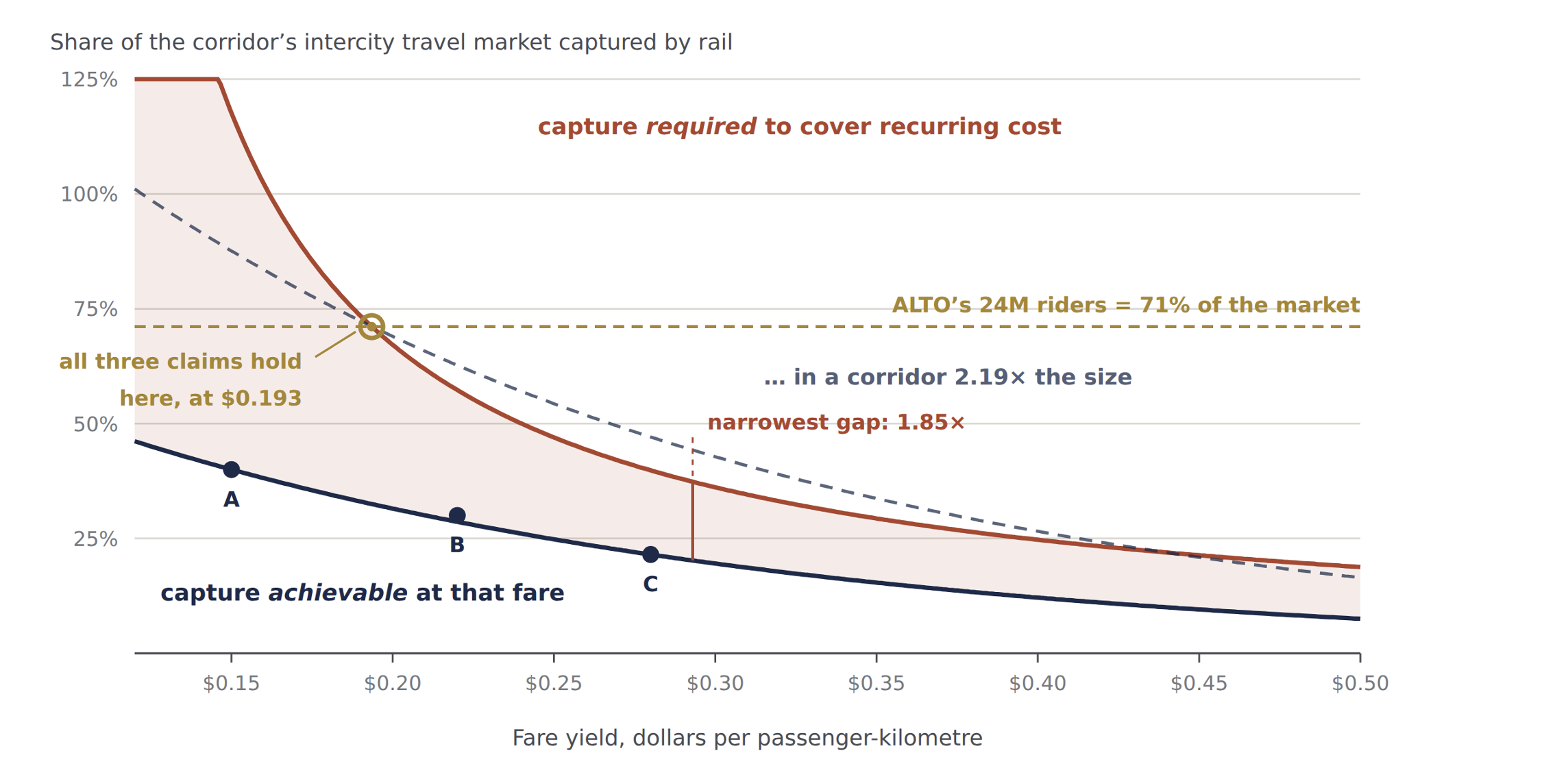
    Chart: the market share the railway needs to cover its costs, against the share it can win, at each fare. The two curves never meet.

    Figure 1. The two curves never meet at any fare. The rust curve is the share of the market the railway would need to cover its running costs; the solid navy curve is the share it can actually win. The shaded area between them is the gap. The dashed navy curve is the same demand curve in a corridor generating 2.19 times as much travel — it touches the rust curve at exactly one point, $0.193, and that point sits on the gold line marking the 71 per cent share ALTO’s 24-million forecast implies. The chart labels this share “capture”, and the fare “fare yield, dollars per passenger-kilometre”.
    At this fare Market share needed, against market share achievable
    $0.15 per km — fare level A
    about $64 a journey
    Needs 117.7% of the entire intercity market. Can win 40%. The railway would have to carry more trips than exist in the corridor at all, across every mode, simply to cover its running costs.
    $0.22 per km — fare level B
    about $94 a journey
    Needs 57.3%. Can win 30%.
    $0.28 per km — fare level C
    about $120 a journey
    Needs 39.8%. Can win 21.5%. This is as close as the gap ever comes: 1.85×, at about $0.29.
    $0.40 per km
    about $171 a journey
    Needs 24.7%. Can win 12.1%. The gap has started widening again as the ridership base collapses.

    Read the last figures as the size of the gap: at every fare, the railway needs between roughly twice and three times the market share it can actually win. There is no fare at which it closes.

    What Would Have To Change

    Fixing one promise at a time

    These are the terms a proponent is most likely to reply in. Three of the four turn out not to reach the joint answer at all.

    A larger travel market — reaches all three

    A corridor population of 34.0 million by 2055, or 2.85 trips per resident, brings 24 million riders within reach. Covering the running costs as well takes the 44.0 million of the joint answer. This is the only repair that reaches all three promises.

    Longer journeys — does not move ridership

    An average journey of 793–1,259 km, against the 428 km assumed — meaning essentially every passenger riding Toronto to Québec City end to end, and at fare level A a journey longer than the line itself. It would help cover costs. It puts nobody extra on a train.

    Lower running costs — covers costs only

    Running costs 37–46 per cent below the O&M Note estimates, with the fixed block down from $1,130 million to about $564 million. Again, nothing on the cost side puts passengers on trains.

    A stronger switch to rail — the same claim in different units

    The whole demand curve lifted by a factor of 2.19 at every fare. This is arithmetically identical to a bigger market, and equally a claim about demand.

    This is the asymmetry the brief turns on. Repairs on the cost side rescue the cost-covering promise and leave the ridership promise exactly where it was, because nothing on the cost side puts passengers on trains. Only a larger travel market reaches all three, and both routes to one — more people, or a greater willingness to switch — are the same claim in different units.

    Where Things Stand · August 2026

    Summary ledger

    Taking the promises one at a time, in the corridor as forecast, at every fare examined:

    Not met
    24 million riders a year. The ceiling across the whole fare range is 13.5 million. At the break-even fare of $0.193 it is about 11 million.
    Not met
    $49.5 billion in economic benefits. The ceiling is $27.8 billion, and that figure accepts ALTO’s own hours saved per passenger without challenge.
    Not met
    Fares cover the cost of running and maintaining the railway. The ceiling is 63–64 per cent, at any price, in the corridor as forecast.
    Robust
    The ceiling on cost recovery is the solid half of this finding. It sits inside the range of fares the modelling actually covers, and needs no projection beyond it.
    Softer
    The ceilings on riders and benefits involve projecting beyond the tested range at fares below $0.15, and a proponent is entitled to challenge them. The joint answer at $0.193 does not depend on any such projection.
    Answerable
    A proponent who accepts a 73.9-million-trip corridor is entitled to hold all three promises at once — and should be asked to say so plainly.

    The three promises are not logically inconsistent with one another, and this brief does not claim they are. There is a genuine joint answer. The difficulty is that the answer describes a corridor that does not exist — and that the fourth promise, the one about how much travel the corridor generates, is the only one ALTO has never had to defend, because it has never been stated.

    That distinction is not a technicality. A single claim that says “this project needs more than twice the travel demand anyone forecasts” invites immediate scrutiny. Three separately sourced numbers that merely happen to agree do not. Splitting one unproven assumption across three chapters is what allowed it to travel through public debate unchallenged — and catching that before tens of billions of public dollars are committed is the whole point of a review like this one.

    Download Full Brief
    Three Claims, One Fare (PDF)
    The complete arithmetic with every step shown, for anyone who wants to check or reject any part of it

    Download PDF

    Limits

    What this brief does not claim

    The translation of the three fare levels into dollars is an inference

    Modal Shift Note 3 defines the three levels by how much subsidy they need and how they compare with airfares, not in dollars per kilometre. The $0.15, $0.22 and $0.28 figures are this brief’s reading of what those descriptions imply. Anyone who rejects the reading should supply the fares the business case actually assumes — and the conclusion holds across the whole range of fares, not only at those three points.

    The 428-kilometre average journey is an assumption

    Carried over from revised O&M Note 3. It matters a great deal: revenue and hours saved both rise and fall with it.

    The construction cost figure is not ALTO’s

    The $75 billion is the midpoint of the $60–90 billion range used elsewhere in this series. ALTO publishes no comparable figure. The returns per dollar should be read as indicative, and they measure benefits against construction cost alone.

    Nothing here depends on the 9.3-billion-hour figure being correct

    It is held at ALTO’s own value throughout. If it is correct, the findings stand as stated. If it turns out to be overstated, the benefit column falls further still and every conclusion here becomes firmer, not weaker.

    The model of the train service is coarse

    A single 450-seat train type, uniformly 65 per cent full over a 1,000-kilometre corridor, is a simplification. A real railway would vary train length and frequency by section, which would cut the ridership-related costs somewhat when ridership is low. It would not touch the fixed costs, which is where the problem lies.
    Sources

    Primary documents and companion notes

    1.

    ALTO, Canada’s Moment: The Economic Opportunity of High-Speed Rail, August 2026. The 24-million ridership forecast, the 9.3 billion hours of travel time saved and the $49.5 billion total benefit figure at a 3.5 per cent discount rate.
    2.

    ALTO, Canada’s Moment, August 2026. The claim appears three times: in the chief executive’s foreword, where revenues are expected to cover all operating and maintenance costs and to offset the ongoing public subsidies conventional passenger rail has historically required; in the executive summary, where operating revenues are expected to fully cover operating and maintenance costs, transitioning passenger rail from a publicly subsidised service to a commercially viable operation; and in the financial chapter, where the project is expected to operate on a self-sustaining basis. The same chapter distinguishes day-to-day operating costs from initial capital investment and lifecycle costs, and states that revenues do not cover all costs once those are included — the distinction examined in revised O&M Note 3, which finds the claim true for day-to-day operations alone, marginal once renewals are included, and failing once the trains themselves have to be replaced.
    3.

    Modal Shift Note 3 — corridor population, starting point and growth path; intercity trips per resident. The 1.68 figure is the 2025 baseline; the working range is 1.6–1.8. Using 1.68 is marginally conservative against this brief’s own conclusion.
    4.

    Modal Shift Note 3 — market shares of 38–42, 28–32 and 20–23 per cent for the three fare levels, which Note 3 calls Regimes A, B and C.
    5.

    Revised O&M Note 3 — infrastructure $1,016M, operations $700M and fleet $127M a year, spread over the life of the assets at 3.5 per cent real; the fixed and variable split giving $1,130M fixed and $8.91M for each train per day.
    6.

    Statistics Canada, The Daily, 17 June 2026 — Canada’s total population estimated at 41,417,056 on 1 April 2026, a decrease of 55,025 over the preceding quarter.
    7.

    Fare levels, service assumptions and the joint solution are set out in full in the PDF brief, including the two equations solved simultaneously in §6.1.
  • The wrong answer to the right question

    Coalition for Better Rail · ALTO HSR Citizen Research Initiative · The HPR Research Report

    The Wrong Answer to the Right Question

    The corridor genuinely needs better trains. What it got instead was a project that grew far beyond its original plan during procurement — and that can’t be fixed with tweaks, because its problems come from how it was chosen, not how it’s being built.

    This chapter doesn’t dispute that the Windsor–Toronto–Ottawa–Montréal corridor needs better intercity rail. It does. What it disputes is ALTO — on grounds that are about method and evidence, not politics. We trace how a modest upgrade of a largely existing, disused rail corridor turned into a 300 km/h greenfield megaproject during a competitive bidding process, lay out four structural problems with the project as designed, and explain why none of it can be patched from the inside.

    Source Note

    Much of this chapter draws on documents obtained through Access to Information requests — internal board and executive records, procurement files, and the independent fairness monitor’s final report — along with the Initiative’s own independent cost, ridership, and route-friction models. Specific releases are cited by their file numbers throughout. Some key documents, including the internal slide where the project’s scope was reframed, remain withheld.

    Download
    Chapter 2: The Wrong Answer to the Right Question (PDF)
    The full chapter, with footnotes and sourcing
    Download PDF
    2.1 · The Real Problem

    The corridor genuinely needs better trains

    The Windsor–Toronto–Ottawa–Montréal corridor connects Canada’s two largest metro areas and the national capital, and generates roughly half the country’s GDP. Despite that, intercity rail service on it is among the worst in any comparable wealthy country. VIA Rail shares track with CN freight, and freight trains get priority — when both need the same stretch of track, the passenger train waits in a siding. The result is slow, unreliable, and infrequent service.

    <64%
    VIA Rail’s on-time performance in 2023 — worse than Air Canada’s 63%, which itself ranked last among North America’s ten largest airlines
    4h+
    Scheduled Toronto–Montréal journey time — more than double a competitive flight, including check-in
    ~50%
    Share of Canada’s GDP generated in this corridor — the economic weight today’s rail service fails to serve

    Schedules are padded with hours of slack to absorb the delays that freight priority makes routine. The result isn’t competitive with driving or flying, and VIA can’t simply add more trains without bumping freight that has the contractual and legal right of way. So the question this report asks isn’t whether the corridor needs investment. It’s what kind of investment actually delivers it — at what cost, on what timeline, with what risk.

    2.2 · How This Happened

    A modest upgrade grew into a much bigger, much pricier project — during the bidding process

    ALTO’s cost and ambition problems didn’t come from ordinary planning drift. Records obtained through Access to Information show the project’s scope escalating in the middle of the bidding process itself — not through any public announcement or debate. Understanding how that happened explains why ALTO costs what it costs today.

    One thing to be clear about up front: this is not a claim that the procurement was run improperly. BDO Canada, the independent fairness monitor appointed in 2022, concluded in its final report of May 2025 that the process it observed was carried out in a fair, open and transparent manner, and recorded no fairness concerns at any stage. The problem is not that rules were broken. It is that a process run properly within its own terms produced a project no one had put to Parliament.

    What was on the table originally

    The project ALTO replaced was VIA Rail’s High Frequency Rail (HFR) plan: a dedicated-track plan running at up to 177 km/h, largely reviving a long-disused rail right-of-way through Peterborough, Havelock, and Smiths Falls — a separate, more direct route away from the CN Kingston Subdivision VIA still shares with freight today — delivered incrementally, segment by segment. Its own 2021 business case projected about 13.5 million riders a year, at a capital cost roughly a quarter to a third of what ALTO now proposes. That’s the baseline the public was never shown as a discrete choice against what came next.

    An open-ended bidding process

    The request for proposals went out in October 2023 without a settled route — internal records show the route was still being debated at the executive and board level as late as March 2024, five months after bidding opened. It also asked every bidder for two designs: one topping out at 200 km/h, and a second, more ambitious one with high-speed sections. The process then included 36 structured private meetings between the government and each bidder over eight and a half months.

    All three bidders proposed something bigger

    A Privy Council Office briefing note of 20 February 2025, released under access to information, records that as the bidding progressed all three shortlisted consortia put forward designs more ambitious than the high-frequency plan — new routes on largely new land, above 250 km/h. The jump in scope did not come from any one bidder. The winning consortium, Cadence — CDPQ Infra, AtkinsRéalis, Keolis, SYSTRA Canada, SNCF Voyageurs, and Air Canada — brings substantial experience in dedicated, higher-speed rail: its members built Montréal’s REM and operate France’s TGV network. What has never been published is the comparison the bidding process was set up to produce. The same briefing note credits an unnamed third party with concluding those bigger proposals would deliver greater benefits, and that analysis has not appeared in any release to date.

    Billions committed before the plan was finished

    The government committed $3.9 billion in the 2024 Fall Economic Statement before the business case was finalized and before a route was chosen. The internal slide that appears to document the scope escalation — titled “Level of Ambition Supported by Business Case” — remains withheld from public release. Once the funding commitment was public, there was effectively no way back to the smaller project.

    Selling the bigger, pricier version

    With the scope already locked in, the government faced a communications problem: a project that started as “VIA HFR” was now something much closer to European-style high-speed rail. Internal records show “high frequency” tested poorly with Ontario audiences, while the name “Alto” tested well with 18–34-year-olds and worked bilingually. A national ad campaign promoting the project’s benefits ran while the business case and route documents were still being withheld from information requesters.

    The pattern, stated plainly

    A project that entered the bidding process as a $9–12 billion, 177 km/h upgrade of a largely disused rail corridor came out the other side as a $60–90 billion (on the government’s own published figures — our independent estimate is materially higher), 300 km/h greenfield railway. That change in scope was never put to Parliament or the public as a choice. It emerged from the mechanics of the procurement itself.

    2.3 · Four Problems Built Into the Design

    Route, math, price tag, ridership — each one falls short

    Having won a mandate for a much bigger project than the one that went to bid, ALTO’s proponents faced four separate problems: a route through sensitive land, a business case that has to clear a federal investment bar, a cost estimate that has to hold up, and a ridership forecast that has to be believable. None of the four holds up well under independent scrutiny.

    2.3.1 · The route runs through some of the most sensitive land in the corridor

    ALTO’s proposed new corridor crosses the Frontenac Arch Biosphere Reserve — a UNESCO-designated ecological corridor — the Napanee Limestone Plain, habitat for several species at risk, and Leda clay deposits south of Ottawa with known engineering hazards at high speed. This wasn’t a routing choice made for technical reasons; it reflects a decision to build an entirely new, 300 km/h-optimized corridor rather than follow existing, already-disturbed infrastructure. In our Participant Experience Survey, only 2% of respondents received direct notification about ALTO, and 88% found the information they did get inadequate. Our Community Friction Index — which scores corridors on land conflict, municipal pushback, expropriation exposure, ecological sensitivity, and public mobilisation — puts ALTO’s corridor at 54 out of 100, in the high-friction range. That matters financially, not just politically: in our statistical model, community friction is a significant predictor of cost overruns.

    2.3.2 · The math doesn’t clear the government’s own bar

    The only published economic appraisal of this corridor is the December 2021 business case for the predecessor project. It puts the benefit-cost ratio at about 0.13 over a 30-year period — about thirteen cents of measured value for every dollar spent — rising to about 0.4 once two newer and less established benefit categories are added in. A separate calculation in the same document shows a net loss of $21.1 billion in present-value terms. These are the government’s own figures. A ratio of 1.0 is simply break-even, the point where benefits equal costs. Our independent analysis, which grounds every input in how comparable projects have actually performed rather than project-specific projections, finds the ratio is likely far worse still.

    ScenarioWhat it shows
    Published (Dec 2021 appraisal)
    30-year evaluation period
    Benefit-cost ratio ~0.13, or ~0.40 on the expanded basis
    Initiative reference-class estimate
    Cost assumed: ~$143B
    Benefit-cost ratio ~0.03–0.11
    Break-evenBenefit-cost ratio of 1.0 — benefits equal costs
    In plain terms

    ALTO fails its own government’s investment test on the government’s own numbers. Checking those numbers against how similar projects have actually performed makes the gap worse, not better.

    2.3.3 · The price tag is very likely too low

    ALTO’s published cost range of $60–90 billion comes from an early-stage estimate — the type quantity surveyors flag as accurate only to within roughly ±50%, which makes it a planning figure, not a firm commitment. Our own cost model, built from 16 comparable rail megaprojects worldwide and calibrated to those projects’ actual outcomes, puts ALTO’s realistic central cost at around $143 billion, with a worst-case scenario approaching $200 billion or more once cold-climate engineering risk (frost-susceptible clay, karst terrain, freeze-thaw cycles at high-speed tolerances) is factored in.

    2.3.4 · No independent study backs the ridership numbers

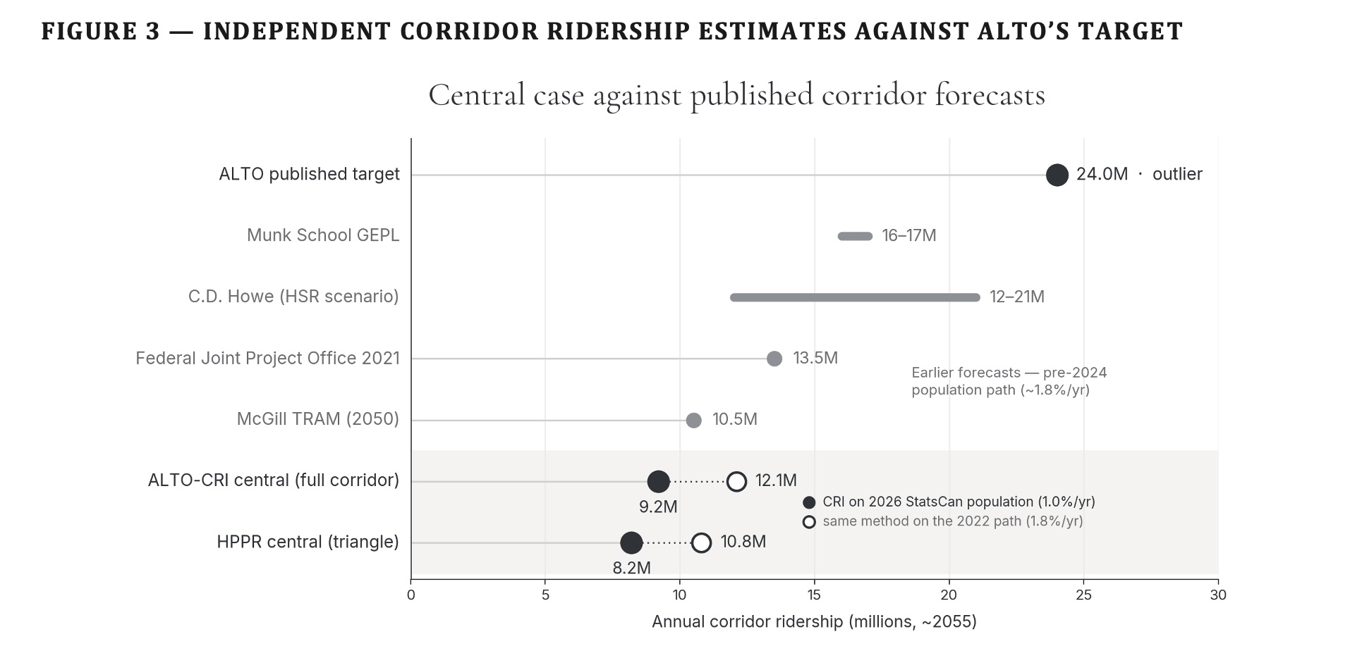
    ALTO projects 24 million riders a year by 2055. No car-dependent North American corridor without existing high-speed rail has ever come close to that. Research on transportation megaprojects generally finds ridership forecasts overstate actual results by about 51% on average. Our own bottom-up model — built from corridor population, trip-making patterns, and VIA’s own ridership data, tested under three different fare and subsidy scenarios — puts 2055 ridership at 3.7 to 17.2 million, with 9.2 million as the central estimate. ALTO’s 24-million target sits 40% above even our upper bound.

    Source2055 ridership estimate
    ALTO’s public target24 million
    ALTO’s internal Corporate Plan figure (by 2059)17 million — about 30% below the public figure
    McGill TRAM stated-preference study~19.7 million (year 50)
    Munk School (U of T) model18–19 million (year 30)
    Standard bias correction applied to ALTO’s own figure8.4 million
    Initiative bottom-up model, central case9.2 million (range: 3.7–17.2 million)
    The pattern here too

    Every independent forecast built from a published methodology lands within or close to our range. ALTO’s own public target is the outlier — and it’s the one figure whose methodology has never been disclosed.

    2.4 · Why Patching It Won’t Work

    These aren’t execution problems — they’re the project’s founding choices

    A different route doesn’t fix the business case. A revised ridership forecast doesn’t fix the cost problem. Tighter project management doesn’t undo the fact that funding was committed before the business case was finished, on a specification set by the bidding process rather than by public need. Four reasons why this can’t be corrected from within:

    It’s been treated as one-of-a-kind, so nothing gets checked against it

    ALTO’s documentation consistently describes the corridor as having no real comparator, which is exactly the reasoning pattern researchers have found opens the door to over-optimistic numbers. Every genuinely comparable project elsewhere in the world gets waved away as not relevant — leaving the project’s own estimate as the only “evidence” available.

    The most optimistic version of the numbers is the one that won

    In competitive funding processes, the most optimistic projection tends to win, because optimism produces a better-looking business case than realism does. A version built on our reference-class numbers — a benefit-cost ratio of 0.03–0.11 — could never have survived the funding decision. The optimistic version did, but only because the more realistic numbers weren’t available yet when the commitment was made.

    The first segment is too weak to stand alone — which is exactly the point

    The planned first segment, Ottawa–Montréal, is the corridor’s weakest market: roughly 98% of that travel is currently by road, and there’s barely any competing flight traffic for a speed premium to beat. It can’t pay for itself. Its economics only work if the network keeps extending toward Toronto — which locks in a public commitment to the rest of the corridor before its full price has ever been disclosed. Britain’s HS2 project shows how badly this can go if it doesn’t: two legs cancelled, leaving a line more than double its original budget serving less than half the original network. HS2 at least stranded into its strongest market. If ALTO’s later phases stall, it strands into its weakest.

    The alternative is quietly being closed off while this proceeds

    The report’s proposed alternative, HPR, would run alongside the existing Highway 401 corridor. Ontario’s ongoing 401 widening is already consuming the road margin that alternative would need, section by section. Every year ALTO’s planning phase continues is a year in which that door narrows further — a real cost that doesn’t show up in any of ALTO’s published figures.

    What’s Next

    What’s in the rest of this report

    This chapter has traced one argument in four parts: the corridor’s need is real (2.1); a modest upgrade became a much bigger project during procurement (2.2); the resulting project has four structural problems (2.3); and none of it can be fixed by refinement (2.4). The chapters that follow set out the alternative.

    Ch. 3
    The HPR alternative. How a passenger line built along the existing Highway 401 and rail corridor can free up freight capacity at the same time, instead of building an entirely new line elsewhere and leaving the freight problem untouched.
    Ch. 4
    Route and cost. Where the line would go and what it would cost, using the same cost model applied consistently to both ALTO and HPR.
    Ch. 5
    Environment and communities. How the two options compare on carbon emissions and disruption to the communities along the route.
    Ch. 6
    How many people would ride it. Ridership estimates built on the real-world pattern, checked four different ways.
    Ch. 7
    Running costs. The ongoing yearly balance between what it costs to operate and maintain the railway, and what fares plus any subsidy bring in.
    Ch. 8
    Is it worth it. A full cost-benefit and financial analysis across a range of scenarios, including the value of the freed-up freight capacity.
    Ch. 9
    Getting it built. How to phase construction, manage the risk of cost overruns, and keep the project accountable to the numbers in this report.
  • Would an Alto stop help kingston

    Would an ALTO Stop Help Kingston?

    Kingston has one of the busiest stations on the network. The question that matters is not whether it gets a stop, but whether a stop would leave more people riding the train, or fewer.

    ⚠ What has been said, and what has not been published

    On 22 July 2026 ALTO’s chief executive, Martin Imbleau, told CBC Radio’s Ottawa Morning that Kingston will probably get a station, and that most ALTO trains would pass through without stopping.1 Neither the timetable nor the location of the station has been published.

    Those two missing facts are exactly the ones that decide the outcome. This brief therefore tests the range: today’s railway, a faster conventional railway using the existing station, and ALTO with a station either inside the city or a twenty‑seven‑minute drive north of it, at normal fares and at fares 25 per cent higher. Every number that goes into the model is listed, so any of them can be argued with.

    The short answer

    Of the options tested, only one leaves Kingston with more rail trips than it has today: a faster conventional railway serving the existing station, at about 12 per cent more. The best ALTO case — a station inside the city, at normal fares — roughly matches today. Every other ALTO case comes out below today’s service, by 8 to 17 per cent.

    The reason is simple. Speed is only one part of what makes a train trip worth taking. ALTO’s faster run to Toronto is worth about 10 per cent more trips on its own. But cutting the number of daily stops from eighteen to eight gives that back. Charging 25 per cent more gives it back again. Moving the station twenty‑seven minutes north of the city costs another 6 to 8 points on top.

    Running more trains cannot rescue it by itself. Even at eighteen stops a day, matching what Kingston has now, an out‑of‑town station at a premium fare still comes out around 9 per cent below today. And about 8 per cent of Kingston’s trips — Belleville, Brockville, Cobourg, Napanee, Oshawa — have no ALTO equivalent at any frequency, because high‑speed trains do not stop at those places.

    Download
    Kingston’s ALTO Ridership Analysis — Full Brief (PDF)
    Full method, all parameters, sensitivity ranges and break‑even tables
    Download PDF
    The Comparison

    Six versions of Kingston’s railway

    The table below is the whole brief in one place. The first row is what Kingston has today. The second is a faster conventional railway from the same station. The last four are ALTO, differing only in where the station sits and what the ticket costs.

    +12%
    faster conventional railway, existing station, same number of trains, normal fares
    the only option that grows ridership
    0%
    best ALTO case: station in town, normal fares, eight stops a day
    matches today, does not beat it
    −17%
    ALTO station 27 minutes north, eight stops a day, fares 25% higher
    central case for an out‑of‑town station

    Table 1 · Headline comparison

    OptionTo TorontoStops a dayFare premiumAnnual tripsChange
    Today’s service135 min18none450,000
    Faster conventional railway, existing station95 min18none502,000+12%
    ALTO, station in town80 min8none449,0000%
    ALTO, station in town80 min8+25%403,000−10%
    ALTO, 27 min north80 min8none416,000−8%
    ALTO, 27 min north80 min8+25%376,000−17%

    All four ALTO rows assume eight stops a day and that today’s conventional service is withdrawn. They differ only in where the station is and what the ticket costs. No fare structure for intermediate stations has been published, so both possibilities are shown rather than assumed. The faster conventional railway is the 240 km/h new‑build line proposed under the High Performance Rail framework, serving the existing station.

    Starting Point

    Why Kingston already rides the train

    Kingston’s place among the busiest stations on the network gets cited as the reason it should have a high‑speed stop. But what produces that ridership decides whether a different kind of station would reproduce it. Four things do most of the work, and a high‑speed alignment north of the city removes two of them.

    It gets two sets of trains, not one

    Kingston sits halfway along the Toronto–Montréal mainline, and the Toronto–Ottawa trains use the same track as far as Brockville. So Kingston collects two timetables instead of one, and ends up with a level of service beaten only by the three biggest cities on the corridor. Frequency matters to ridership on its own, quite apart from speed: in intercity rail, a 10 per cent increase in service typically brings 4 to 7 per cent more trips.

    The station serves a region, not a city

    Napanee, Gananoque, Amherstview and the western Thousand Islands have no intercity rail of their own, so people drive to Kingston to catch the train. Ridership credited to a city of 132,485 is actually generated by an area several times larger; the Kingston census metropolitan area is 172,546.6

    The population is unusually inclined to take the train

    Some thirty‑nine thousand post‑secondary students study in a city of 132,485: Queen’s enrols 32,585, St. Lawrence College about 4,000 full‑time equivalents at its Kingston campus, and the Royal Military College of Canada 2,418.5 That is about twenty‑nine students for every hundred residents — against roughly twenty‑three in Sherbrooke and twenty‑one in Guelph, the two Canadian cities most often set beside Kingston on this measure.7 Many come from the Toronto and Ottawa regions and travel without a car. Kingston also has a large retired population, for whom avoiding the highway is the point of the trip, and an unusually high share of hospital, university, military and public‑sector jobs where travel is expensed and defaults to rail.

    But that ridership is hard to charge a premium for

    This travel is not spread evenly. It piles up at term boundaries, Thursday and Sunday afternoons, reading weeks and holidays, and it creates a matching flow of families travelling to Kingston. These are the travellers most sensitive to how often trains run and how far the station is from where they are going, and the least able to just drive instead. They are also the least profitable: peaked, price‑sensitive, and largely outside the weekday business hours a high‑speed operation’s revenue depends on.

    Two things worth being clear about

    The ridership figure itself is not published. Kingston’s standing as one of the busiest stations rests on statements by the operator and the Minister, not on released station‑level data. That is the first item on the list of things that should be published, at the end of this brief.

    Existing demand is not the same as new demand. Busy today proves Kingston already travels by train. It does not prove that a different station would generate additional trips. Only new trips add ridership to the corridor.

    There is also no flight from Kingston to Toronto. Elsewhere, high‑speed rail wins its premium passengers off aircraft. In Kingston those passengers are already on the train, so there is nobody to convert. Extra trips can only come out of cars, or be created from nothing.

    Both of the things that built Kingston’s ridership — frequent trains, and a station within the city, roughly ten minutes from the core and the university — are the two things a high‑speed alignment north of the city takes away. That is what the model is built to test.

    Method

    How the numbers were worked out

    Every trip is priced in minutes. Add up the time on the train, the time getting to and from the station at each end, the waiting created by having fewer trains, and the fare converted into minutes using what an hour is worth to that kind of traveller. Time spent driving to a station or standing on a platform counts for more than time sitting on a moving train, because people dislike it more. Journeys that involve changing trains carry an allowance for the change. That matters for one market in particular: ALTO reaches Montréal from Kingston by way of Ottawa, so some of those journeys involve a change, where a direct lakeshore railway does not.

    That total is the real cost of the trip. If it goes up, fewer people travel. If it goes down, more do. The response used here is roughly one for one: make the total 10 per cent better and you get about 10 per cent more trips.

    Travellers are split into four destinations and four types, each divided by whether they have a car available: thirty‑two groups, each worked out separately and then added up. That matters because a student without a car and an expensed public‑sector traveller react to a distant station in completely different ways.

    Table 2 · Everything the model assumes

    InputValue used
    Trips today450,000 a year through the station (tested from 400,000 to 550,000)
    Where people goToronto 58%, Ottawa 22%, Montréal 12%, other corridor stations 8%
    Who travelsStudents 30%, seniors and leisure 25%, public sector 20%, other 25%
    Share without a carStudents 85%, seniors and leisure 50%, public sector 15%, other 20%
    Worth of an hour$14, $20, $48 and $24 respectively, in the same order
    Time on the trainToday 135 / 120 / 160 min; ALTO 80 / 45 / 105 min (Toronto / Ottawa / Montréal)
    Getting to the stationExisting station 10 min by car, 20 by transit; ALTO 27 by car, 35 by shuttle
    How that time is weighted1.5 times if a car is available, 2.0 times if not
    WaitingHalf the gap between trains, weighted at 0.5, across a fifteen‑hour day
    ALTO fare premium25% in the central case; 0% and 40% also tested
    Sensitivity of demandOne for one in the central case (tested from 0.8 to 1.2)

    Far‑end access time is held identical in every scenario, which is a conservative choice: it gives ALTO the benefit of the doubt at the Toronto and Ottawa ends.

    Two possible futures for today’s trains

    Every service level is tested twice, because the answer depends less on ALTO than on what happens to the service Kingston already has.

    Replacement

    ALTO becomes Kingston’s rail service to Toronto, Ottawa and Montréal, and conventional service is withdrawn or cut below a useful level. Trips to Belleville, Brockville, Cobourg, Napanee and Oshawa lose their train altogether.

    Both together

    Today’s service keeps running at present frequency and ALTO is added on top. Travellers pick whichever is cheaper in total, and only the improvement over the better of the two creates new trips.

    What is assumed rather than known

    Four inputs are estimates, not published data: the number of trips today, where those trips go, ALTO’s journey times (the alignment for this stretch has not been published), and where the station would be. All four appear on the list at the end of this brief. The model also applies a constant response to a very large change in trip cost, which is at the outer edge of where this method behaves well. The direction of the results is solid. The exact sizes are indicative.

    Result One

    Where the speed gain goes

    Start with today’s service and change one thing at a time. This is the clearest way to see why a faster train can still end up with fewer passengers.

    Table 3 · One change at a time

    StepAnnual tripsChangeEffect of this step
    Today’s service, as it runs450,000
    Cut the Toronto run to 80 minutes, change nothing else496,000+10%+10 pts
    Cut stops from 18 a day to 8449,0000%−10 pts
    Add a 25 per cent fare premium403,000−10%−10 pts
    Move the station 27 minutes north376,000−17%−6 pts

    The second row is the entire value of high‑speed running time at Kingston: about 10 per cent. Each of the three things that come with it takes back as much or more. This calculation already leaves out trips to other corridor stations, which a high‑speed line cannot serve at any frequency.

    Result Two

    More trains cannot fix it on its own

    Suppose the number of stops is the thing that gets negotiated. Hold the station twenty‑seven minutes north and the fare 25 per cent higher, and vary how often ALTO calls.

    Table 4 · ALTO at a station 27 minutes north

    Stops a dayAnnual tripsChangeRangeIf today’s trains stay
    6359,000−20%−17% to −24%0%
    8376,000−17%−13% to −21%0%
    10387,000−14%−10% to −18%+0.2%
    18408,000−9%−4% to −14%+1.6%
    12 (six each way)394,000−12%−9% to −17%+0.5%
    16 (eight each way)404,000−10%−6% to −15%+1.3%
    20 (ten each way)411,000−9%−3% to −14%+1.9%

    The range covers the whole plausible span of the model’s assumptions, at a 25 per cent fare premium. The bottom three rows read six, eight and ten as stops each way, which is the most generous reading available. It improves the result without changing the sign. The last column is the “both together” case, where today’s service survives: ALTO then adds almost nothing, because travellers only switch when it is genuinely better for them.

    The fare premium matters more than the timetable

    Table 5 · What moves the answer

    Stops a dayNormal faresFares +25%Fares +40%Station 25 min outStation 45 min out
    6−12%−20%−24%−17%−23%
    8−8%−17%−21%−13%−20%
    10−5%−14%−19%−10%−17%

    The last two columns hold the fare premium at 25 per cent and vary the drive from the station to downtown; the central case is 27 minutes. Notice that going from normal fares to a 25 per cent premium costs more than doubling the distance to the station.

    How many trains would it actually take?

    The more useful question is what it would take for an out‑of‑town ALTO station to be no worse for Kingston than the service it already has. At normal fares the answer is nine stops a day for everyone. At a 25 per cent premium, the answer falls apart.

    Table 6 · Daily stops needed just to match today, Toronto trips

    Who is travellingAt normal faresAt a 25% premium
    Public sector and institutional (expensed)913
    Other business and leisure927
    Seniors, leisure, visiting family948
    Students and young adults9no number works

    Forty‑eight stops a day is a train every twenty minutes all day. For students, no frequency at all makes up for a distant station plus a premium ticket, because their time is worth less than the fare increase costs them.

    One case runs the other way and should be said plainly: expensed public‑sector travel between Kingston and Ottawa is better off under ALTO in every scenario tested, because today’s service on that pair is slow and indirect. It is a real gain, and it is a small share of the total.

    Under the friendliest assumptions available — normal fares, a station twenty‑five minutes out, today’s trains kept running alongside, ten stops a day — the best figure the model will produce for an out‑of‑town Kingston station is about +8 per cent. Getting there means giving up the premium pricing the revenue case depends on everywhere else.

    Result Three

    What if you just made today’s trains faster?

    Now reverse the test. Keep the existing station, keep eighteen stops a day, keep normal fares, and change nothing but speed on the existing route.

    Table 7 · Speed alone, from the existing station

    Toronto journey timeTime savedAnnual tripsChange
    135 min, as it runs today450,000
    118 min, reliable 160 to 177 km/h13%471,000+4.6%
    95 min, a 240 km/h conventional railway30%502,000+11.6%
    80 min, upper bound for this station41%525,000+16.6%

    The last row applies high‑speed running time to the existing station. It is there to separate speed from station location, frequency and fare, not as a proposal.

    The comparison that matters

    Eighty minutes to Toronto from the existing station, eighteen stops a day, normal fares: about +17 per cent. The same eighty minutes from a station twenty‑seven minutes out of town, eight stops a day, fares 25 per cent higher: about −17 per cent.

    The time on the train is identical. The two outcomes are thirty‑four points apart, and every one of those points is station location, frequency and fare.

    Speed gives diminishing returns

    Roughly speaking, every 1 per cent cut in journey time buys about 0.4 per cent more trips. A 30 per cent time saving buys about 12 per cent more passengers. For most of Kingston’s travellers, time on the train is a minority of what the trip really costs them — fare, getting to the station and waiting make up the rest, and speed does nothing about any of those. The gain concentrates where an hour is worth most: on a 95‑minute conventional railway, public‑sector travel grows about 17 per cent, business and leisure 13, seniors and leisure 12, students 10.

    A conservative figure, and a warning

    These figures are cautious. The response to journey time implied here is weaker than the rail literature usually finds, because the fare term in the calculation dampens it. Using a more standard figure, the same 30 per cent time saving would give about +22 per cent rather than +12. Table 7 should be read as a floor, with the 95‑minute case plausibly worth anywhere from +10 to +25 per cent. The comparisons earlier in the brief are unaffected, because they compare like with like.

    The warning is that fares erode the gain fast in either direction. Raising tickets 10 per cent to help pay for an upgrade cuts the benefit from about +12 per cent to about +7 — two‑fifths of the speed gain eaten by a 10 per cent fare rise. That is the same mechanism that sinks the high‑speed cases, working here on the alternative. It is an argument for funding an upgrade from capital rather than from the farebox.

    What It Means

    A stop is not the same as service

    Three things set whether Kingston gains or loses, and speed is not one of them: how far the station is from where people are actually going, what the ticket costs, and whether today’s trains survive. Frequency cannot rescue the result on its own. At eighteen stops a day, matching today, an out‑of‑town station at a premium fare still comes out around 9 per cent down.

    A public debate about whether Kingston gets a station, and how many trains stop there, is a debate about the wrong variables.

    The two things ALTO has said do not fit together

    A station justified by strong ridership, but served by a minority of trains, has its timetable set by the express service rather than by the demand used to justify it. Table 6 shows why that is not a workable compromise: the frequency needed to make the station work at a premium fare is far above what an express pattern tolerates. The usual international answer is two tiers, express and semi‑fast, which needs somewhere for fast trains to overtake at the intermediate station. Whether the cost estimate includes that overtaking capacity is a question with two possible answers, and both are informative.

    A conventional railway does better here

    A new conventional railway built for 240 km/h, running typically at 200, serves Kingston without moving the station, without the fare premium high‑speed operation needs, and without cutting the number of trains that stop. It captures a smaller share of the theoretical time saving and a larger share of the ridership. That is the trade the tables above quantify.

    What Would Change the Answer

    Three commitments, and four documents

    None of this is a prediction that a Kingston station must fail. The results turn on assumptions, and those assumptions are all things the project could settle.

    Would help
    A station much closer to the core, or a frequent connection to it that is committed and timed to the trains rather than hoped for.
    Would help most
    Normal fares on Kingston journeys. Table 6 shows this is the single decisive variable. A premium fare is what makes the arithmetic unrecoverable for students, seniors and leisure travellers.
    Would help
    A binding commitment that service on the existing line is maintained, which turns the replacement case into the both‑together case, plus a published timetable, so frequency becomes a fact instead of an assumption.

    Four things that should be published

    Before any of these figures are treated as more than an order of magnitude, four inputs should be replaced with real data:

    Not published
    Station‑level boardings and destinations. This alone would settle both the number of trips today and where they go. A matter for the operator.
    Not published
    The calling pattern assumed for the Toronto–Ottawa segment — how many trains actually stop, and where.
    Not published
    The fare structure for intermediate stations. On the evidence above, this matters more than anything else on the list.
    Not published
    The station location, with the assumed travel time from it to downtown Kingston.

    The first sits with the operator. The other three sit with the project and its joint project office, whose report and business case remain unpublished.

    The finding that matters

    It is not that a Kingston station would fail. It is that the service Kingston already has is the benchmark the project has never been asked to beat — and on the assumptions set out here, it does not beat it.

    How to read the numbers on this page

    Every number here other than the two quoted statements is output from our own model, built on the parameters listed in the full brief. Those parameters are assumptions, not measurements, and the four listed above as needing publication are the ones that move the result. The model is set out so that any parameter can be replaced and the arithmetic re-run: the direction of the findings holds across the ranges tested, the exact magnitudes are indicative.

    Where ALTO has not published something — a timetable, a station location, a fare — we say so rather than inferring it, and we make no claim about why it has not been published.

    Sources
    1.
    CBC News, “Kingston probably getting high-speed rail stop, says Alto CEO,” 22 July 2026 — interview with Martin Imbleau on CBC Radio’s Ottawa Morning. He says Kingston will probably receive a station, citing ridership, and that most ALTO trains would pass through without stopping, along with Laval and Trois-Rivières, to preserve express service between the larger cities. cbc.ca
    2.
    City of Kingston, Council Meeting Minutes 2026-06, 17 February 2026, Resolution 2026-73, carried as amended 9–2 — support for a southern route contingent on Highway 401 corridor development and on a stop being added in Kingston, as close to the urban core as possible. Examined in the companion brief Which Trains Stop in Kingston?
    3.
    Elasticity ranges: intercity frequency elasticities of +0.4 to +0.7 and journey-time elasticities of −0.6 to −0.9 are the conventional ranges in the rail demand literature, used here as reference values rather than as findings of this brief. The generalised-cost elasticity of −1.0 central, banded −0.8 to −1.2, is our own choice and is tested across that band throughout.
    4.
    Current journey times are as timetabled by VIA Rail. ALTO journey times are our assumption, since no alignment has been published for the Toronto–Ottawa segment.
    5.
    Queen’s University, 2025–26 Enrolment Report, as at 1 November 2025 — 28,561 full-time students, plus 1,704 part-time undergraduate, 1,389 part-time graduate and 931 online undergraduate, giving 32,585 in total. St. Lawrence College reports about 4,000 full-time equivalents at its Kingston campus. Royal Military College of Canada: 1,209 full-time and 587 part-time undergraduate, 276 full-time and 346 part-time graduate students, giving 2,418 in total. RMC’s part-time and graduate enrolment includes serving officers studying at a distance, so it is counted here on the same all-enrolment basis as Queen’s rather than as a resident population; on full-time enrolment alone the city total is about 38,000, and the ratio is about twenty-nine per hundred either way. macleans.ca queensu.ca (PDF)
    6.
    Statistics Canada, 2021 Census of Population — City of Kingston (census subdivision) 132,485; Kingston census metropolitan area 172,546, comprising the City of Kingston, South Frontenac, Frontenac Islands and Loyalist Township. statcan.gc.ca
    7.
    Comparators, on the same all-institutions basis where the data allow. Sherbrooke: about 40,000 students across eight institutions in a city of 172,950, roughly twenty-three per hundred residents. Guelph: 29,617 full-time equivalents at the University of Guelph in a city of 143,740, roughly twenty-one per hundred — a figure that excludes the Conestoga College campus and is therefore a floor. ocul.on.ca
    Download Full Brief
    Kingston’s ALTO Ridership Analysis (PDF)
    Full method, all thirty‑two market segments, sensitivity bands and break‑even calculations
    Download PDF
  • One missing number

    Many Benefits, One Missing Number

    ALTO’s benefits page, set against independent estimates for the corridor — and against the cost figure it never states.

    ⚠ What the page does not say

    ALTO’s “Discover Alto’s Many Benefits” page presents at least nine distinct benefit figures — GDP, jobs, tourism, road decongestion, emissions avoided, and annual ridership. It states no capital cost, no operating subsidy, and no benefit-cost ratio anywhere on the page. ALTO benefits page

    Every figure on the page is a numerator. The one number that would let a reader judge whether the benefits are worth the spending — the cost of the project — appears nowhere on it.

    Critical Finding

    The page is built on a single asymmetry: benefits are presented gross, and the cost side is absent. Restore the denominator and the picture inverts. On ALTO’s own official $60–90 billion cost the benefit-cost ratio is only about 0.1; on the Initiative’s higher independent estimate, about 0.06 — against roughly 0.44 for the lower-speed HPPR alternative. Whichever cost figure you use, the benefits recover a dime or less on the dollar, far short of the 1.0 a project needs to break even; the page asks readers to evaluate the project on numerator alone.

    On the page’s own headline figures, the ridership claim of up to 24 million passengers by 2055 is roughly 2.6 times the Initiative’s central estimate, and the sustainability claim inverts under full-lifecycle carbon accounting: the Initiative finds ALTO a net emitter of about 15 million tonnes CO₂e over fifty years, while HPPR is a net carbon sink.

    This is the standard presentation pattern of optimism bias documented in megaproject appraisal: gross benefits foregrounded, costs and risks kept off the page, and ceiling figures — “up to” — offered as though they were expectations.

    The Frame

    Benefits gross, cost absent

    The GDP line is the clearest instance. The page reports a 1.1 per cent increase in Canada’s GDP, valued at $24.5 billion “in today’s value” — a figure discounted to the present without disclosing the capital sum it is being discounted against. The Initiative’s ECI/CFI cost model puts ALTO at approximately $143 million per kilometre central; over a corridor of roughly one thousand kilometres, the capital envelope is an order of magnitude larger than any single benefit line quoted on the page. The HPPR spine, by contrast, is modelled at roughly $28–40 million per kilometre. ALTO’s own official figure, stated elsewhere, is $60–90 billion for the corridor; the conclusion here does not turn on whose estimate you take, since even on that lower number the benefit-cost ratio is only about 0.1, and on the Initiative’s estimate about 0.06.

    Presented this way, the benefits cannot be wrong — only incomplete. A gross benefit is a real quantity; it simply says nothing about whether the project earns it back. That judgement requires the two numbers the page withholds: the cost, and the ridership assumption most of the other benefits depend on.

    Comparison

    The page’s claims against the corridor’s numbers

    Each row sets a figure as ALTO states it beside the corresponding finding from the Initiative’s modelling.

    ALTO’s ClaimThe Initiative’s Finding
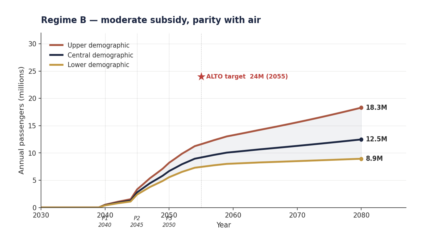
    Ridership. Up to 24 million passengers annually by 2055. The Initiative’s central estimate is approximately 9.2 million in 2055, rising to about 12.5 million by 2080 — roughly 2.6 times lower than the page’s figure. “Up to” marks a ceiling, not an expectation, and the figure coincides exactly with the page’s own 2041 corridor population of 24 million, inviting readers to conflate people in the corridor with trips captured.
    Emissions. 100% electric — the equivalent of removing about 100,000 cars from the road each year. “100% electric” describes operational emissions only. Counted over its full lifecycle — the embodied carbon of a 300+ km/h greenfield build, against a ridership that is itself overstated — the Initiative finds ALTO a net emitter of roughly +15 Mt CO₂e over fifty years. The lower-speed HPPR alternative, built largely on existing alignment, is a net carbon sink.
    Economic impact. 1.1% increase in Canada’s GDP ($24.5 billion in today’s value). A gross benefit stated with no cost and no netting, discounted to present value without disclosing the capital figure behind it. Set against the Initiative’s cost model, the corresponding benefit-cost ratio is approximately 0.06.
    Jobs. Over 50,000 during construction; a further 5,000 once operational. Construction employment is a project input — a cost — not a benefit. Counting it on the benefit ledger is double-counting, among the most reliably flagged errors in megaproject business cases. The 5,000 operational jobs are a genuine recurring effect; the 50,000 construction jobs are not a benefit at all.
    Road decongestion. Valued at $570 million. The figure scales directly off ridership. If the 24 million capture is roughly 2.6 times high, the decongestion benefit is proportionally overstated. Induced demand refilling freed road capacity is not addressed.
    Tourism. Approximately $800 million in revenue each year. A gross figure with no displacement netting — spending that would have occurred anyway, or shifted from elsewhere in the corridor, is not removed.
    Travel times. Toronto–Montréal ~3h; Ottawa–Montréal ~1h; Montréal–Québec City ~1h30. These times are the payoff of the 300+ km/h greenfield alignment that drives both the ~$143M/km cost and the community disruption the page does not mention. HPPR achieves competitive times at 180–240 km/h for a fraction of the cost.
    Cost of the project. Stated nowhere on the page. ALTO’s own official range, given elsewhere, is $60–90 billion; the Initiative’s independent estimate is higher, at roughly $143 million per kilometre. This is the number against which every benefit above would have to be weighed — and the one the benefits page omits.
    Three Inversions

    Where the page’s strongest claims turn over

    The sustainability claim inverts under lifecycle accounting

    The page’s environmental case rests on ALTO being “100% electric.” That describes how the trains are powered, not what building the line costs in carbon. A 300+ km/h greenfield corridor — concrete, steel, tunnelling, geofoam, land conversion — carries a large embodied-carbon debt that operational electricity does not offset, particularly once the offset is recomputed against realistic rather than headline ridership. The Initiative’s finding is a net carbon deficit of roughly +15 Mt CO₂e over fifty years, while the lower-speed HPPR alternative is a net sink. The single most quotable line on the page — sustainability — is the one the accounting reverses.

    “Up to 24 million” is a ceiling offered as an expectation

    The headline ridership number does the persuasive work of the page, and “up to” is doing the work inside it. The Initiative’s central estimate is about 9.2 million passengers in 2055. Systematic overstatement of rail ridership at the appraisal stage is one of the best-documented patterns in the megaproject-forecasting literature, and this figure fits it squarely. The Initiative’s brief The Anatomy of an Optimistic Forecast sets out the mechanism in full.

    Construction jobs are counted on the wrong side of the ledger

    The page presents “over 50,000 jobs during construction” as a benefit. In a proper appraisal, construction labour is an input the project pays for — part of its cost, not part of its return. Presenting it as a benefit counts the same money twice. This is standard in the appraisal literature, and it is one of the easier errors for a general reader to check.

    Three Numbers

    What restoring the denominator shows

    2.6×
    the page’s 2055 ridership claim over the Initiative’s central estimate
    Initiative ridership modelling
    +15 Mt
    net CO₂e over fifty years — ALTO as emitter, not saver, on a lifecycle basis
    Initiative lifecycle carbon analysis
    0.06–0.1
    benefit-cost ratio for ALTO — on the Initiative’s estimate and on ALTO’s own $60–90B; both far below 1.0 (HPPR ~0.44)
    Initiative cost & benefit model

    None of these three figures appears on ALTO’s benefits page. Each is derived from the page’s own claims once the cost and the ridership assumption are made explicit.

    Where things stand · July 2026

    Summary ledger

    Against the benefit claims as the page presents them:

    Overstated
    Ridership — “up to 24 million by 2055” is roughly 2.6 times the Initiative’s central estimate of ~9.2 million.
    Contradicted
    Emissions — the “100% electric” sustainability claim reverses to a net +15 Mt CO₂e deficit once lifecycle carbon is counted.
    Omitted
    Benefit-cost ratio — no BCR is stated anywhere; the Initiative’s central case is ~0.06.
    Omitted
    Capital cost — no cost figure appears on the page; central estimate ~$143M/km.
    Miscounted
    Construction jobs — presented as a benefit; they are a cost input, and counting them double-counts.
    Overstated
    Decongestion and tourism — gross figures that scale off the overstated ridership, with no netting for displacement or induced demand.
    Omitted
    Land and community impact — the disruption the 300+ km/h alignment requires is absent from the benefits page entirely.

    The page is titled “Discover Alto’s Many Benefits.” The benefits are real as gross figures; what the page withholds is the cost against which they would have to be set, the ridership assumption most of them depend on, and the lifecycle accounting that reverses its environmental claim. Read with those three restored, the case the page makes for the project is substantially weaker than the case it appears to make.

    Sources

    Documents and analysis

    1.
    ALTO, “Discover Alto’s Many Benefits,” altotrain.ca, page reviewed July 2026. altotrain.ca
    2.
    ALTO, “Fast Forward: Shaping Canada’s Future with a High-Speed Train,” the explanatory document referenced from the benefits page.
    3.
    ALTO HSR Citizen Research Initiative, ridership envelope modelling — central estimates: ALTO ~9.2M (2055) / ~12.5M (2080); HPPR ~8.2M (2055) / ~10.4M (2080).
    4.
    ALTO HSR Citizen Research Initiative, lifecycle carbon analysis — ALTO net +15 Mt CO₂e over fifty years; HPPR net sink.
    5.
    ALTO HSR Citizen Research Initiative, ECI/CFI cost model (ALTO ~$143M/km central; HPPR spine ~$28–40M/km) and benefit-cost analysis (ALTO ~0.06 on the Initiative’s cost and ~0.1 on ALTO’s own $60–90B; HPPR ~0.44).
    6.
    ALTO HSR Citizen Research Initiative, “The Anatomy of an Optimistic Forecast” and “A Straighter Line,” citizenresearch.ca.
    7.
    Bent Flyvbjerg, on optimism bias and reference-class forecasting in the appraisal of major infrastructure projects.
  • Undressing the addressable market

    Technical Brief · Corridor Demand

    Undressing the Addressable Market

    Alto’s demand case, read against the corridor’s roadside counts, its current population path, and the international reference class.

    ⚠ New Finding · The 95-million figure has no published source

    Alto’s April 2026 commentary states that “ninety-five million intercity trips take place each year between the cities Alto will serve,” rising to 140 million by 2049. The figure has been repeated across government communications and press coverage since. It does not appear in Alto’s own explanatory document Fast Forward (March 2025), the Corporate Plan Summary 2024-25 to 2028-29, or the June 2026 What We Heard consultation report. No independent analyst — C.D. Howe, the Munk School, McGill TRAM — has adopted it. The denominator that anchors Alto’s modest-quarter framing is stated in a commentary without any published derivation.

    Key Finding

    95 M → ~25 M.  Alto’s 95-million-intercity-trips figure counts every trip, by every mode, over every distance, across the whole corridor. The market a high-speed line can realistically serve — the longer, station-to-station journeys where rail competes with air and car — is roughly a quarter of it, about 25 million a year; the rest is short, regional, and off-corridor travel no train could carry.

    Central independent ridership sits at 8–9 million a year, rising toward 10 at maturity — less than half of Alto’s 24-million target. The three markets a fast service actually converts (car, air, and existing rail) sum to about that level. The reference-class floor from comparable car-dependent corridors is 4–5 million. Alto’s 24-million target stands alone above every published independent forecast.

    Download
    Undressing the Addressable Market — Full Brief (PDF)
    Technical brief with methodology, tables, figures, and full source citations

    Download PDF

    The Claim

    Alto’s demand case, in its own words

    In an April 17, 2026 opinion piece published in the Toronto Star and La Presse and reproduced on altotrain.ca, Alto’s chief executive set out the demand case for the Toronto–Québec City high-speed line. Its central figures are a headline market of ninety-five million intercity trips a year across the corridor, rising to one hundred and forty million by 2049; a population of eighteen million reaching twenty-two million within fifteen years; and a target of twenty-four million annual passengers by 2055, presented as consistent with international outcomes. The piece is framed to reassure — its very title insists that high-speed rail is no leap of faith.

    This brief tests the claim on its own terms. It does not dispute that the corridor is large, that it is growing, or that its intercity system is under strain — all three are true. It disputes the inference the commentary draws from them: that a twenty-four-million forecast is therefore measured, modest, and safe.

    Read against three independent bodies of evidence — the corridor’s roadside traffic counts, the population path Statistics Canada now projects, and the international record of what comparable high-speed lines actually carry — the demand case rests on optimistic framing rather than measurement. Where the commentary offers large round numbers and a single favourable analogue, the evidence points to central ridership near a third of the headline, and to a growth story built on a population Canada has already walked back.

    What the Evidence Shows

    Six findings

    The findings rest on four independent methods, each built to be reproducible from public data: a reference class of comparable corridors, a modal-shift ridership model, a market-by-market demand build-up, and a re-basing on Statistics Canada’s current population. A fifth lens — the standard appraisal treatment of optimism bias — governs how all four are read.

    Central independent ridership is 8–9 million a year, not 24

    Rising toward 10 at maturity. The risk-adjusted floor from comparable car-dependent corridors is 4–5 million. Alto’s 24-million target sits above every published independent forecast of the corridor.

    The demand builds from three real sources, not a 95-million abstraction

    The market a fast service actually converts is measurable: the cars crossing the corridor, the air travellers on the competitive pairs, and the existing VIA riders it retains. Added together — roughly 2.8–3.5 million from car, 1.7–2.0 million from air, and about 3.3 million retained rail (VIA’s directly reported 2025 Corridor East ridership) — they come to about 8 to 9 million. The 95-million figure is an all-modes, all-pairs total that no service captures.

    The 95-million figure itself is unsourced

    Stated in the commentary without citation, and absent from Fast Forward (March 2025), the Corporate Plan Summary 2024-25 to 2028-29, and the June 2026 What We Heard consultation report. No independent analyst has adopted it. The denominator that anchors the modest-quarter framing is not just broad but unpublished.

    The demand-growth story reverses the per-capita trend

    Ninety-five to one hundred and forty million over 2026–2049 is about 1.7 per cent a year, faster than the corridor’s own population growth. The gap implies rising travel per resident — against the grain of hybrid work and videoconferencing.

    The population base is the pre-cap one

    Twenty-two million in fifteen years extrapolates the 2015–2025 immigration surge. Statistics Canada’s January 2026 projection is lower; on the current path the corridor is about 6.3 million people smaller by 2055 than the counterfactual Alto’s numbers assume.

    The one comparator offered is a best case

    Madrid–Barcelona is among the strongest high-speed successes on record. The honest reference class — the full distribution of high-speed outcomes, many of which undershot their forecasts — brackets the answer far below 24 million.

    Method 1 · Reference Class

    What comparable corridors actually carry

    Rather than model the corridor from assumptions, the reference-class method asks what corridors with similar car dependence, density, and trip lengths actually achieve once fast rail opens. Each candidate corridor is scored on a Car Dependency Index (CDI) — a composite of car mode share, population density, and transit provision at the endpoints. The Toronto–Québec City corridor’s high car dependence places it with reference cases that, rescaled to this line, carry the equivalent of roughly 4 to 5 million corridor trips a year at maturity. This is the risk-adjusted floor: what the evidence says the corridor is most likely to do before any speed, fare, or density assumption is layered on.

    Figure 1 — Comparable intercity-rail corridors plotted by their Car Dependency Index against annual ridership; the Toronto–Québec City corridor's high car dependence places it with reference cases carrying 4 to 5 million corridor trips a year.
    Figure 1 — The reference class: ridership against car dependency. Comparable intercity-rail corridors scored by their Car Dependency Index. The Toronto–Québec City corridor’s high car dependence places it with reference cases that, rescaled to this line, carry the equivalent of roughly 4 to 5 million corridor trips a year — the risk-adjusted floor.
    Methods 2 & 3 · The Three Markets

    Demand, counted not modelled

    A fast service on this corridor draws from three distinct current populations: the car market, the air market on the competitive city pairs, and the existing rail riders. Each is measurable from public data. Because they are distinct populations, they add without double-counting.

    The car market is read at the Highway 401 screenline where it crosses into Québec, after Ottawa-bound traffic has left via Highway 416 and Cornwall-local traffic has loaded, stripped of the 30 to 35 per cent commercial-truck share and short regional trips: roughly 8.8 to 11.0 million end-to-end car person-trips a year across the triangle at an occupancy of 2.0. Applying the road-market capture rates converts these into the rail ridership the car market alone would yield.

    Table 1 — Rail ridership drawn from the car market: per-leg car person-trips and rail capture rates for Toronto–Montréal, Ottawa–Toronto, and Ottawa–Montréal, summing to 2.8–3.5 million rail passengers per year from the car market.
    Table 1 — Rail ridership drawn from the car market. Capture rates are road-market shares from the modal-shift analysis at a moderate-fare regime; they express rail’s share of the combined car-and-rail market. Only Toronto–Montréal is confirmed by roadside counts; the Ottawa legs are demand-sized.

    The car market is only one of three. A fast corridor service also draws from the air travellers on the same city pairs, and it retains the passengers already riding the train. The corridor air market on the competitive pairs — Toronto–Montréal, Toronto–Ottawa, and the smaller Ottawa–Montréal — is on the order of 2.5 to 3.0 million point-to-point passengers a year, of which a fast train on these distances captures about two-thirds.

    Existing conventional rail is now reported directly in VIA’s 2025 annual results: 3.34 million passengers a year on the Corridor East service group (Québec City–Montréal–Ottawa–Toronto), within a Québec City–Windsor corridor total of 4.18 million. Essentially all of the triangle share is retained by a faster, more reliable service. VIA’s audited subsidy figures also fix the shape of the trip-length distribution: 48.51 dollars per passenger over 0.22 dollars per passenger-mile is an average trip of about 355 kilometres — roughly a third of the end-to-end corridor distance. Even the passengers already choosing rail are, on average, taking journeys well short of the full corridor.

    Table 2 — Where the corridor's rail ridership comes from: diversion from car (2.8–3.5M), diversion from air (1.7–2.0M), and existing VIA rail retained (~3.3M), summing to a central total of approximately 8–9 million rail passengers per year.
    Table 2 — Where the corridor’s rail ridership comes from (central). Car, air, and existing-rail travellers are distinct current populations, so the three sources add without double-counting. The rail line uses VIA’s Corridor East service group directly, rather than deriving a triangle share of the wider Québec City–Windsor total. The total is the central case around 2055; it rises toward 10 million at maturity as the ramp completes, and remains far below 24 million.
    Method 4 · The Population Basis

    The 6.3-million deficit

    Every ridership figure scales with the population beneath it, so the choice of population path is decisive. The brief uses Statistics Canada’s January 2026 projection (catalogue 17-20-0003), which incorporates the 2024–25 federal Immigration Levels Plan.

    Against the pre-2024 growth path that older corridor forecasts — and the commentary’s twenty-two-million figure — assume, this is materially lower: the corridor reaches about 19.8 million by 2055 on the current path, versus 26.1 million on the counterfactual, a deficit of 6.3 million. Because ridership scales with population, a forecast on the old path is inflated by roughly the same proportion the population has been cut — before any question of mode share or capture even arises.

    Figure 2 — Corridor population time series 2015–2060 showing four trajectories: pre-2024 counterfactual reaching 26.1M by 2055; Statistics Canada January 2026 central projection reaching 19.8M; high-growth 23.1M; low-growth 17.4M. Alto's CEO's 22M-in-fifteen-years forecast is marked as an outlier above the current path.
    Figure 2 — Corridor population: the 6.3-million deficit. The pre-2024 counterfactual (~1.8%/yr) reaches 26.1 million by 2055; Statistics Canada’s post-cap January 2026 projection (~1.0%/yr) reaches 19.8 million — a 6.3-million gap that every ridership figure scales with. The open diamond marks Alto’s own forecast of 22 million within fifteen years; its implied ~1.35%/yr growth runs above the current path.
    Triangulation

    Where Alto’s target sits against every independent forecast

    The three methods converge. The demand-side build-up sums to about 8 to 9 million a year; the bottom-up modal-shift model lands in the same place; the reference class puts a floor near 4 to 5 million. Set beside the full band of independent corridor estimates, Alto’s 24-million target stands alone above every one.

    Figure 3 — Independent corridor ridership estimates around 2055. Alto's published target of 24.0M is shown as an outlier above every independent forecast: Munk School 16–17M, C.D. Howe 12–21M, Federal Joint Project Office 13.5M, McGill TRAM 10.5M, and the Initiative's own central case at 9.2–12.1M.
    Figure 3 — Independent corridor ridership estimates against Alto’s target. Annual corridor ridership around 2055. Alto’s 24-million target stands alone above every independent forecast — the Munk School, C.D. Howe, the Joint Project Office, and McGill — and above the Initiative’s own central case (filled markers). The open markers plot the Initiative’s method on the pre-2024 population Alto’s numbers assume; even then it stays within the published band, so the distance is population basis, not method.
    The Claim, Audited

    Where the 95-million figure appears — and where it doesn’t

    A demand denominator on which a $60–90 billion capital commitment rests should be reproducible from published sources. Alto’s is not. The ninety-five-million and one-hundred-and-forty-million figures are stated in the April 2026 commentary without citation and are absent from every canonical planning document the corporation has published.

    PresentImbleau, M., “High-speed rail is not a leap of faith: why it matters for Canada’s growth” — Op-ed, Toronto Star and La Presse, April 17, 2026; reproduced on altotrain.ca. The single document in which the 95-million and 140-million figures appear. Stated without citation, methodology, or reference to any underlying study.

    AbsentFast Forward: Shaping Canada’s Future with a High-Speed Rail Network (March 2025) — Alto’s own public-facing explanatory document. Discusses ridership growth from ~3 million (2024) to 24 million (2055) and 43 million (2084), but does not reference the 95-million intercity-trip figure or provide any market-total denominator on that scale.

    AbsentVIA HFR – VIA TGF Inc., Corporate Plan Summary 2024-25 to 2028-29 (November 2024) — the corporation’s tabled planning document referenced by the Library of Parliament backgrounder on the project. Contains ridership targets (“17 million by 2059” for HFR, before the HSR rebrand) but no 95-million total-market figure.

    AbsentJune 2026 What We Heard Report on the corridor study area — Alto’s own summary of the January–April 2026 consultation, running to more than 130 pages. Does not reference a 95-million figure.

    AbsentQuarterly Financial Reports through Q3 2025-26 — Alto’s mandatory reporting to Parliament. Does not reference a 95-million figure.

    AbsentIndependent published analyses of the corridor — the C.D. Howe Institute’s All Aboard study (March 2026), the Munk School Global Economic Policy Lab’s HSR analysis, Transportation Research at McGill’s corridor demand modelling, and Michael Schabas’s Senate submission on Bill C-15 (January 2026, 65 pp.). None uses the 95-million figure.

    The finding does not, on its own, resolve whether the 95-million figure is defensible. It resolves whether the figure is auditable. On the public record as it stands, it is not: no derivation has been published, no methodology has been described, and no independent source has adopted it.

    Recommendation

    Three things follow

    The demand case that anchors a 1,000-kilometre corridor, a $60–90 billion capital commitment, and a multi-decade delivery programme cannot responsibly rest on figures that have not been made auditable. Three steps would meet the standard.

    Release the demand model for independent audit

    A forecast that anchors an alignment and a multi-decade capital commitment cannot responsibly remain unpublished. In particular, the derivation of the ninety-five-million and one-hundred-and-forty-million intercity-trip figures cited in the April 2026 commentary should be published alongside the underlying model.

    Adjust toward the reference class and current population

    Standard megaproject appraisal requires promoter forecasts to be adjusted toward the reference class rather than accepted at face value. Alto’s should also be re-based on Statistics Canada’s January 2026 population projection, rather than the pre-2024 path the current forecast assumes.

    Size the corridor decision to the audited demand

    Not to a ninety-five-million headline or a twenty-four-million target that no independent method reaches. High-speed rail need not be a leap of faith. But the demand case as currently stated is closer to one than the corridor’s own numbers allow.

    Download Full Brief
    Undressing the Addressable Market (PDF)
    Full methodology, tables, figures, basis and limitations, and complete source citations

    Download PDF

    Sources

    Primary documents and data

    Every figure in this analysis is drawn from the public sources or companion analyses set out below and is reproducible from them. Sources are grouped by the claim or quantity they support.

    1.The claim examined. Imbleau, M., President and Chief Executive Officer of Alto. “High-speed rail is not a leap of faith: why it matters for Canada’s growth.” Commentary, altotrain.ca, April 17, 2026. altotrain.ca. The source, stated without further citation, of the ninety-five-million and one-hundred-and-forty-million intercity-trip figures, the eighteen-to-twenty-two-million population claim, and the twenty-four-million passenger target for 2055.

    2.Alto planning documents in which the 95-million figure does not appear. Alto, Fast Forward: Shaping Canada’s Future with a High-Speed Rail Network (March 2025). VIA HFR – VIA TGF Inc., Corporate Plan Summary 2024-25 – 2028-29. Alto, June 2026 What We Heard Report on the corridor study area public consultation. All at altotrain.ca.

    3.Companion research, Citizen Research Initiative. Intercity Car Trips Between Toronto, Ottawa and Montréal (2026) — road-side measurement of end-to-end car travel at the Highway 401 Québec-boundary screenline, the per-leg car person-trips of Table 1, and the road-market capture rates of Table 2. HPR Research Report — Ridership (2026) — the demand reference class and Car Dependency Index (Figure 1); the modal-shift model, R = P × μ × s × φ(t); the population basis (Figure 2) and the 6.3-million deficit; and the triangulation against independent forecasts (Figure 3). All at citizenresearch.ca.

    4.Traffic and travel-demand data. Ministry of Transportation of Ontario, Provincial Highways Traffic Volumes — annual average daily traffic on Highway 401, sections between the Highway 416 interchange and the Québec boundary. VIA Rail Canada, 2025 Annual Report (Montréal, March 2026): 4.40 million passengers system-wide and 986 million passenger-miles; 4.18 million on the Québec City–Windsor corridor and 3.34 million on the Corridor East service group; audited service-group subsidy figures implying an average Corridor East trip of about 355 kilometres. Statistics Canada, Air passenger traffic at Canadian airports (table 23-10-0253), together with airport-authority passenger statistics for Toronto Pearson, Montréal–Trudeau, and Ottawa Macdonald–Cartier. Transport Canada, Transportation in Canada annual report.

    5.Population. Statistics Canada, Population Projections for Canada, Provinces and Territories, January 2026 vintage (catalogue 17-20-0003), which incorporates the 2024–25 federal Immigration Levels Plan; and Census of Population, 2021, for the corridor’s census-metropolitan-area populations. These underpin the 19.8-million (post-cap) and 26.1-million (pre-2024 counterfactual) 2055 corridor figures and the 6.3-million deficit.

    6.Comparator corridor forecasts. Transport Canada and the EcoTrain consortium, Updated Feasibility Study of a High-Speed Rail Service in the Québec City–Windsor Corridor (2011). Federal Joint Project Office and the VIA High Frequency Rail baseline (2021). Transportation Research at McGill (TRAM), corridor demand modelling. C.D. Howe Institute (2026), high-speed-rail scenario. Munk School Global Economic Policy Lab, corridor demand. Schabas, M., Alto High-Speed Rail: Conceptual Design and Business Case, Senate submission on Bill C-15 (January 2026). These supply the independent ridership band of Figure 3.

    7.Forecasting method and optimism bias. B. Flyvbjerg, “Survival of the Unfittest: Why the Worst Infrastructure Gets Built — and What We Can Do About It” (Oxford Review of Economic Policy, 2009), and related work establishing reference-class forecasting; B. Flyvbjerg and D. Gardner, How Big Things Get Done (2023). HM Treasury (United Kingdom), The Green Book and its supplementary guidance on optimism bias. Oxford Global Projects, reference-class forecasting datasets and practice. UK National Audit Office, successive reports on High Speed 2 (HS2) documenting systematic optimism in demand forecasts and cost escalation.

    ALTO HSR Citizen Research Initiative  ·  citizenresearch.ca  ·  Corridor Demand Brief  ·  July 2026
    Independent, non-partisan research on the proposed Toronto–Québec City high-speed rail corridor.
  • The more you look

    The More You Look, the Worse It Gets — ALTO HSR Citizen Research Initiative

    The More You Look, the Worse It Gets

    Thirty studies of high-speed rail in this corridor, across fifty-six years. One simple pattern runs through all of them.

    ⚠ The bottom line, up front

    The people building the railway say it will pay for itself. The one independent study in 2026 that actually checked the math — using the builders’ own cost estimates — found a hole of about $53 billion over fifty years.

    That’s not a fluke. It’s the pattern. For fifty-six years, the case for this railway has looked best in exactly the studies with the most to gain from building it.

    In one minute

    We read thirty major studies of high-speed rail in this corridor, from 1970 to today, and asked every one the same set of questions — with all the dollar figures put on a level footing.

    The verdict almost always matches who paid for the study. Equipment makers, the proponent and paid advocates say build it. Independent governments say wait. And every single study that actually runs the finances finds the same thing: ticket sales can’t cover the cost, so the public pays most of the bill.

    The numbers that look great — low costs, huge ridership, big climate wins — come from the promoters. The numbers that survive an independent look are far more sober. The closer and more independent the analysis, the weaker the case.

    Read the full report
    Corridor Rail Studies, 1970–2026 — A Cross-Decade Analysis
    Thirty studies, thirty-four dimensions, nine findings, with the full evidence tables
    Download PDF
    How we know

    Thirty studies. Same questions. Fifty-six years.

    We didn’t cherry-pick. We took thirty of the major studies of this railway — going right back to a 1970 federal commission — and put the same 34 questions to all of them, so the answers line up side by side across the decades.

    30
    major studies of this railway, read into one matrix
    1970–2026
    34
    questions asked of every single study
    so the answers compare
    56
    years of studies, all priced in today’s dollars
    a level playing field

    The studies come from every side: equipment makers, government task forces, a Crown corporation, universities, Transport Canada, and the builders themselves. That range is the whole point — it lets us tell a real change in the corridor apart from a change in who’s doing the asking.

    What we found

    Nine things every reader should know

    Read across all thirty studies, nine patterns keep showing up. Here they are in plain terms.

    1The answer depends on who paid for the study

    Line up the verdicts and it’s impossible to miss. The build-it studies come from equipment makers, from a Crown corporation that wanted to run the trains, from the proponent, and from paid advocates. Every independent government that looked said wait. Building new is the sponsors’ answer — not what fifty-six years of evidence actually points to.

    2It has never paid for itself. Not once.

    Every study that runs the money lands in the same spot: fares can’t cover the cost, and taxpayers foot most of the bill. VIA’s own 1984 numbers came out negative. In 1995, three governments agreed the public would cover 70–75%. In 2026, an independent model put the public subsidy at about $53 billion over fifty years — and found the railway wouldn’t even break even until year 44. The promise that it’ll fund itself is the single most optimistic claim in the whole record.

    3The closer you look, the more it costs

    Whenever a promoter and an independent body price the same thing, the promoter’s number is lower — and the price climbs as the estimate gets more serious. A 2026 advocacy paper gets the cost down to $63 billion only by assuming rock-bottom construction prices, about a third of our own central estimate of roughly $143 million per kilometre. The cheaper the headline, the thinner the math underneath it.

    4The ridership numbers don’t hold up

    The passenger forecasts are shakier than they look — and academics, an airline, Parliament and Transport Canada have all said so. One 1994 study showed the forecast could swing fivefold just by changing a single modelling choice, on the same data. Transport Canada’s own reviewers called the assumptions “optimistic and aggressive.” And the biggest numbers always belong to the promoters.

    5The freight idea is good — with one catch

    Splitting passengers and freight onto the corridor’s two parallel tracks, and freeing up freight capacity as a bonus, is a genuinely sound idea — it was proposed back in 2002. The catch: at the time, the freight railways said they didn’t need the extra capacity. It’s a strong argument, as long as it’s honest about that condition.

    6Going faster barely helps

    Study after study finds that top speed buys almost no extra riders — one found just an 8% jump going all the way from 300 to 400 km/h, another only about 9% from 200 to 300. So the level-headed studies settle far lower: a 2002 plan judged 240 km/h fast enough, and even the independent 2026 model assumes trains averaging just 200–250 km/h. The “top speed everywhere” designs are the outliers — a moderate railway of roughly 180–240 km/h carries nearly the same riders for far less money, and that’s where the evidence actually sits.

    7We’ve seen this financing risk before

    Having a private partner build and run the railway while the public owns the assets isn’t new — and neither is the warning. Both Parliament (1998) and Transport Canada (2003) flagged the same danger decades ago: deals like this can hand the risk to taxpayers and the reward to investors, with a rosy headline resting on one convenient assumption.

    8The climate math only counts the good half

    For decades, no study counted carbon at all. Now they do — but only the savings from getting people out of cars and planes. The huge emissions from pouring hundreds of kilometres of concrete and steel and clearing land? Left out. Count both sides honestly and this design adds emissions for decades. That’s the difference between a climate win and a climate cost.

    9When the numbers fail, out comes “nation-building”

    There’s a move that shows up again and again: when the dollars-and-cents case comes up short, in come national unity, regional growth, and keeping up with other countries. One 2016 report recommended extending the line even at a benefit-cost ratio of 0.24 — about 24 cents of benefit for every dollar spent. These arguments can be fair. But they do the heaviest lifting exactly where the economics are weakest.

    The gap, side by side

    What the promoters say vs. what independent studies find

    All nine findings come down to one contrast. Same railway, same engineering — but the promoters’ numbers and the independent record split apart at every point that matters, and they split the same way every time.

    What the promoters sayWhat independent studies find
    Build it new. Equipment makers, a Crown corporation that wanted the contract, the proponent, and paid advocates all say go ahead. Wait. Every independent government that studied it held off; the reviews and the airlines said upgrade what’s there instead.
    The verdict:Build  vs  Wait
    It’ll pay for itself. The 2025 prospectus says the trains will turn a profit — the rosiest claim in fifty-six years. Taxpayers pay most of it. From 1984 to 2026, every study that runs the money says fares can’t cover the cost. The 2026 independent model: about $53 billion in public subsidy over fifty years.
    The money:Self-funding  vs  ~$53B public
    As low as $63 billion. A 2026 paper reaches that number by assuming bargain construction prices. More like $80–90 billion. The proponent’s own range tops out at $90 billion; independent build-ups land near $80 billion. Costs rise the closer you look.
    Price tag:~$63B  vs  ~$80–90B
    24 to 56 million riders. The 2025–2026 figures are the highest ever produced for this line. About half that. The only recent independent, survey-based forecast lands near 10 million a year — right in line with fifty years of history.
    Yearly riders:~24–56M  vs  ~10M
    A big climate win. The proponent headlines a 39-megatonne cut — counting only the savings from fewer car and plane trips. A climate cost, for decades. The emissions from building it — concrete, steel, cleared land — are left out entirely. Count both sides and it adds emissions.
    On carbon:Half the ledger  vs  The whole ledger
    Ridership

    Same railway. Forecasts from 6 million to 56 million.

    Put the passenger forecasts next to each other and they span almost tenfold — for one railway line. The high numbers always come from the promoters. The one to trust is the recent independent forecast built on an actual survey of travellers.

    ~10M
    independent, survey-based forecast for 2050
    McGill, 2026
    24–43M
    the proponent’s own forecast
    ALTO prospectus, 2025
    42–56M
    the highest numbers ever produced for this line
    2026 advocacy paper
    Study (year)Who produced itYearly ridersBasis
    Air Canada / CP (1993)Airline / railway5.8 Mthe low end of the record
    Task Force (1991)Governments7.8 Mfull corridor
    Tri-government (1995)Governments10–12 Mfull corridor
    EcoTrain (2011)Governments10–11 Mfull corridor
    Lynx (1998)Private consortium11.1 MQuébec City–Toronto
    SNCF (2010)Equipment makerup to 22.5 Mbest-case scenario
    ALTO prospectus (2025)Proponent24–43 Mfull network
    Advocacy paper (2026)Paid advocacy42–56 Mthe highest ever
    McGill (2026)Independent~10 Msurvey-based, 2050

    The numbers aren’t perfectly apples-to-apples — they cover different routes and years — which is part of the point. The takeaway is simple: the independent, survey-based forecast is about half the proponent’s.

    What it means

    Five takeaways

    The current project sits right at the meeting point of every pattern above. The prospectus is the most upbeat sales pitch in the whole record. The most careful independent 2026 work finds a multi-billion-dollar hole. And the one favourable outside verdict is reached only by pairing the cheapest possible construction cost with the highest ridership ever forecast for the line. Here’s what that adds up to.

    What the record points to

    Building new from scratch is the sponsors’ pick, not the safe reading of history. Fifty-six years of evidence leans toward upgrading what exists — or waiting for a full, honest costing.
    Expect the public to pay most of it. Three governments said 70–75% back in 1995, and every financial study since has landed in the same place.
    A moderate-speed, lower-cost railway fits the evidence better. Extra speed barely adds riders, and costs balloon the closer you look. Both have been true for decades.

    What to insist on

    Get the ridership numbers independently checked before trusting them. A single forecast from the people who want to build it isn’t enough — the best studies in the record always used more than one independent forecaster.
    Make the freight case — but be upfront about the catch. The idea is sound; its real value depends on the freight railways actually wanting the freed-up capacity. Say so plainly.
    The evidence

    All thirty studies, at a glance

    Here’s the whole set, oldest to newest. Read the two right-hand columns together — who did the study, and what they concluded — and Finding 1 jumps out: the “build it” verdicts belong to the sellers and the promoters; the governments that were truly independent said wait.

    YearStudy — who did itIndependent of the builder?Verdict
    1970Intercity Passenger Transport Study — CTCFederalUpgrade
    1984High-Speed Passenger Rail in Canada — VIACrown corpMixed
    1990Review of Previous Studies — TRANSURBConsultantWait
    1990A Pragmatic Approach (SPRINTOR) — ABBEquipment makerUpgrade
    1990The Canadian TGV Project — Bombardier / GEC AlsthomEquipment makerBuild new
    1991Rapid Train Task Force — Ontario / QuébecGovernmentsWait
    1991Competition in Rail Carriage — BerkowitzAcademicBuild new
    1992FAST TRACKS — VIA (advocacy)Crown corpBuild new
    1993HST Market Assessment — Air Canada / CPAirline / railwayUpgrade
    1994Demand-model re-estimate — Gaudry & Le LeyzourAcademicNo verdict
    1995Industrial Strategy (Vol II) — Simpson-GuerinConsultantNo verdict
    1995Routing & Costing Study — SNC-Lavalin / DelcanConsultantNo verdict
    1995Québec–Ontario HSR, Final Report — tri-govGovernmentsWait
    1998The Lynx Proposal — Lynx consortiumPrivate consortiumBuild new
    2002VIAFast — VIA RailCrown corpUpgrade
    2003VIAFast validation — IBI for Transport CanadaGov’t reviewerNo verdict
    2009Infrastructure and the Economy — Martin Prosperity Inst.AcademicBuild new
    2010Socio-Economic Study of HSR — SNCFEquipment makerBuild new
    2011Updated Feasibility (EcoTrain) — tri-governmentGovernmentsWait
    2014Toronto–Kitchener–London HSR — SchabasConsultantBuild new
    2015Future of Passenger Rail — Library of ParliamentParliament / indep.Upgrade
    2016Preliminary Business Case — SDG (Steer)ConsultantBuild new
    2016High Speed Rail in Ontario — Special AdvisorProvincialBuild new
    2021Toronto–Montreal Analysis — Munk SchoolAcademicBuild new
    2022Speed and Frequency — AlstomEquipment makerBuild new
    2025All Aboard — C.D. Howe InstituteAdvocacyBuild new
    2025Fast Forward — ALTO (the proponent)ProponentBuild new
    2026Conceptual Design & Business Case — SchabasAdvocacyBuild new
    2026Corridorwide Survey & Financial Analysis — McGillAcademicNo verdict
    2026Eastern Ontario Route (Hwy 401) — Schabas & AntinucciAdvocacyBuild new

    “Advocacy” means a document written to argue a case — a sales prospectus, a think-tank brief, or paid expert advocacy. “No verdict” means the study analysed the question but didn’t take a build/don’t-build position.

    The independent studies to trust

    Where the sober numbers come from

    The full list is above. If you read just a few, read the independent ones — the counterweight to the sales pitch.

    1.
    Québec–Ontario High Speed Rail Project, Final Report — three governments together, 1995. Concluded the public would cover 70–75% of the cost, and a private-only version couldn’t be financed.
    2.
    VIAFast validation — IBI Group for Transport Canada, 2003. The government’s own reviewers, who flagged “optimistic and aggressive” ridership assumptions.
    3.
    Updated Feasibility Study (EcoTrain) — three governments, 2011. The most recent independent-government study; it said wait.
    4.
    Future of Passenger Rail in Canada — Library of Parliament, 2015. Recommended upgrading service rather than building new.
    5.
    Corridorwide Survey & Financial Analysis — Transportation Research at McGill, 2026. The independent study behind the $53-billion subsidy figure and the ~10-million ridership forecast.
  • Modal shift ridership

    Citizen Research Initiative · Modal Shift Analysis · Note 3

    The Ridership Envelope for the ALTO Corridor, 2035–2080

    What can the corridor actually carry? Population times trips-per-resident times modal share, scaled by a realistic phased opening — and measured against ALTO’s published 24-million target and every other independent forecast.

    ⚠ What This Note Examines

    This note builds a 45-year ridership envelope from three multiplicands — corridor population, per-capita intercity trips, and ALTO’s modal share under three fare-and-subsidy regimes — using the modal-shift machinery from the two companion notes on rail–air and rail–car substitution, and scaling the result by ALTO’s announced three-phase opening.

    The resulting envelope is then compared against ALTO’s published forecasts, the McGill TRAM stated-preference projection, the Munk School GEPL model, the C.D. Howe scenario analysis, and the federal government’s own 2021 Joint Project Office business case.

    Summary

    The corridor population baseline is about 14.9 million across the directly-served CMAs in 2025. The 2024–25 federal cap on non-permanent residents produced a structural inflection — Toronto’s CMA shrank by ~1,000 people in 2024–25 after gaining 269,000 the year before — creating a credible lower trajectory (0.5%/yr) that did not exist in pre-2024 forecasts and bounding the upper trajectory (1.6%/yr) below pre-2024 expectations.

    Three regimes span the policy envelope: heavy subsidy ($2.5–4.5B/yr, ~38–42% capture), moderate subsidy at parity with air ($1.5–2.5B/yr, ~28–32% — the canonical business-case configuration), and minimal subsidy under P3 yield management ($0.5–1.5B/yr, ~20–23%). The combined envelope at mature operation runs from 6.1 to 25.7 million by 2080, central case 12.5 million. The 2055 reading — ALTO’s headline year — is 3.7 to 17.2 million, central case 9.2 million; the corridor is not yet at mature operation in 2055 under the announced phasing.

    ALTO’s published 24-million-by-2055 figure sits ~40% above the upper bound for 2055 and is incompatible with the announced phasing under any plausible ramp curve. Every forecast built from a disclosed methodology — TRAM, Munk GEPL, the federal JPO — sits within or close to the CRI envelope. ALTO’s published targets are the outlier against every other forecast for the corridor.

    Download
    Modal Shift Note 3 — Ridership Envelope Research Note (PDF)
    The full note with all figures and tables: the population trajectories, the three regimes, the phasing and ramp framework, the 2035–2080 envelope, and the comparison with every published forecast
    Download PDF
    1 · Framework

    Three multiplicands

    ALTO’s annual ridership in any year is the product of three quantities: the corridor population served, the average number of intercity trips each resident makes per year across air, rail and car, and ALTO’s share of those trips. Forecasting ridership therefore means forecasting each multiplicand and combining their realistic ranges into an envelope of outcomes.

    The two companion notes supply the modal-share machinery. Note 1 derives the air-substitution S-curve and locates the corridor’s three rail scenarios on it at travel time and price. Note 2 extends the framework to road–rail under a North American calibration anchored on VIA’s 13% rail share against road, and develops the price-ratio, group-size, gas-price and reliability sensitivities. What the two notes do not provide is the population denominator that converts share into absolute volume, the per-capita trip generation that scales the market with demographic change, the temporal phasing that distinguishes opening-year from mature ridership, and the explicit fare-and-subsidy regimes. This note adds those four pieces.

    Ridership = corridor population × intercity trips per capita × ALTO modal share, scaled by ramp-up. Each multiplicand has a defensible range. The envelope combines them.
    2 · Population

    The baseline and the 2024 demographic break

    ALTO directly serves CMAs from Toronto to Québec City. The 2025 baseline is about 14.9 million — Toronto (7.10M), Montréal (4.62M), Ottawa-Gatineau (1.55M), Québec City (0.86M), plus the smaller served centres (~0.8M combined).

    The 2024–25 demographic year produced a structural inflection. The federal Immigration Levels Plan announced in October 2024 was the first to cap temporary residents, requiring a multi-year drawdown. The effect on the two largest CMAs was immediate: Toronto’s CMA shrank by ~1,000 people in 2024–25, following a gain of 269,000 the year before, and Greater Golden Horseshoe growth collapsed from ~313,000/yr to ~40,000. This is a structural break from the baseline pre-2024 forecasts assumed — it invalidates the linear extrapolation of the 2022–24 surge.

    Table 1. Three population trajectories for the directly-served corridor CMAs, anchored on the 2025 baseline of ~14.9M. The central trajectory is the working assumption for the envelope; the upper and lower trajectories define the population-side bounds. Anchored on StatCan’s January 2026 projections (LG / M1 / HG scenarios) with a ~0.4-point corridor-CMA growth premium.
    TrajectoryAnnual growth20502080Driver
    Lower0.5%16.9M19.6MNPR drawdown is structural; aging accelerates
    Central1.0%19.1M25.7MNPR drawdown is one-off; immigration normalises
    Upper1.6%22.2M35.6MPre-2024 pace partly resumes after political cycle
    Corridor population: pre-2024 versus post-2024 trajectories, 2025 to 2080, showing the demographic correction the federal cap on non-permanent residents introduced
    Figure 1. Corridor population trajectories, 2025–2080, comparing pre-2024 (dashed) and post-2024 (solid) demographic assumptions on the same axis. The dashed lines represent the population input comparable published forecasts used; the solid lines reflect the 2024 federal cap and the StatCan data released January 2026. By 2080 the gap is striking — ~50M vs 35.6M (upper), 33.8M vs 25.7M (central), 23.1M vs 19.6M (lower). The post-2024 upper trajectory sits below the pre-2024 central across much of the horizon. Roughly 15 to 25% of the gap between the CRI envelope and the other forecasts is attributable to this single demographic correction alone.

    The trajectories are anchored on Statistics Canada’s official projections (released 27 January 2026), with a ~0.4-point corridor-CMA growth premium reflecting the directly-served CMAs’ historically faster growth — population-weighted ~1.8%/yr over 2000–2025 against the national 1.23%, moderated for Quebec’s projected demographic-weight decline and the Western redirection of interprovincial migration. The 0.4-point premium is a deliberately conservative reading, chosen so the envelope is not vulnerable to the argument that it underweights the corridor’s growth advantage.

    3 · Trip Generation

    Per-capita intercity trips

    The three principal pairs together carry ~19.9 million annual person-trips across air, rail and car (Note 2). Adding the secondary pairs and intermediate-station traffic brings the addressable market to about 25 million annual person-trips — against a 2025 population of 14.9 million, a per-capita rate of about 1.68 trips per resident per year.

    Over a 45-year horizon, competing effects roughly cancel. Hybrid work has structurally reduced corridor business travel below the pre-pandemic baseline, and AI-mediated meetings continue to erode marginal demand for in-person business travel — the literature consistently finds business travel adjusts more elastically to communication technology than leisure travel does. On the supporting side, urbanisation, economic concentration into the corridor, and rising affluence in the secondary centres lift demand. The net effect is roughly stable to mildly declining; this note uses a range of 1.6 to 1.8 trips per capita, central case ~1.7.

    4 · Modal Share by Regime

    Three fare-and-subsidy regimes

    ALTO’s share of the addressable market is the third multiplicand — and the dimension on which the corridor decision turns most directly. The aggregate share is a weighted blend across air, current rail and car markets on the three principal pairs, with realistic group composition (a mix of solo, couple and family travellers) rather than the solo-traveller readings that anchor the time-and-price geometry.

    A

    Heavy operating subsidy — low fares

    Fares at VIA-equivalent levels (rail-to-air ratio 0.4–0.5; per-person rail-to-car ~1.0 solo), capital absorbed into the public account. Annual subsidy $2.5–4.5 billion. Captures ~85% of the air market, ~100% of existing VIA demand, ~22% of the rail+car market on a group-weighted basis. Aggregate share: ~38–42%.

    B

    Moderate subsidy — parity with air (canonical)

    Fares at parity with air (rail-to-air ratio ~1.0; per-person rail-to-car ~2.0–2.4 solo). Annual subsidy $1.5–2.5 billion. Captures ~70% of air, ~95% of existing VIA demand, ~9–11% of rail+car. Aggregate share: ~28–32%. This is the configuration under which the 24-million headline is implicitly framed.

    C

    Minimal subsidy — P3 yield management

    Fares above air parity (rail-to-air ratio 1.1–1.4; per-person rail-to-car 3–4 solo, above 12 for a family of four). Annual subsidy $0.5–1.5 billion — still positive, because the fully self-funded P3 model is not survivable arithmetic at any modal share consistent with the framework. Captures ~50% of air, ~80% of existing VIA demand, ~4% of rail+car. Aggregate share: ~20–23%.

    Table 2. Three fare-and-subsidy regimes, with implied modal capture and aggregate share of corridor person-trips. The factor-of-two range across regimes operates independently of the infrastructure choice — the same physical asset produces double or half the ridership depending on the fare-and-subsidy decision. No regime delivers self-funding at any modal share consistent with the framework.
    RegimeFare structureAnnual subsidyAir captureCar captureAggregate share
    A — HeavyT–Mtl ~$80–130; rair ≈ 0.4–0.5$2.5–4.5B/yr~85%~22%38–42%
    B — ModerateT–Mtl ~$150–220; rair ≈ 0.9–1.0$1.5–2.5B/yr~70%~9–11%28–32%
    C — MinimalT–Mtl ~$220–350+; rair ≈ 1.1–1.4$0.5–1.5B/yr~50%~4%20–23%
    5 · Phasing & Ramp

    Opening-year is not mature-year

    Ridership in any specific year depends on three timing variables: the construction schedule, the segment opening sequence, and the ramp curve on each opened segment. The 2026–2034 period is consumed by consultation, environmental assessment, expropriation, design, P3 negotiation and enabling works — none of it revenue service. Canadian P3 megaproject experience (Eglinton Crosstown, Confederation Line, Ontario Line) suggests timelines slip rather than compress; the earliest plausible phased opening is ~2038, central scenario closer to 2040.

    Phase 1 — Montréal–Ottawa

    Opens first: shortest (~190 km), simplest engineering, but the smallest pair. Serves only the Ottawa–Montréal demand pool (~20% of corridor) — it cannot draw Toronto flows because Toronto isn’t connected yet. Early-year ridership is structurally small.

    Phase 2 — Toronto extension

    The demand inflection point. Adds ~450 km and unlocks Toronto–Ottawa and Toronto–Montréal — ~60% of corridor demand. Cumulative Phase 1+2 coverage is ~80%: the full Toronto–Ottawa–Montréal triangle. Plausible window 2042–2046.

    Phase 3 — Québec City extension

    The most schedule-vulnerable: the St-Lawrence crossing, Leda clay risk, an unsettled routing, and an unresolved federal-provincial cost-share with Québec. Adds the final ~20%. Window 2047–2052, with a credible permanently-deferred scenario.

    The ramp curve in the North American context is meaningfully slower than European comparators. Madrid–Barcelona took ~4 years to decisively overtake the air bridge, under conditions far more favourable to rail than ALTO faces; Brightline Miami–Orlando remains in financial ramp-up with bond ratings downgraded to CCC+. The envelope is calibrated against the Brightline profile for the lower and central cases and Madrid–Barcelona for the upper case.

    Table 3. Ramp factors applied to each opened segment — the fraction of that segment’s mature ridership realised in each year post-opening. Regime C (yield management) ramps slowest; Regime A (low fares) fastest. Applied separately to each phase, with each segment’s clock starting from its own opening year.
    Years post-openingLower (Regime C)Central (Regime B)Upper (Regime A)
    Year 115%25%35%
    Year 335%50%65%
    Year 555%70%80%
    Year 875%85%92%
    Year 10+90%95%100%
    Table 4. Phase opening schedule by scenario. The fare-and-subsidy regime correlates with delivery pace: heavily-funded projects face political pressure for early openings and federal cost-overrun absorption removes renegotiation friction; lean P3 structures slip. Phase 3 moves most widely because of the St-Lawrence crossing and the Québec cost-share. Defensible bounds extend each year by ±2–3.
    ScenarioRegimePhase 1 (Mtl–Ott)Phase 2 (Ott–Tor)Phase 3 (Mtl–QC)
    LowerC — minimal204220482055
    CentralB — moderate204020452050
    UpperA — heavy203820422046

    Under the central scenario, the corridor is at ~29% of mature potential in 2045, ~65% in 2050, and ~88% in 2055 — genuine full-corridor maturity is not reached until around 2060. ALTO’s 24-million-by-2055 figure is incompatible with the announced phasing under any plausible ramp curve: the corridor cannot be mature in 2055 if Phase 3 only opens in 2050. If Phase 3 is permanently deferred but Phases 1–2 complete, mature ridership is ~4.9 to 20.5 million across regimes — the more credible of the downside readings given Québec’s negotiating position.

    6 · The Envelope

    Ridership, 2035–2080

    Combining population, trip generation, regime and phasing produces the envelope below. The lower bound combines Regime C with the lower population trajectory and 1.6 trips/capita; the central case combines Regime B with the central trajectory and 1.7; the upper bound combines Regime A with the upper trajectory and 1.8 — each paired with its corresponding ramp curve and opening schedule.

    9.2M
    CRI central case at 2055 (Regime B)
    3.7–17.2M
    Full 2055 envelope across regimes and demographics
    24M
    ALTO’s published 2055 target — ~40% above the upper bound
    Table 5. ALTO annual ridership envelope, 2035–2080, in millions, with the three-phase opening sequence and ramp applied. Lower: Regime C × lower population × 1.6 trips/cap. Central: Regime B × central × 1.7. Upper: Regime A × upper × 1.8. The 2040 figures reflect Phase 1 alone; 2045 reflects Phase 2 just opening; 2050 reflects Phase 3 just opening. Full-corridor maturity is reached around 2060, not 2055.
    YearStatusLower (M)Central (M)Upper (M)
    2035Construction; no revenue service000
    2040Phase 1 (Mtl–Ott) opening years00.41.8
    2045Phase 1 maturing; Phase 2 opens0.52.89.2
    2050Phase 1+2 maturing; Phase 3 opens1.96.714.8
    2055Phase 1+2 mature; Phase 3 ramping3.79.217.2
    2060All phases near-mature plus growth4.810.218.7
    2070Mature plus sustained growth5.811.321.9
    2080Mature plus full forecast growth6.112.525.7

    Figures 2a–2c plot the year-by-year trajectory under each regime separately. Within each figure, the three lines are the demographic trajectories; the spread within a figure shows demographic uncertainty, and the spread across the figures shows the fare-and-subsidy choice — a policy decision, not an infrastructure one. The 24-million target is marked on each as a reference.

    Ridership trajectory under Regime A, heavy subsidy, low fares: lower, central and upper demographic lines against the 24-million ALTO target
    Figure 2a. Regime A (heavy subsidy, VIA-equivalent fares, $2.5–4.5B/yr). Aggregate share 38–42%. Phase openings 2038/2042/2046. The 2055 readings are 11.0 / 13.6 / 17.2M; the 2080 readings 12.5 / 17.5 / 25.7M. Even the most favourable combination — Regime A with upper demographic growth — leaves the 24M target ~40% above the trajectory at 2055.
    Ridership trajectory under Regime B, moderate subsidy, parity with air: the canonical business-case configuration against the 24-million target
    Figure 2b. Regime B (moderate subsidy, parity with air, $1.5–2.5B/yr) — the canonical configuration under which the published business case is implicitly framed. Aggregate share 28–32%. Phase openings 2040/2045/2050. The 2055 readings are 7.4 / 9.2 / 11.6M; the 2080 readings 8.9 / 12.5 / 18.3M. The target sits above the achievable range by a factor of ~2.1 to 3.2 at 2055.
    Ridership trajectory under Regime C, minimal subsidy, P3 yield management: fares above air parity against the 24-million target
    Figure 2c. Regime C (minimal subsidy, P3 yield management, fares above air parity, $0.5–1.5B/yr) — the configuration most consistent with the consortium’s announced commercial structure. Aggregate share 20–23%. Phase openings 2042/2048/2055. The 2055 readings are 3.7 / 4.6 / 5.8M; the 2080 readings 6.1 / 8.5 / 12.4M. Even the upper demographic falls below the McGill TRAM projection at 2055.

    Three patterns emerge. The regime choice (a policy lever) shifts 2080 central ridership by a factor of ~2 — 17.5M (A), 12.5M (B), 8.5M (C). The demographic choice shifts it by another factor of ~2 — 12.5M (lower) to 25.7M (upper) under Regime A. And the 24-million target sits above every plausible 2055 trajectory in every figure: the closest reading, Regime A with upper growth, produces 17.2M — 28% below the target. Reaching 24M by 2055 requires the most favourable regime, a demographic trajectory above the upper case, and a corridor fully mature by 2055 — three conditions that cannot all hold under the announced phasing. The Regime A upper trajectory does reach the 24M neighbourhood — but a full quarter-century later, in 2080.

    7 · Comparison

    ALTO’s target is the outlier

    The CRI envelope can be placed alongside the other published forecasts for the same corridor. The pattern is unambiguous: every forecast built from a disclosed methodology clusters near the CRI envelope, and ALTO’s public targets stand alone above all of them.

    Table 6. Published and modelled ridership forecasts for the corridor. Not strictly comparable across columns — ALTO’s 2055 figure assumes full-corridor completion well before 2055; the Munk GEPL figures are Toronto–Montréal scaled to a corridor equivalent; C.D. Howe applies sensitivity analysis to VIA’s forecasts; the JPO 2021 figure is for the predecessor HFR 177 km/h spec. The pattern is robust: every disclosed-methodology forecast sits within or close to the upper end of the CRI envelope, and well below the ALTO public targets.
    SourceMethodBy 2050By 2055By ~2080–85
    ALTO public targetsNot disclosed24M (2055)43M (2084)
    ALTO Corporate PlanTreasury Board filing (incl. Local Services)17M (2059)
    McGill TRAMStated-preference survey, n ≈ 8,30010.5M~19.7M (yr 50)
    Munk School GEPLDisclosed logit with induced demand~16–17M~18–19M
    C.D. HoweScenario analysis on VIA’s forecasts12–21M
    Federal JPO 2021Pre-procurement business case (HFR spec)~13.5M
    Flyvbjerg adjustmentALTO −65% reference class8.4M (from 24M)15M (from 43M)
    CRI envelopeModal-shift × population × regime1.9 / 6.7 / 14.83.7 / 9.2 / 17.26.1 / 12.5 / 25.7

    The dispersion among the disclosed-methodology forecasts is narrow — TRAM at 10.5M by 2050, Munk GEPL at 16–17M corridor-equivalent, the JPO 2021 at 13.5M, and C.D. Howe’s 12–21M range all sit in the same zone. The CRI central case sits on the conservative side of this cluster; the CRI upper bound sits centrally within it. The dispersion between the cluster and ALTO’s public targets, by contrast, is wide: the 24-million figure is ~40% above the CRI upper bound for that year, more than double the TRAM number, and 14% above the top of the C.D. Howe range. Notably, ALTO’s own Corporate Plan figure of 17M by 2059 — filed with Treasury Board — is ~30% below its public 24M figure and closer to the CRI upper bound; the reconciliation of the two ALTO figures is not publicly disclosed.

    Every forecast for the corridor built from a disclosed methodology — TRAM survey, Munk GEPL logit, federal JPO business case — sits within or close to the CRI envelope. ALTO’s 24-million public target sits 40 per cent above the upper bound at 2055 and is the outlier in the published literature.
    8 · Why the Gap

    Why the CRI envelope sits below the cluster

    The CRI central case sits below the disclosed-methodology cluster, and its upper bound sits centrally within it. This is not a forecasting error in those studies — they were built for different purposes, finalised on different timelines, and applied different assumptions where the modal-shift literature offers latitude. Six factors account for the bulk of the divergence, in roughly descending order of impact.

    1. The 2024 demographic inflection is post-cutoff for every other forecast

    The single largest source. Every published forecast was finalised before the federal NPR caps produced observable effects. The January 2026 StatCan data was not available to any of them. ~15–25% of the gap, before any other consideration.

    2. North-American modal-shift recalibration

    The comparators use European-anchored elasticities. Note 2 recalibrates the rail–car curve against VIA’s ~13% road share, shifting the inflection from τ₀ = 0.65 to 0.46. ~15–25% of the gap, largest on the road-substitutable share.

    3. Explicit phased opening

    The CRI envelope models each phase’s own opening date and ramp; the comparators assume an implicit step-change to maturity. ~30–40% of the gap at the 2050–2055 horizon specifically, converging by 2070–2080.

    4. Group-composition weighting

    Family and 3+ travel essentially cannot be captured by rail at any defensible fare. Most models use an average traveller; the CRI weights across realistic solo/couple/family proportions. ~5–15% of the gap, largest on the car-substitutable share.

    5. Canadian P3 vs European open-access pricing

    Madrid–Barcelona’s gains came from open-access competition (25–50% fare cuts). The Cadence monopoly concession, with Air Canada’s equity stake, eliminates that mechanism. ~10–20% of the gap, largest on the lower-end scenarios.

    6. Bottom-up vs top-down or stated-preference

    ALTO’s targets are top-down (subject to the Flyvbjerg ~65% optimism bias); TRAM is stated-preference (overstates realised behaviour). The CRI is built bottom-up from observed VIA shares. ~5–15% of the gap, operating as a multiplier on the rest.

    Taken together, the six factors are not independent surprises pushing the same way — they are mostly visible to the other forecasts too, but each embedded different assumptions where the literature offers latitude. The CRI envelope’s central case sits below the cluster because it applies all six defensible positions at once; its upper bound, by construction, relaxes the unfavourable end of each while staying internally consistent, and sits centrally within the cluster. By 2080, when the demographic, phasing and ramp factors have all played out, the CRI upper bound of 20.7M sits in the centre of the published cluster’s mature-state range. None of the comparators is wrong; each answers a different question. The CRI envelope answers a sixth: what realised annual ridership is consistent with current empirical evidence, the announced phasing, and the modal-shift literature applied to the Canadian context.

    Download Full Note
    Modal Shift Note 3 — Ridership Envelope Research Note (PDF)
    Reference document with the full framework, all six tables, the four figures, and the complete source list
    Download PDF
    Sources

    Principal sources

    1.
    Statistics Canada (27 January 2026). Population projections for Canada (catalogue 17-20-0003; dashboard 71-607-X-2022015), LG / M1 / HG scenarios. — and the 2024–25 demographic estimates and the federal Immigration Levels Plan (October 2024) cap on non-permanent residents.
    2.
    El-Geneidy, A. et al. — Transportation Research at McGill (TRAM), stated-preference corridor projection (March 2026), n ≈ 8,300. tram.mcgill.ca
    3.
    Munk School Global Economic Policy Lab, University of Toronto — disclosed logit corridor model with induced demand.
    4.
    Jones & Fariha (February 2025). All Aboard. C.D. Howe Institute scenario analysis. cdhowe.org
    5.
    Federal Joint Project Office (2021) pre-procurement business case (HFR 177 km/h specification), released through Access to Information, November 2025.
    6.
    Flyvbjerg, B., Holm, M.S. & Buhl, S. — meta-analysis of rail-project ridership forecast accuracy (mean ~65% overstatement).
    7.
    VIA Rail Canada Annual Report 2023; corridor person-trip volumes and modal shares as developed in Note 2, Table 1. — and Brightline Florida (2024–2026) ridership reports and KBRA bond rating actions; Madrid–Barcelona AVE ramp and open-access pricing record.
    8.
    ALTO public communications (the Imbleau / Fast Forward 24- and 43-million figures) and the ALTO Corporate Plan filed with Treasury Board (17M by 2059, including Local Services).
    9.
    ALTO HSR Citizen Research Initiative companion notes: Note 1 — rail–air substitution and Note 2 — rail–car substitution, which supply the modal-share machinery; and the Modal Shift & Ridership synthesis brief that sets this note alongside Notes 1, 2 and 4.
  • Cost of running the train

    The Cost of Running the Train

    What it costs to run a high-speed corridor every year — and the ridership it would take to pay for it.

    ◆ Operating-Cost Methodology

    The debate over a high-speed corridor usually fixes on the construction price tag. But a corridor that is built still has to be run — maintained, staffed, energised, and periodically re-equipped — for as long as it operates. That recurring cost is a separate question from the capital cost, and it is answered by a separate methodology.

    This brief sets out that methodology in three parts: the cost of keeping the fixed assets in service, the cost of running trains on them, and the cost of replacing the trains when they wear out. It then asks the single question those three costs raise together: how many passengers would the corridor need to carry to cover them?

    Critical Finding

    For a 1,000 km dedicated high-speed corridor under Canadian operating conditions, the three recurring cost streams sum to approximately $2.15 billion per year at baseline service. To cover that from fare revenue at the modelled fare and load factor, the corridor would need to carry approximately 12.5 million passengers per year. At the modelled baseline service level, fare revenue recovers only 80 per cent of recurring cost — a $439 million annual deficit, incurred before a single dollar of construction debt is serviced.

    This brief builds each of the three cost streams from international benchmarks, stacks them, and derives the break-even ridership. The point is not a verdict on the project. It is to give the reader a structure for testing any published operating-cost or ridership claim against the arithmetic that governs it.

    The Structure

    Three cost streams, three different shapes

    Recurring lifecycle cost is not one number. It is three streams with fundamentally different drivers, and they respond to traffic in opposite ways. Modelling them as a single line item — the common “O&M” or “lifecycle cost” figure — hides the structure that decides whether cost recovery is achievable at all.

    Stream 1 · Maintenance
    Keeping the assets in service
    $1.27B
    per year, MID
    Track, signalling, electrification, structures, stations — inspected, maintained, and periodically renewed. Driven by the existence of the assets, not the traffic on them. 77 per cent fixed.
    Stream 2 · Operations
    Running the trains
    $700M
    per year, MID
    Crew, energy, rolling-stock servicing, station staffing, dispatching, commercial and overhead. Driven by the act of running trains. 69 per cent variable.
    Stream 3 · Fleet capital
    Replacing the trains
    $180M
    per year, MID
    Trainsets wear out after 25–35 years and must be replaced. The acquisition cost is not one-time — it is the first cycle of a periodic recapitalisation, annuitised here for comparability.

    The first two streams have opposite sensitivity to traffic. Maintenance is dominated by the cost of having the assets there at all: patrol, inspection, and age-based renewal continue whether eighty trains run or two hundred. Operations is dominated by the cost of activity: more trains mean more crew-hours, more energy, more servicing. The third stream, fleet capital, is set by the size of the fleet needed to deliver peak service — it does not scale with utilisation at all.

    This opposite-shape structure is why a single bundled cost figure cannot be audited. A reader given only a total cannot tell how much of it is fixed — and the fixed share is precisely what determines how the cost behaves as ridership changes.

    Stream 01 · Infrastructure Maintenance

    The cost of keeping the assets in service

    Infrastructure maintenance has two parts that must be modelled separately. Routine maintenance is annual recurring spend on inspection and preventive and corrective work. Renewal is the periodic capital replacement of long-life components — rail, ballast, contact wire, signalling electronics — annuitised over each asset’s useful life. Conflating the two is the most common business-case error in long-life infrastructure analysis; omitting the renewal annuity understates real lifecycle cost by 40 to 60 per cent.

    $1.27B
    annual maintenance + renewal at the MID central scenario
    $1.08B–$1.52B LOW–HIGH envelope
    77%
    of the maintenance line is fixed — independent of traffic
    a floor of ~$980M/yr that no ridership reduces
    3–10×
    ALTO’s per-train-km infrastructure cost vs mature European peers
    $37–$77/train-km across 40–100 trains/day

    Applied to the worked example — a 1,000 km dedicated double-track corridor at 300 km/h, under an Eastern Canadian climate-and-terrain uplift of 1.375 — the maintenance-plus-renewal total is approximately $1.27 billion per year, or $1.27 million per route-kilometre. Stripping the Canadian uplift leaves an underlying figure of about $920k per route-km, which sits at the top end of the European HSR range — the appropriate position given Canadian labour rates and the absence of a domestic HSR supply chain.

    The structurally important fact is the fixed-cost floor. About $980 million of the annual total is incurred regardless of how many trains run. No ridership scenario reduces it. This is the single most important number for the alternative-framework comparison: a corridor that already exists and is already being maintained for other traffic does not add a fresh fixed-cost floor of this size merely because passenger services are layered onto it.

    Download Note 1
    O&M Note 1: Infrastructure Maintenance Costs for HSR (PDF)
    Cost structure, calculation formula, full asset inventory, Canadian adjustment factors, sensitivity envelope, and the seven-question diagnostic framework — 11 pages
    Download PDF
    Stream 02 · Operations

    The cost of running the trains

    Operating cost decomposes into eight categories. Three — traincrew, traction energy, and rolling-stock light and intermediate servicing — scale directly with train-kilometres. Three — station operations, network control, and insurance — are largely fixed. One (commercial) scales with revenue, and one (general and administrative overhead) is applied as a markup on direct costs. Where infrastructure is dominated by the existence of assets, operations is dominated by the act of running trains.

    $700M
    annual operating cost at the MID baseline service level
    $24 per train-km at 80 trains/day
    69%
    of operating cost is variable — it scales with traffic
    the mirror image of the maintenance line
    51%
    of operating cost sits in just three categories
    crew, rolling-stock servicing, station operations

    At the baseline 80 trains per day, total operating cost is approximately $700 million per year, or $24 per train-km after an Ontario-grid climate uplift. Three categories — traincrew, rolling-stock servicing, and station operations — account for just over half the total. Any cost-reduction strategy that does not touch those three addresses only half of operating cost.

    Two findings cut against common assumptions. Energy is small: traction power is only about 6 per cent of operating cost, so grid decarbonisation or efficiency gains will not materially move the operating line — the environmental argument for high-speed rail rests on modal shift and embodied emissions, not on operating-energy savings. And stations are the largest fixed line: at roughly $18 million per staffed station per year, each additional intermediate stop adds about that much to the fixed-cost floor regardless of how many trains call there. Station-count decisions are not cost-free.

    The alternative-framework comparison matters less here than it does for maintenance. Operating cost per train-km is largely independent of whether the corridor is dedicated high-speed track or shared with other services — so the structural cost advantage of the High Performance Rail (HPR) framework lives in the infrastructure line, not the operations line.

    Download Note 2
    O&M Note 2: Operating Costs for HSR (PDF)
    The eight cost categories, unit-cost parameters, fixed/variable decomposition, frequency sensitivity, and the operating-cost diagnostic framework — 9 pages
    Download PDF
    Stream 03 + Combination · Cost Recovery

    Stacking the three — and the break-even it implies

    The third stream is the fleet itself. Trainsets retire after 25 to 35 years; the acquisition cost is therefore the first cycle of a recurring recapitalisation. For a 30-trainset fleet at roughly $70 million per set — about $2.1 billion of fleet capital — annuitised over a conservative 25-year life at the Treasury Board reference discount rate, the annual fleet-replacement annuity is approximately $180 million per year. Whether the assumed life is 25 or 35 years moves this by only about 10 per cent; what matters is that the cost exists at all, not the exact horizon.

    Summing the three streams at the MID baseline gives the full recurring picture:

    Combined recurring cost — 1,000 km corridor, 80 trains/day, MID
    M · $1.27B
    O · $700M
    F · $180M
    Maintenance & renewal — $1.27B (59%) Operations — $700M (33%) Fleet capital — $180M (8%)
    Total recurring lifecycle cost ≈ $2.15 billion per year · 40-year present value ≈ $28.6 billion

    Collected into a single function of service frequency, combined cost is approximately $1.38 billion in fixed cost plus $9.6 million per train-per-day. Revenue rises along a different line, set by fare yield, seats, load factor, and corridor length. Whether the two lines cross — and at what passenger volume — is the cost-recovery question.

    Break-Even Condition
    Annual fare revenue=Maintenance+Operations+Fleet capital
    ridership × fare=$1.27B+$700M+$180M

    At the modelled fare yield of $0.20 per passenger-kilometre and a 65 per cent load factor, the lines cross at approximately 12.5 million full-corridor passenger trips per year. Below that ridership, the corridor cannot cover its recurring cost from fares — before any allowance for construction debt.

    Service / metric (MID)Value
    Total combined recurring cost (M + O + F)$2,147M / yr
    Fare revenue at 80 trains/day ($0.20/pkm, 65% LF)$1,708M / yr
    Annual deficit at baseline service−$439M / yr
    Cost recovery ratio at baseline0.80
    Break-even ridership12.5M pax / yr
    At baseline service, fare revenue recovers 80 per cent of recurring cost. The $439M deficit is incurred before any construction debt service or return on capital.

    Including fleet replacement raises the break-even by about 15 per cent — from 10.9 million pax/yr on an operations-and-maintenance-only basis to 12.5 million once the trains themselves are paid for. The effect is mechanical: every dollar added to the fixed-cost floor needs roughly 8.5 cents of additional annual contribution to recover.

    Download Note 3
    O&M Note 3: Combined Cost Recovery for ALTO HSR (PDF)
    Fleet-capital methodology, the combined three-stream model, break-even derivation, the yield × load-factor sensitivity matrix, and the cost-recovery diagnostic framework — 16 pages
    Download PDF
    How Fragile Is the Break-Even?

    It moves sharply with fare and load factor

    The 12.5-million figure is not a constant. It depends heavily on two assumptions a business case can set at will unless they are disclosed and benchmarked: the average fare yield, and the average load factor. A modest reduction in either pushes the required ridership up steeply.

    Fare yield ($/pax-km)LF 55%LF 65%LF 75%
    $0.1531.422.919.1
    $0.1818.715.313.5
    $0.20 (MID baseline)14.712.511.3
    $0.2311.19.89.1
    $0.269.08.17.6
    Break-even ridership in millions of full-corridor passenger trips per year. MID baseline ($0.20 yield, 65% LF) highlighted at 12.5M.

    A 25 per cent cut in yield — from $0.20 to $0.15 per passenger-kilometre — nearly doubles the break-even ridership at baseline load factor, from 12.5 to 22.9 million. This matters because $0.20 per passenger-kilometre is already above the European average: SNCF’s TGV and Trenitalia’s Frecciarossa run nearer €0.14 with higher load factors on long-haul routes. A Canadian assumption above the European benchmark requires explicit justification from route economics, demographics, and competing-mode pricing — it cannot simply be asserted.

    Why this matters

    The international record on rail demand forecasts is not encouraging: across a large sample of projects, nine in ten rail forecasts overestimated ridership, with an average overestimation around 100 per cent in the first decade. A break-even at 12.5 million leaves little margin to absorb that kind of forecasting error — and the margin shrinks further at any fare below the modelled $0.20.

    The Honest Answer

    Can the corridor pay to run itself?

    At the modelled baseline, no — not from fares alone. The corridor would need to carry roughly 12.5 million passengers a year to cover its recurring cost, and at the baseline service level it recovers only 80 per cent, running a $439 million annual deficit. And this is the easy half of the cost question. Break-even here is computed on recurring lifecycle cost only.

    The construction cost has not entered yet. At the proponent’s own $60–90 billion estimate, construction debt service alone would add on the order of $2.5 to $5 billion per year — several times the entire operating-and-maintenance surplus available at any plausible service level. The recurring cost recovers, at best, the cost of running the corridor; it does not begin to recover the cost of building it.

    This is not, in itself, an argument against the project. Most large rail systems in the world close their gaps through public subsidy and have done so for over a century. The question the methodology forces is narrower and more answerable: is the recurring cost being disclosed honestly, separated into its three streams, with the fare and load-factor assumptions stated and benchmarked — so that a reader can check whether the ridership forecast clears the break-even the arithmetic requires?

    A reader who knows the cost has three streams, knows the fixed-cost floor cannot be reduced by running more trains, and knows where the break-even sits can ask, at every turn, what the missing terms are. That is what this brief is for.

    For the Next Federal Statement

    Three questions to ask of any operating-cost claim

    Each follows directly from the methodology. None presupposes opposition to any project. Each is the kind of question the arithmetic requires to be answered before a reader can form a judgment.

    1. Are the three streams disclosed separately?

    Maintenance, operations, and fleet capital have different drivers and opposite sensitivities to traffic. A single bundled “O&M” or “lifecycle cost” figure cannot be audited. In particular: is rolling-stock replacement amortised into the recurring line, or quietly treated as one-time acquisition capital? Omitting it understates recurring cost by around 10 per cent.

    2. What fare yield and load factor are assumed?

    Both must be stated and benchmarked. A yield above $0.20 per passenger-kilometre sits above the European average and requires demographic, competitive, and route-specific justification. Without these two numbers, a ridership figure cannot be tested against break-even at all.

    3. What is the cost-recovery ratio at the central ridership forecast?

    Below 1.0, recurring cost cannot be self-funded from fares. Between 1.0 and 1.2 is a thin margin highly exposed to the normal range of forecasting error. And whatever surplus exists above break-even is the only resource available to service construction debt — which is the far larger number.

    None of these questions presupposes a view about whether the corridor should be built. Each is the kind of question a reasonable reader would ask before forming one — and each is a question the published materials have so far not been pressed to answer in the terms the arithmetic requires.

    Sources

    The three notes and their evidence base

    This brief synthesises the three operating-cost research notes produced by the Initiative. Each is available in full below, with the complete derivations, parameter tables, sensitivity analyses, and diagnostic checklists summarised here.

    1.ALTO HSR Citizen Research Initiative, O&M Note 1: Infrastructure Maintenance Costs for HSR, May 2026 — cost structure, calculation formula, asset inventory, Canadian adjustment factors, frequency sensitivity, diagnostic framework.
    2.ALTO HSR Citizen Research Initiative, O&M Note 2: Operating Costs for HSR, May 2026 — the eight operating-cost categories, unit-cost parameters, fixed/variable decomposition, operations-versus-infrastructure elasticities.
    3.ALTO HSR Citizen Research Initiative, O&M Note 3: Combined Cost Recovery for ALTO HSR, May 2026 — fleet-capital methodology, the combined three-stream model, break-even derivation, yield × load-factor sensitivity matrix.
    4.Primary cost benchmarks — California High-Speed Rail Authority, 2024 Business Plan O&M and lifecycle cost models; SNCF Réseau and SNCF Voyageurs annual financial reports; Renfe / ADIF Alta Velocidad annual accounts; UIC Lasting Infrastructure Cost Benchmarking; Federal Railroad Administration HSIPR Best Practices.
    5.Methodology and discount rates — Treasury Board of Canada Secretariat, Canada’s Cost-Benefit Analysis Guide; EU Directive 2012/34/EU and Implementing Regulation 2015/909; CATRIN Deliverable D8; IRG-Rail direct-cost reports.
    6.Demand-forecasting accuracy — Flyvbjerg, Skamris Holm and Buhl, “How (In)accurate Are Demand Forecasts in Public Works Projects?” Journal of the American Planning Association 71, no. 2 (2005); and related reference-class forecasting literature.
    7.ALTO HSR Citizen Research Initiative, Reading the Answer and Reading the Footnote, May 2026 — companion briefs reading the Q-923 cost and ridership claims, and the cost-estimate classification, against the academic record.
  • Transport Action Canada

    The Voice ALTO Has Already Heard From

    Transport Action Canada and Transport Action Ontario — the country’s principal pro-rail civil-society voice — have made detailed substantive recommendations about ALTO. What they asked for. What the record shows ALTO has so far addressed. What their voice contributes that nothing else in the public record does.

    ⚠ Documents Under Analysis

    On March 16, 2026, Transport Action Canada and Transport Action Ontario submitted an 18-recommendation written response to ALTO at the close of the January–March 2026 consultation period. The organizations also published an open letter setting out what they believe the substantive questions about the project are, and what credible alternatives have been studied previously.

    They are explicitly pro-rail. They are not opposed to high-speed rail in principle. Their concerns are technical, financial, and service-continuity concerns, and they are asking for the same documents and analyses that Parliament’s own Transport Committee asked for in September 2024 — and that have not been produced.

    Critical Finding

    The questions about ALTO’s cost, ridership, document release, and VIA-service impact are not coming only from project-affected landowners, from anti-rail critics, or from research initiatives. They are coming from the country’s principal pro-rail civil-society voice, in March 2026, on the public record, having formally engaged with ALTO through ALTO’s own consultation process.

    The brief sets out what Transport Action asked for, what the record shows ALTO has addressed, and what credible alternatives they have publicly identified.

    Download
    The Voice ALTO Has Already Heard From — Full Brief (PDF)
    What Transport Action Canada and Transport Action Ontario asked of ALTO, what ALTO has addressed, and what their voice contributes to the public record
    Download PDF
    The Witness

    Who Transport Action is

    Transport Action Canada describes itself as “Canada’s citizen advocacy organization for public transportation,” with members who have “discussed and debated the subject over the past five decades, including of course High Speed Rail and possible alternatives.” It and its provincial affiliates — including Transport Action Ontario, jointly authoring the consultation letter analysed here — are the principal national civil-society voice on Canadian intercity rail policy.

    Their position on ALTO is unambiguous. The open letter opens by welcoming “serious discussion of all options to improve passenger rail.” The consultation letter opens by describing the organizations as “a knowledgeable, passenger-focussed NGO that is very supportive of intercity passenger rail.” They explicitly recognize the underlying problem ALTO is intended to address — that VIA Rail’s constrained access to CN’s Kingston Subdivision “has long been recognized as untenable, which prompted the development and launch of VIA’s High Frequency Rail proposal in 2015.”

    They acknowledge the limits of incremental improvement: “just improving the CN route in isolation while continuing to operate alongside freight would not come close to the quintupling of capacity and slashing of travel times possible with some kind of dedicated track.” They are, in plain terms, an organization that wants more passenger rail in Canada and is substantively critical of how this particular HSR project is being delivered.

    What They Asked For

    The March 2026 consultation response

    Transport Action’s March 16, 2026 letter to ALTO’s Government and Stakeholder Relations office contains eighteen specific recommendations across seven sections. The four recommendations that most directly overlap with the existing CRI evidence base are set out below.

    Recommendation 1
    On the business case and cost
    What Transport Action asked

    “There is considerable skepticism from the public and stakeholders about the business case for HSR… It is urgent that a detailed Business Case be completed as soon as possible, including preferred corridor, capital cost, detailed ridership, fares, revenue and methods of calculation.”

    Mapped onto the parliamentary record

    This is, in substance, the same request as Recommendation 4 of TRAN Report 18 (September 2024), which asked the Minister to require an HFR-versus-HSR cost analysis within six months. As CRI’s brief The Report That Vanished documents, that analysis was never produced. Transport Action is asking, eighteen months later, for the same kind of cost-and-business-case work.

    Recommendation 2
    On ridership transparency
    What Transport Action asked

    “No details are provided on the ridership model, population assumptions, network assumptions, demand per segment, fares, cost of gasoline etc. Although the ridership assumption may be reasonable when lifted from European ridership, there is skepticism that this would be replicated in central Canada, due to lower fuel prices, absence of road tolls etc.”

    Mapped onto the parliamentary record

    This maps directly onto Claim 3 in Reading the Answer — the government’s 43-million-by-2084 ridership figure in Q-923. Transport Action specifically raises the central-Canadian fuel-price and road-toll conditions that distinguish the corridor from the European benchmarks, and quantifies the Ontario provincial subsidy to personal car use at $2.5 billion per year as a “politically tilted playing field” that any credible ridership model must account for.

    Recommendation 3
    On document release
    What Transport Action asked

    “We urge you to release a full unredacted version of the JPO report, plus any other reports that were in the ‘data room’ made available to the three bidders. At this time, with the tender process completed, there should be nothing in these reports that is business-confidential.”

    Mapped onto the parliamentary record

    This is — almost word for word — the same request as Recommendation 6 of TRAN Report 18. Transport Action makes an additional point that the procurement-completion rationale for non-disclosure no longer applies: with the bidder data-room phase concluded, there is no remaining commercial confidentiality argument. The reports have still not been released.

    Recommendation 6
    On the future of VIA service
    What Transport Action asked

    “Recent media reports from Kingston regarding possible diminution of current VIA Rail services when ALTO is operational must be heeded… It is important that ALTO and VIA Rail jointly issue a statement promptly about plans for services at these cities. Otherwise, local elected officials and residents will continue to impede ALTO’s progress.

    Mapped onto the parliamentary record

    This maps directly onto Recommendations 8 and 10 of TRAN Report 18 — the VIA-impact analysis and the no-service-reduction commitment, both unanswered since September 2024. The Senate TRCM raised the same concern in February 2026. The question has now been asked across two parliamentary chambers and one substantial stakeholder consultation submission; it has not been substantively answered.

    Transport Action’s remaining fourteen recommendations cover downtown and shoulder station design, affordable fares, intercommunity bus access for towns currently outside the rail network, emergency-management cooperation with rural fire and EMS, wildlife crossings, sufficient road and trail bridges, recognition of Ontario’s 1834 Drainage Act, First Nations contingency planning for archaeological discovery, sensitive-agricultural-use mapping (sugar bushes, vineyards, certified organic land), and compensation frameworks for intensive agricultural operations that would need to be relocated. Several bear directly on issues documented in CRI’s Five Hundred Farms brief.

    Three Alternatives They Identified

    What pro-rail technical analysis says is possible

    A question CRI has not previously had answered by a technically literate pro-rail body: were credible alternatives to ALTO actually studied, and what did the studies show? Transport Action’s open letter identifies three.

    01

    Targeted CN-route improvements

    “Further investments to improve passenger and freight fluidity, like the third track between Belleville and Napanee and station improvements… would make a big difference to reliability at modest cost.”

    Transport Action concedes this alone is insufficient to deliver the “quintupling of capacity and slashing of travel times” possible with a dedicated track — but lays out a complementary package of known modest cost.

    02

    The freight grand bargain

    “Moves most CN freight over to the CPKC route through Perth… The existing CN route could then be upgraded to support more passenger services at up to 170 km/h, with travel times of around 4 hours between Toronto and Montreal or Ottawa.”

    This is the High Performance Rail framework substantially as CRI has documented it, here independently advocated by Transport Action as a technically credible option.

    03

    HFR on the original Havelock alignment

    “A dedicated track that takes a more direct route between Toronto and Ottawa, with the advantage of reconnecting Peterborough to the railway network, was VIA Rail’s preferred option, while also preserving service on the existing route through Kingston.”

    This is the project the Joint Project Office was funded in 2017 to study, the project the Transport Committee studied in 2023–24, and the project the federal government redesignated in late 2024.

    Why earlier HSR-along-the-lakeshore studies did not proceed

    Of independent technical interest is Transport Action’s observation about why HSR following the Lake Ontario lakeshore has been studied multiple times without proceeding:

    High Speed Rail following a lakeshore from Toronto through Kingston has also been studied before, more than once, by both the federal and provincial governments, without proceeding. For safety reasons, and to achieve 7 km+ minimum radii for higher speeds, such a dedicated track could not be placed too close to the existing alignment nor right alongside Highway 401. It would thus require significant expropriation, and the number of homes and businesses close to CN’s tracks and the 401 has only grown since the last such study in 2011. The chances are that communities like Port Hope and Trenton would be bypassed entirely, and route from Kingston to Ottawa would also then also go through the same sensitive Frontenac Arch region and many of the communities expressing most concern about Alto’s southern study corridor.

    Transport Action Canada, open letter on ALTO HSR route options in eastern Ontario. read the letter

    This is the route-geometry argument set out by a pro-rail body with the technical standing to make it — the same observation about HSR’s 7-km curve-radius requirement that CRI’s engineering research has documented, here presented as a published critique by an established advocacy organization.

    What Their Voice Contributes

    A fifth source category, otherwise absent

    The Citizen Research Initiative’s briefs to date have drawn on four categories of source. Each has its own evidentiary weight; each has its own limitations. Transport Action contributes a fifth that has been substantively absent until now.

    Parliamentary record

    Order Paper questions, Transport Committee reports, Senate committee testimony, the High-Speed Rail Network Act. Authoritative but procedurally bounded.

    Academic studies

    The McGill Transportation Research and Munk School Global Economic Policy Lab analyses. Methodologically rigorous but bounded by funding and study scope.

    Journalism

    The Canadian Press and Globe and Mail reporting; CBC News; Globe coverage of the NFU response. Documentary but episodic.

    Affected stakeholders

    OFA, UPA, CFA, BFO, NFU. Authentic to affected communities but advocating for their members’ specific interests.

    Pro-rail advocacy

    Transport Action Canada and Transport Action Ontario. A credible, technically literate, pro-rail civil-society voice with no opposition to the project in principle, no economic interest in its outcome, and a fifty-year record of engagement with Canadian intercity passenger rail policy.

    This matters in two specific ways. First, it forecloses the response that the questions about ALTO’s cost, ridership, document release, and VIA-service impact are coming only from project-affected landowners or from anti-rail critics. They are coming from the country’s principal pro-rail civil-society voice, on the public record, having formally engaged with ALTO through ALTO’s own consultation process. Second, it puts the alternatives that have been considered — including the HPR framework the Initiative has been documenting — into the technical vocabulary of an organization that has the standing to describe them.

    Recommendations That Remain Live

    What still has not been produced

    As of May 2026, the public record shows that:

    The cost analysis Transport Action’s March 2026 letter asked for — and that TRAN Report 18 Recommendation 4 had asked for in September 2024 — has not been produced. The $60–90 billion AACE Class 5 figure in Q-923 stands without it.
    The Joint Project Office report Transport Action’s March 2026 letter asked to be released — and that TRAN Report 18 Recommendation 6 had asked to be released in September 2024 — has not been released. Transport Action’s additional point that the procurement-completion rationale for non-disclosure no longer applies has not been addressed.
    The VIA-impact analysis Transport Action’s March 2026 letter asked for, that the Senate TRCM raised concerns about in February 2026, and that TRAN Report 18 Recommendations 8 and 10 had asked for in September 2024, has not been produced. ALTO’s published material continues to refer to “optimization” of existing VIA services without a binding commitment.
    The ridership-model assumptions Transport Action’s March 2026 letter asked be made public have not been published. The government’s 43-million-by-2084 figure in Q-923 stands without disclosed methodology behind it.

    None of these are partisan demands. None of them is hostile to the project. All of them are recommendations from an established pro-rail advocacy organization, made through ALTO’s own consultation process, asking the same things that Parliament’s own committee was asking. Their continued non-fulfilment is procedural, not substantive — and procedurally, as The Report That Vanished sets out in detail, the questions remain available to be revived by parliamentary or stakeholder action.

    Download Full Brief
    The Voice ALTO Has Already Heard From (PDF)
    Reference document for federal decision-makers, parliamentarians, journalists, and constituents tracking the file
    Download PDF
    Sources

    Primary documents and references

    1.
    Transport Action Canada and Transport Action Ontario, Comments arising from ALTO HSR Stakeholder Roundtable and Public Consultation Sessions (letter to Peter Paz, Government and Stakeholder Relations, ALTO), March 16, 2026. Signed by Terry Johnson (President, Transport Action Canada) and Peter Miasek (President, Transport Action Ontario). ontario.transportaction.ca
    2.
    Transport Action Canada, Why did the government chose Alto? (open letter on ALTO HSR route options in eastern Ontario), 2026. ontario.transportaction.ca
    3.
    House of Commons Standing Committee on Transport, Infrastructure and Communities, Issues and Opportunities: High Frequency Rail in the Toronto to Quebec City Corridor. 18th Report, 44th Parliament, 1st Session. Tabled September 2024. ourcommons.ca
    4.
    Order Paper Question Q-923, 45th Parliament, 1st session. Asked by Philip Lawrence (MP for Northumberland–Clarke), March 5, 2026; answered April 22, 2026.
    5.
    ALTO HSR Citizen Research Initiative companion briefs: Reading the Answer (May 2026); Reading the Footnote (May 2026); The Report That Vanished (May 2026); What We Know About ALTO’s Reporting and Accountability (May 2026); Five Hundred Farms (May 2026).